
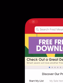
After recently interviewing at Kroger Digital (known as Fred Meyer in the northwestern region of the US) for a Quality Engineer role I had some free time over the Thanksgiving holiday for a side project. I had already started to investigate the Fred Meyer iOS app and compiled a list of bugs and improvements to reference in the interview but I didn't get a chance to go over everything that I uncovered. I really enjoyed meeting the team and wanted to continue my investigation to show just how eager I was to join the team. One thing that was mentioned during the interview was that a previous QE there had handed over a packet of 75 bugs/improvements during their interview. The interviewers seemed pretty impressed by this and it's an amazing total but not that unrealistic for any app from a non-tech first company.
One bug that I had previously come across was this weird app icon distortion issue when backgrounding the app. I was curious about why it was happening and I had a hunch that I could fix it with a little more investigation. Just taking a quick glance at the icon I started to notice some other potential issues with it. I'm a competitive person on occasion and I had this historical number of "75 bugs" floating around in my head and it seemed like a fun target. I thought it would be a little hilarious to see how close I could get to 75 bugs/improvements before even launching app. It sounds like a ridiculous target but I got very close and may have actually exceeded that number...
Why Waste Your Time On This?
I believe that attention to detail is a critical trait that every great QE should have. This project hopefully an example of the level of detail that I'm capable of. This is definitely not a high priority issue but I don't work there yet so I have no other tasks assigned to me. I also have secretly wanted to become a designer over the years. Exercises like these help me understand more about the craft and give me more experience with various design tools. I totally understand that most people who see the final icon comparisons will see no value and ask "why would you waste your time on this"? That's totally fine and understandable but I'm a person who appreciates these big little details and am passionate about getting them right. That's really the essence of software; 1's and 0's, true or false, right and wrong. In the end though it's just a slightly humorous and educational project for me.
The First Bug
Here is the first issue that I noticed with the app icon. You should be able to see the thick grey banding on the bottom of the icon during the backgrounding animation.
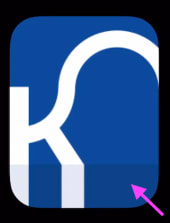
Why would it be doing that? There are plenty of other similar looking app icons with a logo on top of a white background but none of them seemed to exhibit the same banding behavior. So there must be something wrong with the app or icon asset. When playing around with the main Kroger app I noticed the same thing happening with their blue Kroger app icon. Is this a problem on all 30+ Kroger apps? Not quite, but it is a problem on about 50% of them. More on that later.
So how do we investigate this further? We need a way to access the actual icon image assets but without having access to any of the source files. We used to be able to just download an app .ipa bundle file within iTunes but in recent versions of macOS, iTunes has been removed. There is a way to install an old version but it doesn't really work for what we're trying to do. I used a sort of hacky method with Apple Configurator 2 to download a backup .ipa of the Fred Meyer app from the App Store. This gave me access to the whole Fred Meyer.app container and all the files within it. There are some loose image assets within it but most are locked away in the main compiled Asset Catalog file (Assets.car). There are some handy open source tools which allow you to extract the image assets within the .car file. I used Asset Catalog Tinkerer and extracted everything that I could. I was able to track down all of the raw .png app icon assets this way. I started going through them trying to find the thick grey banding but they all looked pretty normal in Preview.app.

Then I gathered all of the app icon assets and added them to an iOS test app that I created. I was able to reproduce the issue with my test app so now I knew the issue was with the icon assets and had nothing to do with the apps.

If we change the Preview.app canvas to white (#FFFFFF) we start to see something fishy with the icon. The right and bottom sides of the icon seem to have a darker grey border. It should theoretically be all white (#FFFFFF) and match the white canvas color.

Zooming in on it a bit more we can see that there is indeed a 1-pixel grey border on the right and bottom sides of the icons.

So now I knew that this 1-pixel grey line was somehow responsible for the backgrounding animation issue. I was still confused on how but once I slowed down the animation within the iOS simulator I started to see why. During the animation iOS seems to grab the whole bottom row of pixels of an app icon and stretch it down to make it feel a bit more immersive when launching or closing an app. Look at the blue Kroger icon screenshot above and you can see the stretching effect on the right leg of the "K". This feels like more of an iOS bug to me though, it's an animation hack but it works fine on 99% of the icons. Most modern app icons don't have content that touches the edge of the icon. The majority of icons consist of small logos or glyphs centered on a mostly solid color background. You wouldn't really ever notice this animation bug if you didn't accidentally have a row of dark pixels on your mostly white icon. You can even see the behavior mid-animation on the Apple Maps icon.

I went over all of the individual sizes for the icon assets and saw that the grey border wasn't on every single size but it was on 75% of them. We could have just gone in with an image editor and changed the grey pixels to white but by this time I had seen enough of the icon to spot a few other things I could improve. Fixing all of them would be pretty impossible to pull of by just using an image editor. I decided that if I wanted it done correctly I would have to basically re-create the icon from scratch.
Tweaking The Brand Refresh
Before we dive in and start making the new icon lets go over some of the other fixes that I want to include in it. Kroger recently did a brand refresh which included a new updated Kroger logo and marketing campaign. I really like the look of the new logo and the way they applied it to the main Kroger app icon. Aside from the animation banding issue mentioned earlier I think it's an amazing icon. It's simple but bold and has some character to it. It uses just the first letter of the logo and it's positioned off center on the bottom-left to showcase the more expressive loop in the upper-right. Some of the edges of the character are slightly clipped off but it's very minor.

I was a little surprised to see some branding experts mostly-negative opinions on the brand refresh but I think the implementation into the icon is perfect. The other 15 or so banner stores (Fred Meyer, Ralphs, Fry's, etc.) didn't quite get the same amount of love and attention for the refresh. None of the banner store logos were updated but they still decided to bring over the app icon refresh for all their various apps. I don't quite agree with this choice but I can understand the idea behind it. A lot of the other logos use very odd outdated wordmarks so just showing giant slightly-clipped versions of the first character for all those apps feels very lazy. My sympathies to the designers though, I can imagine the time pressure they must have been under to crank out 15+ new perfect bold app icons at once. Not easy an easy job.

Luckily the Fred Meyer logo is much more modern looking than the other banner logos. Here's what the app icon used to look like before the brand refresh and how it looks like in the current version.

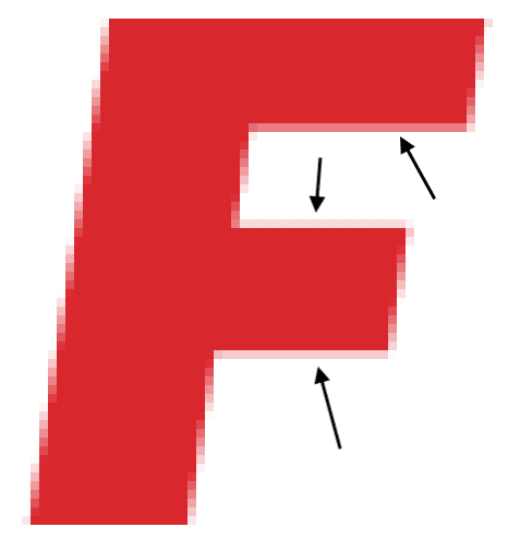
The new icon is fine and definitely bigger and bolder but I thought the previous version was already pretty good (except the registered trademark symbol). My initial impression of a giant red "F" didn't make me feel super comfortable and inspire me with confidence. It reminded me more of receiving a failing grade on a school project. You hate to see it.

It's mostly fine though and it's easier to re-create from scratch so we're keeping the current icon design as our baseline. One improvement that I'm adding is to not clip off any part of the red "F" by extending it beyond the icons edges. In the current version the bottom and the top are just slightly clipped. It's usually not the best practice to have a logo touch the edges of the icon. It helps to leave a little space around the edges for the logo to breathe. This technique works for the new Kroger blue icon, just not so much on all the other banner store wordmarks though.
What Color Is This?
Another thing that was bothering me was the new icon seemed to use a bit duller and de-saturated red color. I wanted to find out what the actual Fred Meyer red brand color was but I couldn't find any official brand guidelines. In order to narrow in on an official red brand color I decided to run color tests with xScope on all the Fred Meyer app icons and various logos within the app and around the web. The new app icons consistently use hex code color #D9272E but I was able to find multiple references around the web that pointed to #ED1C24 being the actual brand color.

- There's actually a Fred Meyer vector logo on the website that has a fill color of #ED1C24.
- The favicon on the website uses #ED1C24.
- The vector logo on Wikipedia uses #ED1C24.
- The vector logo on brandeps.com uses #ED1C24.
- There's a Fred Meyer company page on encycolorpedia.com that references #ED1C24 as the brand color.
This seemed like enough evidence that #ED1C24 was the real red brand color. We'll use this as the red color when re-creating the icons. I could be totally wrong in assuming this is the correct red as the brand colors may have been recently updated. I just think it's a bit more saturated and looks better on screen so we're going with it.
More recent iOS devices have wide color gamut displays so I wanted to learn more about digital color spaces and see if we could create better looking icons using the Display P3 color space. Xcode now supports using two different icon assets with for both sRGB and Display P3 color profiles. I started off by keeping the sRGB color hex code #ED1C24 and just assigning the Display P3 color profile to it. It looked amazing on screen next to the current app icon but it was way too vibrant and saturated. It almost looked like neon red and it just didn't feel quite right.
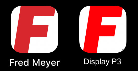
I read a lot of articles and blog posts about working with different color spaces and how to use color profiles correctly. Instead of assigning a Display P3 color profile to the same sRGB color code I should have converted the colors into Display P3. After a lot of trial and error I came to the conclusion that we wouldn't see any real benefit by adding Display P3 versions of the app icons. The red brand color is already within the sRGB color space so by converting it to Display P3 our eyes would still see the same red color. Display P3 color profiles work best on photographs and more complex artwork. You just can't really see any difference on flat app icons that use a minimal color pallet.
Pixel Fitted
We pretty much have all we need now to start to re-create the icon. We were able to get a copy of the vector logo so we can copy the "F" from it and have it be as sharp as possible in all resolutions. We have the red brand color that we're going to fill the "F" with. That's about all we need to get started but there is one more improvement that I'd like to add to all the icons. It's called pixel-fitting (shout out to Dustin Curtis for the amazing blog post)! If we zoom into one of the current app icons we can see the effects of not pixel-fitting. Take a look at the horizontal edges within the "F" path. Notice how they're blurry and have a line of more pink-ish pixels where it transitions from red to white.
We'll have to manually adjust these horizontal vector points for all 13 icon sizes that we need for Xcode. This is a lot more work to remove most of the fractional pixels but it's going to produce super sharp icons. The smaller icon sizes will see the most benefit. We're technically modifying the actual shape of the "F" but it shouldn't be noticeable if we do correctly.
Starting Fresh (For Everyone) 😉
I think we have our plan and have everything that we need now to re-create the icons. We're going to be using Sketch as our vector editor. Here are the steps we're following starting with the largest 1024x1024px size:
- Create a 1024x1024 square and fill it with white #FFFFFF, this is our icon background.
- Copy the "F" vector path from the .svg we found on the website and paste it on top of the white background.
- Stretch and fit the "F" path (while maintaining its aspect ratio) to be as tall as the background and centered within it.
- Select the "F" path and fill it with the red brand color #ED1C24.
- In order to maintain the correct angles in the "F" path we need to draw 6 vector guidelines around the horizontal points that we'll be moving before we start pixel-fitting. These will help us place the vector points correctly and not throw off the geometry of the "F" path.

- Now we can zoom way into those vector points along the horizontal axis to see the fractional pixels that we want to turn into full pixels. Drag the horizontal vector point to the closest pixel edge on the y-axis and then center it within the guideline we created on the x-axis. Do this for all 6 horizontal points.

- Hide the guideline layers so only the background and "F" path are visible.
- Export the icon at 1x size as a .png with an sRGB color profile and uncheck both "Interlace PNG" and "Save for web".
Most designers would just stop here after creating the 1024px version of the icon and then use it to create scaled down versions of the icon. There's even an official template within Sketch that automates this super quickly. We could use this method as it's a lot faster to create all the sizes of icons but we would miss out on all the pixel-fitting improvements if we automate it. This automation also seems to be the cause of our original grey banding animation bug. The designer created the original 1024px version and kicked off the automation that down-scaled and created all the smaller icons sizes. I'm not sure what tool they used but somewhere during that procedure the grey border started to appear on most of the icon sizes.
Since we're choosing to include pixel-fitting we'll need to repeat these steps for the 12 other required iOS app icon sizes. This was by far the most time consuming step of the whole project. The results turned out great though. No more grey banding during the animation, displaying the full "F", using the correct red color and no more blurry edges!
One More Fix
Before we add all of our 13 new fixed icon images to Xcode, there's still one more improvement that we can make. We can compress the individual .pngs even more by running them through a PNG optimizer. This is still a lossless compression/optimization that won't affect the visual clarity of the images but it will reduce their size before we add them to our Xcode project/bundle. I started using Pngcrush which produced solid results but then I discovered OptiPNG and it was able to reduce the size even more. Here are the sizes of the original icon images compared to our fixed and size-optimized versions:
Original (13) icons total size: 48,254 bytes
Fixed (13) icons total size: 19,977 bytes
That's a 58.6% reduction in size! The original icons weren't that massive to begin with but every little savings adds up. Imagine if we did this with every .png asset that's include in the app bundle. We could save people way more bandwidth by optimizing all the images. This would speed up so many things and reduce the memory footprint of the app.
Future Improvements
The fixed icons look pretty great but I thought of some potential improvements. Instead of the icon being just a giant "F" it might be more recognizable to people if we have both initials "FM" in the icon. I would lose some of the boldness of the recent icon refresh but I think it could work. The website favicon is actually already doing this. Here's a quick test concept that I threw together inspired by the favicon. We can even invert the colors to make it a bit bolder.

Outro
So what was our final bug/improvements count? Did we get close to 75? It's a little hard to calculate since I both found and fixed a bunch of them but here's a rough total.
Fix grey banding animation/grey border (I think there were 9 total sizes that had the border): 9
Display the whole "F" within the icon: 13
Update "F" to use the correct brand color: 13
Pixel-fit vector paths: 13
Optimize PNGs: 13
Total bug/improvements: 61
I think that's a pretty respectable total to find before we even launched the app. The 15 other banner store apps also have the same grey banding animation/border bug so maybe a better total would be something like: ~300+? I'm good with 61 though.
I had a super fun time on this project. I learned way more about digital color spaces, color theory and wide gamut color. I also had a chance to use some new tools and improve my skills on some others. After completing this project I feel like a better QE, designer and writer. Great success!

These are all of the different tools that I used during the project.
- Sketch
- ImageMagick
- identify
- Pixelmator
- Pixelmator Pro
- Preview
- ColorSync Utility
- xScope
- Xcode
- iOS Simulator
- Pngcrush
- OptiPNG
- Kaleidoscope
- Asset Catalog Tinkerer
- acextract
- Apple Configurator 2
- iTerm2
- Visual Studio Code
- Tower
- Firefox
- Git
- Github
- Markdown
- LICEcap
- Quicktime Player
- homebrew
Photo by Markus Spiske on Unsplash
You can check out all of the various icons and test apps here: https://github.com/sleeve/fredmeyer-app-icon
Thank you so much for reading! Please feel free to let me know if you have any feedback or suggestions. I would love to hear it!


Top comments (0)