I watched Brad Traversy's and FollowAndrew's tutorials about this and deconstructed them to make sense to me. This article is the result.
The Objective
A menu that displays as a hamburger menu when the viewport is small and as an inline list when the viewport is larger.
The Plan
- Start the HTML.
- Toggle the menu between open and closed.
- Create the hamburger.
- Hide the toggler.
- Change the hamburger into an 'X' when the menu is open.
- Make the menu display for larger viewports.
- Make the transitions between open and closed smoother.
- Make some initial typography choices.
- Add more general layout.
The HTML
This is the beginning of our index.html file.
<!DOCTYPE html>
<html lang="en">

<head>
  <meta charset="UTF-8">
  <meta
    name="viewport"
    content="width=device-width, initial-scale=1.0"
  >
  <title>A Responsive Menu</title>
</head>

<body>

</body>

</html>
I'm making the assumption that our navigation menu will be a part of our page's header, so let's add the header and nav tags:
. . .
<body>
  <header>
    <nav>

    </nav>
  </header>
</body>
. . .
To be able to toggle our menu between opened and closed we need some kind of boolean state. A checkbox input will give us this. We'll give it the id of toggler.
. . .
<body>
  <header>
    <nav>
      <input
        type="checkbox"
        id="toggler"
      >
    </nav>

  </header>
</body>
. . .
Now we can add our menu options.
. . .
  <header>
    <nav>
      <input
        type="checkbox"
        id="toggler"
      >

      <ul>
        <li><a href="#projects">projects</a></li>
        <li><a href="#about">about</a></li>
        <li><a href="#contact">contact</a></li>
      </ul>
    </nav>

  </header>
. . .
Toggling The Menu
Let's start working on the toggle functionality. Create a css directory and a menu.css file and add a link to the css file in the index.html head. Here's the relevant parts of the updated index.html:
<!DOCTYPE html>
<html lang="en">

<head>
  <meta charset="UTF-8">
  <meta
    name="viewport"
    content="width=device-width, initial-scale=1.0"
  >
/* This is the link to the css file. */
  <link
    rel="stylesheet"
    href="css/menu.css"
  >

  <title>Responsive Navigation</title>
</head>

<body>
. . .
The menu options are what we will be hiding or showing depending on the state of the checkbox. When the checkbox is not checked we want the menu closed. To do this we'll give the unordered list (ul) a max-height of 0 to collapse it and hide its contents with overflow: hidden:
/* 1. Toggle the menu */
ul {
  max-height: 0;
  overflow: hidden;
}
Next we want to open the menu when the checkbox is checked. We can check the state of the checkbox and if it's checked we can expand the height of the ul.
/* 1. Toggle the menu */
ul {
  max-height: 0;
  overflow: hidden;
}

#toggler:checked ~ ul {
  max-height: 240px;
}
The tilde (~) is a subsequent-sibling combinator. So #toggler:checked ~ ul says, "when #toggler is checked select the next ul tag that is a sibling of #toggler and set its max-height to 240px."
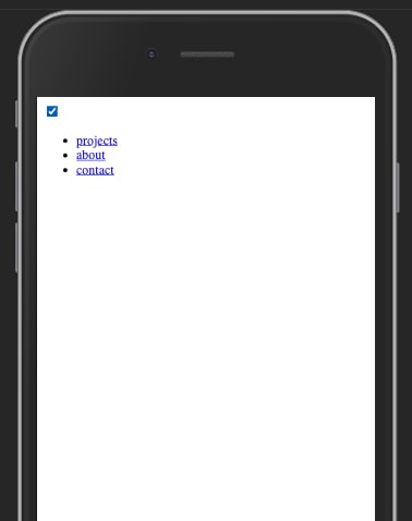
If you open the index.html file in your browser you should see a lonely checkbox:

And if you click on the checkbox you should see your menu:
Create the hamburger
Right now we have a bare checkbox input. We're going to replace it with a hamburger.
Since we want to get rid of the checkbox we'll need an element to take its place. A cool thing about HTML inputs is that when paired with a label tag, a click on the label does the same thing as clicking on the input.
Let's add a label:
<body>
  <header>
    <nav>
      <input
        type="checkbox"
        id="toggler"
      >
      <-- Here's the label. -->
      <label for="toggler">
        Toggle me.
      </label>

      <ul>
        <li><a href="#projects">projects</a></li>
        <li><a href="#about">about</a></li>
        <li><a href="#contact">contact</a></li>
      </ul>
    </nav>
  </header>
</body>
Clicking on "Toggle me" will open and close the menu. Our hamburger will go here instead.
The classic hamburger is three horizontal lines. We will style a single span tag so that it will create these three lines.
First we add the span tag with an id of "hamburger":
<body>
  <header>
    <nav>
      <input
        type="checkbox"
        id="toggler"
      >
      <label for="toggler">
        <-- The new span tag. -->
        <span id="hamburger"></span>
      </label>

      <ul>
. . .
In our css file we'll give this span a width, height, and background color so we can see it.
#hamburger {
  display: block;
  height: 2px;
  width: 25px;
  background-color: black;
}
Notice that span is an inline element. In order to give it width and height we set it to display: block. We could have used a div here instead and saved a line of css. For completely subjective reasons I prefer the span here. And none of the other semantic HTML tags made much sense to me in this context. I'd love to hear your thoughts on other choices.
Now we have the burger in our hamburger. Next for the buns.
Our buns are going to have the same basic starting point as the burger. We can add the ::before and ::after pseudo-elements to the span.
#hamburger,
#hamburger::before,
#hamburger::after {
  display: block;
  height: 2px;
  width: 25px;
  background-color: black;
}
These pseudo-elements will render something like this:
      <label for="toggler">
        <-- The new span tag. -->
        <span id="hamburger">
          ::before
          ::after
        </span>
      </label>
At first, all three of these spans will display right on top of each other, so you won't see them. We're going to move the ::before and ::after span's above and below the original span, respectively.
In order to move the pseudo-elements, which are children of the original span, we need to give the original a position of relative. Below the rest of the css rule sets add:
#hamburger {
  position: relative;
}
We also need to give the pseudo-elements a position of absolute which let's us move them in relation to their parent, the original span:
#hamburger::before,
#hamburger::after {
  position: absolute;
  content: '';
}
Note that we added the property content with a value of an empty string. Without this the pseudo-elements won't be rendered because they wouldn't have anything to display. Without content, they won't acknowledge other styles applied to them.
Now we can move the ::before up and the ::after down by adding these rule sets:
#hamburger::before {
  top: -5px;
}

#hamburger::after {
  top: 5px;
}
Hide the toggler
We don't need to see the checkbox anymore to be able to toggle the menu, so let's hide it.
#toggler {
  display: none;
}
X Marks The Spot
We're going to transform our hamburger into an 'X' by rotating the ::before and ::after buns and disappearing the burger by adding these rule sets to our css:
#toggler:checked ~ label #hamburger {
  background: transparent;
}

#toggler:checked ~ label #hamburger::before {
  transform: rotate(-45deg);
  top: 0;
}

#toggler:checked ~ label #hamburger::after {
  transform: rotate(45deg);
  top: 0;
}
By setting the top property on ::before and ::after to 0, we bring them both back down on top of the burger. Now when they are rotated their centers are matched up giving us an 'X'.
A Menu For Larger Viewports
The view we've created so far is meant for smaller devices. If the user has more real estate we'll show them a menu better suited to their screen. We'll use a media query for this.
@media (min-width: 42em) {

}
The min-width of 42em is totally subjective. If the user hasn't changed the base font size of their browser 1em is about 16px. This comes out to 672px.
The first thing we want to do is hide the hamburger.
@media (min-width: 42em) {
  /* Hide the hamburger */
  label {
    display: none;
  }
}
The next thing I want to do is stop limiting the height of the menu. This way it will always be visible.
@media (min-width: 42em) {
  /* Hide the hamburger */
  label {
    display: none;
  }

  ul {
    max-height: none;
  }
}
Now I want the items to lay out in line.
@media (min-width: 42em) {
  /* Hide the hamburger */
  label {
    display: none;
  }

  ul {
    max-height: none;
  }

  li {
    float: left;
  }
}
We'll come back to this in the layout section.
Easing Transitions
I'm working on developing my eye for design and the niceties of UI/UX. In putting this project together I learned about transitions. This is still pretty subtle for me and very brand new.
When the menu is opened, it just appears, pops into existence, and is equally abrupt when leaving. We can smooth this out. In our menu.css file let's revisit our rule set for the ul tag and use the transition property.
ul {
  max-height: 0;
  overflow: hidden;
  transition: max-height 0.2s ease;
}
The transition property attaches itself to some other property declared on an element and moderates the transition between the two states. Here we're saying that when the ul (the menu) is revealed or hidden that we want this to take two tenths of a second. Play around with this value. What feels best to you?
Chris Coyler has some thoughts about this that I'm still grappling with.
We can also smooth out the transition between the hamburger and X states of our menu icon. Again, revisiting our menu.css and the ::before/::after state:
#hamburger::before,
#hamburger::after {
  position: absolute;
  content: '';
  transition: all 0.2s ease;
}
all here means any of the properties on these elements that are manageable by transition. In particular we're attaching this to the top and transform properties we defined earlier.
Again, play with these. Where else might you want transitions? Are there better ways of implementing them? Please let me know what you find!
Typography
We're not going super deep here, but we'll want our fonts to be styled so that when we start working on the layout we can react to something closer to our end goal.
In the css directory create a main.css file. Add a link to it in index.html.
<!DOCTYPE html>
<html lang="en">

<head>
  <meta charset="UTF-8">
  <meta
    name="viewport"
    content="width=device-width, initial-scale=1.0"
  >
  <-- Linking to our more general styles -->
  <link
    rel="stylesheet"
    href="css/main.css"
  >
  <link
    rel="stylesheet"
    href="css/menu.css"
  >
  <title>Responsive Navigation</title>
</head>
. . .
In main.css we'll add a base font for the whole page:
body {
  font-family: Arial, Helvetica, sans-serif;
}
Let's replace the default anchor tag styling.
a {
  color: black;
  text-decoration: none;
}
Layout
For better or for worse, I like to do styling and layout last. I prefer to get the mechanics working first. I've seen people far more skilled than I jump back and forth between styling/layout and mechanics or even start with styling/layout. So there's probably no right or wrong here. Do what gets it done and is most interesting for you.
To get to a basic starting point for all tags I removed margin and padding globally in main.css:
* {
  margin: 0;
  padding: 0;
}
This seems to mess things up for us. The hamburger almost left the screen.
Our nav contains our hamburger and our menu, but is not something we are actually seeing. So let's leave it alone and work with the tags we are seeing. We can bump the hamburger down by giving the label some margin. labels are inline elements so we set the display property to block to apply margins.
label {
  display: block;
  margin: 2em;
}
I'm using ems because I'm thinking that tying layout to the font size might help give the page some kind of cohesion. I could be very wrong about this, but it's working for me right now.
I want the hamburger and all of the navigation to be on the right side of the header so in menu.css I added:
nav {
  float: right;
}
I'm noticing that it can be difficult to click on the hamburger/X. You have to click very precisely. If you put a border on the label you'll see why. Changing the label's margin to 1em and adding a padding of 1em fixes this.
The next thing I notice is that the menu items are scrunched together. Also in menu.css I give them some room with:
li {
  padding: 1em;
}
That all seems to be in a pretty good spot now. This is a deep rabbit hole and it all comes down to your particular use case. Now what about bigger screens? Let's revisit our media query.
We've got a good start, but if you play with the screen width you'll see that the items appear slightly above the hamburger. I want them to replace the hamburger, to kind of slide out to left of it. The items still have 1em of padding from the small screen layout. I'm removing that so that I can get a better sense of where things should be in the new layout.
@media (min-width: 42em) {
  /* Hide the hamburger */
  label {
    display: none;
  }

  ul {
    max-height: none;
  }

  li {
    float: left;
    padding: 0;
  }
}
I'll use margin to move the ul down 1.5em so that the items' mid-line lines up with the mid-line of the hamburger, and move the right side over 2em to match up with the hamburger.
  ul {
    max-height: none;
    margin: 1.5em 2em 0 0;
  }
Almost there! I want to give the items their space back and add a bit of demarcation between them with a right-side border:
  li {
    float: left;
    padding: 0 1.5em;
    border-right: 1px solid black;
  }
And that's it. There's a lot of variations and fixes to be done, but it really depends on where and how you're using the menu. So this is a good jumping off place.
Writing this was an amazing exercise and I learned so much! I hope it's been useful for you, too. Please let me know if you have any questions, suggestions, or corrections.
Thanks for reading.


Top comments (0)