
Today we are going to create a dropdown component using AlpineJS and TailwindCSS.
AlpineJS is a simple JavaScript toolkit for creating reactive components. TailwindCSS is an utility based CSS framework. You can use both these frameworks in the HTML markup itself. But for some repeating components, you can extract it as a separate component so that you can reuse it.
Note: The following example doesn't follow accessibility principles to keep it simple. Make sure you follow accessibility principles for production websites.
Check out this gist for full source code.
HTML
Open a new html file in your website and add the following snippet.
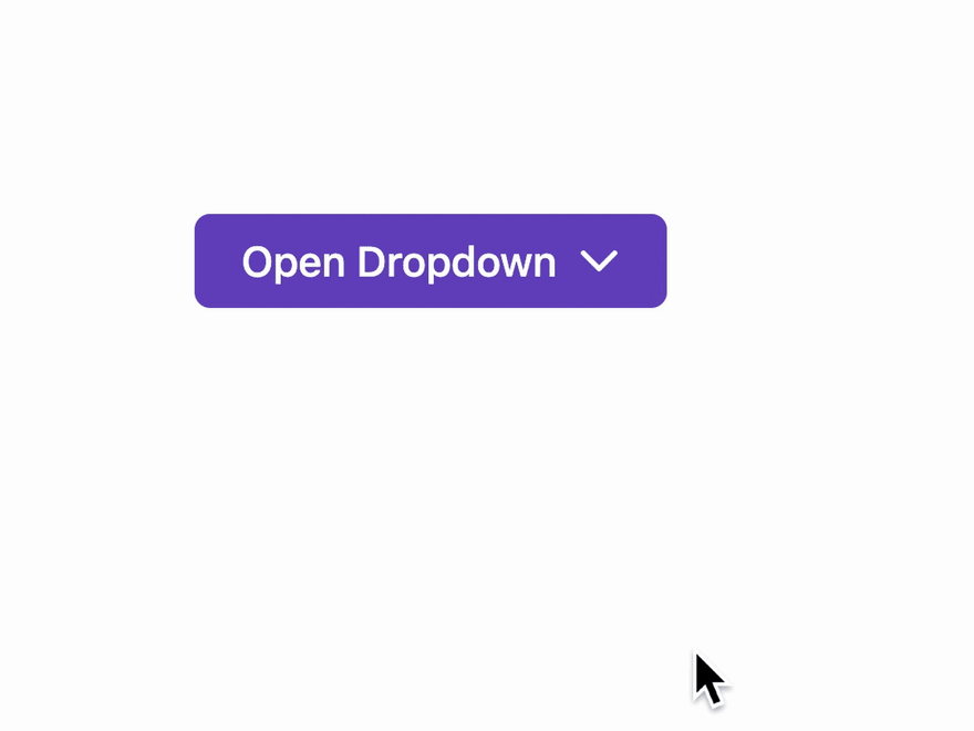
<div class="dropdown">
  <button class="dropdown-trigger" id="open-color-menu">
    Open Dropdown
  </button>
  <div class="dropdown-list" id="color-menu">
    <a href="#" class="dropdown-item">Red</a>
    <a href="#" class="dropdown-item">Blue</a>
    <a href="#" class="dropdown-item">Green</a>
  </div>
</div>
CSS
Let's start with all the CSS that we need, I assume you have already set up a Tailwind integrated website. So in your CSS file, you can add this.
We use a special @apply function here that is available from TailwindCSS. It's used to inline any Tailwind utility classes into our own custom CSS.
[x-cloak] {
  @apply hidden;
}

.dropdown-trigger {
  @apply inline-block py-2 px-4 rounded-md bg-purple-700 text-white;
}

.dropdown-list {
  @apply absolute z-10 shadow-md w-56 flex flex-col border border-solid border-gray-200 bg-white p-2 rounded;
}

.dropdown-item {
  @apply relative flex px-2 py-1 items-center text-gray-800;
}

JS
Next, we can use Alpine to give our dropdown that sweet interactivity. Make sure you already have AlpineJS defined and then change your dropdown markup to this.
<div x-data="dropdown()">
  <button class="dropdown-trigger" id="open-color-menu" x-spread="trigger">
    Open Dropdown
  </button>
  <div class="dropdown-list" id="color-menu" x-spread="dropdown" x-cloak>
    <a href="#" class="dropdown-item">Red</a>
    <a href="#" class="dropdown-item">Blue</a>
    <a href="#" class="dropdown-item">Green</a>
  </div>
</div>
Here, x-data is the encapsulating function, the x-spread attributes will allow us to bind the object of Alpine directives to an this element so that we can reuse it everywhere.
And x-cloak hides the dropdown list before Alpine is defined. So we won't see the dropdown list and then hide on page load.
And then add this to a script file in your website:
window.dropdown = function () {
  return {
    open: false,
    trigger: {
      ["@keydown.escape"]() {
        this.open = false;
      },
      ["@click"]() {
        this.open = true;
      },
    },
    dropdown: {
      ["@keydown.escape"]() {
        this.open = false;
      },
      ["x-show.transition"]() {
        return this.open;
      },
      ["@click.away"]() {
        this.open = false;
      },
    },
  };
};
When you click on the dropdown trigger,
- The
@clickdirective makes theopenvariable true. - When the open variable is true, the dropdown will show because of the
x-show.transitiondirective, wheretransitionwill add a little animation while opening up.
When you click outside or press escape button,
- The
@click.awayand@keydown.escapedirectives will make theopenvariable false. - It will make the same
x-show.transitionhide the dropdown element.
And that's it, you can use this markup everywhere in your website and it will work for you. If you need to change CSS or JS in this component, you have to do it just once.
Check out this gist for the full source code.

Top comments (0)