This post was sent on my newsletter a few weeks ago, just saying.
This is part of a series of posts about writing good components
Today, let's talk about forms.
You have probably read a bunch of articles about state management in forms, this isn't one of them. Instead, I'd like to talk about the design and API of forms.
There are a bunch of things happening here, but first let me show you the API.
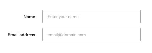
<Form layout="label-on-left">
  <Form.Field label="Name">
    <TextInput type="text" placeholder="Enter your name" />
  </Form.Field>

  <Form.Field label="Email">
    <TextInput
      type="email"
      placeholder="email@domain.com"
    />
  </Form.Field>
</Form>
Let's look at each one of the components and break them down:
Form
It starts with a Form component which on the surface is a basic form element with a class attached. It renders whatever you put inside it.
function Form(props) {
  return <form className="form">{props.children}</form>
}

render(<Form layout="label-on-left">...</Form>)
It also accepts a layout prop, which is useful for use cases where you are short on space.
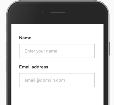
<Form layout="label-on-top">...</Form>
This changes how the labels are aligned (right to left) and how margins work.
The form doesn't control the width and margin of it's inner contents though. That's for the form field to take care of.
The Form does need to communicate this layout information down though.
The easiest thing to do would be to pass the layout in props, but because the contents of a form is dynamic (decided by the developer who uses this form), we can't control that.
This is where the context API comes in.
/* Create a new context */
const LayoutContext = React.createContext()

function Form(props) {
  /*
    Wrap the children in a context provider
    with the value based on props
  */
  return (
    <form className="form">
      <LayoutContext.Provider
        value={{ layout: props.layout }}
      >
        {props.children}
      </LayoutContext.Provider>
    </form>
  )
}

export default Form
export { LayoutContext }
Now a form field can consume this context and get the value of layout
Form Field
The FormField component adds a label before rendering whatever you put inside it (like a text input).
function Field(props) {
  return (
    <div className="form-field">
      <label {...props}>{props.label}</label>
      {props.children}
    </div>
  )
}
In addition to that, it adds a class for layout - which comes from the context we created in Form.
/* Get the layout consumer */
import { LayoutContext } from './form'

/*
  Use the consumer to get access to the
  context - it uses the render prop API

  We pass this as the class to the form field
*/
function Field(props) {
  return (
    <LayoutContext.Consumer>
      {context => (
        <div className={`form-field ${context.layout}`}>
          <label {...props}>{props.label}</label>
          {props.children}
        </div>
      )}
    </LayoutContext.Consumer>
  )
}
The useContext hook from React 16.8+ makes the syntax easier to understand
/* Get the layout consumer */
import { LayoutContext } from './form'

function Field(props) {
  /*
    Grab the context from the useContext hook
    which accepts the context variable as the input
  */
  const context = useContext(LayoutContext)

  return (
    <div className={`form-field ${context.layout}`}>
      <label {...props}>{props.label}</label>
      {props.children}
    </div>
  )
}
If you're curious, you can check the css here:
.form-field.label-on-left {
  max-width: 625px;
  display: flex;
  align-items: center; /* align vertically */
}
.form-field.label-on-left label {
  text-align: right;
  width: 175px;
  margin-right: 25px;
}

.form-field.label-on-top {
  width: 100%;
  display: block; /* instead of flex*/
}
.form-field.label-on-top label {
  text-align: left; /* instead of right */
  margin-bottom: 25px; /* instead of margin-right */
}
Form.Field?
The last detail I want to talk about is this awkward dot syntax for components.
Because the form Field is always used with a Form, it makes sense to group them together for the user.
One way to do that is to export it from the same file:
/* form.js */
import Field from './field'

function Form(props) {
  /* ... */
}
export default Form

export { Field }
Now, users can import them together:
import Form, { Field } from 'components/form'

render(
  <Form>
    <Field>...</Field>
  </Form>
)
We can make a tiny improvement by attaching the Field on the Form component itself.
/* form.js */
import Field from './field'

function Form(props) {
  /* ... */
}

Form.Field = Field
export default Form
This code works because React components are javascript objects, and you can add additional keys on this object.
What this means for the user is when they import Form, they get the Field automatically.
import Form from 'components/form'

render(
  <Form>
    <Form.Field>...</Form.Field>
  </Form>
)
I really like this API because it makes the connection between Form and Form.Field obvious.
Note: You have to move the context into a different file to avoid cyclic dependency loop.
The combination of the dot syntax and context makes our Form component smart while keeping it composable at the same time.
Hope that was helpful in your journey
Sid

Top comments (0)