In the article, we will go into detail on how to use align-content.
Align Content
The flex-wrap attribute's behaviour is altered by the align-content property. Flex lines are aligned.
It is used to specify the alignment between the lines inside a flexible container. This property defines how each flex line is aligned within a flexbox.
Format
content-{alignment}
| Alignment | Tailwind Class | CSS Property |
|---|---|---|
| Center | content-center |
align-content: center; |
| Start | content-start |
align-content: flex-start; |
| End | content-end |
align-content: flex-end; |
| Between | content-between |
align-content: space-between; |
| Around | content-around |
align-content: space-around; |
| Evenly | content-evenly |
align-content: space-evenly; |
let's see each of this in action,
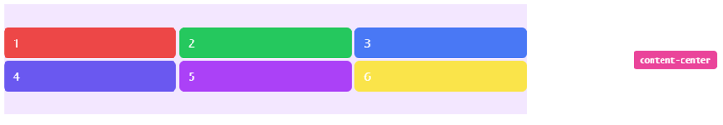
Center
This class is used to position lines in the flex container's center.
<li class="flex h-40 w-full items-center px-4 py-2">
  <div class="justify-items-auto grid h-full w-full grid-cols-3 content-center gap-1 bg-purple-100">
    <span class="rounded-md bg-red-500 px-3 py-2 text-white">1</span>
    <span class="rounded-md bg-green-500 px-3 py-2 text-white">2</span>
    <span class="rounded-md bg-blue-500 px-3 py-2 text-white">3</span>
    <span class="rounded-md bg-indigo-500 px-3 py-2 text-white">4</span>
    <span class="rounded-md bg-purple-500 px-3 py-2 text-white">5</span>
    <span class="rounded-md bg-yellow-300 px-3 py-2 text-white">6</span>
  </div>
  <div class="ml-5 w-1/3 text-right">
    <div class="rounded-2 inline-block whitespace-nowrap rounded bg-pink-500 px-2 py-1 font-mono text-xs font-semibold text-white">content-center</div>
  </div>
</li>
Output:
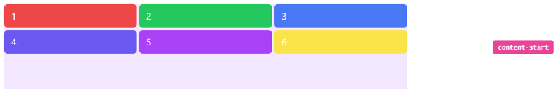
Start
This class is used to place lines at the beginning of the flex container.
<li class="flex h-40 w-full items-center px-4 py-2">
  <div class="justify-items-auto grid h-full w-full grid-cols-3 content-start gap-1 bg-purple-100">
    <span class="rounded-md bg-red-500 px-3 py-2 text-white">1</span>
    <span class="rounded-md bg-green-500 px-3 py-2 text-white">2</span>
    <span class="rounded-md bg-blue-500 px-3 py-2 text-white">3</span>
    <span class="rounded-md bg-indigo-500 px-3 py-2 text-white">4</span>
    <span class="rounded-md bg-purple-500 px-3 py-2 text-white">5</span>
    <span class="rounded-md bg-yellow-300 px-3 py-2 text-white">6</span>
  </div>
  <div class="ml-5 w-1/3 text-right">
    <div class="rounded-2 inline-block whitespace-nowrap rounded bg-pink-500 px-2 py-1 font-mono text-xs font-semibold text-white">content-start</div>
  </div>
</li>
Output:
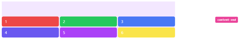
End
To position lines at the end of the flex container, use the content-end class.
<li class="flex h-40 w-full items-center px-4 py-2">
  <div class="justify-items-auto grid h-full w-full grid-cols-3 content-end gap-1 bg-purple-100">
    <span class="rounded-md bg-red-500 px-3 py-2 text-white">1</span>
    <span class="rounded-md bg-green-500 px-3 py-2 text-white">2</span>
    <span class="rounded-md bg-blue-500 px-3 py-2 text-white">3</span>
    <span class="rounded-md bg-indigo-500 px-3 py-2 text-white">4</span>
    <span class="rounded-md bg-purple-500 px-3 py-2 text-white">5</span>
    <span class="rounded-md bg-yellow-300 px-3 py-2 text-white">6</span>
  </div>
  <div class="ml-5 w-1/3 text-right">
    <div class="rounded-2 inline-block whitespace-nowrap rounded bg-pink-500 px-2 py-1 font-mono text-xs font-semibold text-white">content-end</div>
  </div>
</li>
Output
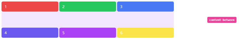
Between
With the help of this class, rows can be placed in a container so that each line has the equal amount of space.
<li class="flex h-40 w-full items-center px-4 py-2">
  <div class="justify-items-auto grid h-full w-full grid-cols-3 content-between gap-1 bg-purple-100">
    <span class="rounded-md bg-red-500 px-3 py-2 text-white">1</span>
    <span class="rounded-md bg-green-500 px-3 py-2 text-white">2</span>
    <span class="rounded-md bg-blue-500 px-3 py-2 text-white">3</span>
    <span class="rounded-md bg-indigo-500 px-3 py-2 text-white">4</span>
    <span class="rounded-md bg-purple-500 px-3 py-2 text-white">5</span>
    <span class="rounded-md bg-yellow-300 px-3 py-2 text-white">6</span>
  </div>
  <div class="ml-5 w-1/3 text-right">
    <div class="rounded-2 inline-block whitespace-nowrap rounded bg-pink-500 px-2 py-1 font-mono text-xs font-semibold text-white">content-between</div>
  </div>
</li>
Output
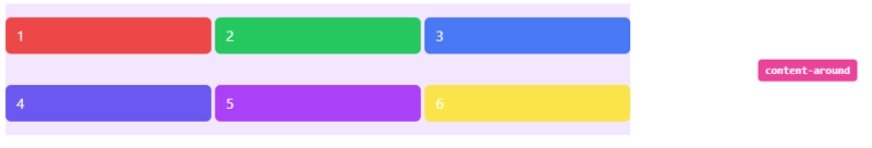
Around
By using this class, rows are distributed equally within a container so that each line has a same amount of surrounding space.
<li class="flex h-40 w-full items-center px-4 py-2">
  <div class="justify-items-auto grid h-full w-full grid-cols-3 content-around gap-1 bg-purple-100">
    <span class="rounded-md bg-red-500 px-3 py-2 text-white">1</span>
    <span class="rounded-md bg-green-500 px-3 py-2 text-white">2</span>
    <span class="rounded-md bg-blue-500 px-3 py-2 text-white">3</span>
    <span class="rounded-md bg-indigo-500 px-3 py-2 text-white">4</span>
    <span class="rounded-md bg-purple-500 px-3 py-2 text-white">5</span>
    <span class="rounded-md bg-yellow-300 px-3 py-2 text-white">6</span>
  </div>
  <div class="ml-5 w-1/3 text-right">
    <div class="rounded-2 inline-block whitespace-nowrap rounded bg-pink-500 px-2 py-1 font-mono text-xs font-semibold text-white">content-around</div>
  </div>
</li>
Output
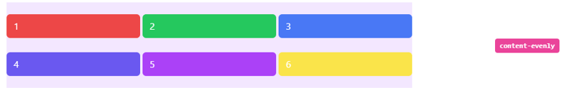
Evenly
This class is used to arrange rows in a container so that there is an equal amount of space around each item, while also accounting for the doubling of space between each item that you would see if you used the content-around class.
<li class="flex h-40 w-full items-center px-4 py-2">
  <div class="justify-items-auto grid h-full w-full grid-cols-3 content-evenly gap-1 bg-purple-100">
    <span class="rounded-md bg-red-500 px-3 py-2 text-white">1</span>
    <span class="rounded-md bg-green-500 px-3 py-2 text-white">2</span>
    <span class="rounded-md bg-blue-500 px-3 py-2 text-white">3</span>
    <span class="rounded-md bg-indigo-500 px-3 py-2 text-white">4</span>
    <span class="rounded-md bg-purple-500 px-3 py-2 text-white">5</span>
    <span class="rounded-md bg-yellow-300 px-3 py-2 text-white">6</span>
  </div>
  <div class="ml-5 w-1/3 text-right">
    <div class="rounded-2 inline-block whitespace-nowrap rounded bg-pink-500 px-2 py-1 font-mono text-xs font-semibold text-white">content-evenly</div>
  </div>
</li>
Output
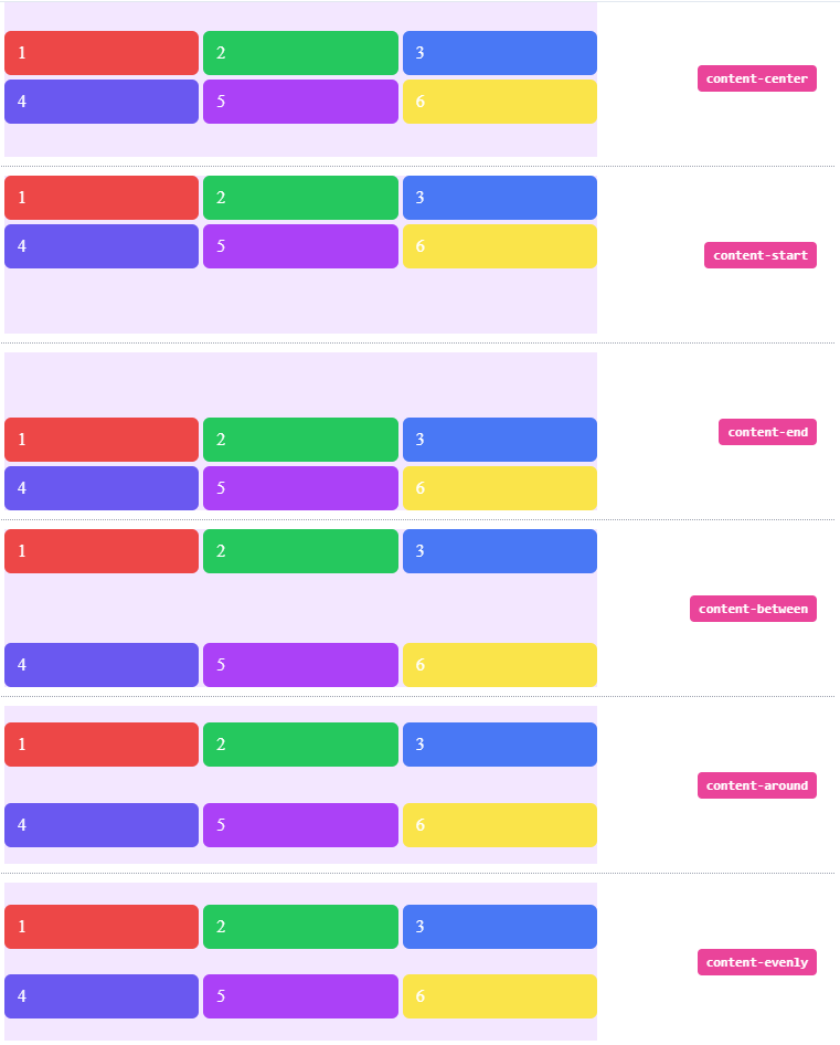
Full code:
The overall code will be attached to repo link.
Overall Output
Resources:
tailwind.css
Thank you for reading :), To learn more, check out my blogs on Justify-Content, Responsive Navbar and Justify-Item.
If you liked this article, consider following me on Dev.to for my latest publications. You can reach me on Twitter.
Keep learning! Keep coding!! 💛


Top comments (0)