In this article, I am going to show you how to create a pop-up login form using HTML and CSS. You must have seen different types of websites or applications pop-ups or modal boxes. Which undoubtedly increases the quality of the website a lot.
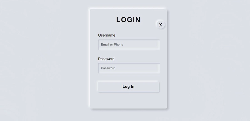
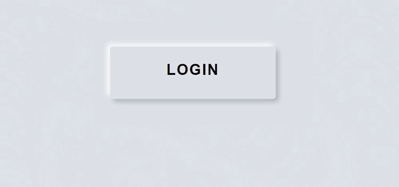
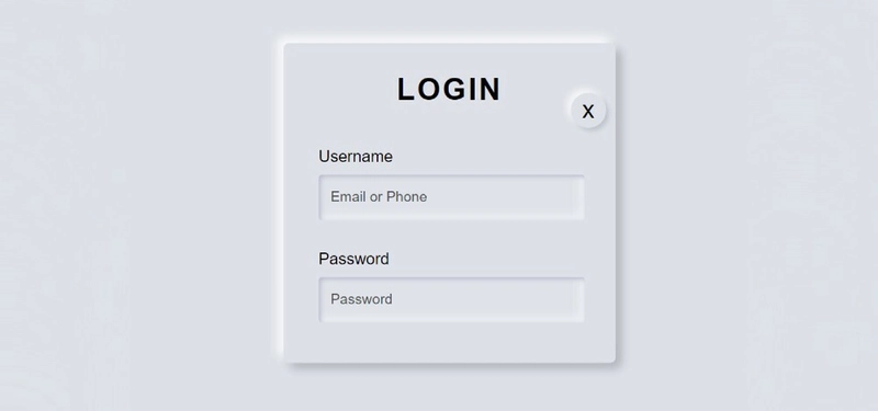
The popup login form is a modern design login page. It is hidden under normal conditions. A button or link can be found on the webpage. When we click on that link, we will see the full form.
You can watch the live demo to see how it works. Now it's time to learn from the complete tutorial how I designed this popup login form with the help of HTML and CSS. Before sharing this tutorial, I would like to say something about this design.
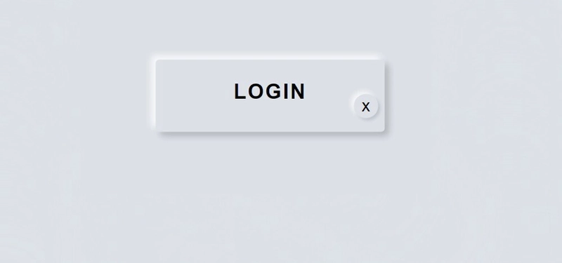
I made this design with the help of Neumorphism. Under normal circumstances, we will see a small button on the homepage. When you click on that button, you will see the complete login form.
Step 1: Design the web page
I designed the web page using this small amount of CSS code below. Here I used the background color of the web page # dde1e7.
body{
  margin:0;
  padding:0;
  font-family:sans-serif;
  background: #dde1e7;
  min-height: 100vh;
}

I added the login form and the popup button between the div below.
<div class="center">

   <!-- Home page button -->


   <!-- Popup login form -->

</div>
Step 2: Create a popup button on the web page
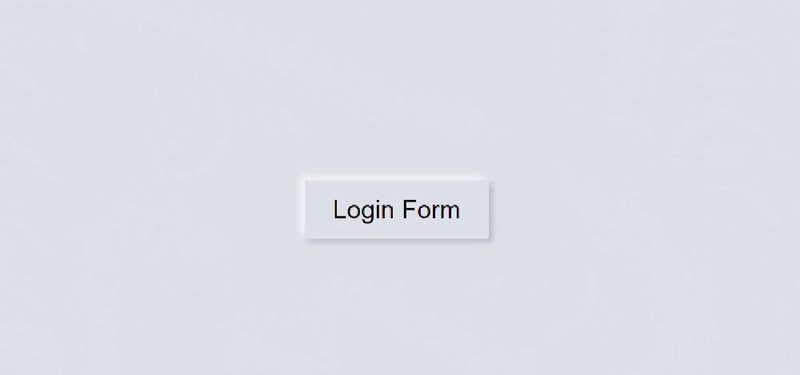
I have created a button on the homepage using the HTML and CSS code below. As I said before, you can see only one button on the homepage.
Now the following codes have helped to create and design it. I used the button 160px width and 50px height.
<input type="checkbox" id="click">
    <label for="click" class="click-me">Login Form</label>
#click{
  display:none;
}

.click-me{
  display:block;
  width:160px;
  height:50px;
  background: #dde1e7;
  text-align:center;
  font-size:22px;
  line-height:50px;
  cursor:pointer;
  box-shadow: -3px -3px 7px #fffdfdcc,
              3px 3px 5px rgba(94, 104, 121, 0.342);
}
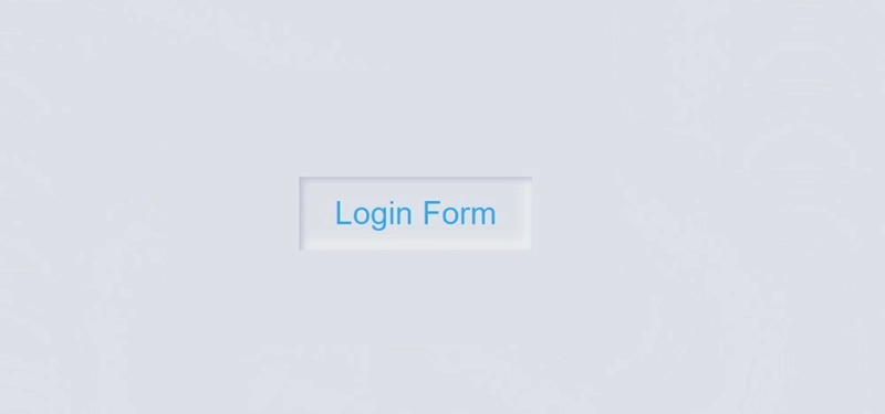
Now I have added the hover effect. When you click on that button, you will see some changes here.
.click-me:hover{
     color: #08adef;
     box-shadow: inset 2px 2px 5px #babecc,
                     inset -5px -5px 10px #ffffff73; }
Step 3: Create the basic structure of the login form
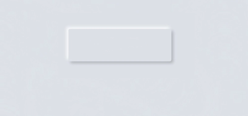
Now I have created a popup box in which I will add all the information of the login form.
I have used opacity: 0 in the CSS code. opacity: 0 will help to keep this form completely hidden under normal circumstances.
The length of this box is 330 px and I have used Height Auto. Here too I have used the background color white.
<div class="content">

</div>
.center,.content{
  position:absolute;
  top:50%;
  left:50%;
  transform:translate(-50%,-50%);

}
.content{
  opacity:0;
  visibility:hidden;
  width: 330px;
  height: auto;
  background: #dde1e7;
  padding: 30px 35px 40px;
  box-sizing: border-box;
  border-radius: 5px;
  box-shadow: -6px -6px 10px rgba(255, 255, 255, 0.8),
               6px 6px 10px rgba(0, 0, 0, 0.2);
}
Now I have implemented this pop-up. Above we have used opacity Zero which means it will not be seen. Now I have used opacity 1which means this login form will appear when you click on the home page button.
#click:checked~.content{
  opacity:1;
  visibility:visible;
}
Step 4: Add titles to the login form
Now I have added a title using these codes. I have used font size 30 px and font-weight: 600 to increase the size of this title.
<div class="text"> LOGIN </div>
.text{
  font-size: 30px;
  color: #000000;
  font-weight: 600;
  text-align: center;
  letter-spacing: 2px;
}
Step 5: Create a cancel button
Now it's time to create a cancel button that will help you hide the login form again.
This button is along the right side of the login form. Its position uses absolute to position it in a certain place.
<label for="click" id="times">x</label>
#times{
  position:absolute;
  right:10px;
  top:20px;
  font-size:25px;
  background: #dde1e7;
  padding: 3px;
  padding-left: 11px;
  padding-right: 11px;
  border-radius: 50%;

  box-shadow: -4px -4px 7px #fffdfdb7,
              3px 3px 5px rgba(94, 104, 121, 0.24);
  cursor:pointer;
}
Step 6: Create a place to input emails and passwords
Now we have created a place to input using the following HTML and CSS code. I used levels with each input.
<form>

  <label for="username">Username</label>
    <input type="text" placeholder="Email or Phone" id="username">

  <label for="password">Password</label>
    <input type="password" placeholder="Password" id="password">

</form>
I have designed the levels with the help of CSS below.
form{
  margin-top: 40px;

}
label{
    display: block;
    margin-top: 30px;
    font-size: 16px;
    font-weight: 500;
}
I have designed the input spaces using these codes.
input{
    display: block;
    height: 43px;
    width: 100%;
    background-color: rgba(255,255,255,0.07);
    border-radius: 3px;
    border: none;
    box-shadow: inset 2px 2px 5px #babecc,
              inset -5px -5px 10px #ffffff73;
    margin-top: 8px;
    font-size: 14px;
    font-weight: 300;
}
::placeholder{
    color: #4b4e4d;
    padding-left: 10px;
}
Step 7: Create a login button in the popup login form
Now I have added a login button in this login form. I used padding 12 px to determine the size of this login button. I used margin-top to keep the button slightly down from the top.
<button>Log In</button>
button{
  width: 100%;
  margin-top: 35px;
  padding: 12px;
  background: #dde1e7;
  border: none;
  font-size: 17px;
  font-weight: 600;
  margin-bottom: 32px;
 box-shadow: -4px -4px 7px #fffdfdb7,
                3px 3px 5px rgba(94, 104, 121, 0.388);
}
button:hover{
 box-shadow: inset -3px -3px 7px #ffffffb0,
       inset 3px 3px 5px rgba(94, 104, 121, 0.692);
}
This is the easiest way to create a modal login form. Hope you learned from this tutorial how I created this pop-up login form using HTML and CSS only.
Related Post:
- Responsive Footer HTML CSS
- International Schools in Hyderabad
- Simple Stopwatch using JavaScript
- JavaScript Password Generator
- IB Schools in Hyderabad
- Sidebar Menu Using HTML CSS
You can visit my blog for more tutorials like this.



Top comments (4)
Nice work
Thank you
This was explained well and it's very neat. I just tried it out myself. Thank you Shantanu
Welcome 😃