Hi there! Today, I’d like to dive into the Tab Bar in .NET MAUI. The tab bar is a key navigation element that allows users to switch between different sections of an app seamlessly. To start, I’ll walk you through how to implement a default tab bar out of the box, along with some of its limitations. Then, I’ll show you how to enhance and customize it to create a more polished and user-friendly experience. Let’s get started!
Default approach
This approach works out of the box with minimal setup. All you need to do is add a bit of code to the Shell configuration.
To get started, create a base project using the .NET MAUI template. This will set up the foundation for implementing the tab bar.
dotnet new maui -n YourProject
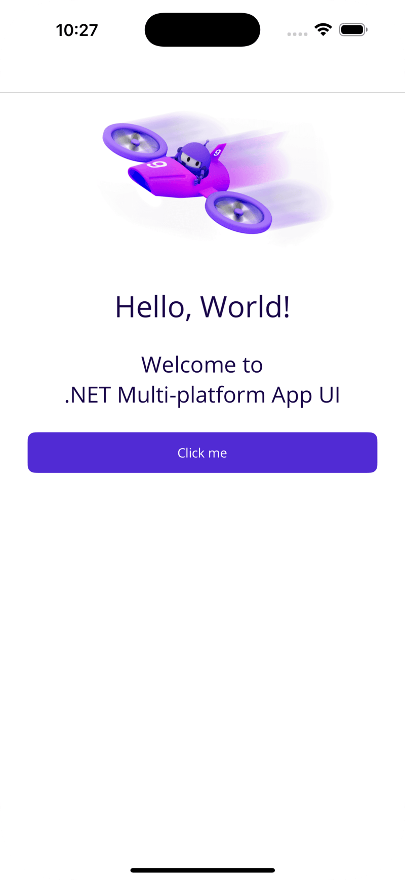
Once you run the project, you should see the following screen:
Now, let’s set up the navigation. Open the AppShell.xaml file, where you’ll find the following structure:
<?xml version="1.0" encoding="UTF-8" ?>
<Shell
    x:Class="CustomTabBar.AppShell"
    xmlns="http://schemas.microsoft.com/dotnet/2021/maui"
    xmlns:x="http://schemas.microsoft.com/winfx/2009/xaml"
    xmlns:local="clr-namespace:CustomTabBar"
    Title="CustomTabBar">

    <ShellContent ContentTemplate="{DataTemplate local:MainPage}" />

</Shell>
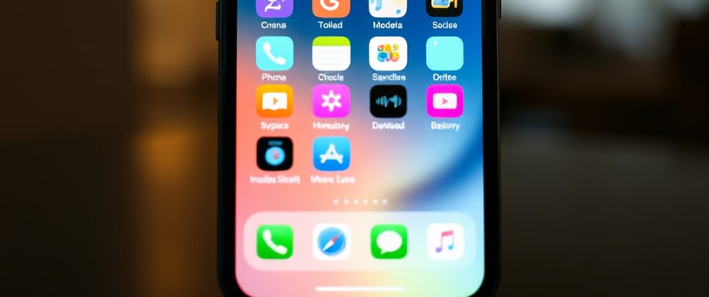
Before we dive into implementing the navigation, let’s enhance the tab bar by adding some icons. I’ve come across a set of stunning icons that I think many of you will love. However, there’s a catch: while we all want beautiful icons, sometimes we’re limited by the options available. You’ll see what I mean as we proceed. The icons I’ll be using are available in the repository linked to this article, so feel free to grab them from there.

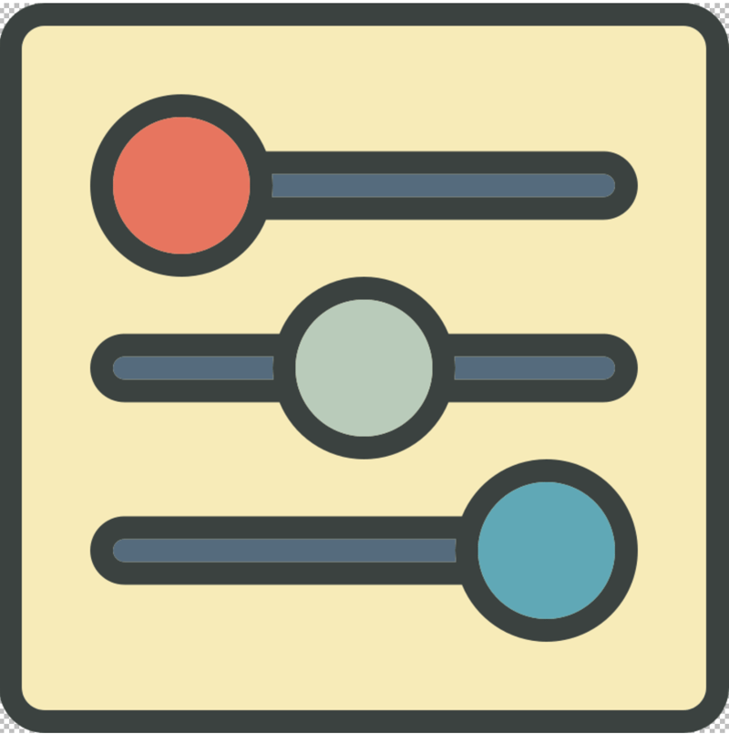
As you can see, these icons are vibrant and visually appealing. However, despite their charm, they aren’t quite suitable for this specific use case. Let me walk you through why that is and what makes them a less-than-ideal fit.
To proceed, you’ll need to replace the existing code with the following:
<ShellContent ContentTemplate="{DataTemplate local:MainPage}" />
To this:
    <FlyoutItem FlyoutDisplayOptions="AsMultipleItems">
        <Tab Title="Profile" Icon="icon_profile.png">
            <ShellContent ContentTemplate="{DataTemplate local:MainPage}" />
        </Tab>
        <Tab Title="Notifications" Icon="icon_notifications.png">
            <ShellContent ContentTemplate="{DataTemplate local:MainPage}" />
        </Tab>
        <Tab Title="Favorites" Icon="icon_favorites.png">
            <ShellContent ContentTemplate="{DataTemplate local:MainPage}" />
        </Tab>
        <Tab Title="Settings" Icon="icon_settings.png">
            <ShellContent ContentTemplate="{DataTemplate local:MainPage}" />
        </Tab>
    </FlyoutItem>
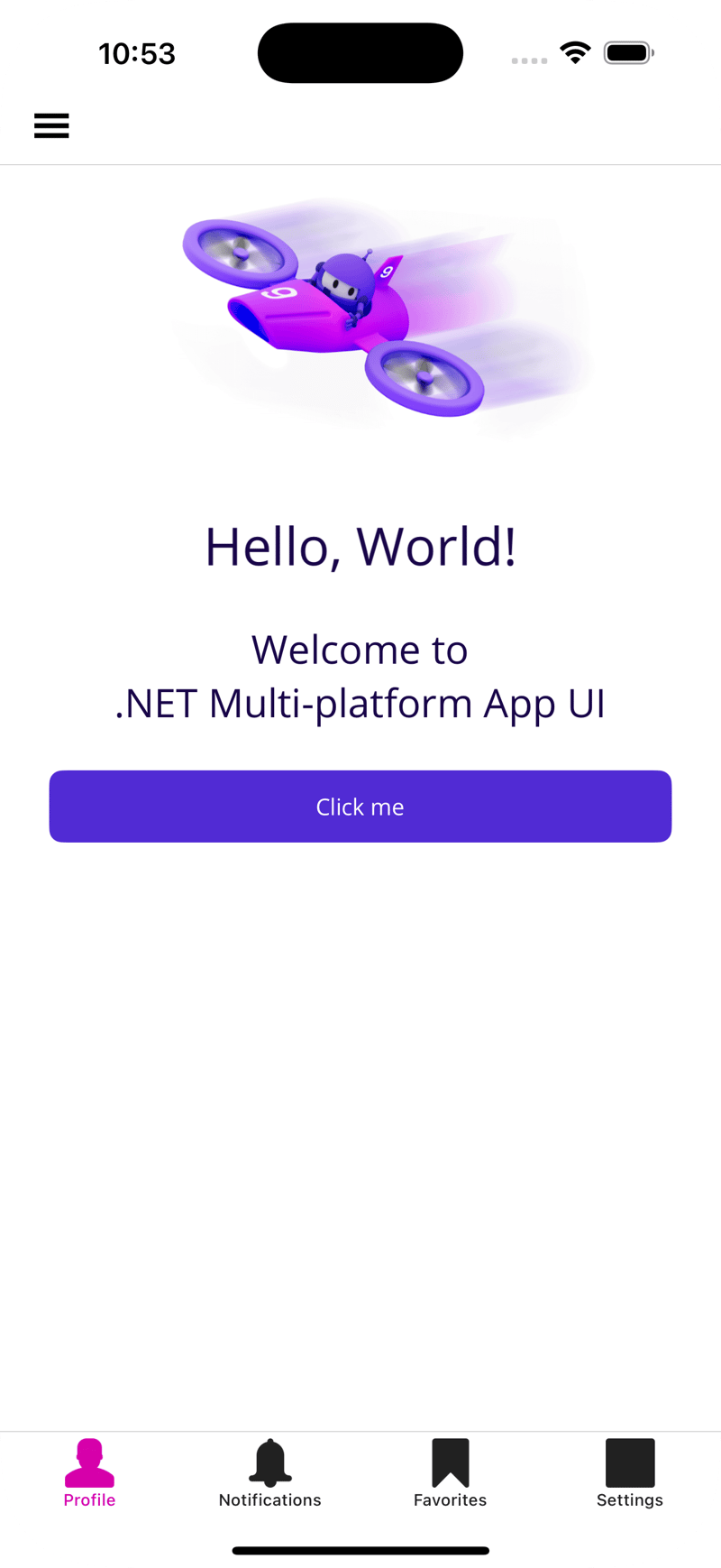
If you run the app now, you’ll notice the icons displayed at the bottom. Unfortunately, the once vibrant and detailed icons have been rendered as monochrome shapes, losing their color and intricate details. Instead of the charming visuals we started with, they now appear as smudged, indistinct marks—far from appealing. This happens because the Shell in .NET MAUI doesn’t support colorful icons in the bottom tab bar, limiting their visual impact and aesthetic appeal.
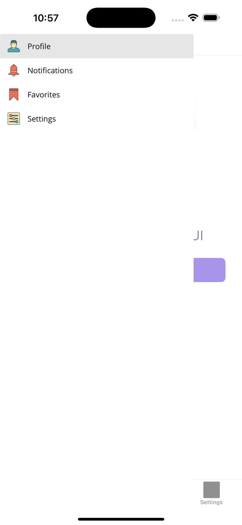
However, if you open the sandwich menu (the flyout menu), you’ll notice that the icons there retain their vibrant and detailed appearance. It’s a bit puzzling why this inconsistency exists—why the icons look stunning in the flyout menu but lose their charm in the bottom tab bar. I’m not entirely sure why this design choice was made, but it certainly highlights a limitation worth addressing.
Of course, you could always search for more suitable icons or even explore iconic fonts to create visually appealing styles, and the result could look quite impressive. However, let’s say you’re set on using these specific icons—maybe you’re fond of their design, or they align perfectly with your project’s theme. The question is, how can you make them work in this context? Let’s dive into a solution that allows you to use these icons effectively.
Custom control
This issue can be resolved by implementing a custom control. To get started, let’s create a ContentView element. Simply paste the following code into TabBarView.xaml. For now, you can leave TabBarView.xaml.cs unchanged—no additional modifications are needed there.
<?xml version="1.0" encoding="utf-8"?>

<ContentView xmlns="http://schemas.microsoft.com/dotnet/2021/maui"
             xmlns:x="http://schemas.microsoft.com/winfx/2009/xaml"
             x:Class="CustomTabBar.Controls.TabBarView">
    <Grid RowDefinitions="*,Auto">
        <Border Grid.Row="1"
                BackgroundColor="{StaticResource Secondary}"
                HeightRequest="100"
                Opacity="0.5"
                Padding="15,0"
                StrokeThickness="0">
            <Border.StrokeShape>
                <RoundRectangle CornerRadius="5" />
            </Border.StrokeShape>
        </Border>
        <FlexLayout Direction="Row"
                    Grid.Row="1"
            JustifyContent="SpaceAround"
            AlignItems="Center">
            <VerticalStackLayout Spacing="4" Padding="10">
                <VerticalStackLayout.GestureRecognizers>
                    <TapGestureRecognizer Command="{Binding GoToHomeCommand}" />
                </VerticalStackLayout.GestureRecognizers>
                <Image Source="icon_profile.png" HeightRequest="24" WidthRequest="24" />
                <Label Text="Home" HorizontalOptions="Center" FontSize="12" TextColor="Black" />
            </VerticalStackLayout>
                    <VerticalStackLayout Spacing="4" Padding="10">
                        <VerticalStackLayout.GestureRecognizers>
                            <TapGestureRecognizer Command="{Binding GoToCalendarCommand}" />
                        </VerticalStackLayout.GestureRecognizers>
                        <Image Source="icon_notifications.png" HeightRequest="24" WidthRequest="24" />
                        <Label Text="Calendar" HorizontalOptions="Center" FontSize="12" TextColor="Black" />
                    </VerticalStackLayout>

                    <VerticalStackLayout Spacing="4" Padding="10">
                        <VerticalStackLayout.GestureRecognizers>
                            <TapGestureRecognizer Command="{Binding GoToFiltersCommand}" />
                        </VerticalStackLayout.GestureRecognizers>
                        <Image Source="icon_favorites.png" HeightRequest="24" WidthRequest="24" />
                        <Label Text="Filters" HorizontalOptions="Center" FontSize="12" TextColor="Black" />
                    </VerticalStackLayout>

                    <VerticalStackLayout Spacing="4" Padding="10">
                        <VerticalStackLayout.GestureRecognizers>
                            <TapGestureRecognizer Command="{Binding GoToSettingsCommand}" />
                        </VerticalStackLayout.GestureRecognizers>
                        <Image Source="icon_settings.png" HeightRequest="24" WidthRequest="24" />
                        <Label Text="Settings" HorizontalOptions="Center" FontSize="12" TextColor="Black" />
                    </VerticalStackLayout>
        </FlexLayout>
    </Grid>
</ContentView>
Next, let’s return to AppShell.xaml and revert to our previous code. This will help us restore the original setup while integrating our new custom control.
<?xml version="1.0" encoding="UTF-8" ?>
<Shell
    x:Class="CustomTabBar.AppShell"
    xmlns="http://schemas.microsoft.com/dotnet/2021/maui"
    xmlns:x="http://schemas.microsoft.com/winfx/2009/xaml"
    xmlns:local="clr-namespace:CustomTabBar"
    Title="CustomTabBar">

    <ShellContent ContentTemplate="{DataTemplate local:MainPage}" />
</Shell>
Now, let’s move to the MainPage.xaml file and make a few adjustments. First, wrap the existing ScrollView block inside a Grid block. Then, just below the ScrollView, insert our custom TabBarView. Here’s what the final implementation should look like:
<?xml version="1.0" encoding="utf-8" ?>
<ContentPage xmlns="http://schemas.microsoft.com/dotnet/2021/maui"
xmlns:x="http://schemas.microsoft.com/winfx/2009/xaml"
xmlns:controls="clr-namespace:CustomTabBar.Controls"
x:Class="CustomTabBar.MainPage">
<Grid RowDefinitions="*,Auto">
<ScrollView>
<VerticalStackLayout
Padding="30,0"
Spacing="25">
<Image
Source="dotnet_bot.png"
HeightRequest="185"
Aspect="AspectFit"
SemanticProperties.Description="dot net bot in a hovercraft number nine" />
<Label
Text="Hello, World!"
Style="{StaticResource Headline}"
SemanticProperties.HeadingLevel="Level1" />
<Label
Text="Welcome to .NET Multi-platform App UI"
Style="{StaticResource SubHeadline}"
SemanticProperties.HeadingLevel="Level2"
SemanticProperties.Description="Welcome to dot net Multi platform App U I" />
<Button
x:Name="CounterBtn"
Text="Click me"
SemanticProperties.Hint="Counts the number of times you click"
Clicked="OnCounterClicked"
HorizontalOptions="Fill" />
</VerticalStackLayout>
</ScrollView>
<controls:TabBarView />
</Grid>
</ContentPage>
The TabBarView.xaml.cs file can remain unchanged—no modifications are needed there.
Once you’ve made all the adjustments, go ahead and run the app. If everything was done correctly, you should see the updated tab bar in action!
It works! While I didn’t use any commands or tap gestures to handle page navigation, my primary goal was to demonstrate how to style the tab bar and address the challenge of using custom icons. Although this solution achieves the desired visual effect, I wouldn’t recommend using it in its current state. Below, I’ll explain the reasons why and discuss potential improvements.
Correct implementation
If you inject the ContentView element directly, you’ll end up with redundant code that lacks flexibility and maintainability. This approach can quickly become cumbersome as your project grows. Fortunately, there’s a better way to address these issues. Let me show you an alternative approach that solves these problems while keeping your code clean and adaptable.
Let’s create another element, similar to a ContentPage, to streamline our solution. Simply paste the following code into the new file:
<?xml version="1.0" encoding="utf-8"?>

<ContentPage xmlns="http://schemas.microsoft.com/dotnet/2021/maui"
             xmlns:x="http://schemas.microsoft.com/winfx/2009/xaml"
             xmlns:controls="clr-namespace:CustomTabBar.Controls"
             x:Class="CustomTabBar.Controls.TabBarPage"
             x:DataType="controls:TabBarPage">
        <ContentPage.Resources>
    <ControlTemplate x:Key="TabBarTemplate">
    <Grid RowDefinitions="*,Auto">
        <Border Grid.Row="1"
                BackgroundColor="{StaticResource Secondary}"
                HeightRequest="100"
                Opacity="0.5"
                Padding="15,0"
                StrokeThickness="0">
            <Border.StrokeShape>
                <RoundRectangle CornerRadius="5" />
            </Border.StrokeShape>
        </Border>
        <FlexLayout Direction="Row"
                    Grid.Row="1"
            JustifyContent="SpaceAround"
            AlignItems="Center">
            <VerticalStackLayout Spacing="4" Padding="10">
                <Image Source="icon_profile.png" HeightRequest="24" WidthRequest="24" />
                <Label Text="Profile" HorizontalOptions="Center" FontSize="12" TextColor="Black" />
            </VerticalStackLayout>
                    <VerticalStackLayout Spacing="4" Padding="10">
                        <Image Source="icon_notifications.png" HeightRequest="24" WidthRequest="24" />
                        <Label Text="Notifications" HorizontalOptions="Center" FontSize="12" TextColor="Black" />
                    </VerticalStackLayout>

                    <VerticalStackLayout Spacing="4" Padding="10">
                        <Image Source="icon_favorites.png" HeightRequest="24" WidthRequest="24" />
                        <Label Text="Favorites" HorizontalOptions="Center" FontSize="12" TextColor="Black" />
                    </VerticalStackLayout>

                    <VerticalStackLayout Spacing="4" Padding="10">
                        <Image Source="icon_settings.png" HeightRequest="24" WidthRequest="24" />
                        <Label Text="Settings" HorizontalOptions="Center" FontSize="12" TextColor="Black" />
                    </VerticalStackLayout>
        </FlexLayout>
    </Grid>
    </ControlTemplate>
</ContentPage.Resources>
</ContentPage>
The code must be placed within a ControlTemplate, which is mandatory to include in the Resources block.
For a visual demonstration, I created a clone of MainPage named ExtendedMainPage. While the logic and layout remain the same, a few modifications are necessary. As you may know, a ContentPage inherits from the ContentPage class. In this case, however, you’ll need to inherit from TabBarPage, which itself is already derived from the ContentPage class.
public partial class ExtendedMainPage : TabBarPage
{
    int count = 0;

    public ExtendedMainPage()
    {
        InitializeComponent();
    }

    private void OnCounterClicked(object sender, EventArgs e)
    {
        count++;

        if (count == 1)
            CounterBtn.Text = $"Clicked {count} time";
        else
            CounterBtn.Text = $"Clicked {count} times";

        SemanticScreenReader.Announce(CounterBtn.Text);
    }
}
Previously, our ScrollView was placed directly inside the ContentPage and wrapped in a Grid. Now, we’ll take a different approach: instead of using ContentPage directly, we’ll utilize the Content block from the base class and wrap the ScrollView there.
Once this is done, the final step is to navigate to AppShell.xaml and replace MainPage with ExtendedMainPage. This ensures our updated implementation is properly integrated into the app’s navigation structure.
<ShellContent ContentTemplate="{DataTemplate local:ExtendedMainPage}" />
If you test this now, you’ll notice that the bottom tab bar is missing. Why? It’s because we haven’t invoked our ControlTemplate yet. To fix this, simply add the following code to ensure the template is properly applied:
<controls:TabBarPage xmlns="http://schemas.microsoft.com/dotnet/2021/maui"
             xmlns:x="http://schemas.microsoft.com/winfx/2009/xaml"
             xmlns:controls="clr-namespace:CustomTabBar.Controls"
             x:Class="CustomTabBar.ExtendedMainPage"
             ControlTemplate="{StaticResource TabBarTemplate}">
Run the app again. This time, you’ll notice that only the menu is displayed, while the rest of the content is missing. What’s going on? Let’s break it down.
Oh no! It looks like we forgot to instruct our control to display the content from the child element. Let’s fix that.
    <Grid RowDefinitions="*,Auto">
        <ContentPresenter Grid.Row="0" />
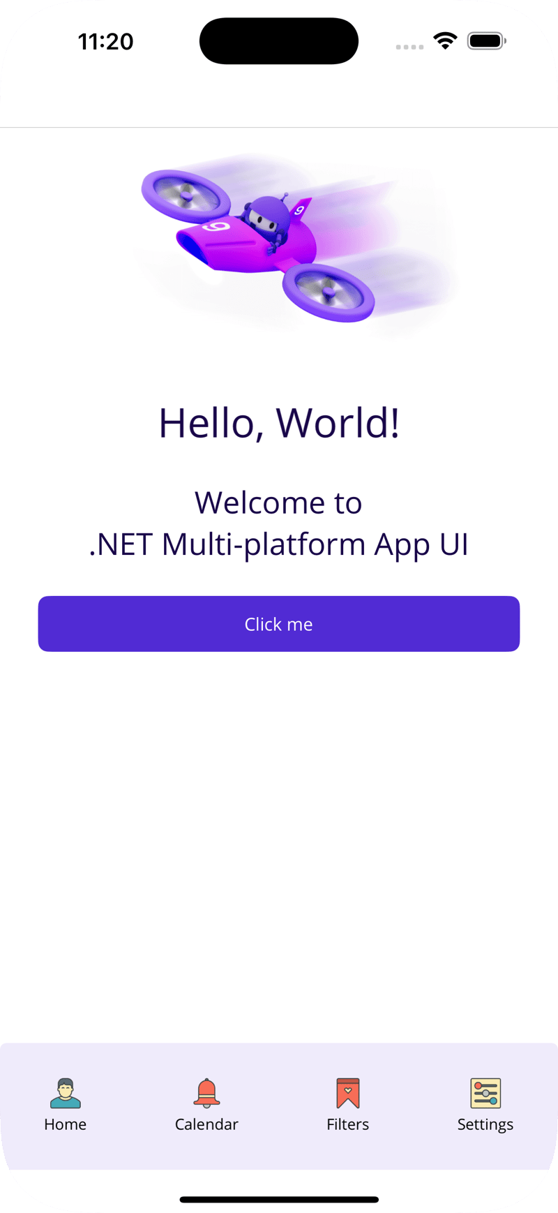
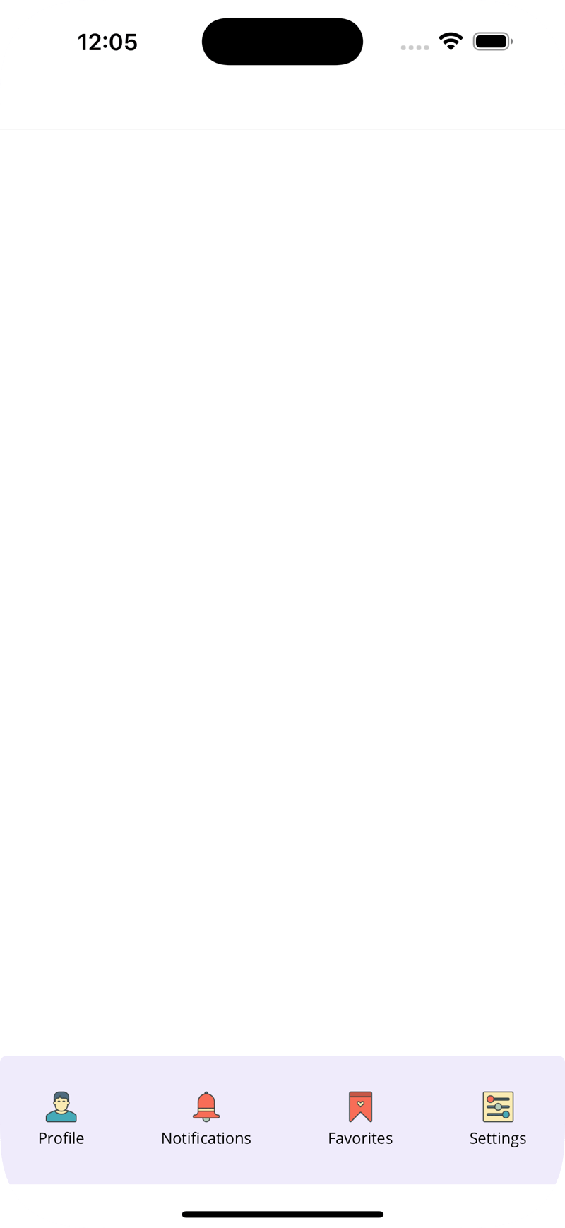
Run the app again—this time, everything should work as expected. The tab bar and content are now displaying correctly!

But you might be wondering, what’s the advantage of this approach compared to the previous one? As I mentioned earlier, this method allows us to use only a single ContentPage while maintaining flexibility. Now, I’d like to show you how to manage the custom control effectively.
Head over to TabBarPage.xaml.cs and add the following code:
public partial class TabBarPage : ContentPage
{
    private static readonly BindableProperty ProfileTextProperty = BindableProperty.Create(nameof(ProfileText), typeof(string), typeof(TabBarPage));
    private static readonly BindableProperty NotificationsTextProperty = BindableProperty.Create(nameof(NotificationsText), typeof(string), typeof(TabBarPage));
    private static readonly BindableProperty FavoritesTextProperty = BindableProperty.Create(nameof(FavoritesText), typeof(string), typeof(TabBarPage));
    private static readonly BindableProperty SettingsTextProperty = BindableProperty.Create(nameof(SettingsText), typeof(string), typeof(TabBarPage));

    public string ProfileText
    {
        get => (string)GetValue(ProfileTextProperty);
        init => SetValue(ProfileTextProperty, value);
    }

    public string NotificationsText
    {
        get => (string)GetValue(NotificationsTextProperty);
        init => SetValue(NotificationsTextProperty, value);
    }

    public string FavoritesText
    {
        get => (string)GetValue(FavoritesTextProperty);
        init => SetValue(FavoritesTextProperty, value);
    }

    public string SettingsText
    {
        get => (string)GetValue(SettingsTextProperty);
        init => SetValue(SettingsTextProperty, value);
    }

    public TabBarPage()
    {
        InitializeComponent();
    }
}
These properties are essential for setting dynamic values that we’ll integrate into the layout. They provide the flexibility needed to customize the control at runtime.
<?xml version="1.0" encoding="utf-8"?>

<ContentPage xmlns="http://schemas.microsoft.com/dotnet/2021/maui"
             xmlns:x="http://schemas.microsoft.com/winfx/2009/xaml"
             xmlns:controls="clr-namespace:CustomTabBar.Controls"
             x:Class="CustomTabBar.Controls.TabBarPage"
             x:DataType="controls:TabBarPage">
        <ContentPage.Resources>
    <ControlTemplate x:Key="TabBarTemplate">
    <Grid RowDefinitions="*,Auto">
        <ContentPresenter Grid.Row="0" />
        <Border Grid.Row="1"
                BackgroundColor="{StaticResource Secondary}"
                HeightRequest="100"
                Opacity="0.5"
                Padding="15,0"
                StrokeThickness="0">
            <Border.StrokeShape>
                <RoundRectangle CornerRadius="5" />
            </Border.StrokeShape>
        </Border>
        <FlexLayout Direction="Row"
                    Grid.Row="1"
            JustifyContent="SpaceAround"
            AlignItems="Center">
            <VerticalStackLayout Spacing="4" Padding="10">
                <Image Source="icon_profile.png" HeightRequest="24" WidthRequest="24" />
                <Label Text="{TemplateBinding ProfileText}" HorizontalOptions="Center" FontSize="12" TextColor="Black" />
            </VerticalStackLayout>
                    <VerticalStackLayout Spacing="4" Padding="10">
                        <Image Source="icon_notifications.png" HeightRequest="24" WidthRequest="24" />
                        <Label Text="{TemplateBinding NotificationsText}" HorizontalOptions="Center" FontSize="12" TextColor="Black" />
                    </VerticalStackLayout>

                    <VerticalStackLayout Spacing="4" Padding="10">
                        <Image Source="icon_favorites.png" HeightRequest="24" WidthRequest="24" />
                        <Label Text="{TemplateBinding FavoritesText}" HorizontalOptions="Center" FontSize="12" TextColor="Black" />
                    </VerticalStackLayout>

                    <VerticalStackLayout Spacing="4" Padding="10">
                        <Image Source="icon_settings.png" HeightRequest="24" WidthRequest="24" />
                        <Label Text="{TemplateBinding SettingsText}" HorizontalOptions="Center" FontSize="12" TextColor="Black" />
                    </VerticalStackLayout>
        </FlexLayout>
    </Grid>
    </ControlTemplate>
</ContentPage.Resources>
</ContentPage>
Finally, you’ll need to assign the appropriate values in ExtendedMainPage to complete the setup.
<controls:TabBarPage xmlns="http://schemas.microsoft.com/dotnet/2021/maui"
             xmlns:x="http://schemas.microsoft.com/winfx/2009/xaml"
             xmlns:controls="clr-namespace:CustomTabBar.Controls"
             x:Class="CustomTabBar.ExtendedMainPage"
             ProfileText="Person"
             NotificationsText="Notifications"
             FavoritesText="Favorites"
             SettingsText="Settings"
             ControlTemplate="{StaticResource TabBarTemplate}">
Go ahead and test it out—the result will be exactly the same as before, but now with a more flexible and maintainable implementation.

Now, I can effortlessly update and customize the text labels, making the control more dynamic and adaptable to changes.
<controls:TabBarPage xmlns="http://schemas.microsoft.com/dotnet/2021/maui"
             xmlns:x="http://schemas.microsoft.com/winfx/2009/xaml"
             xmlns:controls="clr-namespace:CustomTabBar.Controls"
             x:Class="CustomTabBar.ExtendedMainPage"
             ProfileText="Account"
             NotificationsText="Messages"
             FavoritesText="Bookmarks"
             SettingsText="Tools"
             ControlTemplate="{StaticResource TabBarTemplate}">
Take a look now—the labels have been successfully updated! This demonstrates how easily you can modify and customize the content.

Conclusion
In this article, I’ve demonstrated different approaches to creating a more styled and flexible tab bar menu, as the standard implementation comes with certain limitations. That said, my approach isn’t without its drawbacks—it’s more complex and requires adding this custom control to each page individually.
Despite these trade-offs, I hope you found this guide helpful and that it inspires you to implement similar solutions in your own projects.
You can find the complete source code on my GitHub repository for reference and further exploration.


Top comments (0)