
This post is co-authored with David Katz
Background
These days any project that is deployed should incorporate the principles of CI/CD (highly recommended great talk from Eric Ma July 2020 - describes the issue in the realm of Data Science ). Thus after setting up our dagster pipeline we needed to implement some sort monitoring solution to review the outcome of our workflow. Working in a small DS team we needed to push forward and couldn't wait for the heavy guns of the enterprise IT to take over. So until we have there support here is a simple dashboard that we put together to monitor our Assets.
In this blog post we aim to describe how we created a functional dashboard based on python widgets.
We will describe the origin of our data, followed by the our solution using python's Panel library.
The code for this post is in this repo
 sephib
/
dagster-graph-project
sephib
/
dagster-graph-project
Repo demonstrating a Dagster pipeline to generate Neo4j Graph

Dagster Assets
We are not going to dive into Dagster (see previous blog post on our data pipeline), but the TLDR is that Dagster is an orchestration framework for building modern data applications and workflows. The framework has integrated logging and the ability to produce persistent assets that are stored in a database (in our case postgresql) for future references.
For our project we are interested in monitoring the number of nodes and edges that we generate in our data pipline workflow. During our pipeline run we log (or in the Dagster's jargon Materialize - see AssetMaterialization in the documentation) various stats on the datasets that we whish to manipulate. We would like to view the changes of these stats over time in order to verify the "health" of our system/pipeline.
Panel widgets
Today, the python ecosystem is very rich and vibrant with various visualization libraries that are constantly being developed. Two of the libraries that we reviewed were streamlit and Panel. We decided to go with Panel which seemed to suit our needs (due mainly to its structure and maintenance from our side).
Inspired by a talk given by Lina Weichbrodt in the MLOps meetup, we wanted to view the percent change of our metrics over time.
Panel is capable of displaying and integrating many python widgets from various packages. We are going to work with hvplot which best fits our needs, due to its richness and its integration with Pandas.
Getting our data/assets from the database
In this section we describe how we extracted the data from Dagster's Asset database. If this is not relevant, you may want to jump to the sample data section below.
In order to access the Asset data we needed to dig into the event_log table which logs all the events that are generated when running a Dagster pipeline. The script to extracts the data into a Pandas Dataframe, based on the Asset Keys that are defined in the Materialization process, is in the [linked repo].
Here are the key elements in the script:
-
In order to access the assets we need to query the
event_logstable. We can use asqlalchemyquery as follows:select([t_event_logs.c.event]).where(t_event_logs.c.asset_key.in_(assets))
For parsing the results we can use
dagster'sinternal utilitydeserialize_json_to_dagster_namedtuple. Bellow is the function that converts the assets into a dictionary. Please note that we are only retrieving assets of a numeric type (which can be plotted). This is parallel todagit'sdecision to display only asset numeric values in a graphs.
def get_asset_keys_values(results)->dict:
    assets={}
    for result in results:
        dagster_namedtuple = deserialize_json_to_dagster_namedtuple(result[0])
        time_stamp = datetime.fromtimestamp(dagster_namedtuple.timestamp).strftime('%Y-%m-%d %H:%M:%S')
        assets[time_stamp] = {}
        assets[time_stamp]['asset_key'] = dagster_namedtuple.dagster_event.asset_key.to_string()
        from entry in dagster_namedtuple.dagster_event.event_specific_data.materialization.metadata_entries:
            if isinstance(entry.entry_data, FloatMetadataEntryData):  # Only assets that are numerical
                assets[time_stamp][entry.label] = entry.entry_data.value
    return assets
The full code for retrieving the data is in get_dagster_asset.py file.
Sample Data
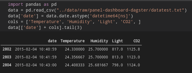
For the dashboard in this post, we are going to use the sample data from bokeh.
Since we are simulating our datapipline outcomes we are going to use a sample of the columns:
- date - as our X / time axis
- Temperature
- Humidity
- Light
- CO2
Let's view the data
Since we are interested in the change of the various stats with time we can use Panda's pct_change method to generate the values that we need. This also allows displaying all the datasets in the same graph since the nominal values of the various datasets are of different orders of magnitude.

Now that we have the data we can build our dashboard
Dashboard
We have 2 widgets that we want to use in our dashboard:
- A line plot - displaying the datasets 1.1. A scatter plot - adding markers to the line plot
- A date_range_slider widget - presenting the date range that we want to display
Our dashboard will display each data series along the X time axis.
DateRangeSlider
Panel's DateRangeSlider widget "allows selecting a date range using a slider with two handles".
The parameters of the widget are self-explanitory
Please not that the value parameter is for the default values of the DateRangeSlider, which consists of the start..end of the slider.
date_range_slider = pn.widgets.DateRangeSlider(
        name='Date Range Slider',
        start=data[date_col].min(),
        end=data[date_col].max(),
        value=(data[date_col].max() - timedelta(hours=1),
               data[date_col].max()
               )   # defualt value for slider
)
Line Plot & Panel's Glue
Now let's look at the Line plot code:
import holoviews.plotting.bokeh
import hvplot.pandas
These define that bokeh will be the visualization engine for hvplot, in addition to allowing for hvplot to use directly Panda's dataframes as the datasources for the plots.
@pn.depends(date_range_slider.param.value)
The Panel decorator causes the line plot to vary - based on the value that is changed from the date_range_slider widget.
start_date = date_range[0], end_date = date_range[1]
mask = (crime_data[date_col] > start_date) & (crime_data[date_col] <= end_date)
data = crime_data.loc[mask]
In order to filter the dataframe we are masking the data based on the current values from the date_range_slider widget.
crime_data.hvplot.line
This is the basic call for a [line plot] to be rendered from the Panda's dataframe.
The scatter plot was added in order to display the value markers on the line plot
Here is the full function:
@pn.depends(date_range_slider.param.value)
def get_plot(date_range):
    data = dft
    start_date = date_range[0]
    end_date = date_range[1]
    mask = (data[date_col] > start_date) & (data[date_col] <= end_date)
    data = data.loc[mask]

    lines = data[cols + [date_col]].hvplot.line(
          x=date_col
        , y=cols
        , value_label= 'value'
        , legend='right'
        , height=400
        , width=800
        , muted_alpha=0
        , ylim=(-0.1, 0.1)  # This can be configured based on the pct change scale
        , xlabel='time'
        , ylabel='% change'
    )
    scatter = data[cols + [date_col]].hvplot.scatter(
                x=date_col,
                y= cols,

    )
    return lines.opts(axiswise=True) * scatter
Final function
Now we can create a functions that connects the different widgets
def get_dashboard(dft, cols, date_col):
    date_range_slider = pn.widgets.DateRangeSlider(
        name='Date Range Slider',
        start=data[date_col].min(), end=data[date_col].max(),
        value=(data[date_col].max() - timedelta(hours=1), data[date_col].max(),)
    )
    @pn.depends(date_range_slider.param.value)
    def get_plot(date_range):
        data = dft
        start_date = date_range[0]
        end_date = date_range[1]
        mask = (data[date_col] > start_date) & (data[date_col] <= end_date)
        data = data.loc[mask]

        lines = data[cols + [date_col]].hvplot.line(
              x=date_col
            , y=cols
            , value_label= 'value'
            , legend='right'
            , height=400
            , width=800
            , muted_alpha=0
            , ylim=(-0.1, 0.1)  # This can be configured based on the pct change scale
            , xlabel='time'
            , ylabel='% change'
        )
        scatter = data[cols + [date_col]].hvplot.scatter(
                    x=date_col,
                    y= cols,

        )
        return lines.opts(axiswise=True) * scatter
    return get_plot, date_range_slider
Desgin the Dashboard
Panel has a simple method to aggregating all the widgets together using rows and columns (like a simple HTML table).
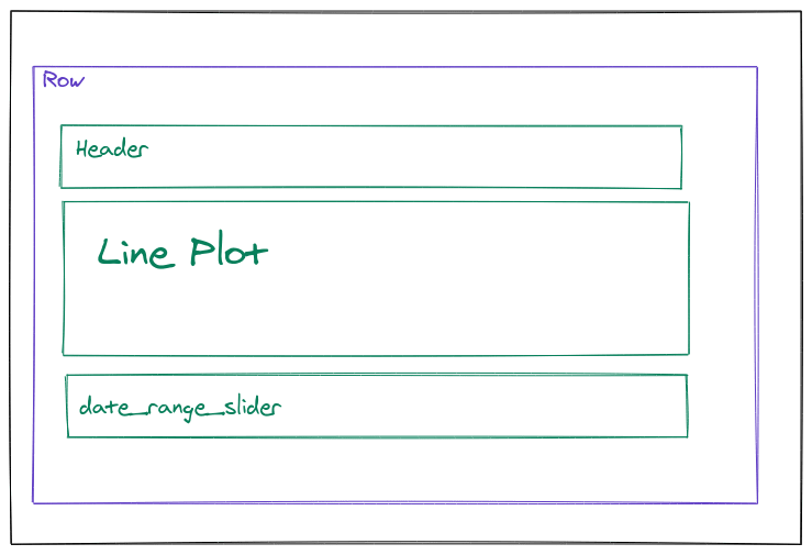
Below is the code to design the layout
plot, date_range_slider = get_dashboard(data, cols, 'date')
dashboard=pn.Row(
    pn.Column(
        pn.pane.Markdown(''' ## Dataset Percent Change'''),
        plot,
        date_range_slider,
    ),

)
dashboard
Conclusion
In this blog post we have outlined our solution for monitoring our Dagster's Assets that we log during our data pipeline workflow.
Using the Panel / hvplot libraries was quite straightforward. The documentation and reference galleries were very useful, although getting the linkage between some widget actions may require a bit of JS. Working with the examples, as in the last section in the getting started documentation, in addition to the more advance examples, show the potential for an elaborate dashboard if required.

Top comments (0)