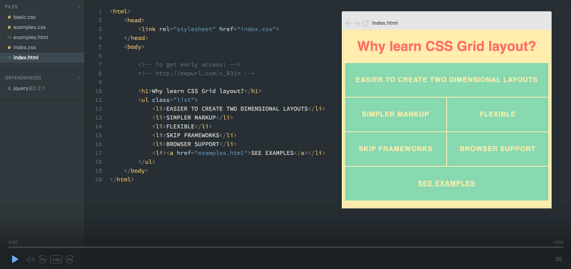
 Click the image to get to the course.
A while ago, I dug my head into CSS Grid and created a full course on the subject. And the more I learned, the more I was convinced that CSS Grid is the future of creating website layouts.
The course is free, and you don't even have to authenticate to watch it. However, you’ll have to sign in if you want to save notes and ask questions throughout the course.
Now let’s have a look at what you’ll learn and how you’ll learn it.
Note: I’ve also launched a free CSS Variables course and a CSS Flexbox course if you're more interested in those subjects.
The course structure
The course is built around three sections. The first two are linear and should be watched in order. They contain the CSS Grid concepts that I think are most important to learn.
The third one is a bonus section, in which you’ll learn concepts that didn’t make it into the first two sections plus see a couple of examples of things you can build with CSS Grid.
Section 1 — The basics
We’ll start with why you should learn CSS Grid. I’ll show you the benefits CSS Grid has over a framework like Bootstrap, comparing the code between the two approaches.
We’ll then jump straight into CSS Grid, starting with a very simple grid which will teach you how to define rows and columns, and the different values you can use to set the width and height. This will also teach you the basics of responsiveness.
The next step is to create a dummy website layout. Here you’ll learn how to position items in the grid. We’ll end the first section with an exciting experiment using the grid-template-areas property, which allows you to prototype layouts quickly.
At the end of section one you should know enough to start using CSS Grid in your personal projects. Here are the main concepts you’ll learn:
-
display: grid; -
grid-template-columns,grid-template-rows -
grid-template(shorthand) -
grid-column,grid-row -
grid-template-areas -
grid-area -
grid-gap -
fr
To get a gist of some of this section you can also check out my two articles Learn CSS Grid in 5 minutes and How to prototype websites quickly with CSS Grid. They touch upon a few of these concepts, though they don’t go as in-depth as the course does.
Section 2 — The advanced stuff
Here you’ll learn about advanced responsiveness. This will enable to create a super cool image grid at the end of the section:

Notice how the grid shuffles around on items to make it work regardless of the width.
As you can see, it varies the number of columns according to the width of the screen size, and it shuffles around on the items (which have different sizes and shapes) so that there are no open spots.
Most of the magic happens in a single line of CSS. However that line of code is a bit complex, so we’ll go through every step of the way so that you’ll fully grasp it.
Here’s what you’ll learn:
-
auto-fit -
repeat -
minmax -
grid-auto-flow - implicit rows
- how the grid lays out items
At this point, you should be comfortable creating pretty much any layout using CSS Grid. And whatever concept you don’t know yet, you’ll be fully capable of finding out for yourself, as you have a strong core understanding of CSS Grid.
Bonus Section
The final section is the bonus material. This doesn’t have to be watched in order, as the screencasts don’t depend on each other. This section consists mainly of various CSS Grid concepts which we couldn’t fit into the first two parts. However, you’ll also find a comparison between Flexbox and Grid, where I look at how the two modules differ and how they can be used together.
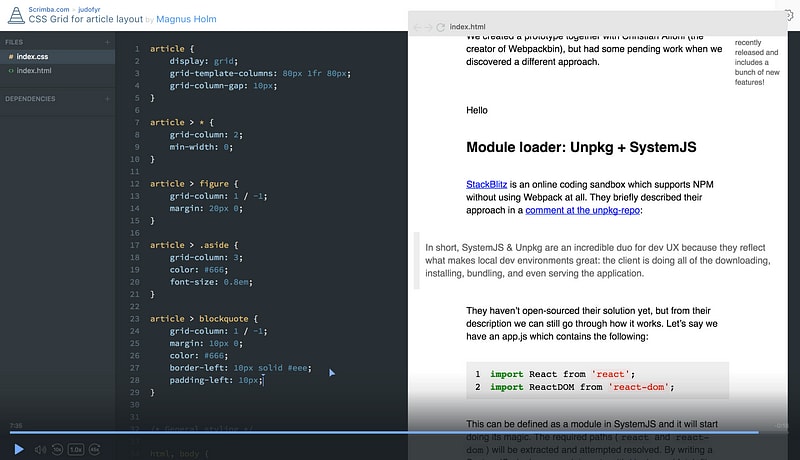
Plus, my co-founder Magnus will give you a very cool example on how to recreate article layouts with CSS Grid. This lecture also inspired me to write an article on the same subject.
 Magnus will take you through building an article layout using CSS Grid.
Finally, we’re going to fill up this course with content whenever we see the need for it.
If you feel something is lacking from the course, just tell us and we’ll create a new screencast on the subject in the bonus section.
Here’s what you’ll learn in the Bonus section.
- named lines
- justifying and aligning (items, self and content)
- creating a Medium-style article layout (by Magnus)
- CSS Flexbox vs Grid
The Scrimba format
The course is built using Scrimba, an interactive coding screencast tool which I’m a co-founder of together and Sindre.
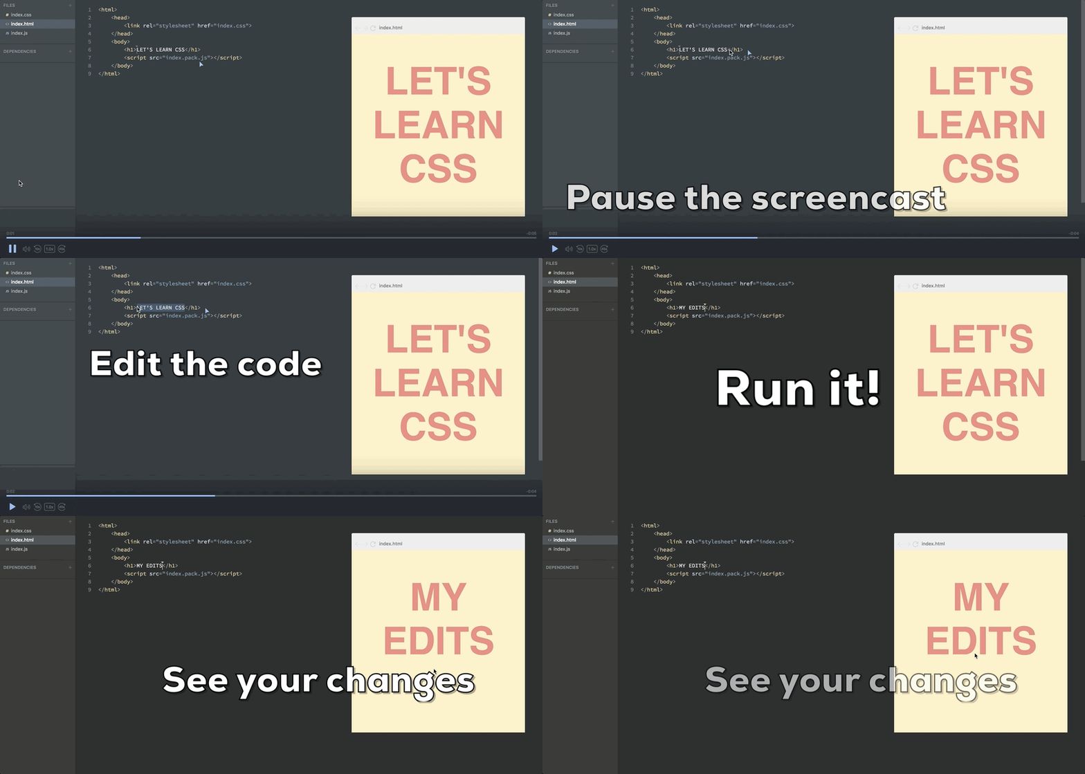
Scrimba screencasts look like normal videos, however, they’re fully interactive. You can edit the code inside the casts.
Here’s a gif which explains the concept:

Pause the screencast → Edit the code → Run it! → See your changes
This is great for when you feel you need to experiment with the code in order to properly understand it, or when you simply want to copy a piece of the code. Also, Scrimba screencasts weigh 1% of videos in file size, meaning that it’s much easier to stream even when your internet connection is slow.
So I really hope you’ll enjoy the course. Sign up today and I’ll see you there :)
Thanks for reading! My name is Per, I’m the co-founder of Scrimba, and I love helping people learn new skills. Follow me on Twitter if you’d like to be notified about new articles and resources.


Top comments (2)
Thanks for that man, exactly what I need. Will learn it during my semester break 😬🙏🏻
Hello Per!
Just wanted to say that I'm watching your course and you explain CSS Grid very well. Thank you so much!