There’s never enough episodes of Queer Eye.
😭
To hold me over until the next season airs, I wanted to revisit the logo and see if I could recreate it in HTML and CSS.
The Logo
The logo effect has a couple of different elements that I need to figure out.
- Matching the font
- Picking the colors
- Offsetting the colors
Fonts
The font used is likely, a custom, sans-serif font. What makes it interesting is that the e is stylistically a lowercase e and the Q is uppercase. Yet, visually have the same weight, stroke thickness, etc. Finding a free font that matches that may be difficult, so for now, I’ll focus on finding a typeface that has the same vibe.
Kumbh Sans in Google Fonts has the modern look that I’m going for, so we’ll roll with it and fix the e later if I can. With our “QE” in an <h1> tag, our CSS will look something like this.
h1 {
     font-family: 'Kumbh Sans', sans-serif;
     font-weight: 300;
}
Which renders something like this.
Colors
Looking at the logo above, it seems to be made of blue, pink, yellow and black, with the yellow and blue having some transparency to make a bright green.
Let’s set up our colors as CSS variables.
 :root {
     --blue: rgb(0, 191, 255);
     --pink: rgb(255, 20, 147);
     --yellow: rgb(255, 255, 0);
     --black: rgb(0,0,0);
 }
With color variables, we can reference them like this color: --var(yellow).
Offsetting The Colors
The fun part!
Each of the colors is offset a little from the main text, but only to the left and right. We can get this effect by using a text-shadow.
Let’s do the first color.
h1 {
     ...
     text-shadow: 5vw 0 var(--pink);
}
Now, for the other colors.
You can specify multiple text-shadow effects at once, by separating them with a comma.
Let’s add the rest of our colors and see how it looks.
h1 {
     ...
     text-shadow:
          5vw 0 var(--pink),
          10vw 0 var(--blue),
          15vw 0 var(--yellow);
}
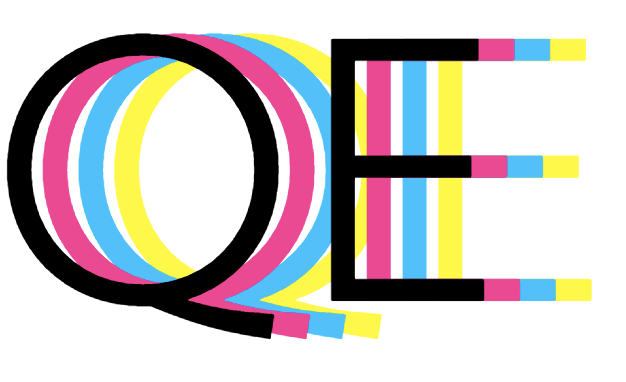
Trippy.
Not quite the effect we are going for, but it’s getting close. I’ll make some adjustments to the text-shadow arguments, so that they shift to the left and right of the black text, without straying so far away.
By default, the first value, the X-coordinate, denotes how far to the right the text-shadow starts. A negative value can be used so that the shadow starts to the left.
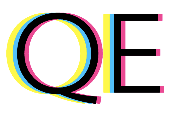
And since most of our colors overlap, rearranging the order of the text-shadow properties, allows all the colors to be seen.
h1 {
     ...
     text-shadow:
          2vw 0 var(--pink),
          -2vw 0 var(--blue),
          -5vw 0 var(--yellow);
}
Nice!
At this point, we’re only missing some green, created by a semi-transparent blue and yellow blending together. The opacity may take some tweaking, so I’ll add that as another CSS variable that I can then reference in the --blue variable.
:root {
    --opacity: .75;
    --blue: rgb(0, 191, 255, var(--opacity));
    --pink: rgb(255, 20, 147);
    --yellow: rgb(255, 255, 0);
    --black: rgb(0,0,0);
}
Putting it all Together
And our end result looks like this.
default-tab
Yasss!
Antoni, Tan, Karamo, Bobby, and Johathan would be proud.
Resources
- https://htmlcolorcodes.com/color-names/
- https://stackoverflow.com/questions/14492695/css-color-names-alpha-transparency
- https://css-tricks.com/snippets/css/css-text-shadow/
The post Queer Eye Text Effect in HTML & CSS appeared first on Shannon Crabill — Front End Software Engineer.


Top comments (6)
It looks amazing Shannon. Love it :)
Thank you!
I can use this technique to build retro effects, thanks!
Oooooh. I can dig it. I'll have to experiment with this myself.
Feel free to share what you come up with.
This is excellent, thanks for sharing Shannon!
Thanks, Sam!