Site Background
Who am I announcing this to? I'm not sure. It's a total vanity project, but we all need a vanity project or two!
I originally published my site seancoughlin. me around two years ago. At the time, I used a basic Bootstrap resume template. I used raw HTML and CSS with a little plain JS.
I filled out my details, deployed to Github pages, and called it a day. The page saw a few content updates, some under-the-hood optimizations for SEO and Lighthouse, and the addition of minor UI tweaks like Font Awesome icons.
Things were fine, but I felt the site had started to feel dated and didn't reflect my current skills. So I went on the hunt for new ideas.
Finding Inspiration
I am an engineer by trade and CS geek by night. As hard as I try, graphic design just isn't my strong suit. However, people are kind and open-source is awesome! If you ever lack inspiration, search out the community. Just remember to cite the helpful people who contribute to your work :).
After some hunting, I arrived at this cool freeCodeCamp tutorial! This guy was great a great teacher and I learned a lot from this tutorial. I typically work with React so this was my first Svelte introduction. I would say this is a good place to start.
https://youtu.be/-2UjwQzxvBQ?si=mM1Fzy3J8zlaHDwS
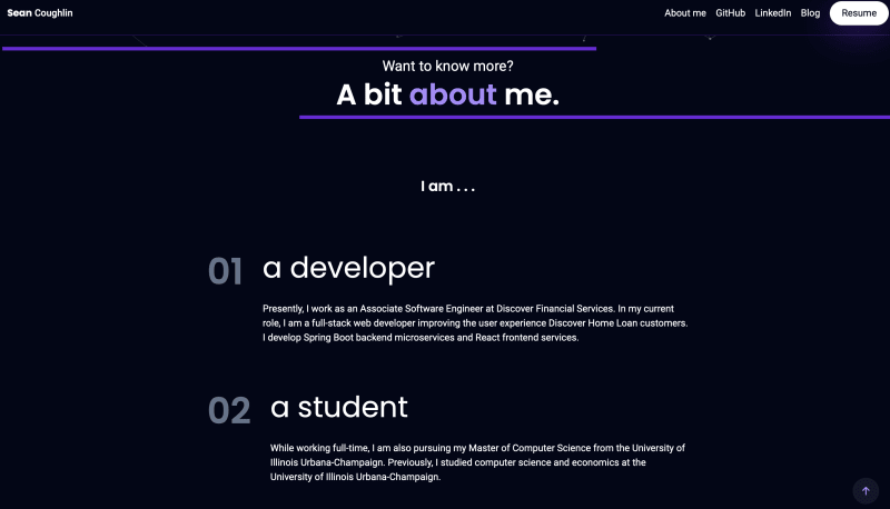
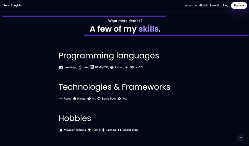
I took his great design and made some tweaks such as adding my details, a skills section, and custom links.
If you want to check out the original tutorial code you can find it here. If you want to check out my source code you can find that here.
The Outcome
Please go check out the new site or view some of these fun screenshots.
Cheers!
Originally published at https://blog.seancoughlin.me.


Top comments (0)