
Introduction
Are you tired of using tables, floats, and other traditional CSS layout methods that just don’t cut it anymore? It’s time to embrace the power of CSS Flexbox! With Flexbox, you can create complex and dynamic layouts that adapt to different screen sizes and device orientations. This tutorial will take you through all the basics of CSS Flexbox and introduce you to advanced techniques for creating truly stunning web designs.
If you’re the ‘learn by doing’ type, I suggest you check out this game based on flexbox. You’ll understand the whole module in no time.
Flexbox Froggy
In this tutorial, you will learn about the following Flexbox properties and their respective code examples:
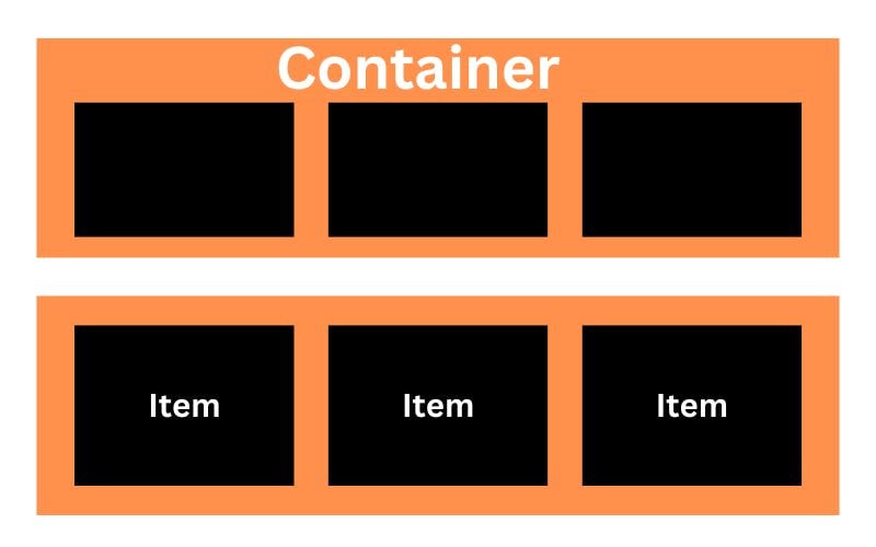
Flexbox Properties for Parent (container)
display
Defines the container as a flex container and enables Flexbox properties to be applied to its children.
.container {
    display: flex; /* or inline-flex */
}
flex-direction
Sets the direction in which flex items are placed inside the container. Options include row, row-reverse, column, and column-reverse.

.container {
  flex-direction: row | row-reverse | column | column-reverse;
}
flex-wrap
Determines whether flex items should wrap or not when there is not enough space on the main axis. Options include nowrap, wrap, and wrap-reverse.
nowrap (default): all flex items will be on one line
wrap: flex items will wrap onto multiple lines, from top to bottom.
wrap-reverse: flex items will wrap onto multiple lines from bottom to top.
.container {

            flex-wrap: nowrap | wrap | wrap-reverse;

    }
flex-flow
Shorthand for setting both flex-direction and flex-wrap at once.
.container {
  flex-flow: column wrap;
}
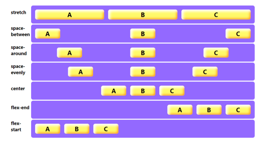
justify-content
justify-content is a CSS Flexbox property that aligns flex items along the main axis of the container. It has six possible values:
flex-start: This value aligns the items to the start of the container. If the container’s main axis is horizontal, the items will be aligned to the left. If the main axis is vertical, the items will be aligned to the top.
flex-end: This value aligns the items to the end of the container. If the container’s main axis is horizontal, the items will be aligned to the right. If the main axis is vertical, the items will be aligned to the bottom.
center: This value centers the items along the main axis of the container. If the main axis is horizontal, the items will be centered horizontally. If the main axis is vertical, the items will be centered vertically.
space-between: This value evenly distributes the items along the main axis of the container, with the first item aligned to the start and the last item aligned to the end. The remaining items are spaced evenly between them.
stretch: This value stretches the items to fill the container along the main axis. This means that the items will be expanded or contracted to fill the available space.
space-around: This value evenly distributes the items along the main axis of the container, with equal spacing between them. There is also spacing at the start and end of the container, so the items are not aligned with the edges.
.container {

           justify-content: flex-start | flex-end | center |

           space-between | space-around | space-evenly | stretch

    }
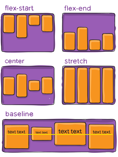
align-items
The align-items property is used to vertically align the flex items inside the container. Here are the descriptions for each value:
flex-start: This value aligns the flex items at the top of the container. The items are aligned based on the cross-start margin edge of the flex items.
flex-end: This value aligns the flex items at the bottom of the container. The items are aligned based on the cross-end margin edge of the flex items.
center: This value aligns the flex items at the center of the container. The items are aligned based on the midpoint of the cross-start and cross-end margin edges of the flex items.
stretch: This value stretches the flex items to fill the container vertically. The items are stretched to fit the container height based on their flex-grow and flex-shrink values.
baseline: This value aligns the flex items such that their baselines align. The items are aligned based on their baseline, which is defined by the font-size and line-height properties.
.container {
  align-items: stretch | flex-start | flex-end | center | baseline
}
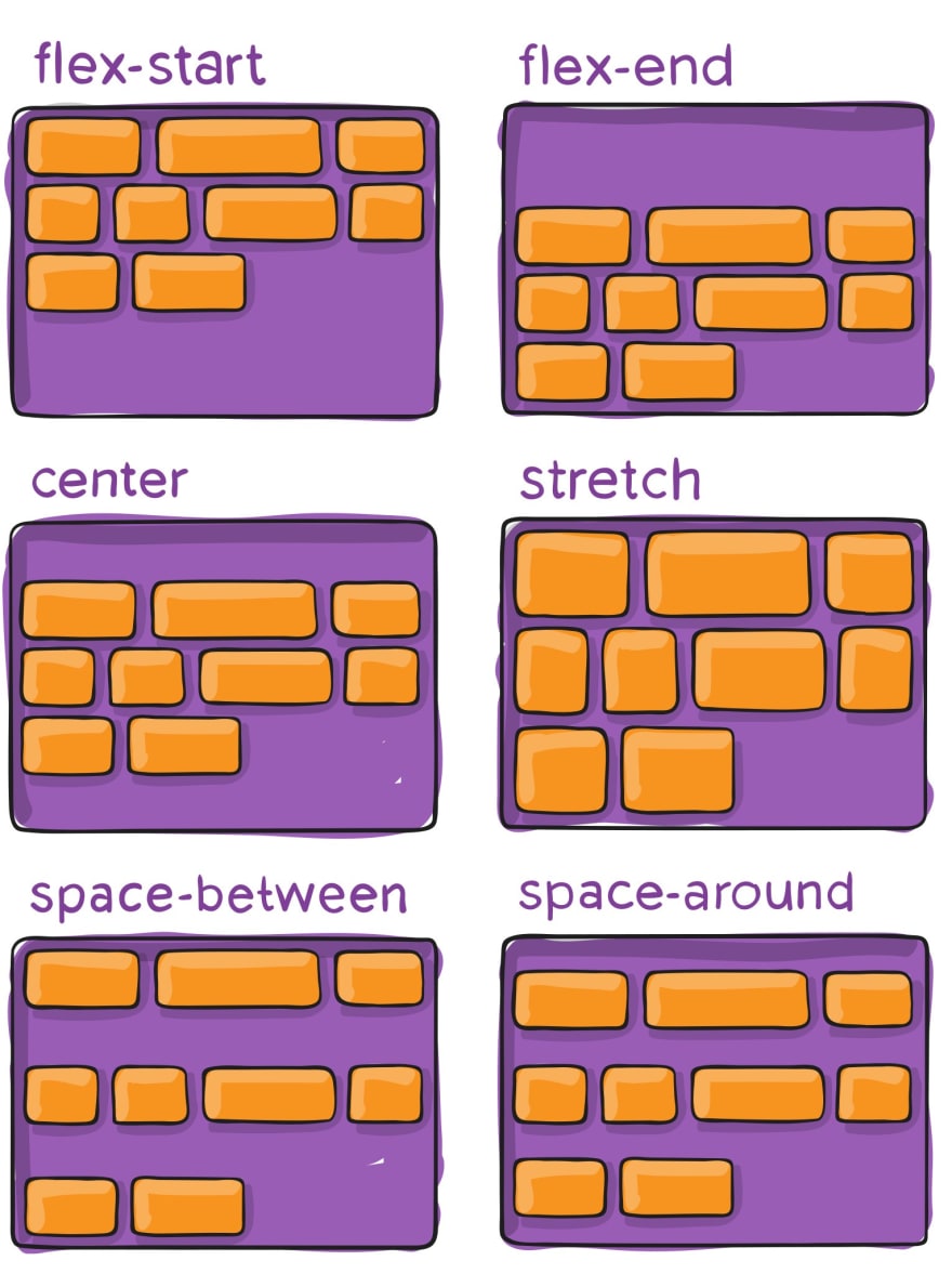
align-content
The align-content property is used to vertically align multiple lines of flex items inside the container when there is extra space along the cross-axis. It only applies when there are multiple lines of flex items, created either by flex-wrap: wrap or when there is not enough space for all items in a single line. Here are the descriptions for each possible value:
flex-start: This value aligns the lines of flex items at the top of the container.
flex-end: This value aligns the lines of flex items at the bottom of the container.
center: This value centers the lines of flex items vertically in the container.
space-between: This value distributes the lines of flex items evenly along the cross-axis, with the first line at the top of the container and the last line at the bottom.
space-around: This value distributes the lines of flex items evenly along the cross-axis, with equal space between each line and the top and bottom of the container.
stretch: This value stretches the lines of flex items to fill the container vertically. The lines are stretched to fit the container height based on their flex-grow and flex-shrink values
.container {
  align-content: flex-start | flex-end | center | space-between | space-around | space-evenly | stretch | start | end | baseline
}
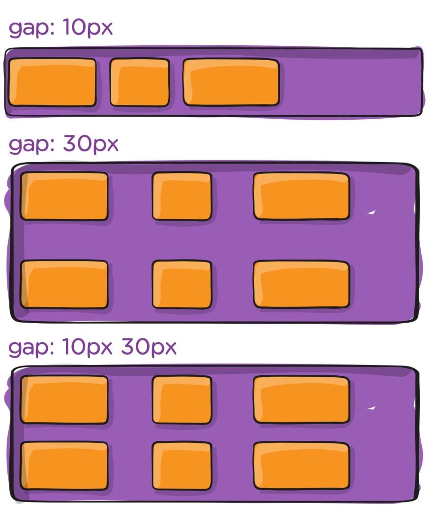
gap, row-gap, column-gap
gap, row-gap, and column-gap are CSS properties used in conjunction with the CSS flexbox layout. These properties allow you to add spacing between flex items in a more efficient way than using margins.
- gap: This property specifies the size of the gap between flex items in both the horizontal and vertical directions. It is a shorthand property for row-gap and column-gap and sets the value for both.
Example:
.container {
  display: flex;
  gap: 10px;
}
This code sets a gap of 10px between all flex items inside the container.
- row-gap: This property specifies the size of the gap between flex items in the vertical direction only.
Example:
.container {
  display: flex;
  flex-direction: column;
  row-gap: 10px;
}
This code sets a gap of 10px between all rows of flex items in the container.
- column-gap: This property specifies the size of the gap between flex items in the horizontal direction only.
Example:
.container {
  display: flex;
  column-gap: 10px;
}
This code sets a gap of 10px between all columns of flex items in the container. Note that this property only works if the flex-wrap property is set to wrap or wrap-reverse.
Flexbox properties for children (items)
order
The order property is used to change the order of flex items within a container. By default, all flex items have an order value of 0. You can set the order property to a positive or negative integer value to change the order of the flex item.
Example :
<div class="container">
  <div class="item item-1">1</div>
  <div class="item item-2">2</div>
  <div class="item item-3">3</div>
  <div class="item item-4">4</div>
</div>

.container {
  display: flex;
  flex-wrap: wrap;
}

.item {
  display: flex;
  justify-content: center;
  align-items: center;
}

.item-1 {
  order: 2;
}

.item-2 {
  order: 1;
}

.item-3 {
  order: 3;
}

.item-4 {
  order: 4;
}
In this example, we have a container with four flex items. We use the order property to change the order of the items.
.item-1 has an order value of 2, which means it will be displayed after .item-2.
.item-2 has an order value of 1, which means it will be displayed first.
.item-3 has an order value of 3, which means it will be displayed after .item-1.
.item-4 has an order value of 4, which means it will be displayed last.
Using the order property, we can rearrange the order of the flex items inside the container without changing the HTML structure.
flex-grow
The flex-grow property is used to specify how much a flex item should grow relative to the other flex items inside the same container. It is a unitless value that represents the proportion of the available space that the item should take up.
If all items have flex-grow set to 1, the container’s remaining space will be distributed equally to all children. If one of the children has a value of 2, that child will take up twice as much space as the others (or it will try, at least).
Here is an example:
.container {
  display: flex;
  width: 500px;
}
.item {
  flex-grow: 1;
  background-color: red;
}
In this example, the container has a width of 500px and contains three flex items with the class .item. The flex-grow property is set to 1 for each item. This means that each item should take up an equal amount of the available space in the container. Since there are three items, each item will take up one-third of the available space.
If we add another item to the container and set its flex-grow property to 2, like this:
.container {
  display: flex;
  width: 500px;
}

.item {
  flex-grow: 1;
  background-color: red;
}

.item-4 {
  flex-grow: 2;
  background-color: blue;
}
The fourth item will take up twice as much space as the other items, since its flex-grow value is set to 2. This means that it will take up two-fifths of the available space, while the other items will take up one-fifth each.
flex-basis
The flex-basis property is used to set the initial size of a flex item before any available space is distributed among the items.
Here’s an example of how to use flex-basis:
.item {
  flex-basis: 150px;
}
In this example, the flex-basis property is set to 150px for the .item class. This means that the initial size of the item will be 150px, and any remaining space will be distributed among the other flex items.
It’s important to note that flex-basis is just one of the properties that controls the size of flex items. The other two are flex-grow and flex-shrink. Together, these properties form what is called the "flex factor," which determines how available space is distributed among the flex items.
Here’s an example of how all three properties work together:
.item {
  flex-basis: 150px;
  flex-grow: 1;
  flex-shrink: 0;
}
In this example, the flex-basis property sets the initial size of the item to 150px. The flex-grow property is set to 1, which means that the item will grow proportionally to other flex items in the container when there is available space. The flex-shrink property is set to 0, which means that the item will not shrink when there is not enough space in the container.
flex-shrink
The flex-shrink property is used to specify how much a flex item should shrink relative to the other flex items in the container when there isn't enough space on the main axis. The default value for flex-shrink is 1, which means that all flex items will shrink equally.
Here’s an example that shows how flex-shrink works:
<div class="container">
  <div class="box box1">Box 1</div>
  <div class="box box2">Box 2</div>
  <div class="box box3">Box 3</div>
</div>

.container {
  display: flex;
}

.box {
  flex-basis: 100px;
  height: 100px;
  border: 1px solid black;
}

.box1 {
  flex-grow: 1;
  flex-shrink: 1;
}

.box2 {
  flex-grow: 1;
  flex-shrink: 2;
}

.box3 {
  flex-grow: 1;
  flex-shrink: 3;
}
In this example, we have a container with three flex items. Each item has a flex-basis of 100px, which sets the initial size of the items. The flex-grow property is set to 1 for all items, which means that they will all grow equally if there is extra space on the main axis.
However, the flex-shrink property is set to different values for each item. The first item has a flex-shrink value of 1, which means that it will shrink proportionally to the other items if there isn't enough space. The second item has a flex-shrink value of 2, which means that it will shrink twice as much as the first item. The third item has a flex-shrink value of 3, which means that it will shrink three times as much as the first item.
If the container doesn’t have enough space to fit all the items at their initial size, the items with higher flex-shrink values will shrink more than the items with lower values. For example, if the container is only 250px wide, the first item will keep its initial size of 100px, the second item will shrink to 75px, and the third item will shrink to 50px.
Conclusion
In conclusion, CSS Flexbox is a powerful tool for building responsive layouts with ease. It provides a simple and intuitive way to arrange elements on a web page, with a minimum amount of code. From the basics to the advanced concepts, we have covered all the important aspects of Flexbox layout in this blog.
We have learned how to create a Flexbox container, how to set up Flexbox properties on child elements, and how to use Flexbox to create responsive layouts. We have also explored some of the lesser-known Flexbox properties like gap, flex-basis, and order.
In summary, CSS Flexbox is a must-learn skill for any web developer. It is an efficient and modern way of creating responsive layouts, and can save you time and effort in the long run. So go ahead, give it a try and start building beautiful, responsive layouts today!
Thank you for reading this far
Subscribe to my Newsletter for exciting posts just like this.
Subscribe | The Pen, Pixel & Profit Club
Join 1,187+ coders, entrepreneurs, and creators for a weekly newsletter featuring web dev tips, business case studies, how-to stories, writing deconstructions, and genius AI tools with usage instructions. Get inspiration and practical advice for your projects. Sign up now!
 sarveshh.beehiiv.com

Top comments (2)
Amazed article! Thanks for sharing.
Thank you so much for taking the time to read my blog and leaving your kind words of appreciation. I'm thrilled to hear that you found our article amazing and hope to continue providing valuable content for my readers. Thanks again for your support!