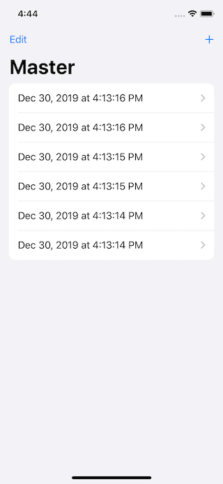
In iOS 13, Apple brought a new style to the Tables, inset grouped.
let tableView = UITableView(frame: .zero, style: .insetGrouped)
The code above would result in a table view with rounded corners and are inset from the edges of the parent view.

SwiftUI has a List view to represent rows or data, just like UITableView. Too bad it doesn't have inset grouped style. You has only two styles (for iOS) PlainListStyle and GroupedListStyle which you can apply to list view like this:
List {
    Text("Item 1")
    Text("Item 2")
    Text("Item 3")
}.listStyle(GroupedListStyle())
iOS 13.2
In iOS 13.2, this is no longer a case. A grouped list will use an inset grouped style when it is presented under the horizontal size class environment.
You can make your grouped lists style present as an inset grouped style by overriding your list view with regular horizontal size class (.environment(\.horizontalSizeClass, .regular)).
List {
    Text("Item 1")
    Text("Item 2")
    Text("Item 3")
}.listStyle(GroupedListStyle())
.environment(\.horizontalSizeClass, .regular)
Apple choose not to introduce a new style like InsetGroupedListStyle, but adapt GroupedListStyle based on size class. I think the reason might lie in their Human Interface Guidelines, here is some part of Inset grouped's definition.
The inset grouped style works best in a regular width environment. Because there's less space in a compact environment, an inset grouped table can cause text wrapping, especially when content is localized.
– Apple's Human Interface Guidelines
As you can see, the explanation is well aligned with the implementation detail.
Originally published at https://sarunw.com.
Find out my latest article and more at https://sarunw.com I post articles weekly there.
Related Resources
- You can check out my compiled cheat sheet at fuckingswiftui.com or goshdarnswiftui.com if you want more work-friendly url.
- Human Interface Guidelines – Tables


Top comments (0)