Hey, designers out there! I'm Saptarshi (a bit hard to pronounce, I know), today I'm gonna help with some effective tips & tricks on how to be a Better UI/UX Designer by the end of 2020 (probably you already are).
If you ever did sit with your paper and pen or might be a laptop and tried to design some cool stuff, yeah you can proudly call yourself a designer, but here we're to know that how we can be a better designer, and stand out of the crowd. So, Let's hop into the cool stuff & I'll try to keep it as short and sweet as I can, so as to not obfuscate.
Get Into Some Research ...
A UI designer has to surf over a tonne of ideas and quirks, it's totally okay for one to not know about all the things that a client wants or your next project needs. And fortunately, we've been gifted Google by Larry and Sergey to handle such problems (some can use bing too ... ).
Let's say you've got a client for a million-dollar deal who wants a clean website to be designed for his new Coffee shop, and unfortunately, you never knew what really a Coffee is, so at this point, you ought to try out Coffee and explore about what the stuff actually is and gradually start exploring about other coffee shops and begin taking inspirations from the popular ones .... wait we'll come to inspirations ahead.
Note : you're not told to make coffee but to make a clean website for a Cafe (so do your research accordingly or it might end up turning up yourself into a barista).
Time For Some Inspiration ...
inspiration (/ɪnspɪˈreɪʃ(ə)n/): a stimulation for designers to design killer UIs.
(... continued) So, you've got quite a lot of cool inspirations while you're researching about our good ol' Coffee.
Haven't you got enough ideas?
Here's some cool resources that can get you boundless inspirations
-
Dribble

Dribbble is a self-promotion and social networking platform for digital designers and creatives. It serves as a design portfolio platform, jobs, and recruiting site and is one of the largest platforms for designers to share their work online. The company is fully remote with no headquarters. -
Behance
Behance is a social media platform owned by Adobe which claims "to showcase and discover creative work". -
Mobbin

Mobbin is a hand-picked collection of the latest mobile design patterns from apps that reflect the best in design. Get inspiration from over 250 iOS apps and 25,000 patterns (screenshots from iPhone 12) available on the platform. Sign up to save your favorite patterns.
Don't worry if you didn't find these much helpful to you, there's a lot more similar on the internet, these were just my biases.
Let's Get Started With The Right Tools In Hand
(... continued) The client's been calling up you for the mock designs, now you should get off all your ideas on a sketch board using the right tools! (don't bother much about the client, take your time to do stuff.)
I'd be carrying out the blog with Figma throughout, but you can choose as your wish.
Here're some of the popular design tools out in the market which you can choose from.
-
Figma
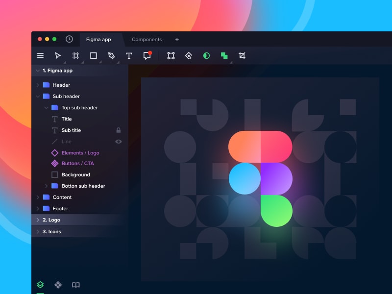
Figma is a vector graphics editor and prototyping tool which is primarily web-based, with additional offline features enabled by desktop applications for macOS and Windows. The Figma Mirror companion apps for Android and iOS allow viewing Figma prototypes on mobile devices. -
Adobe XD

Adobe XD is a vector-based user experience design tool for web apps and mobile apps, developed and published by Adobe Inc. It is available for macOS and Windows, although there are versions for iOS and Android to help preview the result of work directly on mobile devices. -
Sketch

Sketch is a vector graphics editor for macOS developed by the Dutch company Sketch B.V. It was first released on 7 September 2010 and won an Apple Design Award in 2012. It is primarily used for user interface and user experience design of websites and mobile apps and does not include print design features.
Let's Weld Our Idea Into A Brand!
Now what's branding?
branding: a way of making our product stand out in the market (fame!)
But branding is not always exactly that, here our product is Coffee or you can say a Cafe. The first instance we hear about coffee our brain starts assuming something comfy, hot, brownish, or even something more with the deep imaginers. This would be our customers' ideology when they hear about a Cafe! And this is our only tool(spell) to woo millions of customers. It creates recognition.
A Branding Chronology is ought to have these in it ...
- Brand guidelines
- Personality
- Name
- Colour
- Logo
Thereby, some of the best colours suiting our brand will be ...

I'll leave out the Name, and Logo to you guys! hope you do well.
Let's Do Some Real Designing Now!
I believe designers reading this must have some basic knowledge about UI/UX already, so in my words to keep it short and sweet I'll continue with some of the Golden Rules you should follow while designing rather than making you do the whole design.
1. Negative Spacing
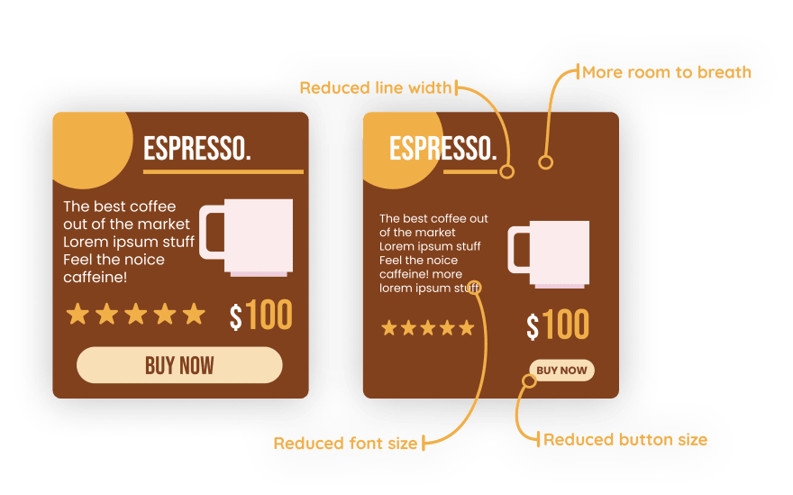
It's simply the areas on your design that aren't taken up by actual design assets. It can be used to separate sections of your design, define certain areas, and also allow your design to have room to breathe.
(... continued)The client's been wanting to show up some of the products of his Cafe in form of a card on the website, let's see how we can make good use of Negative Spacing here.
2. Proximity
Proximity suggests that the design elements are linked in some way or have a relationship should be grouped together. Aspects of your design that do not have a link or a relationship should not be linked together.
3. Repetition
It helps the design have a more continuous theme or look and feel. Repetition can be seen in things like the color scheme used throughout your design or the use of similar shapes and graphics.

4. Contrast
Contrast simply refers to two design elements or aspects that are different in appearance in nature. Contrast is very useful for creating a focal point and giving objects greater visual weight and balancing the image.
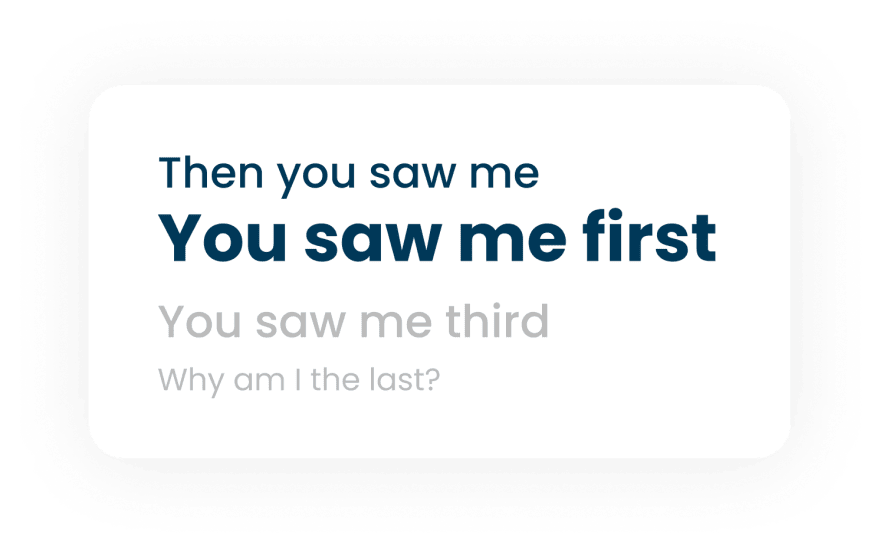
Size, weight, and color can bring in contrast and change how the user views your design.
5. Alignment
The penultimate golden rule for layout design. We should always be mindful of alignment if it's for texts or design elements. In general, you should always look to align your work professionally.

6. Hierarchy
In design, hierarchy is used to help a viewer navigate and digest information easily. It influences the order in which the human eye perceives what it sees. It helps the user navigate with ease by reducing confusion.
(... continued)The client's now making you mad for the website he wants for his Cafe, he says it be catchy and communicative with the user.
Here's a simple mock up for that ...
(hope the client doesn't reads the "lorem ipsum ...")
Now, Let's see how we achieved hierarchy with the mock
It's the predicted eye movement for the user.
How to achieve Hierarchy?
Create a focal point from where the journey starts.
People read bigger items first. So using size and weight will help.
Brighter/Stronger colors tend to catch one's eyes before items in fader shades.
The Final Design Hack
The most efficient trick to make your design stand out is to ... Follow Trends
Following trends is similar to listening to a million clients at once (who are not fluctuating, and the cool ones). It gives you the recognition of being Modern and proves that you're still on the flow!
Some of the Hot Trends currently in the market are
- ### Glassmorphism
 Image by UX Collective
The trendiest frosted glass UI is spreading crazily in 2020 and probably would make a great leap in designs in upcoming years and 2021.
- ### Neomorphism
 Image by UI Store Design
Neomorphism (aka neumorphism) is a relatively new design trend and a term that's gotten a good amount of buzz lately. It's aesthetic is marked by minimal and real-looking UI that's sort of a new take on skeuomorphism.
- ### Materialism
 Image by Sketch App Sources
Materialism is another old yet great trend still followed by the big IT industries such as Google & Microsoft.
Wrapping Up
Thanks to everyone for being with me throughout this article, Hope now you're ready to jump into 2021 with a better designer you. And what you waiting for? our "Cafe" client is calling up, let's complete it fast!
I believe this article helped you even if it's an inch, then do give reactions, don't forget to give feedbacks and forgive me if I meant anything wrong in this article, you are free to correct me. Share it with your friends if you'd like to.
Lots of Love,
Saptarshi.





Top comments (1)
Definitely will help a lot to boost up my journey :)