
Today I will show you how to create a web application that teaches itself how to recommend the best art from the Harvard Art Museum to its users. We will use Adobe XD, HTML/CSS, vanilla Javascript and webpack. With an API connection we will retrieve the art.
What you’ll learn in this tutorial:
- High fidelity prototyping with Adobe XD
- Responsive HTML5/CSS3 layout
- CSS BEM naming
- CSS Flexbox
- CSS Grid
- CSS button animation
- Webpack config
- Vanilla JS ES6
- Setting up a 3rd party API with Harvard art API
- Deploying front- and backend to Heroku
1. Creating the design
For the design, I like to keep things simple and clean. If you are new to design, try to check out dribbble.com and search for ‘art’ or gallery and get inspiration from here. I’m using Adobe XD, which you can download for free from https://www.adobe.com/products/xd.html
If you prefer an online solution, you can use https://www.figma.com/ - which is also free and works similar.
For the app we basically only need two pages: 1) new user page where he/she selects here art preferences, and 2) an overview page with all art recommendations. It’s important to do some reaearch beforehand
1.1 Creating the mockup
To combine the 2 main functions from the app, we can place them on one page. So we will have the controls/settings on the left panel, and in the center we will see our art. Make sure you do not use any special fonts/shadows/colors in this stage. Try to make the functionalities clear and have a good balance of elements.

1.2 High fidelity mockup
Here’s comes the special part. The details will make or break your design, so it is not uncommon most time will be spend on the details.
Colors
Fonts
Shadows
Icons

2. Setting up the project
We will create this project using Visual Studio code as a text editor, you can use any you like but I prefer Visual Code because it gives you great feedback and has many extension possibilities.
To test the project we need to use a test web server, we will use Node.js for this. Make sure you have node installed on your computer, you can download it for free from https://nodejs.org/en/download/
Same goes for Visual Studio Code, which you can download for free from https://code.visualstudio.com/download
Then we’ll also use Git and Github, which both are free. You can download GIT from https://git-scm.com/downloads
Then create an account if you don’t have one already on github.com and create a new repository, this is basically a folder where all you project data will be stored online and locally on your pc. We will call the repository ‘smartart’. Then go to your Github folder on your pc on also create a folder here called ‘smartart’.
We will use the command prompt for managing our git project. Open up the command prompt and browse to your Github folder, in my case C:\Users\’username’\Github. Then go to the smartart folder by using cd smartart (Windows users).
We will initialize this repository by using git init in the command line and then npm init
Then we’ll install the webpack package on our node server by using the following commands
npm install --save-dev webpack webpack-cli webpack-dev-server html-webpack-plugin
Later when we have added our first files we will upload them to the remote (online) github repository.
Now open up visual code and open your just created smartart folder by using the shortcut (ctr+k) + (ctrl+o).
Open up the package.json file to check if your packages are installed correctly:
"devDependencies": {
    "html-webpack-plugin": "^3.2.0",
    "webpack": "^4.41.2",
    "webpack-cli": "^3.3.10",
    "webpack-dev-server": "^3.9.0"
}
Then remove the line in the scripts section and add the following:
"dev": "webpack --mode development",
"build": "webpack --mode production",
"start": "webpack-dev-server --mode development --open"
Then create a file called webpack.config.js and add the following:
const path = require('path');

module.exports = {
    entry: './src/js/index.js',
    output: {
        path: path.resolve(__dirname, 'dist'),
        filename: 'js/bundle.js'
    },
    devServer: {
        contentBase: './dist'
    },
};
plugins: [
        new HtmlWebpackPlugin({
            filename: 'index.html',
            template: './src/index.html'
        })
],
Then add the following folders and files
- dist/js/
- src/js/index.js
- src/index.html
- src/css/main.scss
In index.html type doc and press enter to load a standard HTML file.
Then before the ending body tag add
Let’s add some text on this page, for example
Hello world
Now open up your src/js/index.js file and add the following
const h1 = document.querySelector('h1');
h1.style.color = 'red';
Now use the command ctrl + ~ to open up the terminal in visual studio code.
Type in npm start to open up your new project! Your text should turn red if everything went okay.
We will use sass in our project so we need to add a package in our webpack project that converts scss to css.
Run the command npm install style-loader css-loader --save
Then in index.js delete everything and add: import '../css/main.scss';
Then fill in the following in main.scss to test if it is working:
$color1: red;

h1 {
    color: $color1;
}
Run npm start again and your h1 should be red!
3. Creating the static HTML/CSS website
3.1 Setting up the frame
We will first create our main element which is in the center of the page, we will use CSS grid on the body to set up the layout grid.
Your index.html should look like this now:
<html lang="en">
<head>
    <meta charset="UTF-8">
    <meta name="viewport" content="width=device-width, initial-scale=1.0">
    <meta http-equiv="X-UA-Compatible" content="ie=edge">
    <title>Art app</title>
    <link rel="stylesheet" href="./css/main.scss">
</head>
<body>

    <div class="grid">
        <main class="main">
            <h>Test</h>
        </main>
    </div>

    <script src="./js/bundle.js"></script>
</body>
</html>
Then in the main.scss add the following code to create the grid and main section. The repeat(12, 1fr) will split the whole page up in 12 equal sections. The box sizing border box will make sure the padding of a div won’t make the div bigger but add the padding inside the div itself.
* {
    margin: 0;
    padding: 0;
    box-sizing: border-box;
}

.grid {
    width: 100%;
    height: 100%;
    padding: 5%;
}

.main {
    width: 100%;
    height: 100%;
    display: grid;
    grid-template-columns: repeat(12, 1fr);
    grid-template-rows: repeat(12, 1fr);
    background: lightcoral;
}
Now we will divide up the main part in three sections: the left settings bar, the bottom navigation and information part, and the main center art part. We will do this by placing three divs in the main grid on the right locations.
Inside the main div add the following:
    <main class="main">
        <section class="settings">
            <h1>Settings</h1>
        </section>
        <section class="art">
            <h1>Art</h1>
        </section>
        <section class="info">
            <h1>info</h1>
        </section>
    </main>
Then in the main.scss add the following styles:
.settings {
    grid-column: 1 / span 4;
    grid-row: 1 / span 12;
    background: lightgreen;
}

.art {
    grid-column: 5 / span 8;
    grid-row: 1 / span 8;
    background: lightpink;
}

.info {
    grid-column: 5 / span 8;
    grid-row: 9 / span 4;
    background: lightskyblue;
}
3.2 Creating the settings part
Now we will add the text in the settings box and also include the fonts in main.scss. We do this by selecting our fonts on fonts.google.com and using the import code that it generates.
Place the following in the top of main.scss:
@import url('https://fonts.googleapis.com/css?family=Cormorant+Garamond:300,400,500,600,700|Proza+Libre:400,500,600,700&display=swap');
Then add these variables for easier usage in our css file:
$font1: 'Cormorant Garamond, serif';
$font2: 'Proza Libre, sans-serif';

$color1: #9e324e;
$color2: #333;
Now we can use these variables in our css, which is much easier if we want to change the color or the font in a later stage. Then give the grid a background of #f5f5f5 and the settings #f9f9f9.
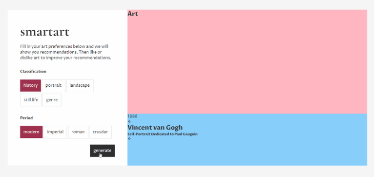
Add the following divs in your HTML file:
<div class="grid">
    <main class="main">
        <section class="settings">
            <h1 class="settings__h1">smartart</h1>
            <p class="settings__p">Fill in your art preferences below and we will show you
            recommendations. Then like or dislike art to improve
            your recommendations.
            </p>
            <h6 class="settings__h6">Classification</h6>
                <div class="box__item active">history</div>
                <div class="box__item">portrait</div>
                <div class="box__item">landscape</div>
                <div class="box__item">still life</div>
                <div class="box__item">genre</div>
            <h6 class="settings__h6">Period</h6>
                <div class="box__item active">modern</div>
                <div class="box__item">imperial</div>
                <div class="box__item">roman</div>
                <div class="box__item">crusdar</div>
        </section>
        <section class="art">
            <h1>Art</h1>
        </section>
        <section class="info">
            <h1>info</h1>
        </section>
    </main>
</div>
Then make sure your settings css looks like this. The buttons won’t be actual buttons or a-tags, we will create them ourselves with javascript. The display inline-block make them sort nicely behind each other. Next up we will add animation to the buttons. You’ll see that with SASS you can use nested styles, which has its benefits.
.settings {
    grid-column: 1 / span 4;
    grid-row: 1 / span 12;
    padding: 3em;
    background: #fefefe;
    .settings__h1 {
        font-family: $font1;
        font-size: 3.5em;
        padding-bottom: 1rem;
    }
    .settings__h6 {
        font-size: .9em;
        padding: 2.5rem 0 1rem 0;
    }
    .box__item {
        border: 1px solid #ccc;
        padding: .8rem;
        margin: .2rem 0 .2rem 0;
        display: inline-block;
        &.active {
            border: none;
            background: $color1;
            color: white;
        }
    }
}
For the button animation we will create a so called pseudo element, which is basically just a simple new div before or after our div. Make sure you set the position of the box item to relative and of the pseudo element to absolute to make sure it’s near the box item itself. Then a litte trick, set the after element zo z-index: -1 and the box item to z-index: 1. Then add the following code which will make the hover effect.
.box__item {
    border: 1px solid #ccc;
    padding: .8rem;
    margin: .2rem 0 .2rem 0;
    display: inline-block;
    position: relative;
    cursor: pointer;
    z-index: 1;
    &.active {
        border: none;
        background: $color1;
        color: white;
    }
    &::after {
        content: '';
        position: absolute;
        top: 0;
        left: 0;
        width: 100%;
        height: 100%;
        background: rgba(0, 0, 0, .1);
        z-index: -1;
        transition: transform 175ms ease-in;
        transform: scaleX(0);
        transform-origin: left;
    }
    &:hover:after  {
        transform: scaleX(1);
    }
}
Let’s add the main button now.

Let’s check how our app looks on mobile, currently not so good:

Let’s fix this. This will actually be really easy thanks to CSS flexbox. We will add a media query for screens smaller than 1200px on the main element. We will change the grid to a flexbox and set the direction to column, so instead of the grid we will just have the divs stacked on each other. Nest the following code within the main class in your css file:
@media all and (max-width: 1200px) {
    display: flex;
    flex-direction: column;
}
That’s it! Works perfectly on mobile.
Now add the following div the settings section:
<div class="box">
    <div class="box__item generate">generate</div>
</div>
With this styling. The justify content decides on which side the div inside should be placed, in our case at the end of the parent div. If you also want to center the div you can use align-items: center also.
.box {
    padding-top: 1rem;
    width: 100%;
    display: flex;
    justify-content: flex-end;
    .generate {
        background: #333;
        color: white;
    }
}
3.3 Information part
Settings part is done. Let’s make the information part. Basically there are 5 elements within the information part: two arrows, the year, the artist and the subtitle. Let’s add them to the HTML and then create the CSS for it. This should be enough. I’m using the free ionicons, which you can get from https://ionicons.com/usage
<section class="info">
    <div class="year">1888</div>
    <div class="circle__wrapper">
        <div class="circle">
            <ion-icon name="arrow-back"></ion-icon>
        </div>
    </div>
    <div class="content">
        <h2 class="content__h2">Vincent van Gogh</h2>
        <h5 class="content__h5">Self-Portrait Dedicated to Paul Gauguin</h5>
    </div>
    <div class="circle__wrapper">
        <div class="circle">
            <ion-icon name="arrow-back"></ion-icon>
        </div>
    </div>
</section>
Without CSS
With CSS

Then add the following CSS for the information box:
.info {
    grid-column: 5 / span 8;
    grid-row: 9 / span 4;
    background: #f1f1f1;
    display: flex;
    justify-content: center;
    align-items: center;
    position: relative;
    .year {
        font-family: $font1;
        color: #ccc;
        opacity: .5;
        position: absolute;
        font-size: 13em;
        margin-top: -18vh;
        left: 1vw;
    }
    .content {
        width: 100vw;
        display: flex;
        flex-direction: column;
        justify-content: center;
        align-items: center;
        .content__h2 {
            font-family: $font1;
            font-size: 3.5em;
        }
        .content__h5 {
            padding-top: .5rem;
            font-size: 1.1em;
            color: $color1;
        }
    }
    .circle__wrapper {
        width: 100%;
        display: flex;
        justify-content: center;
        align-items: center;
    }
    .circle {
        width: 10vh;
        height: 10vh;
        border-radius: 50%;
        display: flex;
        align-items: center;
        justify-content: center;
        background: $color1;
        .circle__icon {
            color: white;
            font-size: 24px;
        }
    }
}
How can we make the second arrow look to the right? We can do this with CSS by using transform: rotate by nesting the following code within .circle__wrapper:
&:last-child .circle .circle__icon {
    transform: rotate(180deg);
}
We also need to add a hover effect on the circle arrows. Let’s make it slightly bigger, add this to the .circle class:
transition: all 175ms ease;
And then next in the hover effect:
&:hover {
    box-shadow: 5px 5px 10px rgba(0, 0, 0, .3);
    transform: scale(1.1);
}
Let’s check mobile again, it’s important to do this regularly so we don’t have to get back into every part at the end. We should add some media queries. On the info div we will do the same trick as we did on the main element. Then on the content and the year we will add some padding and margins to make it look better.
.year {
    @media all and (max-width: 1200px) {
        margin-top: -32vh;
    }
.content {
    @media all and (max-width: 1200px) {
        padding: 1em 4em;
    }
.info {
    @media all and (max-width: 1200px) {
        display: flex;
        flex-direction: column;
    }
3.4 Art part
Now let’s create the actual part for the paintings. Basically this will be a div which holds 5 div that we can scroll.
First we will add some example picture in our HTML:
<section class="art">
    <div class="painting" data-id="1">
        <img src="https://images-na.ssl-images-amazon.com/images/I/81HOBLQO%2BgL._SY679_.jpg">
    </div>
    <div class="painting" data-id="2">
        <img src="https://storage.googleapis.com/ehimages/2017/10/25/img_942b5703ed4c5d3b242a34f7cc87d9c0_1508933938684_processed_original.jpg">
    </div>
    <div class="painting" data-id="3">
        <img src="https://cdn.eventfinda.co.nz/uploads/events/transformed/1276619-567973-14.jpg">
    </div>
    <div class="painting" data-id="4">
        <img src="https://images-na.ssl-images-amazon.com/images/I/81HOBLQO%2BgL._SY679_.jpg">
    </div>
    <div class="painting" data-id="5">
        <img src="https://storage.googleapis.com/ehimages/2017/10/25/img_942b5703ed4c5d3b242a34f7cc87d9c0_1508933938684_processed_original.jpg">
    </div>
</section>
Then we’ll apply the following styles on it. The overflow: hidden makes sure the div slide only in the art div box.
.art {
    grid-column: 5 / span 8;
    grid-row: 1 / span 8;
    background: #f9f9f9;
    display: flex;
    align-items: center;
    justify-content: center;
    overflow: hidden;
    @media all and (max-width: 1200px) {
        min-height: 500px;
    }
    img {
        max-height: 30vh;
        max-width: 20vw;
        @media all and (max-width: 1200px) {
            max-height: 300px;
            max-width: 300px;
        }
    }
    .painting {
        margin: 0 5em;
    }
}
We have finished creating our static HTML/CSS website!
First commit to Github
First create a file called .gitignore in the main folder and add the following text: node_modules
This will skip all the node modules folders to your github folder.
Press ctrl + ~ to open the terminal in Visual Code and then type in the following commands
$ git add .
$ git commit -m ‘first commit’
$ git remote add origin https://github.com/<youraccountname>/smartart.git
$ git push -u origin master
Now you’re files are pushed to your remote github repository.


Top comments (2)
Great tutorial and kudos to you for using vanilla javascript instead of libraries and frameworks.
You can try to use Desech Studio to speed up the process by import adobexd, figma or sketch design files. This will create a clean html structure positioned with css grids.
This is such a cool idea and I'd love to try something similar! Just fyi, your demo link doesn't work! :/