Today we are going to write about contact forms and how to validate them using JavaScript.
The contact form seems to be one of the top features of every basic home page. It is a great way to encourage your visitors to make contact with you, by adding a form which is nice to look at, simple to use and easy to submit. A good web form should to some extent follow the well-known, popular usual style so that your users already have knowledge on how to fill out its input fields and never have to think twice about what kind of data is required and where. We mean the user should never wonder which field is required and which is optional and how to fill them out correctly and how to submit the form successfully.
Form creation rules
Before starting to create the form itself, it is a good practice to take the time and think about what kind of information you are going to ask your user. And also, which fields are going to be required and which can be submitted empty? Are there any restrictions when it comes to the format of the data that he/she enters?
A HTML form’s complexity may range from a plain and simple contact form where we only ask the user to fill out his name, email, phone and a message or it may be a more elaborate form as is the case with new user registration, for example.
We want to make our form better by giving the user interactive real time feedback about if he is filling out the input fields correctly, and let him know if there is a field missing or if it is incorrect
Data validation
Another aspect is the question of data validation. Every time you need to work with input generated by some user, you MUST validate that the data he is submitting is in accordance with your expectations. This means there are conditions, like for example an email input field should definitely contain the @ sign and then a . followed by the domain name. Or a phone number should consist of the + sign and numbers exclusively. Also, you might wish to check that the length of the word that the user has entered is greater than a certain number of characters, so for example you might not want people submitting words shorter than let’s say 3 characters as the message’s body.
Another interesting effect of validating your data in the front-end part of your website’s code is the added advantage of protection against cyber attacks. Always think that if there are input fields in your page, a malicious agent such as a bot might come and attack your site’s code, integrity or availability and thus try and hack your web. Best way of preventing things like this from happening is by double hacker-proofing your code by using front end validation mechanisms like JavaScript validation as well as back end, server-side data validation. These two should make a protection-duo to make it as much difficult as possible for attackers to infiltrate your site.
Contact form accessibility
When designing a contact form, it is of great usefulness to make use of special HTML attributes to make your form more accessible. By this we mean to assign correctly the order of the input fields so that the form can be easily navigated by using keyboard only. You can also improve the ease of use by using the label element, so that input fields are focused upon clicking on the title assigned in the label.
Bulma integration
How can we make use of BULMA in the case of designing html contact forms?
Bulma is a framework, a library similar to Bootstrap which if you learn to use can simplify the css part of your job when designing a web page. We will especially make use of the Bulma’s form section. It’s based on flexbox so we make use of it to position our elements on the screen - specifically our icons. In our little example, the classes will be the modifiers that will tell the icons where to shift or how to look like and that’ll make our life a bit easier.
Has-icons-right, has-icons-left, is-danger, is-small, is-right, etc.

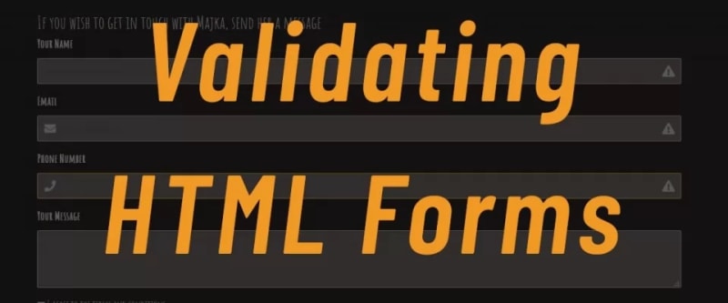
We aim to create a simple contact form, in which will be using the following HTML mark-up:
<section class="section" id="contact">
 <div class="container is-max-desktop">
 <h2 class="title">CONTACT</h2>
 <h3>If you wish to get in touch with Majka, send her a message</h3>
 <form accept-charset="utf-8" action="sendmail.php" method="post" enctype="multipart/form-data">
 </form>
 </div>
</section>
Now this alone will not be sufficient, we also want to have input fields and some buttons, so we add inside element <form> the following - name, email, phone number and message fields and a submit button.
<!--Name field-->
<div class="field">
<label class="label" for="name">Your Name</label>
<div class="control has-icons-right">
 <input class="input needs-validation inputNameField" type="text" name="name" placeholder="name maximum 20 characters" value="" id='inputName' />
 <span class="icon is-small is-right">
 <i id='nameCheckIcon' class="fas fa-exclamation-triangle"></i>
 </span>
 </div>
</div>

<!--Email field-->
<div class="field">
 <label class="label" for="email">Email</label>
 <div class="control has-icons-left has-icons-right">
 <input class="input needs-validation inputEmailField" type="email" name="email" placeholder="your@email" value="" id='inputEmailField' />
 <span class="icon is-small is-left">
 <i class="fas fa-envelope"></i>
 </span>
 <span class="icon is-small is-right">
 <i id='emailCheckIcon' class="fas fa-exclamation-triangle"></i>
 </span>
 </div>
 <p id="emailActionHint" class="help is-danger nezobrazovat">Please enter a valid email so Majka can reach you</p>
</div>

<!--Phone number field-->
<div class="field">
 <label class="label" for="number">Phone Number</label>
 <div class="control has-icons-left has-icons-right">
 <input class="input is-warning" type="text" name="number" placeholder="" value="" />
 <span class="icon is-small is-left">
 <i class="fas fa-phone"></i>
 </span>
 <span class="icon is-small is-right">
 <i class="fas fa-exclamation-triangle"></i>
 </span>
 </div>
</div>

<!--Message field-->
<div class="field">
 <label class="label">Your Message</label>
 <div class="control">
 <textarea class="textarea" name="message" placeholder=""></textarea>
 </div>
</div>

<!--Submit checkbox-->
<div class="field">
 <div class="control">
 <label class="checkbox">
 <input type="checkbox" />
 I agree to the <a href="#">terms and conditions</a>
 </label>
</div>
</div>

<!--Submit button-->
<div class="field is-grouped">
 <div class="control">
 <button class="button is-light" id="submitButton" disabled="true">Submit</button>
 </div>
</div>
As you can see, we have four different input fields:

This line we add to the end of the body, but before closing element </body>. This will do that the javascript will be loaded after the HTML code is executed, or we can add “async defer” property to the <script>, which will do the trick and then your script could be placed anywhere on the page and still the script will run at the end like we want.
<script src="js/main.js?v6" async defer></script>
Note: If you're asking what is “?v6” behind the .js file, that's the version of the JS code, when you need your code editor would read the latest non cached code, you just raise the number of the version and it will load your latest changes to the code.
And now let’s set up the most interesting part – the JavaScript code to check the fields’ content and validate their state:
First we can define constants which will represent our elements we want to work with.
const ourParallax = document.getElementById('parallax')
const parallaxInstance = new Parallax(ourParallax)
const submit = document.getElementById('submitButton')
const inputName = document.getElementById('inputName')
const inputEmail = document.getElementById('inputEmailField')
const iconName = document.getElementById('nameCheckIcon')
const iconEmail = document.getElementById('emailCheckIcon')
const MAXCHARNAMEFIELD = 20
const MINCHARNAMEFIELD = 3
But let's continue. We now set up Event Listeners which will be waiting for some specific action to be happening.
// EVENT LISTENERS
document.addEventListener('change', event => {

 if (event.target.matches('.inputNameField')) {
 validateName()
 } else if (event.target.matches('.inputEmailField')) {
 validateEmail(event.target.value)
 } else {
 //nothing
 }
}, false)
To describe it further - on the whole page we have one listener and when something will change - like its defined inside the parentheses is set on what event -> on ‘change’, it will execute the arrow function. Inside the arrow function we have an IF statement to resolve if the event happened on some of the next elements we have.
For example, if there is some ‘change’ event - we write something in the HTML element input field which has CSS class .inputNameField, IF statement will be true and the next code will be executed. And the code which we have on execution is function validateName() - it's time to describe its code now :
Name Validation
function validateName() {
 var regexString = /w?s?w/g; //words separated by space

 const iconName = document.getElementById('nameCheckIcon')
 const conditions =
 (inputName.value.length > MINCHARNAMEFIELD) &&
 (inputName.value.length < MAXCHARNAMEFIELD) &&
 (inputName.value != null) &&
 (regexString.test(inputName.value)) //test for regex string
 console.log(regexString.test(inputName.value))

 if (conditions) {
 // input box color
 inputName.classList.remove('is-danger')
 inputName.classList.add('is-success')
 // icon type
 iconName.classList.remove('fa-exclamation-triangle')
 iconName.classList.add('fa-check')
 // console.log("icon :" + icon.classList.value)

 //now we call submit button test
 nameValidated = true
 submitCheck()
 } else {
 // input box color
 inputName.classList.remove('is-sucess')
 inputName.classList.add('is-danger')
 // icon type
 iconName.classList.remove('fa-check')
 iconName.classList.add('fa-exclamation-triangle')

 nameValidated = false
 }
}
We define variable with regular expression first.
Also we add two constants to the definition of the variables at the start, which will represent the minimum and maximum characters we want our input field to have. This is the right way to do it, this way you won't have any undescribed constants in your conditionals, so called ‘magic numbers’.
const MAXCHARNAMEFIELD = 20
const MINCHARNAMEFIELD = 3
We make new variable to the icon we would be working with, so far the icon which belongs to the Name input field has Bulma class ‘fa-exclamation-triangle’, and we will change it when the input field is correctly filled.
Next we have series of conditions we want to be checked - input will be checked against all of them and when all are boolean true, for the element set to the variable inputName = document.getElementById('inputName') -declared earlier, we remove the class ‘is-danger’ and we add class ‘is-success’. This will change the color of the field to green. Similarly, to the icon we remove ‘fa-exclamation-triangle’ and add ‘fa-check’, which will make that check icon is displayed.
We declare new variables with default state = false ,added to the start of the file where we have other variables.
var nameValidated = false
var emailValidated = false
Also we want to set a new variable when the input field for the name is correctly filled to ‘true’. This will be useful when we come to the submit button later. The last thing is to call the function submitCheck() every time the change happens to the form. It will execute that function but so far we can ignore it until later. Allright, we should have this:

Email Validation
Next we have validateEmail(value) function, which will be called when some ‘change’ event happens on this HTML element, remember?
validateEmail(event.target.value)
function validateEmail(value) {
 const iconEmail = document.getElementById('emailCheckIcon')
 const emailParagraph = document.getElementById('emailActionHint')

 if (validateRegexString(value)) {
 // input box color
 inputEmail.classList.remove('is-danger')
 inputEmail.classList.add('is-success')
 // icon type
 iconEmail.classList.remove('fa-exclamation-triangle')
 iconEmail.classList.add('fa-check')
 emailParagraph.style = 'display:none'

 emailValidated = true
 submitCheck()
 } else {
 // input box color
 inputEmail.classList.remove('is-sucess')
 inputEmail.classList.add('is-danger')
 // icon type
 iconEmail.classList.remove('fa-check')
 iconEmail.classList.add('fa-exclamation-triangle')
 emailParagraph.style = 'display:block'

 emailValidated = false
 }
}
Let's describe the function.
We declare as variable two elements, icon and paragraph with text we want to show, this paragraph is momentarily hidden (CSS style display:none) so by the load of the page by default there is no text shown.
Next we have a condition where we have called yet another function added to the code - validateRegexString(value), which returns true when the string entered into the input is validated by this function.
function validateRegexString(email) {
 const regexString = /^(([^<>()[].,;:s@"]+(.[^<>()[].,;:s@"]+)*)|(".+"))@(([[0-9]{1,3}.[0-9]{1,3}.[0-9]{1,3}.[0-9]{1,3}])|(([a-zA-Z-0-9]+.)+[a-zA-Z]{2,}))$/
 return regexString.test(String(email).toLowerCase()) // true|false
}
Well if the condition is fulfilled and we for example have a valid email, valid in the sense of the characters entered are looking as an email address, the code will remove red color from the input field, add green color (Bulma classes), from icon removes exclamation triangle and adds check pictogram. Also it keeps from displaying any warning text we have prepared in the element <p> with id = ‘emailParagraph’. 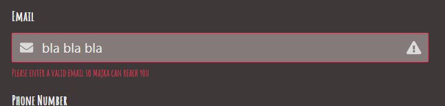
At the end like in the previous validateName() function we have added emailValidated = true and call to the submitCheck() function. ## Submit Button The next and the last element we will be showing is how to make the submit button disabled and only be enabled after the data we want are filled in. So for example we can make the button unclickable unless there is a filled input field name and email, but not the phone and text message, which could be empty. Let's get to the code. 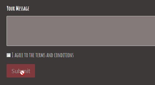
Remember that we have two variables defined by default, nameValidated and emailValidated, and we can use them in the condition to the function submitCheck() - it will be called every time when the input field for name and email is successfully validated. When both are validated and in our variables value is now set to true, the button would be unblocked by removing the attribute ‘disabled’ which has by default.
function submitCheck() {
 const emailParagraph = document.getElementById('emailActionHint')
 console.log(nameValidated, emailValidated)
 if (nameValidated && emailValidated) {

 submit.disabled = false; //button is no longer no-clickable
 submit.removeAttribute("disabled"); //detto
 } else {
 emailParagraph.style = 'display:block' //email warning shows up
 }
}

Conclusion
And that’s it! We successfully designed a simple contact form which can be (and in some form should be) used on any web page. The HTML markup makes correct use of accessibility enhancing attributes. Thanks to the Bulma CSS framework, our form has a neat and elegant look, with icons and colors providing the user with feedback on if the form is filled out correctly. The validation part is possible thanks to our simple vanilla JS script, which uses regular expressions and simple mathematical functions to confirm the data entered is valid.

Top comments (0)