
Whether you’re a designer or a developer working on the user-facing side of things, you have probably noticed how important micro-interactions can be. Let’s think about what micro-interaction is — it is an interaction that revolves around a single moment or use-case, regardless of what is happening in the rest of the app. As such I believe it is important to look at them in a vacuum and see how they work and look by themselves.
This is the first of the series on micro-interactions, and it is going to be fully devoted to the hamburger menu icons, one of the most frequently used elements on the web. We’ll go through the 3 most popular types of motions and how to replicate them in CSS. (With some JS to only toggle a class).
Stack and rotate
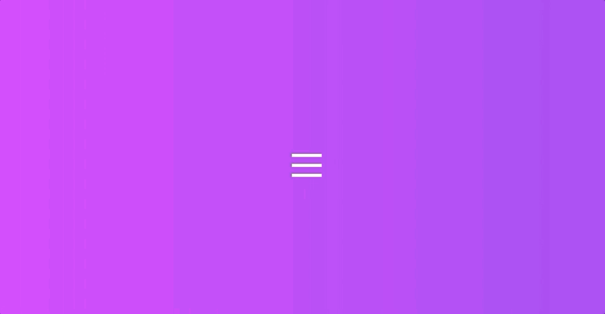
This is one of the most widely used interactions that you can see in many apps and sites, let’s break what happens down.
- Stacking 3 bars on top of each other in the middle
- Hiding one of the bars
- Rotating the 2 visible bars to for an X
- Reverse interaction on close
Let’s start by preparing our HTML, I’ll be using slim since it’s more concise, but of course, you can use either pure HTML or whatever preprocessor you prefer!
We’ll start by drawing the 3 bar elements inside a container. This is the base we will use for most examples:
body
  .hamburger
    .bar
    .bar
    .bar
Now, for the CSS, let's create the base by positioning our bars to look collapsed (default icon):
.hamburger {
  height: 2.3rem;
  width: 3rem;
  display: inline-block;
  cursor: pointer;
  position: relative;
}
.bar {
  border-bottom: 0.33rem solid white;
  position: absolute;
  display: block;
  width: 100%;
  &:first-of-type {
    top: 0;
  }
  &:nth-of-type(2) {
    top: 1rem;
  }
  &:nth-of-type(3) {
    top: 2rem;
  }
}
We'll implement the interaction by toggling a CSS class, here's a short JS that will handle that:
const hamburger = document.querySelector('.hamburger');
hamburger.addEventListener('click', function(){
  hamburger.classList.toggle('opened');
});
Now that the base is ready, let's get straight to the animation, it consists of 2 parts: stacking and rotation. We'll avoid using keyframes and set transition property to trigger at various timings instead, you can pass comma-separated values as type-of-transition duration delay. We'll add this into .opened .bar like so:
transition:
  top 100ms,
  transform 100ms 230ms,
  opacity 100ms;
Time to apply styles to the .opened class, we're going to fade out the middle bar and move and rotate the top and bottom ones to shape a line first, and the X next. We're also going to apply a reverse transition timing for when the X shifts back into a stacked icon.
.opened {
  .bar {
    transition:
      top 100ms,
      transform 100ms 230ms,
      opacity 100ms;
    &:first-of-type {
      top: 1em;
      transform: rotate(45deg);
    }
    &:nth-of-type(2) {
      opacity: 0;
    }
    &:nth-of-type(3) {
      top: 1em;
      transform: rotate(-45deg);
    }
  }
}
To spice it up a little let’s also give our animation that little snap effect by adding transition-timing-function to both .hamburger .bar and .opened .bar
transition-timing-function: cubic-bezier(1, 0.05, 0.62, 1.78);
End result:
Slide and rotate

This interaction is similar to that above, except one might call it more primitive (or efficient!), all animations can be done in 1 step. But let’s see what we should do overall.
- Slide out the middle bar and decrease its opacity
- Rotate the other 2 bars to shape an X
We’ll start with the base from our previous example and go straight to adding effects to bar elements.
The initial position of our bars is the same, what’s different is this time we will add transition: all to simplify our code since there’s no need for multi-step animation, like so
.hamburger {
  height: 2.3rem;
  width: 3rem;
  display: inline-block;
  margin: 0 auto;
  cursor: pointer;
  position: relative;

  .bar {
    border-bottom: 0.33rem solid white;
    position: absolute;
    display: block;
    width: 100%;
    transition: all 350ms;
    transition-timing-function: cubic-bezier(1, 0.05, 0.62, 1.78);
    &:first-of-type {
      top: 0;
    }
    &:nth-of-type(2) {
      top: 1rem;
    }
    &:nth-of-type(3) {
      top: 2rem;
    }
  }
}
We will also tweak our opened class, especially the second element which now needs to slide out to the left and to become transparent:
.opened {
  .bar {
    &:first-of-type {
      top: 1em;
      transform: rotate(45deg);
    }
    &:nth-of-type(2) {
      opacity: 0;
      transform: translateX(-30px);
    }
    &:nth-of-type(3) {
      top: 1em;
      transform: rotate(-45deg);
    }
  }
}
End result:
Flip

A great way to use pre-made custom icons, a flip hamburger button is another thing I see quite frequently. The mechanics are simple, one side had a hamburger icon and another side has a close icon, it flips on click (or on some action).
To make it happen, we first need to adjust our HTML (Slim)
body
  .hamburger
    .hamburger-button
      .icon-opened
        .bar
        .bar
        .bar
    .hamburger-button.hamburger-button-back
      .icon-closed
        .bar
        .bar
This should create two elements, one we’ll style to look like a bar icon, another one will be shaped like an x, with .hamburger-button working as a wrap for the background and inner icon- elements containing our bars. And yes, that is quite a bit of code, but only because we’re creating our icons in CSS, if you use an SVG icon, this should look much simpler!
Now, let’s add our CSS for the outer elements
.hamburger {
  margin: 0 auto;

  &-button {
    border-radius: 100px;
    display: inline-block;
    cursor: pointer;
    background: linear-gradient(to right, #485563, #29323c);
    // the padding along with the inner wrap adds up to 6rem*6rem circle
    padding: 1.85rem 1.5rem;
  }
}
Let's now add our icons. Some things can be combined into a more concise code, but we won't do that here as I want to keep things as easy to understand and follow as possible.
  .icon-opened {
    height: 2.3rem;
    width: 3rem;
    position: relative;
    .bar {
      border-bottom: 0.33rem solid white;
      position: absolute;
      display: block;
      width: 100%;
      &:first-of-type {
        top: 0;
      }
      &:nth-of-type(2) {
        top: 1rem;
      }
      &:nth-of-type(3) {
        top: 2rem;
      }
    }
  }
  .icon-closed {
    height: 2.3rem;
    width: 3rem;
    position: relative;
    .bar {
      border-bottom: 0.33rem solid white;
      position: absolute;
      display: block;
      width: 100%;
      &:first-of-type {
        top: 1em;
        transform: rotate(45deg);
      }
      &:nth-of-type(2) {
        top: 1em;
        transform: rotate(-45deg);
      }
    }
  }
At this point, you should have two icons sitting next to each other, like this.

Once we got here, we can now start working on animation, the JavaScript code is the same as we used before, simply toggling a class on our outer .hamburger element. We will make use of CSS 3D transform properties and positioning.
First, we need to flip the X icon and place it on the backside of the button. To do so we will absolute position the .hamburger-button elements, and add a transform property to our -back element. We will also add backface-visibility: hidden;, the property name should sound pretty self-explanatory, but it hides the backside of an element, it is normally applied to ‘flippable’ elements to prevent flickering caused by z-indexing and layer glitches.
 &-button {
    border-radius: 100px;
    display: inline-block;
    cursor: pointer;
    background: linear-gradient(to right, #485563, #29323c);
    // the padding along with the inner wrap adds up to 6rem*6rem circle
    padding: 1.85rem 1.5rem;
    position: absolute;
    top: 0;
    left: 0;
    backface-visibility: hidden;
    &-back {
      transform: rotateY(180deg);
    }
  }
We will also add pre-defined dimensions and transition properties to our main .hamburger element, as well as transform-style: preserve-3d to make sure that the nested elements are also rendered in 3d space.
.hamburger {
  margin: 0 auto;
  width: 6rem;
  height: 6rem;
  transition: all 300ms ease-in;
  transform-style: preserve-3d;
}
The only thing left to do now is flip the entire .hamburger element when the opened class gets added!
End result:
These 3 micro-interactions can be done fully in CSS without SVG or any JS libraries, and although pretty simple, they can be adjusted to look more smooth or complex with some extra-rotation, transition timing, and other properties. If you look around the web you will notice that most hamburger icons will use one of the above as a basis for their interaction, and rightfully so! The above eliminates any need to use keyframes or fancy libraries while providing a simple solution. Are you aware of any other easy-to-replicate hamburger icon interactions? If so, would love to hear about those too!


Top comments (4)
My favorite was second one, looks really good, and not a fan of last one. Saved to reading list
That's simply wonderful
Thanks, Gopal! Glad you liked it 😊
Thank you, Waqar!
I'll do my best to write another small tutorial in the next couple of weeks seeing that this one got so much attention. 😃