
Creating a bar chart is not that difficult, or is it? Today, we are going to dissect the basic elements of a bar chart and create it from the ground up using D3.js. It’s pretty easy to copy bits and pieces and construct a bar chart. But, the motivation behind this post is to cover the concepts behind creating a bar chart.
You can clone the finished version of this tutorial -D3 Bar Chart repo
I will be using D3.js v5.16.0 which is the latest version of as of yet. Before jumping into coding, first, we need to understand what is the anatomy of a D3 chart.
Anatomy of a D3 Bar Chart
Again, I’m going to keep this as simple as possible. We won’t be covering stuff like calling a Web API, loading a CSV, filtering, cleaning, sorting etc. D3 uses SVG and its coordinate system under the hood - i.e. 0px, 0px are at top left corner.
So, let’s start with a blank SVG and set its width and height.
HTML Structure
<!DOCTYPE html>
<html lang="en">
<head>
  <title>D3 Playground</title>
  <style>
    svg {
      background-color: #ccc;
    }

    rect {
      stroke: black;
      stroke-width: 0.5px;
    }
  </style>
</head>
<body>
  <script src="https://cdnjs.cloudflare.com/ajax/libs/d3/5.16.0/d3.min.js"></script>
  <svg></svg>
  <script>// Our code goes here</script>
</body>
</html>
Now we will add our initial JS code to set things up.
var data = [1, 2, 3, 4, 5];
var width = 800, height = 300;
var margins = {top: 20, right: 20, bottom: 20, left: 20};

// Create the SVG canvas
var svg = d3.select('svg')
            .attr('width', width)
            .attr('height', height);
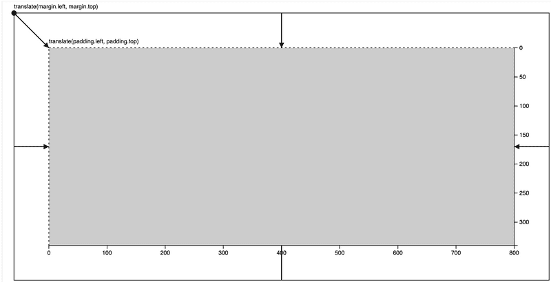
Following diagram shows the key elements we will be having in our bar chart.

Scales
Now we let’s set a scale to our data across x and y axes. By using scales, we can define how each data element can be mapped to pixels on the screen.
Let’s create our scale for x axis,
var xScale = d3.scaleBand()
    .domain([0, 1, 2, 3, 4])
    .range([0, width - (margins.left+margins.right)]);
scaleBand is used when you have ordinal values for your axis. So, it will take any amount of ordinal values in the domain function and spit out values specified in the range function. The reason why we deduct the margins is that we need our bars to fit within the margins of our chart. We will now get values from 0px to 760px.
And the scale for y axis,
var yScale = d3.scaleLinear()
    .domain([1, 5])
    .range([margins.top, 100]);
Since our y axis is going to have quantitative continuous values, we choose the scaleLinear function to map our y values. In our dataset, the min is 1 and the max is 5. So we provide 1 and 5 as an array into the domain. Now our range is from 10px to 100px. Why 100px? Just bear with me on this one.
Now let’s add some margins around in our SVG canvas. Otherwise, you will see clipping and other sorts of problems when you have data on your chart. For this we can use a SVG group element and a transformation.
svg.append('g')
  .attr('transform', 'translate('+ margins.top +','+ margins.left +')')
This is clearly visualised in Mike Bostock’s Observable notebook.
Let’s add the rest of the code to draw the bars.
svg.append('g')
  .attr('transform', 'translate('+ margins.top +','+ margins.left +')')
  .selectAll('rect')
  .data(data)
  .enter()
  .append('rect')
    .attr('x', function(d, i) {
      return xScale(i); // We only need the index. i.e. Ordinal
    })
    .attr('y', function(d, i) {
      return yScale(d); // We need to pass in the data item
    })
    .attr('width', xScale.bandwidth()) // Automatically set the width
    .attr('height', function(d, i) { return yScale(d); })
    .attr('fill', 'lightblue');
In the above code, we have put our bars into a element to group them so that we can transform them easily. Since we are using translate method, it will add 10px to x and y coordinates of each element we will be drawing inside it. The rest of the code works according to D3 data joins.
Let’s run this and see,
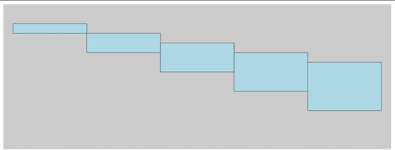
Our DOM looks likes this now,
<svg width="800" height="300">
  <g transform="translate(20,20)">
    <rect x="0" y="20" width="152" height="20" fill="lightblue"></rect>
    <rect x="152" y="40" width="152" height="40" fill="lightblue"></rect>
    <rect x="304" y="60" width="152" height="60" fill="lightblue"></rect>
    <rect x="456" y="80" width="152" height="80" fill="lightblue"></rect>
    <rect x="608" y="100" width="152" height="100" fill="lightblue"></rect>
  </g>
</svg>
Oops, why is it like upside down? Remember that the SVG coordinates start from the top-left corner. So everything gets drawn relative to that point. Which means we need to change the range of our y values. Let’s fix this.
var yScale = d3.scaleLinear()
  .domain([1, 5])
  .range([height - (margins.top+margins.bottom)*2, 0]);
Wait, what’s this calculation? We are basically setting the max and min values for our y range. In other words, we need our max y value to go up until 220px because we need to account for the height of the bar as well.

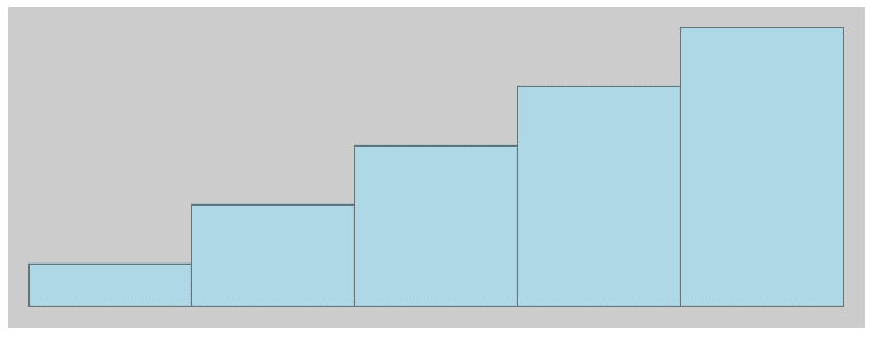
Almost there, but the heights look weird. That’s because we changed our y scale. Now, let’s fix the height.
.attr('height', function(d, i) {
  return height - (margins.top+margins.bottom) - yScale(d);
})
Remember, we need to deduct the top and bottom margins from the total height so that whatever the value we get from yScale will not exceed that boundary.
Cool, now we are getting somewhere 😁
Axes
D3’s axes API is pretty straight forward. You can utilise that to add horizontal and vertical axes to any graph. To wrap up our bar chart, let’s add the axes.
X axis
svg.append('g')
  .attr('transform', 'translate('+ margins.left +','+ (height - margins.top) +')')
  .call(d3.axisBottom(xScale));
Y axis
svg.append('g')
  .attr('transform', 'translate('+ margins.left +','+ margins.top +')')
  .call(d3.axisLeft(yScale));

Looks okay, but the axes are a bit off. So let’s fix that.
var margins = {top: 30, right: 30, bottom: 30, left: 30};
Simple! When creating a graph in D3 always remember to use variables when possible so that you can easily fix if something’s not looking good.
And we are done!

Great! and we are done ✅

Top comments (1)
Thank you :-)