
This is an on-going series of simple tips and tricks for developers who want their work to look beautiful and professional.
In the first part, I’ll start with the very basic technique that you can apply to your UIs to make them look clean and modern.
The design Mindset
Everyone can be a designer. Design is to solve a problem and developers, architects, and engineers are problem solvers. Everyone can design, they just need a design mindset.
When developers wear a designer’s hat, they need to think of the users and their experiences. It’s all about finding intuitive ways of solving the problem at hand. Forget about the performance, architecture & frameworks just for a while and think about the users who will be interacting with what you are developing.
In this series, I will be focusing more on visuals and aesthetics that play an important role in bringing clarity to a product.
Let’s get started.
Part 1 — Background and Foreground
The easiest and fastest way to clean up a UI is to adjust the background and foreground colors.
Foreground: use lighter colors
Background: User darker colors
Some colors that look good for Background:
F4F8F9

EDF2F6

DDEEFC
Foreground color to use with above:
FFFFFF
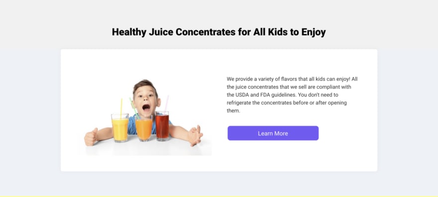
On a grey background, use a white foreground card or container for a clean and minimal effect. Use border radius of 4–6px and slight box-shadow or light grey border for an enhanced effect
Here is an example

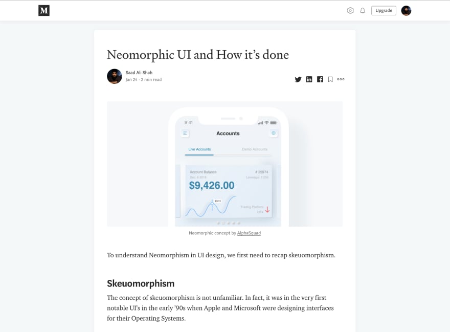
Let’s try this on medium.
Body:
background: #F4F8F9;
Content:
background: #FFF;
box-shadow: 0 0 13px 0 rgba(82,63,105,.05);
border-radius: 6px;
This is a part of minimal styling where we achieve the following:
- Adding white content area on a slightly darker background gives a clean and minimal look
- Increase the readability of the content
Part 2: Buttons

Latest comments (0)