
Hey, this is my first post at Dev.to!!
Motivation
I'm a developer but not a professional React (or Web) developer. I've still developed small open source web apps before though because I like Web (tech)!. One of them is called Galley which was developed in 2017 (why does it feel so old... 😭) and it was for helping my YAML engineering back then.
Although it was not quite a complex app, I enjoyed developing it by learning and using the new tech like React, ReasonML, Grommet, RxJS,and others.
I'm currently a full-time DevOps Engineer working with Kubernetes & Helm and other DevOps tools such as Terraform.
I recently came up with an idea to build an open-source tool that would help to debug Helm (template) development (to be more efficient at YAML engineering 😅).
the tool that I mentioned that I wanted to build is actually quite irrelevant for the rest of the post so we can focus on setting the ground up React component dev environment here
Getting started
Instead of planning the "perfect" app design first, I wanted to develop the idea further by actually building it.
UI stuff
I'm not following very closely with bleeding-edge web tech. So I chose React for a safe bet. I used create-react-app for the first time to kick start quickly.
$ yarn create react-app darkbook
This time I wanted to use a different React UI framework than Grommet. I chose Chakra UI after some research because it:
- supports dark mode
- looks nice out of the box
- has no CSS dependencies
UI first approach for prototyping
Unlike what I did for Galley, I wanted to work on UI parts first before working on any real business logic so that I can concern less of other stuff and focus better on prototyping to enable me to feel what would an app actually could look like.
At first, I considered using a testing library just because of the white background of the web page was too bright for me at night - Yeah, my open sourcing activity is happening mostly at night when I'm free of day time duties ✌🏼.
also because initially, I struggle to get started with Chakra UI with a dark mode which you will see later
After a while, I quickly realized that the testing library isn't really for visual development. So I started looking for alternatives and eventually I was considering Storybook for the first time.
Every new stuff can be intimidating at all different levels. To overcome this, I first made myself familiar with Storybook by going through an official tutorial and it was easy and simple enough to follow. Storybook itself also supports dark mode which is another great point!
After the tutorial, I integrated it into the app I just generated with create-react-app earlier.
$ cd darkbook
$ npx -p @storybook/cli sb init
$ yarn storybook
Commands above will open the basic light-themed Storybook web page.
I played with some code files under
src/storiesto understand how it actually works and I discovered that Storybook is quite well structured and easy to use even though it was new to me.
I also added manager.js to enable the dark mode on Storybook.
// .storybook/manager.js

import { addons } from '@storybook/addons';
import { themes } from '@storybook/theming';

addons.setConfig({
  theme: themes.dark,
});
Working with Chakra UI
If you are not familiar with it, I encourage you to visit the website. It looks quite nice.
I will be honest with you though. Even though it looked nice and the documentation initially seemed fine enough, later I actually struggled quite a bit. Especially when I was trying to enable the dark mode by default.
And that struggle was actually why I decided to post this article hoping this post might be helpful for the first time Chakra UI users like me.
The glimpse of struggles
which you can skip if you are not interested to hear about
I followed the getting started page which essentially running this:
# I recommend you not to do this though and you will see why
$ npm install @chakra-ui/core @emotion/core @emotion/styled emotion-theming
And tried to enable the dark mode by default by following this page, https://chakra-ui.com/color-mode.
However, I couldn't find the way to do it except for toggling the light and the dark mode (which I didn't want)
After trying and looking at this and that, I finally discovered this issue, which shows a history of struggles of others as well for enabling dark mode by default. And it also was a hint that indicating it might be dealt with the version 1.0.
So I started looking at Releases page and found the pre release.
This pre-release looked much more promising than the current stable version and the instruction made more sense so I followed the instruction from it.
Getting actually oriented with Chakra UI
I basically installed Chakra UI like this instead.
$ yarn add @chakra-ui/core@1.0.0
You will probably be prompted to choose the correct version and I chose
1.0.0-next.2which was the latest pre-release at the time of writing this post.
To enable the dark mode for every Story, I added preview.js.
// .storybook/preview.js
// which is modified off from https://github.com/chakra-ui/chakra-ui/blob/657103491bc70194fdd62dcf6ef7e16648c2a6c3/.storybook/preview.tsx

import CSSReset from "@chakra-ui/css-reset"
import theme from "../src/chakra"
import { ChakraProvider, Box } from "@chakra-ui/core"
import { addDecorator } from "@storybook/react"
import * as React from "react"

const newTheme = {
  ...theme,
  config: {
    initialColorMode: "dark",
    useSystemColorMode: false,
  }
}

export const Chakra = ({ children }) => (
  <ChakraProvider theme={newTheme}>
    <CSSReset />
    <Box p={5}>
      {children}
    </Box>
  </ChakraProvider>
)

addDecorator(StoryFn =>
  <Chakra>
    <StoryFn />
  </Chakra>)
.storybook/preview.js basically allows you to have the "layout" page for every Story. Now it feels like we are going somewhere.
Not so fast. Don't forget to actually fetch the theme.
# in ./src
$ npx chakra-cli init --theme
You will see there is a lot of files downloaded that are required to be committed to your own repo and supposedly this will make it a lot easier to customize your own theme according to the Chakra UI and I agree with it too.
Although this can be a bit of bad news for minimalists like me since I also didn't plan to change much of the theme yet. Perhaps let's ignore this issue and be generous about it for now.
We are almost there. It's time to make a few changes to stories to actually use Chakra UI components
# src/stories/1-Button.stories.js
-import { Button } from '@storybook/react/demo';
+import { Button } from '@chakra-ui/core';
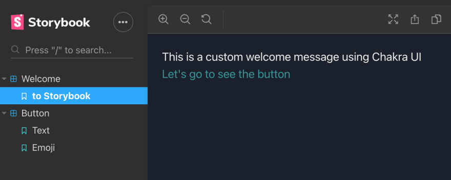
# src/stories/0-Welcome.stories.js
-import { Welcome } from '@storybook/react/demo';
+import { Box, Link } from '@chakra-ui/core'
+
+const Welcome = ({showApp}) => (
+ <>
+ <Box>
+ This is a custom welcome message using Chakra UI
+ </Box>
+ <Link onClick={showApp} color="teal.500">
+ Let's go to see the button
+ </Link>
+ </>
+)
Was it enough?
Yes, it was!
<Welcome />
<Button /> with text
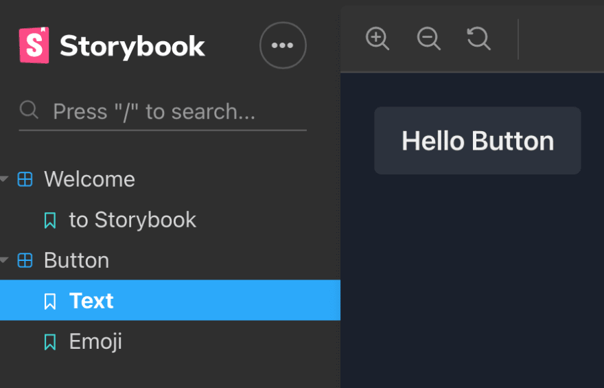
<Button /> with emoji

This means I finally managed to fully set up the environment that I can develop UI components in a way it's completely dark-themed!!!
Here is the repo that you can take a look for the code and commits in case you want to.
Wrapping up
- Storybook wasn't much of overhead even though it was a new tool to me
- enabling dark mode was much more of a (mental) hassle than I thought but I'm quite happy now that it works!
- I'm quite excited to create all the new components and get my hands dirty with all these tools
Misc.
if you don't see stories that have a dark background, make sure to try different browsers.
In my case, Safari kept resetting the page back to the light mode after few milliseconds somehow. So I switched to chrome and worked.
Also, you might need to refresh the page or restart the storybook.
That's it for now and thanks for reading!

Latest comments (1)
That is pretty awesome!
Now we just need to fork github.com/echoulen/storybook-addo... and make a "Theme Switcher" for chakra-ui, so we can also test the light mode!