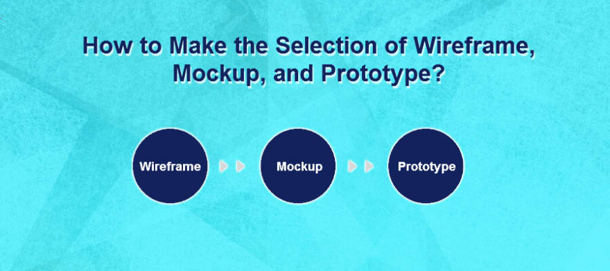
Why is a wireframe simple to understand than a mockup? And how closely a prototype resembles the actual project? Are all of these same or there are some hidden details that need to be read before outlining the project? After all, they look like a greyish-black pencil sketch, which conveys the same ingenious idea!

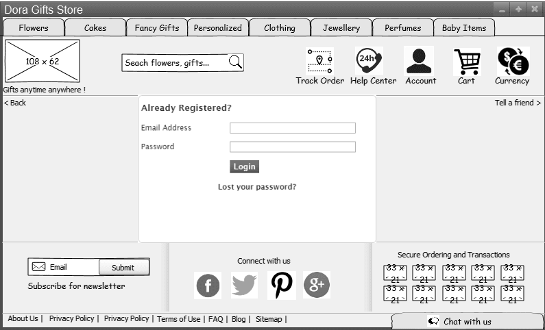
Wireframes (Sketchy, greyish representation of interface)
The design team does not have to spend too much time in looking into details, as it is always a pain to read through an entire website. A wireframe will give you a clear picture of how the future website design will pan out. It is the low fidelity representation of the design.
Why should you wireframe?
You must be aware of the potential benefits that wireframing brings along with it.
• Even a very sketchy greyish wireframe gives an idea of how the future website is likely to be.
• Apart from this, your wireframe is likely to give you an idea of the target audience of the final website.
• Further, these wireframes will help in client validation and approval as they will help re-define certain specifications for the web interface.
• Needless to say, sketching out a website and asking for user inputs there and then helps in reducing developmental effort, cost and time.
It is also important to consider that wireframes are not foolproof and do not always convey the right scenario. You can further refine them by adding some more accurate details, which will make them identifiable and precise. It is likely that grey boxes and sketches are not able to convey everything about how a user interface should be like. The mix of colors followed by structuring out font size and style is not always possible with the wireframes. It is likely that your client does not perceive the whole idea of wireframe and might simply disagree with the main objective.
Mockups (Interactive)
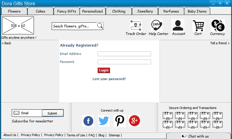
Add some preciseness, colors, and details in wireframes and they become mockups. They are closer to the actual website and are capable of convincing the client in a much better way. Adding to overall visual richness, mockups help in highlighting the essential features of the wireframes.
Certain benefits that mockup brings up with them:
• Mockups help find errors easily and allow for easy and quick revisions.
• These will also give you an idea of the visual hierarchy, color, design, font style, font size, picture placement, graphics and text placements in advance.
• Mockups are good at catching the nerves of the clients and conveying the idea just as they wish to hear.
But these will not be able to convey the right message if they are not introduced at the right time. They can be problematic if introduced too early. They belong to the entire team and all stakeholders must equally participate in creating, testing and commenting on them.
Prototypes (Static Visualization)
Where a wireframe can be considered as an architectural blueprint of a building or a website, a prototype is like a display house or a sample website. It is the closest to the final website. It is the high fidelity representation of the design. Add some more graphics, few animations, highlight the font, add clickable buttons, drop-downs, adjust the text style in your mockups and you are done with your prototype. It’s the complete website without the functionality, which will give you a feeling of using the real app. You can use these prototypes during user testing. It is good to check the simulations of the final interactions for usability of the interface before commencing with the actual development process. Making the interface more tangible and straightforward, prototypes are the most engaging form of design.
Most of the Mobile App Development Companies in India are in process of creating all three designs before proceeding towards actual development in the lure to save substantial cost, time and effort. All of these make sense and bring you a step closer to the actual design.


Top comments (0)