
Hey front end developer! Are you working on your React.js skills? Looking for a project that uses React Hooks? If you’re wanting to learn how to build an Accessible React Carousel with multiple items from scratch, one that’s accessible, translation ready, and inclusive you’re in the right place.
Estimated reading time: 10 minutes

The Accessible React Carousel Project
The Idea behind this build is a React accessible carousel built to have an easy and friendly experience for any user using any device.
The accessible React carousel tackles these specific problems that different users face:
Creating a visual experience for sighted users
Creating an audio experience for non-sighted, or less-sighted users
Building a Translation ready project for sighted, non-sighted, or less-sighted users who don’t speak English
Built in animation consent for users with vestibular, or sensory impairments.
Color, iconography, and labeling for cognitive ease.
This React accessible carousel comes out of the box with features that allow sighted and non-sighted users to experience it equally. The carousel is built to be interacted with for people consenting to interact with it.
In other words, folks who deal with sensory, or balance issues won’t be forced to see movement when the carousel first loads. Instead, they get to choose whether they want to interact with the carousel or not.
All of the features of this carousel are translation ready so anyone with a translation service will be able to experience this carousel visually or not.
Check out the build here, and see it in action right here.
Key Concepts
- Focus Management & Feedback – In this project I was thinking about keyboard focus and how I can use it to provide feedback to users who access my carousel from different devices.
👀 Check out how I use focus to instruct users on what to do.
👀 Check out how I incorporate that focus into the feedback.
- Consent – For some users unanticipated motion can cause discomfort and agitation. Those are not ideal reactions to something you’ve built, so why not provide your users a way to choose whether or not they want to interact with motion?
👀 Check out how I manage consent in the Carousel Gallery Controls.
App Component
The major elements we’re going to cover in the App Component are the Slide Component, Instructions, and Gallery Controls. As you can see in the image below, we have
5 Slide Components within an unordered-list element.
Below the [aria-labelledby=”gallery-label”] element is the instructions div
Below that is our gallery-controls div where we are using Buttons Components.

State and Function of the App Component
The App Components uses the useState() React Hook on the main element to handle Mouse Touch events for mobile users. The point behind this use of state is to ensure that our labeling of the Instruction Component will work appropriately on mobile and not just on desktop.
We define the use of state like this:
const [touched, setTouched] = useState('');
We set the state on the main element like this and call an onTouchStart function:
Next, we create the onMainTouchStart function which will add a class name to the main element when touched:
const onMainTouchStart = () => {
    setTouched('touched');
}`
Styling the touched class
We add the following style which is going to make a lot more sense when we build the instruction component:

`.touched #hover {
    display: block!important;
}
Focus Management
For the [aria-labelledby='gallery-label'] element, we are adding a tabIndex attribute of 0. This allows the user to navigate to the body of the carousel component.
When the keyboard is focused on this element, the instructions will print out a different message than if the user mouses over it. That helps the message be clearer depending on the device.
<div role="region" aria-labelledby="gallery-label" tabIndex="0" aria-describedby="focus">`

##Instructions
The instructions div contains a paragraph tags that explain to the user how to interact with the accessible carousel.

##Instruction HTML
    `<div className="instructions">
        <p id="hover">use buttons or scroll left or right for more</p>
        <p id="focus">use buttons, tab, or your left and right arrow keys for more</p>
    </div>
Instruction CSS
Next, we need to style each of these paragraphs so only the correct instructions appear depending on the device and interaction from the user. We start by setting the display to none on the hover and focus messages.
Then we include the :hover and :focus sudo classes and the .touched class we talked about earlier to display when the gallery-label element is either hovered by a mouse, focussed on by a keyboard, or touched by a touch device.
#hover, #focus {
    display: none;
    text-align: center;
    max-width: 50%;
    word-break: break-word;
    margin: 10px auto;
}
[aria-labelledby="gallery-label"]:hover + .instructions #hover,
[aria-labelledby="gallery-label"]:focus + .instructions #focus,
.touched #hover {
    display: block!important;
}
When the keyboard focuses on the [aria-labelledby="gallery-label"] element, the paragraph explains to the user to use the buttons, tab key, or the left or right arrow buttons.
If the user is using the mouse or a touch screen and focuses on this element, the paragraph tells them to use the buttons or scroll left or right.
This is partially the Key Concept of Feedback, and partially the concept of Focus. How the user accesses the component will inform the type of instructions they’re given.

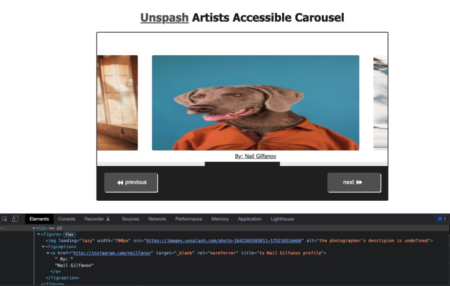
Slide Component
The Slide Component is made up of a list item, figure, image and linked figcaption. The idea behind this component is a gallery of image items. We could change these to be whatever we want, like a post carousel, but for the purposes of this tutorial we’re doing an image gallery.
Below we see the list item, figure, img, figcaption etc that all make up a Slide Component:
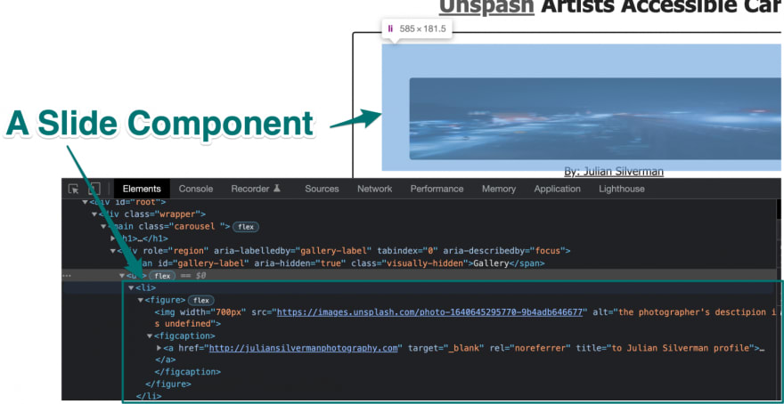
According to the Unsplash API documentation, the gallery should have a link back to the artist’s profile. There are some other required items to include here.
To make the gallery accessible, the images should include an alt description too. Some artists on Unsplash incorporate alt descriptions, and using the Unsplash API, you can pull that information into a prop.
The gallery item should also include:
- the image url
- the artists name
- whether or not the image should be lazyloaded in
We’re going to use chrome native lazy loading to help speed up the load time of our carousel. Images in the initial paint shouldn’t be lazy loaded. Since I designed the carousel to show the first two images by default, I left out the lazy loading attributes on the first two Slide Components.
Props of the Slide Component
The props of the Slide Component are as follows;
We pass the {url} prop to the image file
the alt attribute gets the {description} prop
the artist’s name is the {caption} prop
the artist’s link as the {user} prop
import React from "react";
const Slide = ({url, description, caption, user, loading}) => {
return (
<li>
    <figure>
        <img loading={loading} width="700px" src={url} alt={`the photographer's desctipion is ${description}`} />
        <figcaption><a href={user} target="_blank" rel="noreferrer" title={`to ${caption} profile`}> By: {caption}</a></figcaption>
    </figure>
</li>
);
}

export default Slide;
Once the slide has been incorporated into the App Component and we have defined these props from the Unsplash API, we end up with a list item that looks something like this:
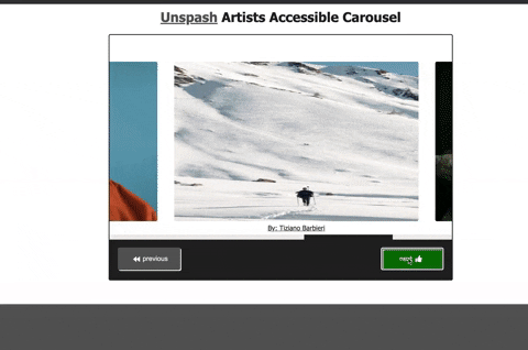
Gallery Controls
We make up the Gallery Controls with two list items containing toggle buttons. The buttons scroll the carousel for the user. You may have noticed by now that this carousel doesn’t scroll automatically. That’s intentional.
Managing Consent
Fast paced movement can actually cause physical pain and discomfort for some users. Giving the users complete control to move the gallery when they want to is the more inclusive way to design these types of elements.

Incorporating the Button Components
Check out my accessible toggle buttons post here to learn how to build these highly reusable components. I’ve taken these buttons and placed them within the same App Component file.
Props of the Buttons Component
If you checked out that tutorial, you may have noticed that I’ve changed the way the Props work in the Buttons components in this project.
The Buttons component needed the following props:
- {label} for the button text and classname,
- {fontIcon} for the appropriate Font Awesome icon,
- {ariaButton}to control the state of the aria-pressed attribute, and
- {onEvent} to create unique event handling for the button’s use.

Include the Button Component in the same file as the App Component:
const Buttons = ({label, fontIcon, ariaButton, onEvent}) => {
    return (
        <div className="button-section">
        <button onClick={onEvent} className={label} aria-pressed={ariaButton} type="button">{fontIcon}{label}{fontIcon}</button>
        </div>
            );
}
I realized I needed my previous and next buttons to perform different tasks. The previous button needed to scroll to the left and the next needed to scroll to the right. I was also able to refactor these buttons so the fontIcon prop could call the icon necessary for the button (ie. for the previous button the faIconPrev icon).
Utilize State for the Button Components
We are defining state for the aria-pressed attribute to handle the function and styling of our button.
The faIconNext and faIconPrev states define the Font Awesome Icon we’ll be using for the button.
//button hooks
    const [ariaPressed, setAriaPressed] = useState(false);
    const [faIconNext, setFaIconNext]           = useState(<FontAwesomeIcon icon={faForward} />);
    const [faIconPrev, setFaIconPrev]           = useState(<FontAwesomeIcon icon={faBackward} />);
Utilize Scroll Functions with the UseRef Hook
In the App component, define the galleryRef:
const galleryRef            =   useRef();
Back on the aria-labelledby="gallery-label" element, we utilize this ref:

<div ref={galleryRef} role="region" aria-labelledby="gallery-label" tabIndex="0" aria-describedby="focus">
Scroll Functions
Inside the App Component, I create the scrollNext, and scrollPrev function to scroll to the left or right respectively using the galleryRef element:
const scrollNext = () => {
    galleryRef.current.scrollBy({
        top: 0,
        left: 625,
        behavior: 'smooth'
      });
}
const scrollPrev = () => {
    galleryRef.current.scrollBy({
        top: 0,
        left: -585,
        behavior: 'smooth'
      });
}
OnClick Button Events
We define the onEvent prop for each button from the Buttons Component:
        <li>
        <Buttons ariaButton={ariaPressed} onEvent={onButtonPrevClick} fontIcon={faIconPrev} label="previous" />
        </li>
        <li>
        <Buttons ariaButton={ariaPressed} onEvent={onButtonNextClick} fontIcon={faIconNext} label="next" />
        </li>
Next inside the onButtonNextClick and onButtonPrevClick functions we’ll call the scrollNext or scrollPrev functions respectively, and set the state for the font icon.

//next click
const onButtonNextClick = () => {
    scrollNext();
   if (ariaPressed === false){
        setAriaPressed(true);
       setFaIconNext(<FontAwesomeIcon icon={faThumbsUp} />);
       setTimeout(() => {
        setAriaPressed(false);
        setFaIconNext(<FontAwesomeIcon icon={faForward} />);
     }, 600);
     console.log("button clicked");

   } else {
      setAriaPressed(false);
      setFaIconNext(<FontAwesomeIcon icon={faForward} />);
}
}
//prev click
const onButtonPrevClick = () => {
        scrollPrev();
    if (ariaPressed === false){
         setAriaPressed(true);
        setFaIconPrev(<FontAwesomeIcon icon={faThumbsUp} />);
        setTimeout(() => {
         setAriaPressed(false);
         setFaIconPrev(<FontAwesomeIcon icon={faBackward} />);
      }, 600);
  console.log("button clicked");
    } else {
       setAriaPressed(false);
       setFaIconPrev(<FontAwesomeIcon icon={faBackward} />);
 }
 }
What we end up with is cohesive and exact button behavior for each of our buttons.
Conclusion
Hopefully now you have the basic building blocks you need to build any kind of Accessible Carousel with React.js.
A wider audience of users will be able to utilize and enjoy your React accessible carousel.
Some key concepts covered were how to create visual feedback based on the device and current usage. We utilize color, iconography, and labeling for easier cognitive load for sighted users. We widened our audience by incorporating labeling for users who aren’t sighted and who may not speak English. And by incorporating focus management and consent into the build, our Accessible React Carousel is inclusive of all types of users.
Photo by Serge Kutuzov on Unsplash
Looking for more React projects? Check out how to make an accessible To Do List and how to create Accessible Toggle Buttons.


Top comments (2)
Very helpful breakdown! Great post
Thank you so much!