

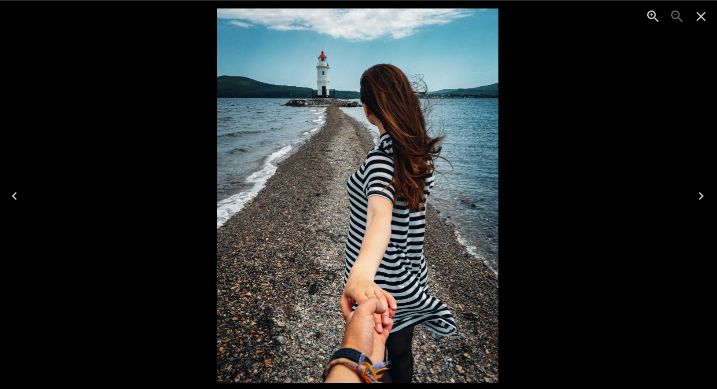
In this article, we'll explore how to create a beautiful image gallery with a lightbox using Next.js and the "yet-another-react-lightbox" library. The lightbox will allow users to view larger images in a modal when clicking on the thumbnails in the gallery. This simple and elegant gallery will enhance the user experience and make your website more visually appealing.
Prerequisites
Before we begin, make sure you have the following installed:
Node.js and npm (Node Package Manager) - You can download them from the official Node.js website.
Next.js 13.4 or later - If you don't have it installed, you can create a new Next.js project with npx create-next-app or update your existing project to the latest Next.js version.
Installing the Required Packages
To get started, we'll need to install the necessary packages for the image gallery and lightbox:
npm install react react-dom yet-another-react-lightbox react-icons
Setting Up the Gallery Component
Now, let's create a new file called Gallery.js in the Components folder of your Next.js project. This file will contain the code for our image gallery:
// Components/Gallery.js
import React, { useState } from "react";
import { AiOutlineExpandAlt } from "react-icons/ai";
import Lightbox from "yet-another-react-lightbox";
import Zoom from "yet-another-react-lightbox/plugins/zoom";
import "yet-another-react-lightbox/styles.css";

const Gallery = () => {
  const [open, setOpen] = useState(false);
  const [image, setImage] = useState("");

  const galleryTab = [
// you can add more image if you want
    {
      imageUrl: "https://themewagon.github.io/snapshot/images/model-1.jpg",
      type: "Nature",
      title: "Beautiful Work",
    },
    {
      imageUrl: "https://themewagon.github.io/snapshot/images/model-2.jpg",
      type: "Nature",
      title: "Beautiful Work",
    },
    {
      imageUrl: "https://themewagon.github.io/snapshot/images/model-3.jpg",
      type: "Nature",
      title: "Beautiful Work",
    },
    {
      imageUrl: "https://themewagon.github.io/snapshot/images/model-4.jpg",
      type: "Nature",
      title: "Beautiful Work",
    },
    {
      imageUrl: "https://themewagon.github.io/snapshot/images/model-5.jpg",
      type: "Nature",
      title: "Beautiful Work",
    },
  ];


  const slides = galleryTab.map((item) => ({
    src: item.imageUrl,
    width: 3840,
    height: 2560,
    srcSet: [
      { src: item.imageUrl, width: 320, height: 213 },
      { src: item.imageUrl, width: 640, height: 426 },
      { src: item.imageUrl, width: 1200, height: 800 },
      { src: item.imageUrl, width: 2048, height: 1365 },
      { src: item.imageUrl, width: 3840, height: 2560 },
    ],
  }));

  return (
    <div className="w-full">
      <div className=" ">
        <div className="flex flex-col md:grid md:grid-cols-3 h-full gap-0 flex-wrap mx-2 md:mx-0">
          {galleryTab.map((x, index) => {
            return (
              <div key={index} className="md:h-[50vw] h-screen relative">
                <div className="group h-full">
                  <div
                    className="bg-cover bg-center h-full w-full bg-no-repeat"
                    style={{ backgroundImage: `url("${x.imageUrl}")` }}
                  >
                    <div className="text-3xl text-white absolute bottom-0 left-2 z-10">
                      <div>{x.type}</div>
                      <div>{x.title}</div>
                    </div>
                  </div>
                  <div
                    className="bg-black opacity-0 group-hover:opacity-75 absolute inset-0 flex items-center justify-center transition-all duration-300 ease-in-out"
                    onClick={() => {
                      setOpen(true);
                      setImage(x.imageUrl);
                    }}
                  >
                    <p className="text-white">
                      <AiOutlineExpandAlt className="text-5xl border w-16 h-16 bg-neutral-500 hover:bg-white hover:text-black p-3 cursor-pointer rounded-full" />
                    </p>
                  </div>
                </div>
              </div>
            );
          })}
        </div>
      </div>
      <Lightbox
        open={open}
        close={() => setOpen(false)}
        plugins={[Zoom]}
        showPrevNext={false}
        slides={slides}
      />
    </div>
  );
};

export default Gallery;
In the above code, we've created the Gallery component that renders a grid of images with an expand icon overlay. When users click on the expand icon, the lightbox will open and display the selected image.
Implementing the Gallery on the Home Page
Next, let's integrate the Gallery component into our home page (app.js):
In this code, we've imported the Gallery component we created earlier and used it in the Home functional component. When you run your Next.js project and navigate to the home page, you should see the image gallery with thumbnails.
Conclusion
Congratulations! You have successfully implemented an image gallery with a lightbox in your Next.js project. Users can now click on the thumbnail images to view them in a larger modal, providing a better user experience for exploring your beautiful images.
Feel free to customize the styles and add more features to enhance the gallery further. You can extend the gallery by adding options like prev/next buttons in the lightbox or adding captions to the images. The "yet-another-react-lightbox" library provides various plugins that can help you achieve additional functionalities.
Now you can showcase your stunning images and captivate your audience with this eye-catching image gallery in your Next.js application! Happy coding!

Top comments (0)