How to create a Website Using HTML and CSS Only
Creating a website from scratch can be an exciting project for anyone with an interest in web development. One of the most basic and fundamental ways to start building a website is by using HTML and CSS. HTML (HyperText Markup Language) is used to structure and define content on a webpage, while CSS (Cascading Style Sheets) is used to add style and design to that content.
Building a website using only HTML and CSS may seem daunting at first, but it’s a great way to learn the basics of web development. By using these two languages, you can create a website that is fully functional and visually appealing without the need for any other programming languages or frameworks.
 on [Unsplash](https://unsplash.com?utm_source=medium&utm_medium=referral)](https://res.cloudinary.com/practicaldev/image/fetch/s--JjLiEaau--/c_limit%2Cf_auto%2Cfl_progressive%2Cq_auto%2Cw_880/https://cdn-images-1.medium.com/max/12000/0%2Ax9s4v9U-nbp8cIeZ)
To get started, you’ll need a text editor and a web browser. There are many text editors available, but some popular choices include Notepad++, Sublime Text, and Visual Studio Code. Once you have your text editor set up, you can begin writing your HTML and CSS code.
Points to be discussed
Preview
YouTube Tutorial
Folder Structure
HTML Code
CSS Code
References
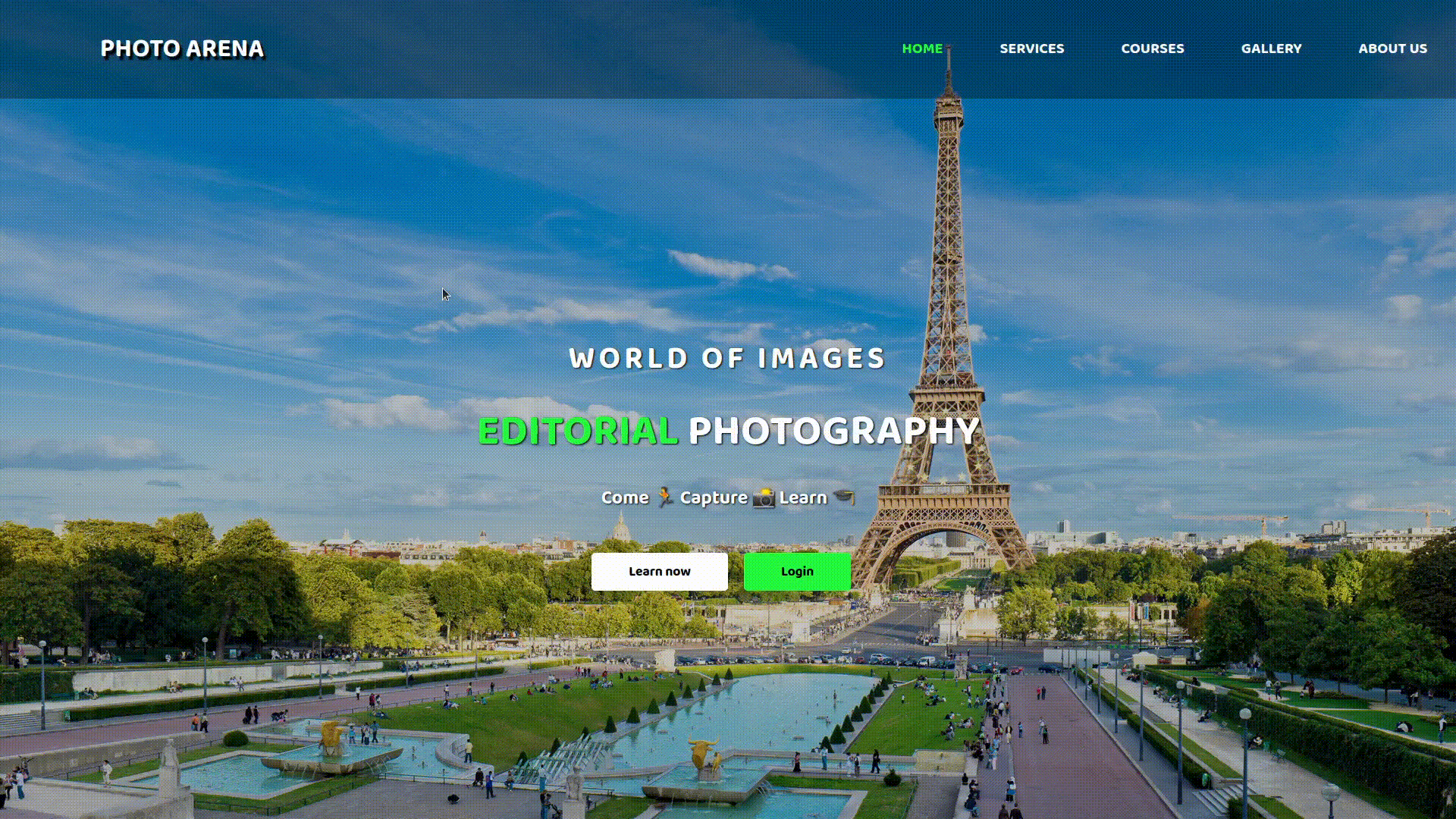
Preview :
Screenshot :-

Live Demo : — COMING SOON
YouTube Tutorial :
Folder Structure
We are creating beginner-friendly websites, so for that, we use conventional file structure. We have one main folder with the name “Photo Arena,” and inside of that folder are an index.html and style.css for styling purposes. In addition to that, we also have one image, namely “bg1.jpg,” in the images folder for use as a background image. The background image is given below in the references.

HTML CODE :
index.html
<!DOCTYPE html>
<html lang="en">
<head>
<meta charset="UTF-8">
<meta http-equiv="X-UA-Compatible" content="IE=edge">
<meta name="viewport" content="width=device-width, initial-scale=1.0">
<title>Photo Arena</title>
<link rel="stylesheet" href="style.css">
<!-- Google Fonts -->
<link rel="preconnect" href="https://fonts.googleapis.com">
<link rel="preconnect" href="https://fonts.gstatic.com" crossorigin>
<link href="https://fonts.googleapis.com/css2?family=Baloo+2:wght@700&display=swap" rel="stylesheet">
</head>
<body>
<div class="container">
<!-- Navigation Bar -->
<nav>
<div class="logo">
<h1> Photo Arena </h1>
</div>
<div class="menu">
<a href="#"> Home </a>
<a href="#"> Services </a>
<a href="#"> Courses </a>
<a href="#"> Gallery </a>
<a href="#"> About Us </a>
</div>
</nav>
<main>
<section>
<h3> World of Images </h3>
<h1> <span class="nameslideshow"> </span> Photography </h1>
<p> Come 🏃 Capture 📸 Learn 🎓</p>
<a href="#" class="btn1"> Learn More </a>
<a href="#" class="btn2"> Login </a>
</section>
</main>
</div>
</body>
</html>
CSS CODE :
style.css
* {
  margin: 0;
  padding: 0;
  box-sizing: border-box;
  font-family: 'Baloo 2', cursive;
}

.container {
  width: 100%;
  height: 100vh;
  background-image: linear-gradient(rgba(0, 0, 0, 0.3), rgba(0, 0, 0, 0.2)), url(images/bg1.jpg);
  background-size: cover;
  background-repeat: no-repeat;
}

nav {
  width: 100%;
  height: 12vh;
  background-color: #00000052;
  color: #fff;
  display: flex;
  justify-content: space-between;
  align-items: center;
  text-transform: uppercase;
}

nav .logo {
  width: 25%;
  text-align: center;
  font-size: 18px;
  text-shadow: 3px 4px 2px black;
}

nav .menu {
  width: 40%;
  display: flex;
  justify-content: space-around;
}

nav .menu a {
  text-decoration: none;
  color: #fff;
  font-weight: bold;
  margin-bottom: 2px;
  position: relative;
}

nav .menu a:hover {
  color: #00fc13;
}

nav .menu a::before {
  content: "";
  position: absolute;
  bottom: 0;
  left: 0;
  width: 0%;
  height: 2px;
  background-color: #b200fc;
  transition: all 0.3s linear;
}

nav .menu a:hover::before {
  width: 100%;
}

nav .menu a:first-child {
  color: #00fc13;
}

main {
  width: 100%;
  height: 85vh;
  display: flex;
  justify-content: center;
  align-items: center;
  text-align: center;
  color: #fff;
}

section h3 {
  font-size: 33px;
  font-weight: 400;
  text-transform: uppercase;
  letter-spacing: 2px;
  text-shadow: 1px 1px 1px #000;
}

section h1 {
  margin: 14px 0px 18px 0;
  font-size: 45px;
  font-weight: 500;
  text-transform: uppercase;
  text-shadow: 1px 1px 2px #000;
}

section p {
  font-size: 20px;
  text-shadow: 1px 1px 1px #000;
  margin-bottom: 45px;
}

section a {
  padding: 9px 30px;
  border-radius: 4px;
  outline: none;
  text-decoration: none;
  font-size: 14px;
  font-weight: 600;
  margin-right: 14px;
}

section .btn1 {
  background-color: #fff;
  color: black;
}

section .btn1:hover {
  background-color: #000;
  color: #fff;
  transition: all 0.3s linear;
}

section .btn2 {
  background-color: #00fc13;
  color: black;
}

section .btn2:hover {
  background-color: #b200fc;
  color: #fff;
  transition: all 0.3s linear;
}

.nameslideshow:after {
  color: #00fc13;
  animation: changename 7s infinite linear;
  content: '';
}

@keyframes changename{
  0% { content: "Portrait"}
  25% { content: "Landscape"}
  50% { content: "Editorial"}
  75% { content: "Event"}
  100% { content: "Nature"}
}
References :
Google Fonts : https://fonts.google.com/specimen/Baloo+2
Background Image :
](https://res.cloudinary.com/practicaldev/image/fetch/s--uUkrXCbd--/c_limit%2Cf_auto%2Cfl_progressive%2Cq_auto%2Cw_880/https://cdn-images-1.medium.com/max/3840/1%2Ar_NtzYtBHyTkucJ_dXpWyA.jpeg)

Top comments (0)