
A data analysis through data visualization
This is a price analysis of two main supermarket chains operating in France.
I got the prices online, imported the data in R for data analysis and plotting. I then exported the most significant visualizations to show the insights.
Why I did this
Of course, I wanted to compare the offering of the two grocery stores to be able to do more informed choices, but I also did it for curiosity.
Specifically, I was curious about the relation between their brand positioning and their pricing strategy. In other words, I wanted to discover if my perception of their brand was consistent with the prices they offer.
Least but not last, I love information visualization, I wanted to play my R and data-analysis skills, and to try out the new Affinity Designer app.
Hypothesis
My perception was that Monoprix has a generally higher brand positioning than Auchan. This was because of the retail experiences as Monoprix comes with cleaner and brighter spaces, but also because it provides a more consistent and original visual identity in all of its customer’s touch points.
Having tried both, I also had the perception that the groceries were a bit cheaper at Auchan, but I never had the chances to compare the same products: they often sell different brands, and commodities brands like CocaCola have the same price everywhere.
Getting some Data
The main concept here was to get the prices for several products from different categories. To be able to compare the stores I needed a clean list of homogeneous products with their own prices.
I’ve run some manual queries over the websites and I soon realize that to avoid spending too much time in cleaning the dataset, It would have been better to narrow down my researches to highly specified categories. Indeed, searching for a product like Olives resulted in including pizzas with olives or other related products, but narrowing the search to Green Olives produced quite more clean results.
After some try I ended up with these trustable categories:
- beers
- eggs
- green olives
- UHT milk
- minced meat
- tuna (in water)
- spaghetti
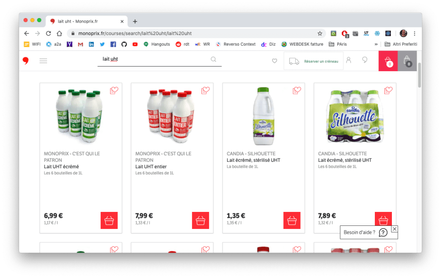
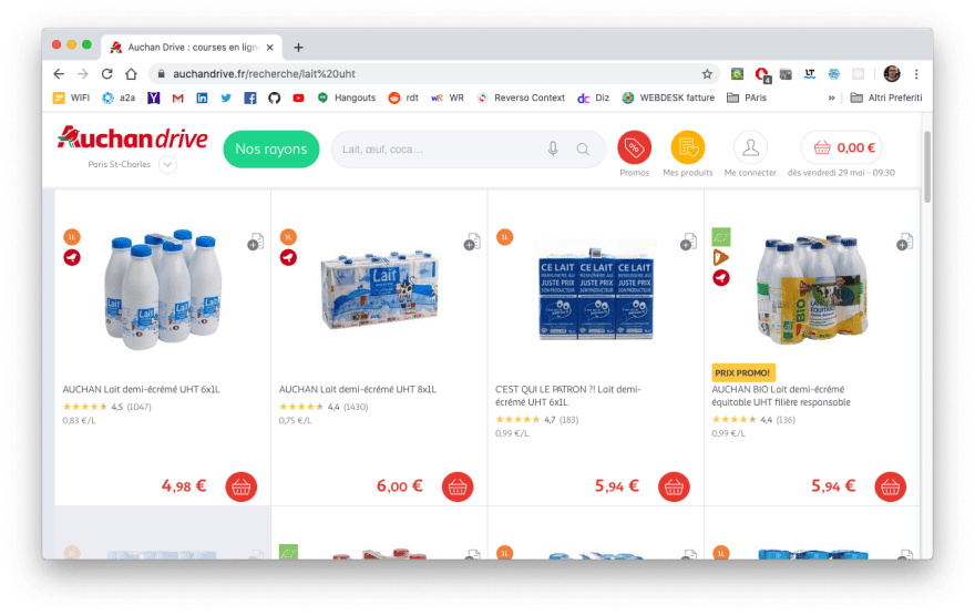
I got the data from the Auchan and Monoprix online grocery store and in just one hour I had my dataset ready to be plotted in R.
The number of products I got for each category in each store vary between 12 and 35 items. The beer makes exception, with more than 150 records from both the stores.
The main property I targeted was the price per Kg, which becomes price per liter and price per piece for the milk and the eggs respectively. To make the items comparable it was necessary to consider this prices instead of the canonical items prices. Luckily both the stores provided this information.
Data analysis
The first interesting insight was the different offering strategy the two supermarket use for the beers. Both of them have a huge offering in terms of items, but the way these items are distributed over the price axis is pretty different.

While the majority of Auchan’s products are priced under 5 euro and its whole histogram results shorter and more compact, the Monoprix one is longer, with a more balanced presence both before and after the 5 euro line.
The highest prices of the category are around 11 and 12 euro per liter and are provided by Monoprix. On the other hand Auchan seems to cover better the bottom end, with more items between 1 - 2 euro per liter.
The insight seems to be confirmed by the other categories.

In all of them, Monoprix tends to cover a wider range of options along the price axis, included the most priced items in the category, while Auchan’s offering is more dense in the low-cost area.
Further confirmation were observable from a facet plot like the one below, where we can appreciate the position of every single product over the price axis.
Prices of commodities products, like eggs or milk, are clearly compressed in a small area at the bottom of the plot, indicating that for this kind of products it’s really hard for the store to operate a real diversification. But as already pointed out, also here Monoprix is still providing a more variegated offering and Auchan looks to be focused in providing the better price.

Again, is important to notice that the number of items is not relevant here and the fact that a store has more (or less) items in a category is due to the way I created the dataset. It doesn’t mean that a store offer less products than the other.
What’s important for this analysis is that every store has enough products in each category to give us a trustable representation of the stores’ offering in terms of price diversification.
Indeed, to have a cleaner view of the situation, we can use a box plot, which is based on the quartiles of the series and help us to not taking in account the number of items taken from each store.

Now we can really appreciate the different strategy the two stores are putting in place. The central quartiles of every category show us Monoprix with a definitely higher priced offering and Auchan with a quite more compressed offering, always closer to the bottom.
Even in the eggs' category is now clear how the Auchan offering, by a pure price perspective, is more competitive than Monoprix.
Conclusions
My original hypothesis about Monoprix was confirmed: my perception of a higher brand positioning is reflected in higher priced products.
Auchan is more competitive on lower prices, having a quite bigger offering at the bottom end of the price axis, while Monoprix provides a more variegated offering (from a price perspective) which includes also some more expensive products. Moreover, in the majority of the categories, Auchan provides the absolute cheapest options.
Is worthy of note that, how we can see in the histograms, almost no category tends to follow the normal distribution. Instead, each category across the two stores, seems to follow a specific distribution curve.

Thank you for reading!
I’m a designer with a passion for data science, but I’m not a data scientist. If you are, and you notice any mistakes in the terminology or in the analysis, please add a comment below, I’d be pleasured to read constructive criticism or to discuss alternatives approaches.
Notes
- The R plots were imported in Affinity Designer for graphic editing.
- Data sources: https://www.monoprix.fr/courses-en-ligne https://www.auchandrive.fr/


Top comments (0)