For more technical details regarding the project : Hasura Hub Submission
A Minimum Viable Product is the version of a new product which allows a team to collect the maximum amount of validated learning about customers with the least effort. And the task assigned to us was App clone of Splitwise. This app makes it easy to split bills with friends and family. It allows you to organize all your shared expenses and IOUs in one place, so that everyone can see who they owe.
We had an initial set back as our react-native developer was inactive which left behind only two members in the subgroup myself a ReactJS developer and a Node.js developer at the backend.
So as a react developer I started off by checking out the user interface and features of the original web-app. I made rough designs of the pages on paper then, I decided which of the features to include in the MVP. Also, there were some guidelines provided provided by Hasura.
Up next, was making the action plan which included our deadlines wireframes and database designs. The rest was a journey from wireframes to MVP.
Features of this MVP
- Users sign up using email, "username - password" based registration (Hasura Auth API).
- Users log in into their accounts, and are authenticated with the help of Hasura Auth API.
- After logging in, users can select from a list of other registered users on the app and add them to their friend-list.
- Users can create groups of 5 members by selecting friends from their friend-list and can share/split their expenses equally with other members in the group.
- There is also provision of adding notes and uploading an attachment (image/pdf) of the bill with the help of Hasura Filestore API.
- After a bill is added all the other members of that group owe the user (who paid the bill in physical world and added it in the app).
- The bills are always split equally and groups can't be modified (i.e. adding more friends or changing the group name) because then it would have become tougher to maintain the group history.
- Every logged in user is associated with a randomly generated Hasura auth-token which is unique for every login session and is used to maintain important user credentials in the Auth API.
- For all other purposes we used the Hasura Data-API
Creating the UI using ReactJS and Material-UI
I simply stuck to the wire frames in most cases except one where I had trouble opening two dialog boxes side by side so I ended up merging the contents into one.
I divided up the interface into several parts so that I had more control over the components.
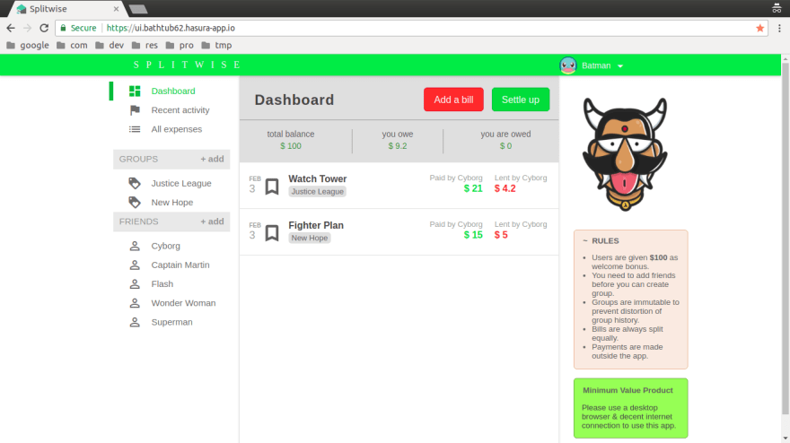
The UI has two distinct parts the navbar (AppBar) and rest of the body. The login and signup pages are interchangeable and the only other page is the dashboard. Dashboard is the place where all the action takes place : adding friends, groups, bills etc. For adding friends, groups, bills I used three material-UI dialogs and for displaying the friends, groups, expense history I used material-UI lists and menus. All the displays are dynamic each time user makes some changes the display is
updated in a fraction of second as soon as the api-calls are finished under the hood. It took me some time to use the use the react life-cycle methods to achieve the same.
Also it was the first time that I had to write a detailed description (Readme) for my project on github. And, also it was the first time I was working with APIs seriously. So, it was a lot of first timers and I'm glad I could pull through.
Challenges We Faced
To be honest it's no fun if it isn't difficult. To me the real thrill of programming is solving these problems. This task was challenging in many ways...
we had to deviate from the database design that I had initially though off. We had to add new columns to the tables because of new situations arising like for example in the groups table we added no_of_members because otherwise I would have had to write more code in ReactJS each time I handled the groups.
I got some logical errors that I couldn't understand and after being stuck for days I finally got rid of those portions and rewrote with a different approach altogether.
But, the biggest challenge was not actually implementing these features it was communicating with other group members. Because, to convey your ideas to a random person takes a bit to patience if not communication skills. Most of our communication was no Slack as it's very convenient in-terms of code sharing adding comments to images etc. Fortunately, my teammate was active on slack so even we faced errors we resolved it together.
Overall it was a great learning experience for me.
For the next task we are going to extend the MVP by adding some more features such as selecting user-avatars currently the user avatar is randomly picked out of 5 choices. Also, I plan on refining the UI and UX etc.


Top comments (0)