If you are here probably you already know what styled-components is so let’s skip the small talk.
Prerequisites for this post is having a React-based application. If you have it, proceed reading. If you don’t, take a look at this before proceeding.
Installing styled-components
Run the following command to install the npm package (or use yarn, as you wish)
npm install styled-components
or
yarn add styled-components
Creating Theme.js component with ThemeProvider
Now, create Theme.js file. This file will be your application’s theme entry point.
import { ThemeProvider } from 'styled-components';

const theme = {};

const Theme = ({ children }) => {
  return <ThemeProvider theme={theme}>{children}</ThemeProvider>;
};

export default Theme;
The theme object is where you’re going to define your theme variables like colours, font sizes and so on. As far as I know there isn’t a perfect way to define this object so it’s up to you to find your perfect way to do so.
I’ll give you an example below
const theme = {
  colour: {
    primary: '#3D315B',
    secondary: '#444B6E',
    background: '#708B75',
    link: '#9AB87A',
  },
  font: {
    size: {
      extraSmall: '14px',
      small: '16px',
      medium: '18px',
      large: '20px',
      extraLarge: '24px',
    },
    family: 'sans-serif',
  },
  breakpoint: {
    mobile: '375px',
    tablet: '600px',
    laptop: '1200px',
    desktop: '1600px',
  },
};
So now your Theme.js file should be something like this
import { ThemeProvider } from 'styled-components';

const theme = {
  colour: {
    primary: '#3D315B',
    secondary: '#444B6E',
    background: '#708B75',
    link: '#9AB87A',
  },
  font: {
    size: {
      extraSmall: '14px',
      small: '16px',
      medium: '18px',
      large: '20px',
      extraLarge: '24px',
    },
    family: 'sans-serif',
  },
  breakpoint: {
    mobile: '375px',
    tablet: '600px',
    laptop: '1200px',
    desktop: '1600px',
  },
};

const Theme = ({ children }) => {
  return <ThemeProvider theme={theme}>{children}</ThemeProvider>;
};

export default Theme;
Using Theme.js
Now that your Theme.js component is ready, you can wrap your React app with it. Go to your React entry point and wrap everything with <Theme>...</Theme>
import React from 'react';
import ReactDOM from 'react-dom';

import Theme from './Theme';

ReactDOM.render(
  <Theme>
    <header></header>
    <main>
      <p>Hello, there!</p>
    </main>
    <footer></footer>
  </Theme>,
  document.getElementById('root')
);
Great, now you need a styled component to see ThemeProvider in action.
// import styled-components
import styled, { css } from 'styled-components';

// create Text component
const Text = styled.p`
  ${({ theme }) => css`
    color: ${theme.colour.primary};
    font-family: ${theme.font.family};
    font-size: ${theme.font.size.medium};
  `}
`;

// use Text component created above
<main>
  <Text>Hello, there!</Text>
</main>;
As you can see, wrapping the whole application with ThemeProvider, the styled components receive theme in the props.
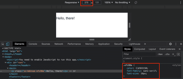
And this is the result
Powerful, eh? But there’s more. You can work with media queries in the same way.
Imagine that you want to change the style of Text component only for mobile devices.
const Text = styled.p`
  ${({ theme }) => css`
    color: ${theme.colour.primary};
    font-family: ${theme.font.family};
    font-size: ${theme.font.size.medium};

    // media query
    @media (max-width: ${theme.breakpoint.mobile}) {
      font-size: ${theme.font.size.small};
      background-color: ${theme.colour.background};
    }
  `}
`;
And this is how it should look like for 376px and 375px respectively.
You made it! You now have a basic theming setup for your React app!
What’s next?
From this point it would make sense improving this theming setup to allow multiple themes like, for example, dark and light theme.


Top comments (0)