
Creating a Custom React Line Chart Component: A Step-by-Step Guide
In this post, we'll create a React line chart component without relying on external charting libraries. This task may seem daunting at first, but you'll find that it becomes manageable and straightforward when we break the component into smaller, more digestible parts. This modular approach not only simplifies understanding but also makes it easier to adapt and extend the component for your specific requirements. The demo and source code are available in the RadzionKit GitHub repository.
Breaking Down the React Line Chart: Key Components and Their Roles
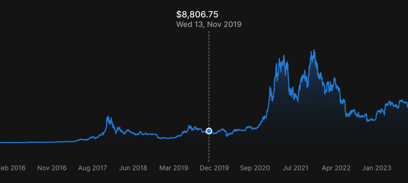
First, let's examine our line chart and deconstruct it into its core components. The central element is the LineChart, notable for its curved line with a gradient fill. Next, we consider the X-axis labels. Given its potential utility in other charts, such as point or area charts, we have aptly named this component ChartXAxis. Following this is the LineChartPositionTracker, crucial for the hover effect that highlights a specific point on the line chart. This component is uniquely important for its dual functionality: it not only emphasizes points but also includes a callback property to identify selected data point. Such a feature is vital for LineChartItemInfo, the final component in our lineup. LineChartItemInfo is responsible for displaying information about the selected point, positioned above the chart. With these essential components identified, we're now ready to start building our line chart.
import { ElementSizeAware } from "@lib/ui/base/ElementSizeAware"
import { useTheme } from "styled-components"
import { useState } from "react"
import { normalize } from "@lib/utils/math/normalize"
import { convertDuration } from "@lib/utils/time/convertDuration"
import { dataVerticalPadding } from "@lib/ui/charts/utils/dataVerticalPadding"
import { LineChartItemInfo } from "@lib/ui/charts/LineChart/LineChartItemInfo"
import { VStack } from "@lib/ui/layout/Stack"
import { Text } from "@lib/ui/text"
import { format } from "date-fns"
import { LineChart } from "@lib/ui/charts/LineChart"
import { LineChartPositionTracker } from "@lib/ui/charts/LineChart/LineChartPositionTracker"
import { ChartXAxis } from "@lib/ui/charts/ChartXAxis"
import { bitcoinPriceTimeseries } from "../data/bitcoinPriceTimeseries"
import { makeDemoPage } from "../layout/makeDemoPage"
import { DemoPage } from "../components/DemoPage"
import { formatAmount } from "@lib/utils/formatAmount"

const chartConfig = {
  chartHeight: 240,
  expectedLabelWidth: 58,
  expectedLabelHeight: 18,
  labelsMinDistance: 20,
}

const data = dataVerticalPadding(
  normalize(bitcoinPriceTimeseries.map((item) => item.price)),
  {
    top: 0.2,
    bottom: 0.2,
  }
)

export default makeDemoPage(() => {
  const [selectedPoint, setSelectedPoint] = useState<number>(data.length - 1)
  const [isSelectedPointVisible, setIsSelectedPointVisible] =
    useState<boolean>(false)

  const { colors } = useTheme()
  const color = colors.primary

  const { timestamp, price } = bitcoinPriceTimeseries[selectedPoint]

  return (
    <DemoPage title="Line Chart">
      <ElementSizeAware
        render={({ setElement, size }) => {
          return (
            <VStack fullWidth gap={4} ref={setElement}>
              {size && (
                <>
                  <LineChartItemInfo
                    itemIndex={selectedPoint}
                    isVisible={isSelectedPointVisible}
                    containerWidth={size.width}
                    data={data}
                  >
                    <VStack>
                      <Text color="contrast" weight="semibold">
                        ${formatAmount(price)}
                      </Text>
                      <Text color="supporting" size={14} weight="semibold">
                        {format(
                          convertDuration(timestamp, "s", "ms"),
                          "EEE d, MMM yyyy"
                        )}
                      </Text>
                    </VStack>
                  </LineChartItemInfo>
                  <VStack style={{ position: "relative" }}>
                    <LineChart
                      width={size.width}
                      height={chartConfig.chartHeight}
                      data={data}
                      color={color}
                    />
                    <LineChartPositionTracker
                      data={data}
                      color={color}
                      onChange={(index) => {
                        if (index === null) {
                          setIsSelectedPointVisible(false)
                        } else {
                          setIsSelectedPointVisible(true)
                          setSelectedPoint(index)
                        }
                      }}
                    />
                  </VStack>
                  <ChartXAxis
                    data={data}
                    expectedLabelWidth={chartConfig.expectedLabelWidth}
                    labelsMinDistance={chartConfig.labelsMinDistance}
                    containerWidth={size.width}
                    expectedLabelHeight={chartConfig.expectedLabelHeight}
                    renderLabel={(index) => (
                      <Text size={12} color="supporting" nowrap>
                        {format(
                          convertDuration(
                            bitcoinPriceTimeseries[index].timestamp,
                            "s",
                            "ms"
                          ),
                          "MMM yyyy"
                        )}
                      </Text>
                    )}
                  />
                </>
              )}
            </VStack>
          )
        }}
      />
    </DemoPage>
  )
})
Implementing Responsive Design in React Charts with ElementSizeAware and useElementSize Hook
Every top-level component of our chart must be aware of its container's width to accurately calculate the positions of various elements. Therefore, it's efficient to obtain the container width at the top level and then propagate this information down to the components that require it. To accomplish this, we can utilize the ElementSizeAware component.
import { ReactNode, useState } from "react"

import { ElementSize, useElementSize } from "../hooks/useElementSize"

interface ElementSizeAwareRenderParams {
  size: ElementSize | null
  setElement: (element: HTMLElement | null) => void
}

interface Props {
  render: (params: ElementSizeAwareRenderParams) => ReactNode
}

export const ElementSizeAware = ({ render }: Props) => {
  const [element, setElement] = useState<HTMLElement | null>(null)

  const size = useElementSize(element)

  return <>{render({ setElement, size })}</>
}
The useElementSize hook is specifically created to monitor the dimensions of a given element, specifically its width and height. This hook updates these dimensions whenever there is a change in the element. To achieve this, it employs the ResizeObserver API in conjunction with the useIsomorphicLayoutEffect hook. The useIsomorphicLayoutEffect hook serves the same purpose as useLayoutEffect but it does not generate errors during Server-Side Rendering (SSR).
import { debounce } from "@lib/utils/debounce"
import { pick } from "@lib/utils/record/pick"
import { useState } from "react"
import { useIsomorphicLayoutEffect } from "react-use"

export interface ElementSize {
  width: number
  height: number
}

const getElementSize = (element: HTMLElement): ElementSize =>
  pick(element.getBoundingClientRect(), ["height", "width"])

export const useElementSize = (element: HTMLElement | null) => {
  const [size, setSize] = useState<ElementSize | null>(() =>
    element ? getElementSize(element) : null
  )

  useIsomorphicLayoutEffect(() => {
    if (!element) return

    const handleElementChange = debounce(() => {
      setSize(getElementSize(element))
    }, 100)

    handleElementChange()

    if (!window?.ResizeObserver) return

    const resizeObserver = new ResizeObserver(handleElementChange)

    resizeObserver.observe(element)

    return () => {
      resizeObserver.disconnect()
    }
  }, [element])

  return size
}
Flexbox-Based Layout for React Chart Components: Managing State and Positioning
We will use a flexbox element with a 4px gap as a container for our chart components. By assigning the setElement function to this container, we initiate the monitoring of changes in the container's dimensions. This is crucial for rendering the chart components accurately once their size is determined. The first component to render is the LineChartItemInfo. This component plays a vital role in presenting information about the selected point on the chart, such as price and date. To manage the state of the selected point, we employ two variables: selectedPoint and isSelectedPointVisible. This approach serves two purposes: firstly, it ensures the LineChartItemInfo is always rendered (even when not visible) to prevent abrupt appearance on the screen. Secondly, it facilitates a smooth fade-out animation when the information becomes invisible, achievable through CSS only if the element is constantly rendered.
Within the LineChartItemInfo component, we have the flexibility to include various child elements. For our specific use case, we will employ a VStack component to vertically stack two Text components. The first Text component is dedicated to displaying the price of the selected point, and the second Text component is tasked with showing the date. The LineChartItemInfo component is strategically designed to position these elements above the chart, ensuring alignment with the selected point. Before delving into the implementation details, it's important to discuss the final property - data.
Normalizing Data for Enhanced Visuals in React Line Charts
In our chart components, data is represented as an array of numbers, specifically ranging from 0 to 1. To accomplish this, we utilize the normalize function. This function identifies the maximum and minimum values in the array, then maps each value to a corresponding number between 0 and 1. For our Bitcoin price chart, the focus is solely on the price values, as these charts typically feature a linear X-axis marked by uniform intervals, and we can always derive the corresponding date from the index of the value in the array.
export const normalize = (values: number[]): number[] => {
  const max = Math.max(...values)
  const min = Math.min(...values)
  const range = max - min
  return values.map((value) => (value - min) / range)
}
Working with normalized data allows us to implement an interesting technique to introduce vertical padding to the chart. This is achieved by appending two extra values to our data array: one greater than 1 and another less than 0. This manipulation causes the rest of the chart to appear smaller, effectively creating a padding effect.
import { normalize } from "@lib/utils/math/normalize"

type PaddingParams = {
  top?: number
  bottom?: number
}

export const dataVerticalPadding = (
  data: number[],
  { top, bottom }: PaddingParams
) => {
  return normalize([...data, top ? 1 + top : 1, bottom ? 0 - bottom : 1]).slice(
    0,
    -2
  )
}
Implementing Dynamic Positioning for LineChartItemInfo Component in React
Examining the implementation of the LineChartItemInfo component, we start with its top container, a standard div element with a width set to 100%. Interestingly, there's no need for absolute positioning here; using the marginLeft property suffices for positioning the info. To calculate marginLeft, we require two pieces of information: the width of the container (received from props) and the width of the content (determined by the ElementSizeAware component). Initially, while the size is being calculated, we set the component's visibility to hidden to avoid any abrupt appearance on the screen. Once we have the size, we can accurately calculate the marginLeft. This calculation involves the index of the selected point, the container's width, and the contentHalfWidth variable, which helps find the content's center. The logic is straightforward: if the content's center is less than contentHalfWidth, marginLeft is set to 0; if it's greater than the container's width minus contentHalfWidth, marginLeft becomes auto. In all other cases, marginLeft equals the content's center minus contentHalfWidth. This ensures the content is always aptly centered above the selected point. To achieve a smooth fade-in and fade-out visual effect, we manipulate the opacity property, setting it to 1 when visible and 0 when not.
import styled from "styled-components"
import { ElementSizeAware } from "../../base/ElementSizeAware"
import { defaultTransition } from "../../css/transition"
import { ComponentWithChildrenProps } from "../../props"

type LineChartItemInfoProps = ComponentWithChildrenProps & {
  containerWidth: number
  data: number[]
  isVisible: boolean
  itemIndex: number
}

const Container = styled.div`
  width: 100%;
`

const Content = styled.div`
  width: fit-content;
  white-space: nowrap;
  transition: ${defaultTransition} opacity;
`

export const LineChartItemInfo = ({
  data,
  itemIndex,
  children,
  containerWidth,
  isVisible,
}: LineChartItemInfoProps) => {
  return (
    <Container>
      <ElementSizeAware
        render={({ setElement, size }) => {
          const getStyle = (): React.CSSProperties => {
            if (!size) {
              return {
                visibility: "hidden",
              }
            }

            const center = itemIndex * (containerWidth / (data.length - 1))
            const contentHalfWidth = size.width / 2
            if (center < contentHalfWidth) {
              return { marginLeft: 0 }
            }

            if (containerWidth - center < contentHalfWidth) {
              return { marginLeft: "auto" }
            }

            return {
              marginLeft: center - contentHalfWidth,
            }
          }

          return (
            <Content
              ref={setElement}
              style={{
                ...getStyle(),
                opacity: isVisible ? 1 : 0,
              }}
            >
              {children}
            </Content>
          )
        }}
      />
    </Container>
  )
}
Building the LineChart Component in React: SVG Paths and Gradient Implementation
Moving on to the LineChart component, it accepts properties like width, height, color, and data. The chart is rendered using a fixed-size SVG, which is composed of two paths. The first path is responsible for rendering the line of the chart, while the second creates a shape filled with a gradient. This setup requires the implementation of two functions: createPath and createClosedPath. These tasks are well-suited for ChatGPT's capabilities. Although it won't handle the entire component creation, it can significantly assist with straightforward tasks like these. The gradient applied in the chart is designed to start at 40% opacity and gradually transition to 0%, resulting in an aesthetically pleasing fade-out effect. For color management, my applications utilize the HSLA color format. For those interested in exploring more about this color format, I recommend checking out a specific post dedicated to it.
import { useMemo } from "react"
import { Point } from "../../entities/Point"
import styled, { useTheme } from "styled-components"
import { transition } from "../../css/transition"
import { HSLA } from "../../colors/HSLA"

interface LineChartProps {
  data: number[]
  height: number
  width: number
  color: HSLA
}

const calculateControlPoints = (dataPoints: Point[]) => {
  const controlPoints = []
  for (let i = 0; i < dataPoints.length - 1; i++) {
    const current = dataPoints[i]
    const next = dataPoints[i + 1]
    controlPoints.push({
      x: (current.x + next.x) / 2,
      y: (current.y + next.y) / 2,
    })
  }
  return controlPoints
}

const createPath = (
  points: Point[],
  controlPoints: Point[],
  width: number,
  height: number
) => {
  let path = `M${points[0].x * width} ${height - points[0].y * height}`
  for (let i = 0; i < points.length - 1; i++) {
    const current = points[i]
    const next = points[i + 1]
    const control = controlPoints[i]
    path +=
      ` C${control.x * width} ${height - current.y * height},` +
      `${control.x * width} ${height - next.y * height},` +
      `${next.x * width} ${height - next.y * height}`
  }
  return path
}

const createClosedPath = (
  points: Point[],
  controlPoints: Point[],
  width: number,
  height: number
) => {
  let path = `M${points[0].x * width} ${height}`
  path += ` L${points[0].x * width} ${height - points[0].y * height}`

  for (let i = 0; i < points.length - 1; i++) {
    const current = points[i]
    const next = points[i + 1]
    const control = controlPoints[i]
    path +=
      ` C${control.x * width} ${height - current.y * height},` +
      `${control.x * width} ${height - next.y * height},` +
      `${next.x * width} ${height - next.y * height}`
  }

  path += ` L${points[points.length - 1].x * width} ${height}`
  path += " Z"

  return path
}

const Path = styled.path`
  ${transition}
`

export const LineChart = ({ data, width, height, color }: LineChartProps) => {
  const [path, closedPath] = useMemo(() => {
    if (data.length === 0) return ["", ""]

    const points = data.map((value, index) => ({
      x: index / (data.length - 1),
      y: value,
    }))

    const controlPoints = calculateControlPoints(points)
    return [
      createPath(points, controlPoints, width, height),
      createClosedPath(points, controlPoints, width, height),
    ]
  }, [data, height, width])

  const theme = useTheme()

  return (
    <svg
      style={{ minWidth: width, overflow: "visible" }}
      width={width}
      height={height}
      viewBox={`0 0 ${width} ${height}`}
    >
      <defs>
        <linearGradient id="gradient" x1="0%" y1="0%" x2="0%" y2="100%">
          <stop
            offset="0%"
            stopColor={color.getVariant({ a: () => 0.4 }).toCssValue()}
          />
          <stop
            offset="100%"
            stopColor={theme.colors.transparent.toCssValue()}
          />
        </linearGradient>
      </defs>
      <Path d={path} fill="none" stroke={color.toCssValue()} strokeWidth="2" />
      <Path d={closedPath} fill="url(#gradient)" strokeWidth="0" />
    </svg>
  )
}
Integrating LineChartPositionTracker with HoverTracker for Interactive React Charts
The next component in our lineup is the LineChartPositionTracker. As it's an absolutely positioned element designed to span the entire area of the chart, it must be rendered alongside the LineChart within an element that has position: relative. This arrangement ensures that the LineChartPositionTracker is correctly positioned over the chart. The component receives data, color, and an onChange callback as its properties. To accurately track the mouse's position over the chart, LineChartPositionTracker incorporates a HoverTracker component. This HoverTracker is essential for monitoring mouse movements across the entire area of the absolutely positioned container.
import styled from "styled-components"
import { takeWholeSpace } from "../../css/takeWholeSpace"
import { HoverTracker } from "../../base/HoverTracker"
import { HSLA } from "../../colors/HSLA"
import { LineChartPosition } from "./LineChartPosition"
import { getClosestItemIndex } from "@lib/utils/math/getClosestItemIndex"

type LineChartPositionTrackerProps = {
  data: number[]
  color: HSLA
  onChange?: (index: number | null) => void
}

const Container = styled.div`
  position: absolute;
  ${takeWholeSpace};
  top: 0;
  left: 0;
`

export const LineChartPositionTracker = ({
  onChange,
  data,
  color,
}: LineChartPositionTrackerProps) => {
  return (
    <HoverTracker
      onChange={({ position }) => {
        onChange?.(position ? getClosestItemIndex(data, position.x) : null)
      }}
      render={({ props, position }) => {
        return (
          <>
            <Container {...props} />
            {position && (
              <LineChartPosition data={data} color={color} value={position} />
            )}
          </>
        )
      }}
    />
  )
}
The HoverTracker component is an essential part of our setup, with two key properties: render and onChange. The render function is responsible for propagating properties to the target element. This propagation is crucial as it allows HoverTracker to listen for mouse events and access the ref, which is necessary to determine the element's bounding box. During a mouse move event, the component captures the x and y positions of the mouse and computes their relative positions, which are conveniently normalized to range between 0 and 1 for both coordinates. To keep the parent component updated about these position changes, HoverTracker utilizes the useIsomorphicLayoutEffect hook, the same one we have encountered previously.
import {
  MouseEvent,
  MouseEventHandler,
  ReactNode,
  useCallback,
  useState,
} from "react"
import { Point } from "../entities/Point"
import { useBoundingBox } from "../hooks/useBoundingBox"
import { enforceRange } from "@lib/utils/enforceRange"
import { useIsomorphicLayoutEffect } from "react-use"

interface ContainerProps {
  onMouseEnter?: MouseEventHandler<HTMLElement>
  onMouseLeave?: MouseEventHandler<HTMLElement>
  onMouseMove?: MouseEventHandler<HTMLElement>
  ref: (node: HTMLElement | null) => void
}

interface ChangeParams {
  position: Point | null
}

interface RenderParams extends ChangeParams {
  props: ContainerProps
}

interface HoverTrackerProps {
  render: (props: RenderParams) => ReactNode
  onChange?: (params: ChangeParams) => void
}

export const HoverTracker = ({ render, onChange }: HoverTrackerProps) => {
  const [container, setContainer] = useState<HTMLElement | null>(null)
  const box = useBoundingBox(container)

  const [position, setPosition] = useState<Point | null>(null)

  const handleMove = useCallback(
    ({ x, y }: Point) => {
      if (!box) return

      const { left, top, width, height } = box

      setPosition({
        x: enforceRange((x - left) / width, 0, 1),
        y: enforceRange((y - top) / height, 0, 1),
      })
    },
    [box]
  )

  const handleMouse = useCallback(
    (event: MouseEvent) => {
      handleMove({ x: event.clientX, y: event.clientY })
    },
    [handleMove]
  )

  useIsomorphicLayoutEffect(() => {
    if (onChange) {
      onChange({ position })
    }
  }, [onChange, position])

  return (
    <>
      {render({
        props: {
          ref: setContainer,
          onMouseEnter: handleMouse,
          onMouseLeave: position
            ? () => {
                setPosition(null)
              }
            : undefined,
          onMouseMove: position ? handleMouse : undefined,
        },
        position: position,
      })}
    </>
  )
}
Centered Positioning in React: Utilizing PositionAbsolutelyCenterVertically and PositionAbsolutelyByCenter Components
With the mouse position known, we can render the LineChartPosition component. This component is responsible for displaying two visual elements on the chart: a vertical dashed line and a circle to highlight a point. In dealing with absolutely positioned elements, while we can determine the center of the element, there's no direct CSS property to position an element by its center. Therefore, we calculate the left and top properties by taking the central coordinates and subtracting half of the element's width and height, respectively. To simplify this process and avoid duplicating logic across different components, we can utilize helper components like PositionAbsolutelyCenterVertically and PositionAbsolutelyByCenter. These components streamline the process of positioning elements based on their center, making it more efficient and reducing code redundancy.
import styled from "styled-components"
import { HSLA } from "../../colors/HSLA"
import { Point } from "../../entities/Point"
import { getColor } from "../../theme/getters"
import { sameDimensions } from "../../css/sameDimensions"
import { round } from "../../css/round"
import { toPercents } from "@lib/utils/toPercents"
import { toSizeUnit } from "../../css/toSizeUnit"
import { PositionAbsolutelyCenterVertically } from "../../layout/PositionAbsolutelyCenterVertically"
import { PositionAbsolutelyByCenter } from "../../layout/PositionAbsolutelyByCenter"

type ChartPositionProps = {
  data: number[]
  color: HSLA
  value: Point
}

const size = 12
const lineWidth = 2

const ChartPoint = styled.div`
  ${round};
  border: 2px solid ${getColor("contrast")};
  ${sameDimensions(size)};
`

const Line = styled.div`
  height: 100%;
  border-left: ${toSizeUnit(lineWidth)} dashed;
  color: ${getColor("textShy")};
`

export const LineChartPosition = ({
  data,
  color,
  value,
}: ChartPositionProps) => {
  const width = data.length - 1
  const index = Math.round(value.x * width)
  const x = index / width
  const y = data[index]

  return (
    <>
      <PositionAbsolutelyCenterVertically
        style={{
          pointerEvents: "none",
        }}
        fullHeight
        left={toPercents(x)}
      >
        <Line />
      </PositionAbsolutelyCenterVertically>
      <PositionAbsolutelyByCenter
        style={{
          pointerEvents: "none",
        }}
        left={toPercents(x)}
        top={toPercents(1 - y)}
      >
        <ChartPoint style={{ background: color.toCssValue() }} />
      </PositionAbsolutelyByCenter>
    </>
  )
}
To position a dashed line, we utilize the PositionAbsolutelyCenterVertically component. This component allows us to define the line's left position by converting the x value into percentages. We set the fullHeight property to true, ensuring that the line extends across the entire chart's height. The PositionAbsolutelyCenterVertically component creates an absolutely positioned wrapper, with the top property at 0 and the left property at the specified value. Inside this wrapper, we place a flexbox element with relative positioning and justify-content: center to align the line vertically in the center. Finally, the Content component is rendered with an absolute position, and thanks to the flexbox's justify-content property, it is centered vertically.
import styled from "styled-components"
import { ComponentWithChildrenProps, UIComponentProps } from "../props"

type PositionAbsolutelyCenterVerticallyProps = ComponentWithChildrenProps &
  UIComponentProps & {
    left: React.CSSProperties["left"]
    fullHeight?: boolean
  }

const Wrapper = styled.div`
  position: absolute;
  top: 0;
`

const Container = styled.div`
  position: relative;
  display: flex;
  justify-content: center;
`

const Content = styled.div`
  position: absolute;
  top: 0;
`

export const PositionAbsolutelyCenterVertically = ({
  left,
  children,
  fullHeight,
  className,
  style = {},
}: PositionAbsolutelyCenterVerticallyProps) => {
  return (
    <Wrapper
      className={className}
      style={{ ...style, left, height: fullHeight ? "100%" : undefined }}
    >
      <Container style={{ height: fullHeight ? "100%" : undefined }}>
        <Content style={{ height: fullHeight ? "100%" : undefined }}>
          {children}
        </Content>
      </Container>
    </Wrapper>
  )
}
For positioning the point, the PositionAbsolutelyByCenter component is employed, adhering to a pattern similar to the previously mentioned component. This approach encompasses a relative Wrapper paired with an absolutely positioned Container, the latter being a flexbox with its alignment centered. Within this framework, the Content component is also positioned absolutely. Such an arrangement guarantees both precise and centered alignment of elements.
import styled from "styled-components"
import { ComponentWithChildrenProps, UIComponentProps } from "../props"

type PositionAbsolutelyByCenterProps = ComponentWithChildrenProps &
  UIComponentProps & {
    left: React.CSSProperties["left"]
    top: React.CSSProperties["top"]
  }

const Wrapper = styled.div`
  position: absolute;
`

const Container = styled.div`
  position: relative;
  display: flex;
  justify-content: center;
  align-items: center;
`

const Content = styled.div`
  position: absolute;
`

export const PositionAbsolutelyByCenter = ({
  left,
  children,
  top,
  className,
  style = {},
}: PositionAbsolutelyByCenterProps) => {
  return (
    <Wrapper className={className} style={{ ...style, left, top }}>
      <Container>
        <Content>{children}</Content>
      </Container>
    </Wrapper>
  )
}
Optimizing X-Axis Label Placement in React Charts with ChartXAxis Component
Finally, for displaying the X-axis labels, various methods exist for labels placement and selection. While the simplest approach would be to distribute the labels evenly across the range using absolute positioning, we will adopt a different strategy here. Our ChartXAxis component, similar to previous components, accepts data, containerWidth, and renderLabel as props. The key distinction, however, lies in our approach to label sizing. Instead of measuring label sizes, we request to provide expected dimensions for label width, height, and preferred spacing. For positioning the labels, we calculate the pixel distance between points and iterate over the data to create an index array of labels to be displayed. This is determined by ensuring each label starts and ends with at least labelsMinDistance pixels from the previous label and the container's end, respectively. Subsequently, we utilize the PositionAbsolutelyCenterVertically component, as seen earlier, to render these labels at the calculated positions.
import styled from "styled-components"
import { PositionAbsolutelyCenterVertically } from "../layout/PositionAbsolutelyCenterVertically"
import { useMemo } from "react"
import { withoutUndefined } from "@lib/utils/array/withoutUndefined"

type ChartXAxisProps = {
  data: number[]
  containerWidth: number
  expectedLabelHeight: number
  expectedLabelWidth: number
  labelsMinDistance: number
  renderLabel: (index: number) => React.ReactNode
}

const Container = styled.div`
  width: 100%;
  position: relative;
`

export const ChartXAxis = ({
  data,
  containerWidth,
  expectedLabelHeight,
  expectedLabelWidth,
  labelsMinDistance,
  renderLabel,
}: ChartXAxisProps) => {
  const stepInPx = containerWidth / (data.length - 1)
  const itemIndexes = useMemo(() => {
    let lastItemEnd = 0
    return withoutUndefined(
      data.map((_, index) => {
        const startsAt = index * stepInPx - expectedLabelWidth / 2
        const endsAt = startsAt + expectedLabelWidth
        if (startsAt < lastItemEnd + labelsMinDistance) return

        if (endsAt > containerWidth) return

        lastItemEnd = endsAt
        return index
      })
    )
  }, [containerWidth, data, expectedLabelWidth, labelsMinDistance, stepInPx])

  return (
    <Container
      style={{
        minHeight: expectedLabelHeight,
      }}
    >
      {itemIndexes.map((index) => {
        return (
          <PositionAbsolutelyCenterVertically left={index * stepInPx}>
            {renderLabel(index)}
          </PositionAbsolutelyCenterVertically>
        )
      })}
    </Container>
  )
}


Top comments (0)