
Originally posted on my blog.
I've decided to redo my website, yet again. This is the 3rd or 4th iteration of my website.
Here were the motivations and goals for the redesign:
1. Host my blog articles on my own website
I've been writting a lot on both Medium and a bit on Dev Community, but I want to have a bit more control in the design and presentation of my blog posts. One of my biggest gripes with Medium is the lack of syntax highlighting for code blocks.
2. Better highlight past projects
In 2019, I want to work with a few clients on a part-time basis to supplement the income I make through my full-time job. The first step to doing that was to make sure I can showcase some of my past work in a favorable light.
3. New tech stack
My previous website was using gulp to build HTML pages from templated pug files. This wasn't that bad since I only had one page on the website, so there wasn't a need to move between pages. However, now that I was going to include a blog, I was going to have to have multiple pages on the website and thus I wanted to use React to get the performance associated with a single page application.
Design
So with those three goals in mind I started to research blogs that I admired. I made sure to screenshot and anotate any elements that stood out to me. I gathered all those screenshots in my design app of choice: Figma.
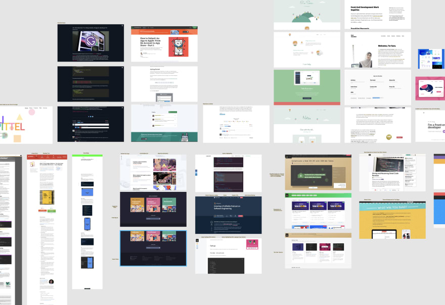
After I gathered all the pieces of inspiration, I went ahead and designed my own website. I knew I wanted to have both a light and dark theme to my website, so I made sure to design both variations.
The reason why I create design mockups instead of just coding the site straight away is so that I can quickly test out which designs look good. I find that I end up doing a few design interations before coming up with a final design. Doing those different variations in code rather than in a design software would take much longer. I also find it helps me better organize my work when I design the project before going into the code, and it ultimately saves me time.
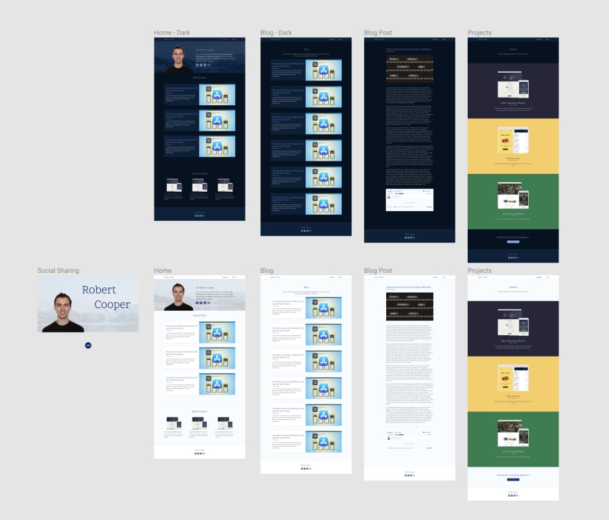
Home Page
The home page, being the first place site visitors land when they visit my site, includes a short description of who I am, the blog articles I've recently written, as well as a preview of the recent projects I've worked on. I made sure to animate elements on the page, using the animate on scroll library, to make the experience slightly more enjoyable.
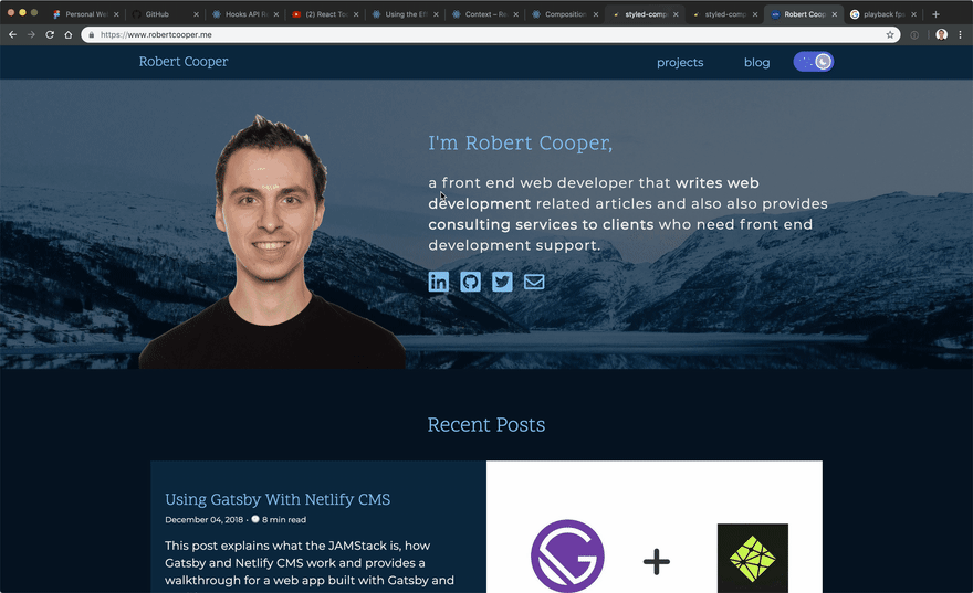
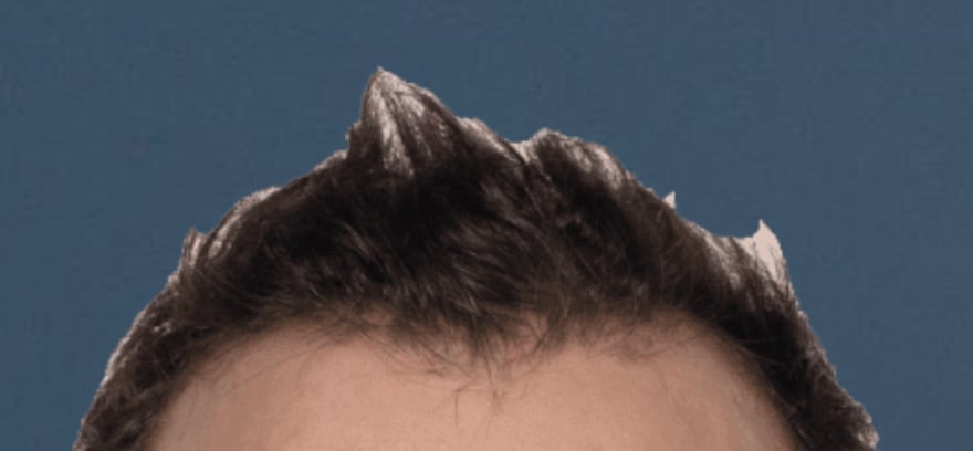
I've included a headshot of myself and I tried to crop out all of the background from the image. Unfortunately, I don't have the design skills required to get rid of some of the white background from my hair and it is prooving to be quite the annoyance every time I see it.
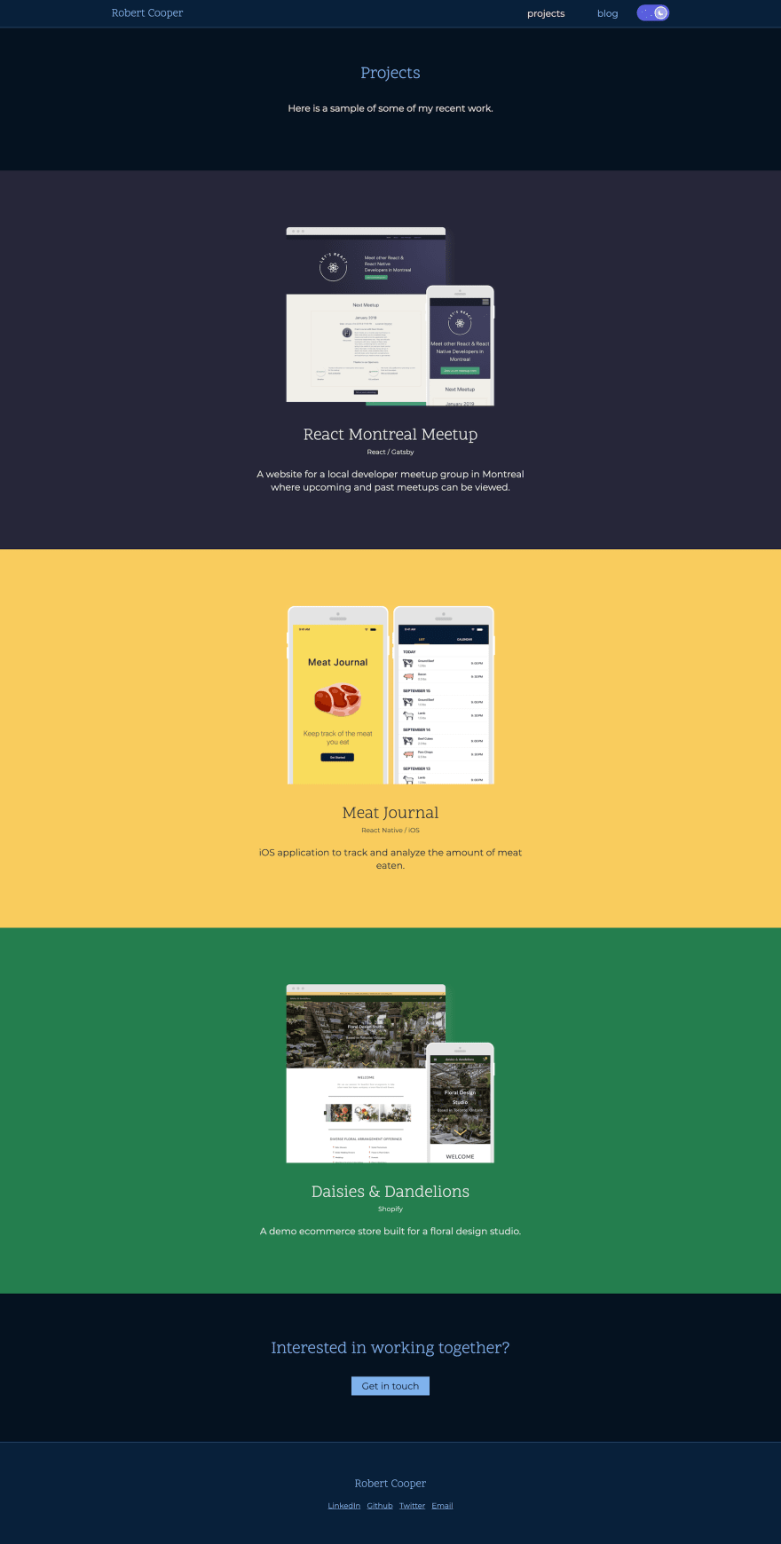
Projects
I've created a page to better showcase my past projects. Each app is presented in a similar way, with screenshots of the apps found within desktop/mobile device frames. Each project is also given it's own section with a short description along with keywords indicating the main technologies used for the projects. A call to action section is found at the bottom of the page for any visitors interested in working together on a project.
In the future, I plan to create full pages for each project in order to present them as full blown case studies.
Blog
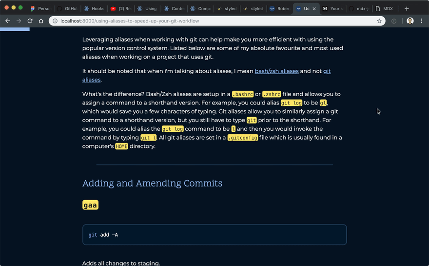
The blog is where things get exciting technology wise. The website is built with React and Gatsby. I'm also using gatsby-mdx which allows me to write my blog posts using MDX. MDX is a different flavour of Markdown which allows for the use of JSX and React components to coexist with markdown in the same file.
If I want to include a custom React component into a blog post to make the post more interactive, I can now do that in MDX. As an example, I can embed the theme switcher component I'm using for my website right into this post:
See this blog post on my website to see the embbeded React component.
I'm quite excited to take advantage of the power of MDX in some of my future blog articles.
Another feature I've added to my blog is the horizontal progress bar indicating a user's progress through a blog post. I've seen this UI pattern on some other blogs and have enjoyed it myself.
I've also include a comment section to blog posts using the Disqus embed. This was surprisingly easy to incorporate into the website using disqus-react.
Dark / Light Theme
Perhaps my favourite part of the website is the ability to toggle between a dark and light themes. I'm using Styled Components to manage the styles on my website and it fortunately has great a API for managing theming.

I'd like to point out that the design and functionality of the theme toggle switch was all taken from @thekitze's Twizzy App landing page. I'm always thankful when talented people like this make their projects open source to allow others to benefit.
I hope to continue to make incremental improvements to my website. Some of the things I'd like to add include unit testing, end to end testing, and an RSS feed to the website. There are also a few bugs I need to squash 👞🐜.

Latest comments (13)
nice job
It looks great, Robert.
If you're having trouble removing the background of your headshot, check out
Thanks to @chriscoyier for this great find.
May I recommend Remove.bg for removing bg from your headshot? YOU'LL THANK ME LATER.
Haha, I did try using it, and it does an AMAZING job at removing the background. However, I found that it reduced the image quality to much :(.
However, your post motivated me to open up a photo editor and remove the lingering background pixel-by-pixel.
Good job, Robert.
Is an SPA really necessary for a blog?
SPAs are definitely not always faster than just a traditional server-side solution. Especially given the amount of JavaScript that has to be downloaded and executed (no caching does not stop this cost).
For some perspective your website took a full 3 minutes to load on my laptop.
This isn't intended as a flame; but web performance and accessibility is very important to me so I feel the need to highlight that throwing technologies like react and SPAs around definitely do not give you enough to make a fast and accessible website.
I mean, the essence of a personal website is a place to play around with since it's...personal.
Then again, you have a good point considering accessibility and performance. The personal website could lead to a rabbit hole of ruthless optimization to make it as good as possible.
It's a fair point, one of the joys of a personal website is that you can do whatever you want; and feel free to do so.
The only risk is if your priority is about communicating text based information and you're making it hard for people by making a slow website.
Oh my. I need to look into optimizing those assets! Thanks for pointing this out.
I don't think the load time is a result of the choice of tech stack. Gatsby is a static site generator, which can hydrate to a SPA once loaded. I think it is a great choice for a blog! As you can see it is the intial html page which is the worst offender, not some huge javascript blob.
I tried robertcooper.me/refreshing-my-pers... and I get similar numbers:
There are many assets to download, the service workers is pulling down gifs of several megabytes and lots of different JS files. Probably by fixing those huge assets the UX will improve a lot :-)
Seeing the same on mobile as well (slow loading speeds) running through my home WiFi. Once loaded though the site looks lovely.