
Images are critical for every website and application today. Whether it is marketing banners, product images or logos, it is impossible to imagine a website without images. Sadly though, images are large in size making them the single biggest contributor to the page size. As per the latest HTTP Archive data, the median page size on desktops is 1511 KB. Images make up for almost 650 KB of that size, roughly 45% of the total page size. Now, since we cannot do away with images, we need to make our web pages load really fast with them. In this guide, we will talk about lazy loading images, a technique that helps improve the page load time and reduce page size while still retaining all the images on the page.
A quick glance at what lazy loading achieves
Before moving further, here is a sample video demonstrating the working of lazy loading. Notice how when the page is scrolled, the grey placeholder is replaced with the actual image.
What is Lazy Loading Images?
Lazy Loading Images refers to a set of techniques in web and application development that defer the loading of images on a page to a later point in time – when those images are actually needed instead of loading them up front. These techniques help in improving performance, better utilization of the device’s resources and reducing associated costs.
The word “lazy” in the English language is often attributed to the act of avoiding work as long as possible.
Similarly, lazy loading defers the loading of resources on the page as long as they are not needed. Instead of loading these resources as soon as the page loads, which is what normally happens, we defer the load of these resources to a later time when they are actually needed.
The technique of lazy loading can be applied to almost all the resources on a page. For example, in a single page application, if a JS file is not needed until later, it is best not to load it initially. If an image is not needed up front, load it later when it is actually needed.
Here, we will stick to lazy loading images and how to do it well on your website.
Why go for lazy loading images at all?
Lazy Loading defers the loading of an image that is not needed on the page immediately. An image that is not visible to the user when the page loads, is loaded later when the user scrolls and the image actually become visible. If the user never scrolls, an image that is not visible to the user never gets loaded.
This has two main advantages.
1. Performance Improvement
The is the most important one for you as a website administrator – better performance and load time. With lazy loading, you are reducing the number of images that need to be loaded on the page initially. Lesser resource requests mean lesser bytes to download and lesser competition for the limited network bandwidth available to the user. This ensures that the device is able to download and process the remaining resources much faster. Hence, the page becomes usable much earlier compared to the case without lazy loading.
2. Cost reduction
The second benefit for you is in terms of delivery costs. Image delivery, or delivery of any other asset, is usually charged on the basis of the number of bytes transferred. As mentioned earlier, with lazy loading, if the image is not visible, it never gets loaded. Thus, you reduce the total bytes delivered on the page. Especially for users that bounce off the page or interact only with the top portion of the page. This reduction in bytes transferred from your delivery network reduces delivery costs. This will become more apparent as we explore lazy loading in the coming sections.
Which images can be lazy loaded?
The basic idea of lazy loading is simple – defer loading anything that is not needed right now. For images, it usually translates to, any image that is not visible to the user up front, can be lazy loaded. As the user scrolls down the page, the image placeholders start coming into viewport (visible part of the webpage). We trigger the load for these images when they become visible.
You can find out which images are a candidate for lazy loading and how many bytes you can save on the initial page load by using the Google Lighthouse audit tool. The audit performed by this tool has a section dedicated for offscreen images. You can also use ImageKit’s website analyzer to identify if your website uses lazy loading or not apart from other critical image related optimizations on your page.
Lazy loading is critical not only to good performance but also to deliver a good user experience to your users. Since combining performance and user experience with lazy loading is important and challenging, we will continue to address this topic in more detail throughout this guide after we have looked at different ways to lazy load images.
Lazy Loading Techniques for images
Images on a webpage can be loaded in two ways – using the tag or using the CSS
background property. We will first look at the more common of the two, the tag and then move to CSS background images.
The general concept of lazy loading images in ![]() tag
tag
Lazy loading images can be broken down into two steps
Step one is to prevent the image load up front. For images loaded using the <img /> tag, the browser uses the src attribute of the tag to trigger the image load. Doesn’t matter if it is the 1st or the 1000th image in your HTML and well off-screen. If the browser gets the src attribute, it would trigger the image load.

Thus, to lazyload such images, put the image URL in an attribute other than src. Let’s say we specify the image URL in the data-src attribute of the image tag. Now that src is empty, the browser doesn’t trigger the image load

Now that we stopped the upfront load, we need to tell the browser when to load the image. For this, we check that as soon as the image (i.e. its placeholder) enters the viewport, we trigger the load. To check when an image enters the viewport, there are two ways. Let’s look at both of them with working code samples.
Trigger image load using Javascript events
In this technique, we use event listeners on the scroll, resize and orientationChange events in the browser. The scroll event is an obvious one to check when the user scrolls the page. The resize and orientationChange events are equally important for lazy loading. The resize event occurs when the browser window size changes. The orientationChange event gets triggered when the device is rotated from landscape to portrait mode or vice versa. In such cases, the number of images that become visible on the screen will change. Thus, we would need to trigger a load for these images.
When either of these events occurs, we find all the images on the page that are to be lazy loaded and have not yet been loaded. From these images, we check which ones are now in the viewport. This is done using the image’s top offset, the current document scroll top and window height. If it has entered the viewport, we pick the URL from data-src attribute and put it in the src attribute. This triggers the image load. We also remove the class lazy that identifies the images to be lazily loaded for events that trigger later. Once all the images are loaded, we remove the event listeners.
When we scroll, the scroll event triggers multiple times rapidly. Thus, for performance, we add a small timeout that throttles the lazy loading function execution.
Here is a working example of this approach.
If you would have noticed, the first 3 images in the example are loaded up front. The URL is present directly in the src attribute instead of the data-src attribute. This is essential for a good user experience. Since these images are at the top of the page, they should be made visible as soon as possible. We must not wait for an event or JS execution to load them.
Using Intersection Observer API to trigger image loads
Intersection Observer API is a relatively new API in browsers. It makes it really simple to detect when an element enters the viewport and take an action when it does. In the previous method, we had to bind events, keep performance in mind and implement a way to calculate if the element was in the viewport or not. The Intersection Observer API makes this really simple, helps avoid the math and delivers great performance.
Below is an example of using the Intersection Observer API to lazy load images. We attach the observer on all the images to be lazy loaded. Once the API detects that the element has entered the viewport, using the isIntersecting property, we pick the URL from the data-src attribute and move it to the src attribute for the browser to trigger the image load. Once this is done, we remove the lazy class from the image and also remove the observer from that image.
If you compare the image loading times for the two methods, event listeners vs Intersection Observer, you would find that using the Intersection Observer API, the image load is triggered much quicker and yet the site doesn’t appear sluggish on scrolling. In the method involving event listeners, we had to add a timeout to make it performant, which has a slightly negative impact on the user experience as the image load is triggered with a slight delay.
However, like everything new in browsers, the support for Intersection Observer API is not available across all browsers. So, we need to fallback to the event listener method in browsers where the Intersection Observer API is not supported. We have taken this into account in the example above.
Lazy Loading CSS Background Images
After <img /> tags, background images are the most common way to load images on a webpage. For <img /> tags, the browser has a very simple approach – if the image URL is available, let’s load the image.
With CSS background images it is not that straightforward. To load CSS background images, the browser needs to build the DOM (Document Object Model) tree as well as the CSSOM (CSS Object Model) tree to decide if the CSS style applies to a DOM node in the current document. If the CSS rule specifying the background image does not apply to an element in the document, then the browser does not load the background image. If the CSS rule is applicable to an element in the current document, then the browser loads the image.
This may seem complex at first, but, this same behavior forms the basis of the technique for lazy loading background images. Simply put, we trick the browser into not applying the background-image CSS property to an element, till that element comes into the viewport.
Here is a working example that lazy loads a CSS background image.
One thing to note here is that the Javascript code for lazy loading is still the same. We are using the Intersection Observer API method with a fallback to the event listeners. The trick lies in the CSS.
The element with ID bg-image has a background-image specified in the CSS. However, when the class lazy is added to this element, in the CSS we override the background-image property and set it to none. Since the rule, combining #bg-image with .lazy class has a higher preference in CSS than just #bg-image, the browser applies the property background-image: none to the element initially. When we scroll down, the Intersection Observer (or event listeners) detects that the image is in the viewport, it removes the class lazy. This changes the applicable CSS and applies the actual background-image property to the element triggering the load of the background image.
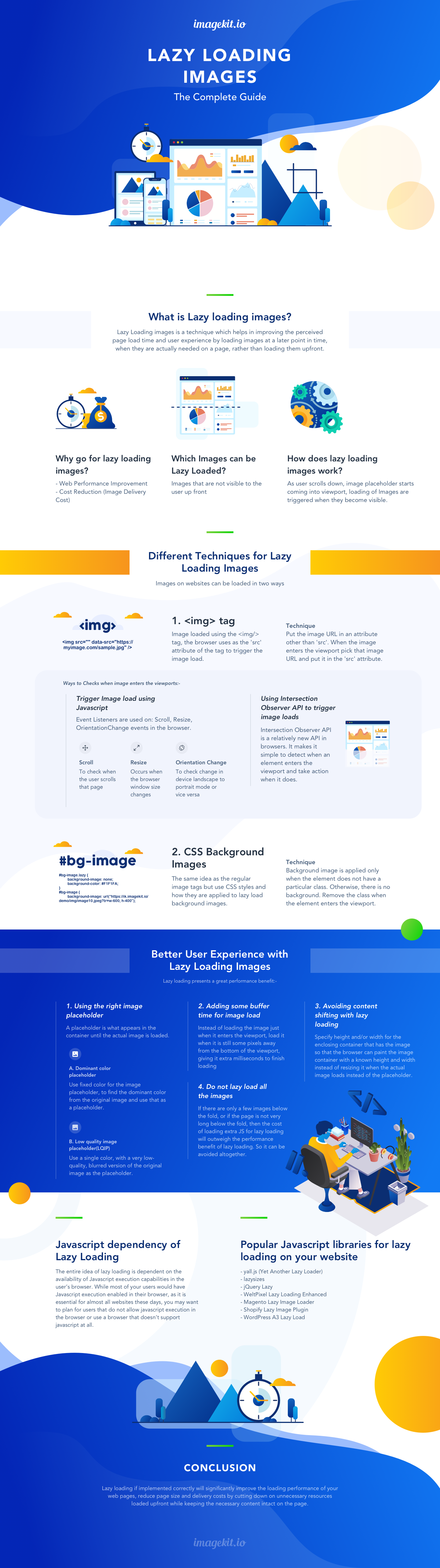
Better user experience with lazy loading images
Lazy loading presents a great performance benefit. For an e-commerce company that loads hundreds of product images on a page, lazy loading can provide a significant improvement in initial page load time while decreasing the bandwidth consumption. However, a lot of companies do not opt for lazy loading, because they believe it goes against delivering a great user experience – the initial placeholder is ugly, the load times are slow etc. In this section, we will try to solve some concerns around user experience with lazy loading of images.
1. Using the right image placeholders
A placeholder is what appears in the container until the actual image is loaded. Normally, we see developers using a solid color placeholder for images or a single image as a placeholder for all images.
We used the same in our example code as well. A solid light grey color is used for all our image backgrounds. However, we can do better to provide a more pleasing user experience. Below are some examples of using better placeholders for our images.
a. Dominant color placeholder
Instead of using a fixed color for the image placeholder, we find the dominant color from the original image and use that as a placeholder. This technique has been used for quite some time in Google image search results and Pinterest.
Sample image picked from Manu.ninja

This might look complex to achieve. But, a very simple way of accomplishing this is to first scale down the image to a 1×1 pixel and then scale it up to the size of the placeholder – a very rough approximation but a simple, no-fuss way to get a single dominant color. Using ImageKit, the dominant color placeholder can be obtained using a chained transform in ImageKit as shown below.
Dominant color placeholder image URL example using ImageKit

The placeholder image is just 661 bytes in size compared to the original image that is 12700 bytes – 19x smaller. And it provides a nicer transition experience from placeholder to the actual image.
Here is a video demonstrating how this effect works for the user.
You can view the working example and code for using dominant color placeholder here.
b. Low quality image placeholder (LQIP)
We can extend the above idea of using a dominant color placeholder further. Instead of using a single color, we use a very low-quality, blurred version of the original image as the placeholder. Not only does it look better, it also gives the user some idea about what to expect in the actual image and gives the perception that the image load is in progress. This is great for improving the perceived loading experience. This technique has been utilized by the likes of Facebook and Medium.com for images on their websites and apps.
LQIP image URL example using ImageKit

The LQIP is 1300 bytes in size, still almost 10x smaller than the original image and a significant improvement in terms of visual experience over any other placeholder technique.
Here is a video demonstrating how this effect works for the user.
You can view the working example and code for using LQIP technique here.
It is clearly evident from the video samples of the two techniques above, that using dominant-color placeholders or using low-quality image placeholders provides a smoother transition from the placeholder to the actual image, gives the user an idea of what is to come in place of that placeholder and improves loading perception.
2. Adding some buffer time for image load
When we discussed different methods to trigger image load above, we checked for the point of time where the image enters the viewport i.e. image load is triggered when the top edge of the image placeholder, coincides with the bottom edge of the viewport.
The problem
Often, users scroll really fast through the page and the image will need some time to load and appear on the screen. In this scenario, combined with the fact that the load image event might be triggered with a delay because of throttling, you would often face the scenario where the placeholders come into the viewport, the user waits for a few milliseconds and then the image shows up. This delay makes for a poor user experience.
While using Intersection Observers to load the image or using low-quality image placeholders provides better loading performance and user experience, there is another simple trick that you can use to ensure that the images are always loaded completely when they enter the viewport – introduce a margin to the trigger point for images.
The solution
Instead of loading the image just when they exactly enter the viewport, load the images when they are, let’s say, 500px away from entering the viewport. This provides additional time, between the load trigger and the actual entry in the viewport, for the images to load.
With the Intersection Observer API, you can use the root parameter along with the rootMargin parameter (works as standard CSS margin rule), to increase the effective bounding box that is considered to find the “intersection”. With the event listener method, instead of checking for the difference between the image edge and the viewport edge to be 0, we can use a positive number to add some threshold.
The example here uses a 500px threshold to load images.
As evident from the video below (monitor the network requests closely appearing at the bottom), while scrolling, when the third image is in view, the 5th image gets loaded. When the 4th image comes into the view, the 6th image gets loaded. This way we are giving sufficient time for the images to load completely and in most cases, the user won’t see the placeholder at all.
And if you didn’t notice earlier, in all our examples, the third image (image3.jpg) is always loaded up front, even though it is outside the viewport. This was also done following the same principal – load slightly in advance instead of loading exactly at the threshold for better user experience.
3. Avoiding content shifting with lazy loading
This is another trivial point, which if solved, can help maintain a good user experience.
The problem
When there is no image, the browser doesn’t know the dimensions of the content that is to be displayed in the enclosing container. And if we do not specify it using CSS, the enclosing container would have no dimensions i.e. 0 x 0 pixels. Then, when the image gets loaded, the browser would resize the enclosing container to fit the image. This sudden change in the layout causes other elements to move around and it is called content shifting. As demonstrated in this content shifting article & video from Smashing Magazine, it is a rather unpleasant experience for a user, as the content moves suddenly when the image loads.
The solution
This can be avoided by specifying a height and/or width for your enclosing container so that the browser can paint the image container with a known height and width. Later, when the image loads, since the container size is already specified and the image fits into that perfectly, the rest of the content around that container does not move.
4. Do not lazy load all the images
This is another mistake that developers often commit – lazy load all the images on the page. This might reduce the initial page load, but would also result in bad user experience as a lot of images even at the top of the webpage won’t show up till the Javascript gets executed.
We can follow some general principles to identify which images should be lazy loaded.
a. Any image that is present in the viewport, or at the beginning of the webpage, should not be lazy loaded. This applies to any header image, marketing banner, logos etc. as the user should see them as soon as the page loads. Also, remember that mobile and desktop devices will have different screen sizes and hence a different number of images that will be visible on the screen initially. So you need to take into account the device type to decide which resources to load up front and which to lazy load.
b. Any image that is just slightly off the viewport should not be lazy loaded. This is going by the principle discussed above – load slightly in advance. So let’s say any image that is 500px or a single scroll from the bottom of the viewport can be loaded up front as well.
c. If the page isn’t lengthy, may be just a single scroll or a couple of scrolls, or if there are less than 5 images outside the viewport, then lazy loading can be avoided altogether. It would not provide any significant benefit to the end user in terms of performance. The additional JS that you load on the page to enable lazy loading will offset the gain from lazy loading such a small number of images.
Javascript dependency of Lazy Loading
The entire idea of lazy loading is dependent on the availability of Javascript execution capabilities in the user’s browser. While most of your users would have Javascript execution enabled in their browser, as it is essential for almost all websites these days, you may want to plan for users that do not allow javascript execution in the browser or use a browser that doesn’t support javascript at all.
You could either show them a message telling them why the images won’t load and that they need to switch to a modern browser or enable Javascript. Or you can use the noscript tag to create a usable experience for these users as well. Using the tag approach for such users has some gotchas. This question thread on Stack Overflow does a great job addressing these concerns and is a recommended read for anyone looking to address this set of users.
Popular Javascript libraries for lazy loading on your website
Since browser environments and implementation details can vary across browsers and devices, it is best to use a tried and tested library for lazy loading. Here is a list of popular libraries and platform specific plugins that will allow you to implement lazy loading with minimal effort
yall.js (Yet Another Lazy Loader) – Uses Intersection Observer and falls back to event-based lazy loading. Supports all major HTML element types but not background-images. Works on IE11+ as well.
lazysizes – Very popular and extensive functionality. Supports responsive images srcset and sizes attribute as well. High performance even without Intersection Observer.
jQuery Lazy – A simple, jquery based lazy loading library.
WeltPixel Lazy Loading Enhanced – A Magento 2 extension for lazy loading images
Magento Lazy Image Loader – A Magento 1.x extension for lazy loading images
Shopify Lazy Image Plugin – A Shopify extension for lazy loading images. It is paid though.
WordPress A3 Lazy Load – Image lazy loading plugin for WordPress
How to test if lazy loading is working?
Once you have implemented lazy loading, you would want to check if the behaviour of images on your website is as intended. The simplest way would be to open up developer tools in Chrome browser.
Go to Network Tab > Images. Here, when you refresh the page for the first time only the images that are to be loaded up front should get loaded. Then as you start scrolling down the page, other image load requests would get triggered and loaded. You can also notice the timings for image load in the waterfall column in this view. It would help you identify image loading issues if any or issues in triggering the image load.
Another way would be to run the Google Chrome Lighthouse audit report on your page after you have implemented the changes and look for suggestions under the “Offscreen images” section.
Conclusion
We have covered almost everything related to lazy loading images in this guide. Lazy loading if implemented correctly will significantly improve the loading performance of your web pages, reduce page size and delivery costs by cutting down on unnecessary resources loaded up front, while keeping the necessary content intact on the page. Your users would love it too when they get a great experience with the faster loading pages.
So, what are you waiting for? Get started with lazy loading images now!

Top comments (5)
Give my <lazy-image> element a try.
Neat article, thanks for sharing!
Good article Rahul. Go ahead.
you should check out Imgix. It's a hosted service that allows realtime processing of master images and provides a JS library for lazy-loading and dealing with responsive-design-centric media.
I think you should take a look at this: github.com/RevillWeb/img-2