The Challenge
Each year in October, Women Make holds a month-long, non-competitive hackathon called Just F*ing Ship It. The goal is to build and launch something over the course of a month.
2020 was the third year of the challenge and my first year participating. Here's what I did and what I learned!
In This Article
- What I Built
- The Tech and Tools I Used
- What I Learned and Other Takeaways
- How It's Going Now
- What's Next for Start Designing Today
What I Built
Validating my Idea
At first, I wanted to do something simple and small, like redesigning this blog. But then I got an idea that I just couldn't get out of my head and bought a domain, as you do. 😂
I spend much of my spare time designing knitting patterns, which I have been doing since 2015. I have learned a lot about knitting pattern design from resources dispersed all across the web during that time.
I had recently had a few conversations with other knitters who wanted to start designing, but didn't know how to start. Those conversations got me thinking that a one-stop resource website could be helpful.
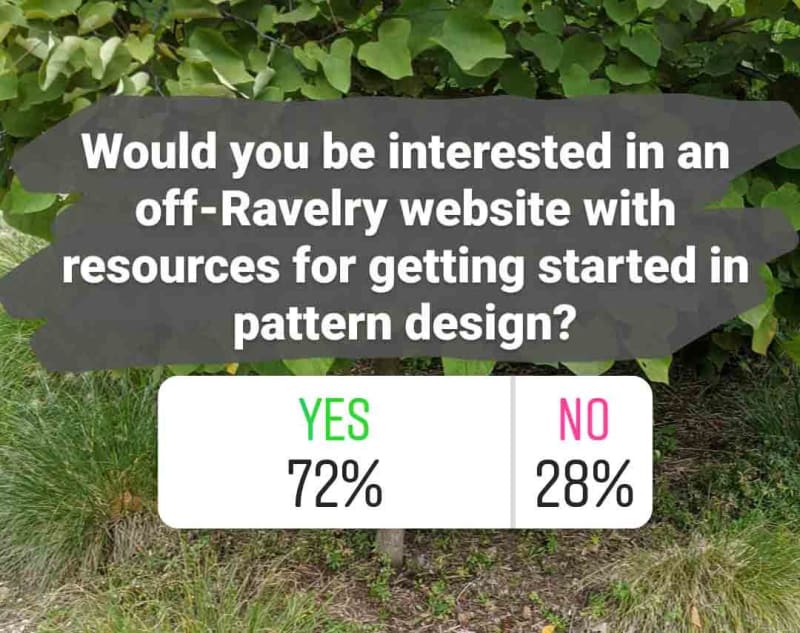
I posted a poll on Instagram asking if folks would be interested in a website that collected resources on how to design knitting and crochet patterns and got enough interest that I decided to go for it.
I bought startdesigningtoday.com (and startdesigning.today for good measure), created a new ConvertKit account, and threw up a quick landing page with a form for interested folks to submit their email address.
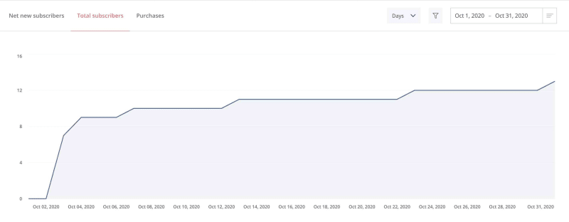
I posted about it on Instagram and got some interest right away! Nine aspiring designers signed up for my interest list in the first two days, with a few more trickling in throughout the month.
The Scope
Since the challenge only lasted one month and I work a full-time job, I needed to make sure to scope the project to something I could actually build and ship in a month, while working on it just a few hours a week.
I have big ideas around building a whole Start Designing Today ecosystem (like an email course and community), but for this challenge, I decided to focus on the website. Even if I never get around to building any of the other stuff, I think the website provides a good amount of value on its own.
I wrote out a very brief list of functional requirements for the website:
- The website should have resources pages.
- Users should be able to search resources.
- Users should be able to filter resources by category.
- The website should have a blog section with original articles.
- The website should show featured articles.
- Users should be able to sign up for a newsletter.
- Users should be able to submit a resource.
In the end, I decided to reduce the scope even further to ship an MVP in time. I only included these four functional requirements in the website I launched on November 1:
- The website should have resources pages.
- Users should be able to filter resources by category.
- The website should have a blog section with original articles.
- Users should be able to sign up for a newsletter.
Screenshots
For larger screenshots, visit the original article on my blog.
Here are some screenshots of the main features of the site, or you can click here to browse it yourself. These screenshots are taken of the desktop site--if you are reading this on your phone, visiting the live site will be a better, responsive experience.
If you aren't interested in the appearance and structure of the site, click here to skip ahead to the technical implementation details! I won't be offended. 😊
I went with an upside-down homepage approach to prioritize newsletter signups. I didn't want to bury the newsletter call to action at the bottom of the page where visitors might not see it.
Below the header, the homepage prompts visitors to select which stage of the design process they are looking for help with. These are the resource categories I mentioned in my functional requirements.
When a user clicks on a resource category, they come to a page with subcategories/topics across the top that they can click to view resources about that topic. Below is an example of a resource page, Submitting to Publishers.
There are also blog, about, and contact pages, but there's nothing particularly interesting and screenshot-worthy going on there. 😂
The Tech and Tools I Used
Front End: Gatsby
I used Gatsby for the front end. I already had some limited experience with Gatsby from building my personal site and customizing this blog, but not really enough to build Start Designing Today.
However, Wes Bos's Gatsby course, which I had been looking forward to for a while, came out around the start of the challenge. The timing was perfect for me to use this project as a tool to practice what I learned.
To be honest, I'm still only about halfway through the course! Once I learned everything I needed for Start Designing Today, I stopped so I could get going on building the site. I'll get back to it sometime soon, I promise!
No-Code Back End: Airtable
I didn't want to build a custom backend for this project, but I didn't need a full CMS either. I decided to go with Airtable, which is a pretty sweet no-code application tool.
I used it to build a simple relational database with just three tables: Parent Categories, Categories, and Links.
I used the gatsby-source-airtable plugin to get the data out of Airtable and into my Gatsby site. This post on building a custom CMS with Airtable and Gatsby was really helpful for getting up and running.
Hosting: Netlify
I use Netlify for hosting whenever I can these days. Since Start Designing Today is a static site, Netlify is perfect for it.
Whenever I add new data to Airtable, I just pop on over to Netlify and trigger a new deploy. And when I update my code and push it to GitHub, a new deploy builds automatically. 😊
Newsletter: ConvertKit
I'm using the free tier of ConvertKit for the newsletter, for now. I'm thinking about doing a pattern design email course in 2021. If I do that, I might upgrade to a paid plan so I can have access to automations.
What I Learned and Other Takeaways
First things first: I learned I don't want to do anything every day for a month if it isn't eating, sleeping, or knitting. 😂 I set out to work on this every day in October, but after about two weeks, I couldn't keep up the pace anymore. I needed breaks and took several, some multiple days long. I'm really glad I went with a limited MVP scope for this project so I could comfortably take breaks and still ship on time without stressing.
I found it incredibly helpful to have a community of people doing this challenge at the same time. I doubt I would have built and shipped this website in a month if it wasn't for the amazing Women Make community.
Announcing the site at the start of the challenge also helped me stay accountable because I knew there were real people excited about it and waiting for it. That helped me avoid the trap of finishing the first 80%, which is usually the most fun part, and then never finishing that last 20% and getting it out the door.
Would I Do it Again?
I had a blast participating in the Just F*ing Ship It challenge this year and I definitely think it will become an annual thing for me, but I probably won't try to take a completely new project from start to MVP launch next year. Even though I did take days off, I was very ready to be done by the end.
Maybe next year I'll tackle that blog redesign, instead. 🤷♀️
How It's Going Now
Newsletter
Since launching, I started sending the weekly Start Designing Today newsletter. As of this writing on December 5, 2020, my little email list has grown slightly to 16 subscribers. I have sent four newsletters with open rates between 60% and 85% and no unsubscribes yet!
SEO
A few weeks after launch, I signed up for a free Ahrefs Webmaster Tools account and found out that I had really f*ed up my SEO by accidentally having redirect chains for every page! (This is bad because Google won't index pages that look like they have moved.)
It turns out it's a really bad idea to forget the trailing slash in links and even worse to generate page slugs without trailing slashes. If I referenced a page with a trailing slash, it would redirect to that same page without a trailing slash, and then redirect AGAIN to that page with a trailing slash. D'oh.
I updated how I was generating page URLs in my gatsby-node.js file and generated them with a trailing slash from the start. I also checked all my internal links and added trailing slashes. That seems to have solved the problem.
I referenced this article by Maxime Heckel on SEO mistakes he has made with his Gatsby blog and how to fix them several times throughout the process of debugging that redirect chain issue. It's definitely worth checking out.
Real Results
So far, I have received one real testimonial that the site is helpful! A knitter DMed me on Instagram to tell me that she was designing her first sweater thanks to Start Designing Today! She said "your site is so perfect for finding what I need." I couldn't be happier with that!
What's Next for Start Designing Today
For now, I'm focusing on sending my newsletter consistently, coming up with more topics to write about for the blog, and improving SEO by doing some keyword research and editing copy where it makes sense. I have a couple sites in mind that I would like to compete with for rankings, so I'll be starting there.
In the longer term, I would like to launch an email course to walk folks through the process of designing a pattern, with the goal of having a publication-ready pattern by the end of it.
I also want to explore creating a community for aspiring knit and crochet pattern designers, whether that's something as simple as a Discord server, or something more.
What About You?
Have you launched anything recently? How is it going? I would love to hear about it!


Top comments (2)
Very good article.
Thank you!