Learn how to create a simple button out of a link tag and style it with CSS that will work on any website.
CSS Buttons are a great way to add clickable buttons to your website because they are responsive (adjust to different screen sizes), much faster to load than buttons made with image files and you can add effects to CSS buttons like ‘hover’ and ‘focus’.
Now you’re convinced you definitely want HTML Buttons styled with CSS on your website, let’s look at how to actually make them.
Step 1 - Creating a HTML Button
The first step is to create some HTML that you can then copy / paste into your website to actually create the element that is going to be your button.
Buttons can perform many different functions on a website but let’s assume that you want your button to take a user to another page on your website. For this we need to write a link:
<a href="https://html-buttons.com/button-generator">Click me! I'm a button.</a>
Clicking this link simply takes the user to the page defined inside the quote marks. Links are made by using an opening and closing anchor tag: <a>Click Here</a>. The href=”” attribute defines the location of the link.
We now have a basic HTML link that looks like this:
We can now use CSS to turn it into a stylish button.
Step 2 - Using CSS to style the HTML Button
To style your button with CSS we need to add a class to the link tag. You can call the class pretty much anything you like but let’s go with ‘myButton’ for this demo.
<a class="myButton" href="https://html-buttons.com/button-generator">Click me! I'm a button.</a>
The class allows us to ‘target’ the HTML with our CSS to give it style. To do this we need to create a stylesheet and define the CSS rules for our new class ‘myButton’.
Stylesheets are defined in HTML with the <style> tag with all your CSS is written inside the style tags.
<style>
/*Your CSS goes in here*/
</style>
To define the class ‘myButton’ add the following code inside your new style tags:
<style>
  .myButton {
     /*CSS rules are defined in here*/
  }
</style>
Note how the class ‘myButton is preceded by a fullstop and followed by an opening and closing curly bracket.
We will write our CSS rules inside the curly brackets.
Step 3 - Getting creative, styling the new CSS Button
Everything is set up, we can go ahead and get creative to turn our plain old HTML link element into a beautifully styled CSS Button. But what kind of style should it have?
There are no rules, you can style your button however you like. Here are a whole load of CSS styled buttons for inspiration and below are my ideas for styling a good button.
If you don’t want to write your own code, you can also check out the button generator I made which allows you design buttons visually without coding.
Spacing
Spacing sets buttons apart from other elements on the page and it’s useful to give us space around the words inside the button so that we can add a colored background or a border later on.
There’s a tiny problem we need to solve first. Anchor tags are by default ‘inline’ which means they display themselves inline or ‘inside’ other html tags, most commonly paragraph tags.
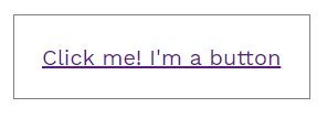
To fix this we want to change the display property for the anchor tag to ‘inline-block’. This then allows us to add spacing in the form of ‘padding’ to the button. Here is what that code looks like and the result. I’ve also added a light border to you can see how the padding has increased the size of the button.
<style>
.myButton {
     display:inline-block; /*This ensures the button stands out from other HTML elements*/
     padding:20px; /*This adds 20 pixels of padding around the inner text on all sides*/
     border: 1px solid gray; /*This adds a light gray border, 1 pixel wide, around the outside of the button*/
}
</style>
Here’s the result of the CSS above on the HTML anchor element:
Color
A splash of color makes any button stand out. Often designers come up with ‘accent’ colors in their brand designs and these are perfect for buttons.
Usually, the accent color used in a button is opposite the site’s main theme color so that it stands out nicely. For example, orange buttons work well on blue websites.
Let’s add some color now to our CSS Button. We can add color to the button in three main ways:
- Background
- Font
- Border
These parts of your button can be colored by adding the following CSS:
<style>
.myButton {
   background: orange;
   color: blue;

   /*CSS rules already written*/

   display:inline-block;
   padding:20px;
   border: 5px solid green; /*Note how I changed the color from gray to green*/
}
</style>
Here’s the result of adding those new color rules:
Ok, so it’s not going to win any design competitions but at least we know the CSS works!
CSS recognises loads of colors by their names (i.e. red, orange, blue, yellow etc) but you can also define colors using Hexidecimal which gives you many more possible colors to choose from.
Hex colors (short for Hexidecimal colors) look like this: #21BC27 which just happens to be a rather nice shade of green.
The easiest way to choose a Hex color is to use a color picker like this one.
Once you’ve found colors you like, you can use the Hex values in your CSS like this:
<style>
.myButton {
   background: #21BC27;
   color: #CDFFCA;

   /*CSS rules already written*/

   display:inline-block;
   padding:20px;
   border: 1px solid #20750D; /*The new border color is here*/
}
</style>
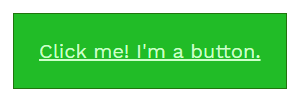
And here’s the result of those Hex colors. Certainly a more pleasing button than the first attempt.
Borders
Borders are very useful when styling HTML and CSS Buttons because not only do they give your button an outline that can be colored and styled but they also allow you to define what happens to your button’s corners.
Do you prefer rounded corners or hard square corners? We can use borders to give us both.
Borders are defined in two main rules, the ‘border’ rule and the ‘border-radius’ rule. The ‘border’ rule allows us to define border width, border type and border color on one line and the border radius rule allows us to define the radius of the corner. That is to say, how rounded the corners of the button should be.
Here’s what that looks like in CSS and in the resulting button.
Note how I removed the old border rules and replaced them with new ones:
<style>
.myButton {
    border: 5px solid #20750D;
    border-radius: 12px;

    /*CSS rules already written*/

    background: #21BC27;
    color: #CDFFCA;
    display:inline-block;
    padding:20px;
}
</style>
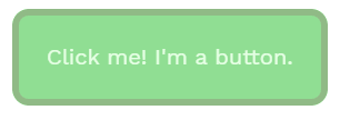
These new border rules create a solid border on all sides of the button 5 pixels wide in dark green (#20750D). All four corners of the button are rounded to a radius of 12 pixels. Here’s the result:
There are loads of options with your borders. For a start, you don’t have to have a border on every side. You can define a different style for the top, right, bottom and left border of your button. You can do the same for the corners too so none of the sides or the corners have to be the same.
Here’s how that looks in CSS:
<style>
.myButton {
    border-top: 5px solid #20750D;
    border-right: 2px solid red;
    border-bottom: 10px solid yellow;
    border-left: 7px solid green;
    border-radius: 12px 1px 8px 30px;

    /*CSS rules already written*/

    background: #21BC27;
    color: #CDFFCA;
    display:inline-block;
    padding:20px;
}
</style>
Notice how we define border-top, border-right, border-bottom and border-left separately but the border-radius values are all defined on one line. When you’re defining multiple values on one line the order is always top, right, bottom left. However, with corners it’s top-right, bottom-right, bottom-left, top-left.
Here’s what the button now looks like:
Pretty awful! But, it demonstrates the point. One button design that makes good use of different border values is Forest. Forest has one dark green border at the bottom until you hover over it when you can then see light green buttons on the other three sides.
Seville on the other hand has a consistent border style all the way around but uses different border radius values to create a unique look with opposing corners rounded and square.
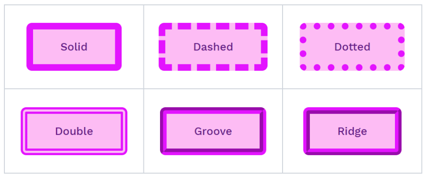
Borders also don’t have to be solid. They can be:
- solid
- dashed
- dotted
- double
- groove
- ridge
Here’s how to write CSS for the different border types:
<style>
.solid {
   border: 2px solid gray;
}
.dashed {
   border: 2px dashed black;
}
.dotted {
   border: 2px dotted green;
}
.double {
   border: 2px double blue;
}
.groove {
   border: 2px groove yellow;
}
.ridge {
  border: 2px ridge red;
}
</style>
Each border type looks totally different:
Groove and Ridge border types only really work visually when the border color is light enough that the contrast can be seen. If you use a very dark color, the effect isn’t visible.
Hover Effects
Hover effects change the button’s style when the user hovers their mouse or cursor over the button. Note that hover effects don’t really work on touch devices where there is no cursor.
However, everyone loves a hover effect on a button because it makes the button interactive and helps reinforce the point that the button should be clicked.
Any of the CSS we’ve added so far can be changed with a hover effect: spacing, color and border, but you there is also another favourite of the hover effect styles: opacity.
Opacity is the level of ‘see through’ the button is. You can make any element more or less see through on the page or hide something all together. The opacity rule looks like this:
<style>
  .opacityButton {
    opacity:1;
  }
  .opacityButton:hover {
    opacity:0.5;
  }
</style>
In this example, the opacity of any element with the class ‘opacityButton’ will be 1 and when you hover over it, the opacity will become 0.5. Basically, the button goes see through when you hover over it.
Did you see how we define hover effects too? It’s easy really, you just add ‘:hover’ after the class and define separate rules for what should happen to the button when it is hovered over.
Here’s how to add hover to our working example button:
<style>
.myButton {
  border: 5px solid #20750D;
  border-radius: 12px;
  background: #21BC27;
  color: #CDFFCA;
  display:inline-block;
  padding:20px;
  opacity:1;
}
.myButton:hover {
  opacity:0.5;
}
</style>
All we’ve done is added the opacity rule to our class ‘myButton’ and then written the same class again but this time with the :hover declaration defined.
Here’s the result:
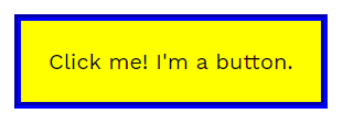
But it’s not just opacity that can change on hover, in this example we’ll change the color, border, and background all in one go.
Note, we are not changing the opacity:
<style>
.myButton {
  border: 5px solid #20750D;
  border-radius: 12px;
  background: #21BC27;
  color: #CDFFCA;
  display:inline-block;
  padding:20px;
}
.myButton:hover {
  border: 5px groove blue;
  border-radius:0px;
  color:black;
  background:yellow;
}
</style>
And here’s the result:
Transition
In partnership with :hover, we can also define a transition value to make the hover effect change faster or slower depending on our tastes. Transitions are measured in seconds and the rule looks like this:
<style>
.transition {
   transition:1.5s;
}
</style>
If you add a transition to both the main class and the class with the :hover modifier, then you’ll get a transition both when the user hovers over the button and when they stop hovering over the button.
The transition value can be different for each. For example, the transition could be faster when the user hovers over the button and slower when the user stops hovering.
Here’s the transition effect in use on our demo button:
<style>
.myButton {
  border: 5px solid #20750D;
  border-radius: 12px;
  background: #21BC27;
  color: #CDFFCA;
  display:inline-block;
  padding:20px;
  transition:3s;
}
.myButton:hover {
  border: 5px groove blue;
  border-radius:0px;
  color:black;
  background:yellow;
  transition:0.5s
}
</style>
In this example, when the user hovers over the button it will transition to the new styles defined in 0.5 seconds (half a second) but when the user stops hovering, the main styles will take effect over 3 seconds.
Doing more with HTML and CSS Buttons
As you can see there are so many creative ways to style a button. This guide has shown you the basic methods for creating a HTML link element that you can then target with a class (myButton) which we then use to define CSS rules to give the element style.
You can create buttons like this on your website using these techniques but you might have more questions about things like button size, alignment (left, middle, right) and how to add icons to your buttons.
It starts to get a little bit complicated (nothing you can’t handle of course!) but there is an easier way. Here on the HTML Buttons website is an easy to use Button Generator that allows you to change CSS rules using sliders and inputs while the button design updates on the page instantly.
It makes designing buttons super quick and easy and it gives you the code you need to use the button on your website right away.
You can also browse our library of ready-made HTML and CSS Buttons that you can use for free in your web project. You can still customise these buttons to align them left, center, right or 100% width. You can also add icons, adjust the size and even change the HTML tag you want to use.
We also have other helpful guides on creating and using HTML and CSS buttons for your web design projects.







Top comments (0)