In this post, we'll listen for DOM events using Angular's @HostListener so that we can trigger actions when an element scrolls completely into view (and reverse them once the element begins scrolling out of view).
Full code is available here
Handy Use-Cases for this Approach
- Trigger animations while users scroll down a page (all the rage in SaaS)
- Confirm if sections of a view have been "read" by a visitor
- Qualify some other logic first before having sensitive information appear
Core Concepts in this Article
- Shortcuts in VSCode
- SCSS quick tips (in comments)
- Implications of
ng-containerelement - The
ViewChilddecorator for anchored element IDs - Event listening with
HostListener,ElementRef, andViewChild - How
XandYcoordinates work in the viewport - JavaScript's
getBoundingClientRect()method
Skip Ahead
- Create the App
- Add Dependencies
- Scrollable Elements
- Listening to the Event and Capturing Viewport Coordinates
- Recognizing the Elements to Fire Event
- End Result
Create the App
Start with a new angular app (without generating test files) by running the following command in your terminal followed by the flag included here:
$ ng new viewport-scroll-demo --skip-tests
Add Dependencies
CommonModule
Add the CommonModule from angular's core package to ensure that we can manipulate the DOM with angular's core directives.
// app.module.ts

import { AppComponent } from './app.component';
import { BrowserModule } from '@angular/platform-browser';
import { NgModule } from '@angular/core';

// ⤵️ Add this
import { CommonModule } from '@angular/common';

@NgModule({
  declarations: [
    AppComponent
  ],
  imports: [
    BrowserModule,
    // ⤵️ and this
    CommonModule
  ],
  providers: [],
  bootstrap: [AppComponent]
})
export class AppModule { }
-
Material Icons
We'll be adding an icon to an element that will appear and disappear, depending on if it's inside the viewport or not. Add the following to your index.html file within its <head> section:
<link rel="stylesheet" href="https://fonts.googleapis.com/icon?family=Material+Icons">
Now we're able to add icons, using Google's Material Icons Library with the following syntax:
- Add a
.material-iconsclass to an<i>element - Specify the icon with the string that the element is wrapped around
<i class="material-icons">search</i>
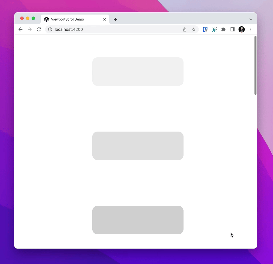
Scrollable Elements
To help us visually understand where we are in a view, let's add elements of different colors.
- Remove the placeholder content inside the
app.component.html. - Add
divelements with different classes. I created 10 elements with the first having a.oneclass, the second having a.twoclass, and so on. - We differentiate with classes so that we can add different styles to better recognize when elements scroll into and out of view
If you're using VSCode, you can quickly do this by typing out the class with its prefix
.in the template and pressingTABon your keyboard

-
Styling with SCSS
Add the following SCSS. Remember that we'll be adding icons so this is why there are references to classes that do not yet exist in the template:
Note: I added descriptive comments since I realize I tend to overlook the power of SCSS in my posts
// app.component.scss

:host {
  // Ensures the host itself stacks the elements in a column
  width: 100vw; // Enables a narrow centering [line 11]
  display: flex;
  flex-flow: column nowrap;
  align-items: center;
  justify-content: flex-start;
}

div {
  // Center narrow content
  width: 320px;
  min-height: 100px;
  margin: auto;

  // Space between elements
  // Notice that I don't use `margin:` as this would override the above `margin: auto`
  margin-top: 5rem;
  margin-bottom: 5rem;

  // Use Flexbox to center enclosed elements (icons)
  display: inline-flex;
  flex-flow: row nowrap;
  align-items: center;
  justify-content: center;

  border-radius: 18px; // Pretty corners
  i { font-size: 30px; } // Resizes the Icons

  // Gradual "Color" Change via Opacity
  &.one { background-color: #00000010; }
  &.two { background-color: #00000020; }
  &.three { background-color: #00000030; }
  &.four { background-color: #00000040; }
  &.five { background-color: #00000050; }
  &.six { background-color: #00000060; }
  // IF adding icons, icons should be white for visible contrast
  &.seven { background-color: #00000070; color: white; }
  &.eight { background-color: #00000080; color: white;}
  &.nine { background-color: #00000090; color: white; }
  &.ten { background-color: #000000; color: white; }
}
Now if you run $ ng serve in your terminal (to serve the app locally), this is what you'll find on localhost:4200:

Adding Conditional Icons
In the component file, add two properties to drive the behavior for 2 elements in the template. Since my example uses the web and public icons, I've created the following properties:
// app.component.ts

// ...

export class AppComponent {
  showsWebIcon = false;
  showsPublicIcon = false;
}
-
NG-Containers and Anchored IDs
Inside the template:
- Add two
ng-containerelements inside the 5th and 8th elements we created earlier- We use the
ng-containerinstead of tacking the*ngIfdirective onto the div since this ensures that whatever is enclosed will not appear in the DOM.
- We use the
- Enclose two different material icons inside those elements
- Add an
*ngIfdirective that toggles the appearance of theng-containerbased on the corresponding properties we created above - Add an anchored reference to the 5th and 8th enclosing divs called
#fiveand#eightso that we can access them from the component
<!--app.component.html-->

<!-- more code ... -->

<div class="five" #five> <!-- ⬅️ New ID: `#five` -->
  <!-- ⤵️ Conditional ng-container with `*ngIf` directive -->
  <ng-container *ngIf="showsWebIcon">
    <i class="material-icons">
      web
    </i>
  </ng-container>
</div>

<!-- more code ... -->

<div class="eight" #eight> <!-- ⬅️ New ID: `#eight` -->
  <!-- ⤵️ Conditional ng-container with `*ngIf` directive -->
  <ng-container *ngIf="showsPublicIcon">
    <i class="material-icons">
      public
    </i>
  </ng-container>
</div>

<!-- more code ... -->
-
Accessing Elements from the Component
In order for the HostListener to recognize elements from the DOM, we have to access the elements inside the component and initialize them as references with ElementRef. We can use Angular's @ViewChild feature to do this:
- Import
ViewChildfrom Angular's core package - Create a label with a
@ViewChildprefix decorator that accepts the template's ID as astring- Ensure that the type is specified to
ElementRefwhich is also imported from Angular's core package
- Ensure that the type is specified to
// app.component.ts

// ⤵️ Import ViewChild here
import { Component, ElementRef, ViewChild } from '@angular/core';

// ...

export class AppComponent {
  showsWebIcon = false;
  showsPublicIcon = false;

  // ⤵️ Access through ViewChild like this
  @ViewChild('five') divFive!: ElementRef;
  @ViewChild('eight') divEight!: ElementRef;
}
Listening to the Event and Capturing Viewport Coordinates
- In the
app.component.tsfile, importHostListenerfrom the core package - Create a public
onViewScroll()method prefixed with the@HostListenerdecorator; which takes in the event it's listening for, and an argument that specifies an event
// app.component.ts

// ⤵️ Import HostListener
import { Component, ElementRef, HostListener, ViewChild } from '@angular/core';

// ... more code

export class AppComponent {
  // ... more code

  // ⤵️ Add the HostListener decorator and onViewportScroll() method
  @HostListener('document:scroll', ['$event'])
  public onViewportScroll() {

  }
}
Explainer: Viewport Coordinates and BoundingRect
Skip to the next section if you're already familiar with these
To better understand the logic we're adding to this method, let's refresh on how the viewport captures coordinates:
- Coordinates are defined on an X and Y axis that starts in the top-left [
0,0] - The further away from the top an element is, the greater the Y axis number will be; and the further away from the left an element is, the greater the X axis number will be

The <element>.getBoundingClientRect() method returns the viewport coordinates of the smallest possible rectangle that contains the target element specified; and specific coordinates for what's returned can be accessed with .top, .left, etc.

Recognizing the Elements to Fire Event
Getting the ElementRect from the DOM
Now we can add the onViewScroll() logic in a way that calculates the current window height against the current position of the element we specify
- Import
ElementReffrom the core package - Have the method instantiate the current window's height when the event is triggered by the listener
- Calculate the bounded rectangle identified [using
<element>.getBoundingClientRect()method] against the window's height to determine its coordinates - Note: I added a private helper function for resetting the icon properties to
false```typescript
// app.component.ts
// ⤵️ Import ElementRef from the core package
import { Component, ElementRef, HostListener, ViewChild } from '@angular/core';
// ... more code
export class AppComponent {
// ... more code
// ⤵️ method called by other methods, to hide all icons
private hideAllIcons() {
this.showsWebIcon = false;
this.showsPublicIcon = false;
}
@HostListener('document:scroll', ['$event'])
public onViewportScroll() {
// ⤵️ Captures / defines current window height when called
const windowHeight = window.innerHeight;
// ⤵️ Captures bounding rectangle of 5th element
const boundingRectFive = this.divFive.nativeElement.getBoundingClientRect();
// ⤵️ Captures bounding rectangle of 8th element
const boundingRectEight = this.divEight.nativeElement.getBoundingClientRect();
// ⤵️ IF the top of the element is greater or = to 0 (it's not ABOVE the viewport)
// AND IF the bottom of the element is less than or = to viewport height
// show the corresponding icon after half a second
// else hide all icons
if (boundingRectFive.top >= 0 && boundingRectFive.bottom <= windowHeight) {
  setTimeout(() => { this.showsWebIcon = true; }, 500);
} else if (boundingRectEight.top >= 0 && boundingRectEight.bottom <= windowHeight) {
  setTimeout(() => { this.showsPublicIcon = true; }, 500);
} else {
  this.hideAllIcons();
}
}
}
---
# End Result
Though this _functional_ demo doesn't make it look too exciting (at all), it's a great tool to keep in your arsenal for when that complex use-case makes its way around!
Ri

Top comments (4)
Hey Nice work, Learnt something new
Thanks buddy! Glad it helped!
Hey Ria,
thanks for the post. Unfortunately my ElementRef's are undefined at the time the HostListener is established. I do not understand why your code does not have any issues with that since they should only become available with the AfterViewInit lifecycle hook?
Thanks for sharing!