Guiding Users to an "A-ha" Moment
In 2020, ex-fb exec Chamath Palihapitya shared his secret for growing Facebook to its first billion users. He had a laser focus on only 3 goals: getting users in the door, getting users to experience core value as fast as possible, and delivering core value as often as possible.
We wanted to see if we could apply these principles at Arctype and recreate the magic that Chamath engineered at Facebook. So last month we focused on the second goal, getting users to experience core value, and we saw some impressive results.
At Arctype we’re building a SQL editor to help our users collaborate on database management and analytics. One of our core metrics is the percentage of our users who have run a query. After going through the process below, we were able to improve this metric by close to 2X. Here were the 3 steps we followed:
- Create a dashboard to find underperforming KPIs
- Interview real users to understand why these metrics are low
- Fix the issues by “stealing” Read along to learn how to apply these same steps to have more successful onboardings in your own product.
Creating a metrics dashboard
To improve our new user experience, we had to understand how new users were currently using Arctype. We used to answer these questions by running queries and creating charts. This process was time-intensive and often led to duplicate work from someone unknowingly re-creating an existing query. To solve this we decided to create a dashboard focused on user onboarding. We saw three main benefits for creating a dashboard:
- View multiple metrics at the same time to see the big picture
- Easily shared with anyone on the team
- Saves time on future analysis
The next step was deciding what to include in the dashboard.
Selecting the right product metrics for the dashboard
We wanted this dashboard to provide a picture of what users were doing leading up to running their first query. When creating a dashboard focused on a user journey these are the rules we apply:
- 1-3 “key” metrics (KPIs). These provide a snapshot view of how the product is performing. When choosing these metrics we think about what defines success for this portion of the user experience.
- 1-2 charts. The goal for the charts is to provide a more detailed look into the key metrics. Some common visualizations are showing performance over time or frequency distributions for specific user events.
- Input controls such as dropdown menus to allow users to dynamically adjust the dashboard
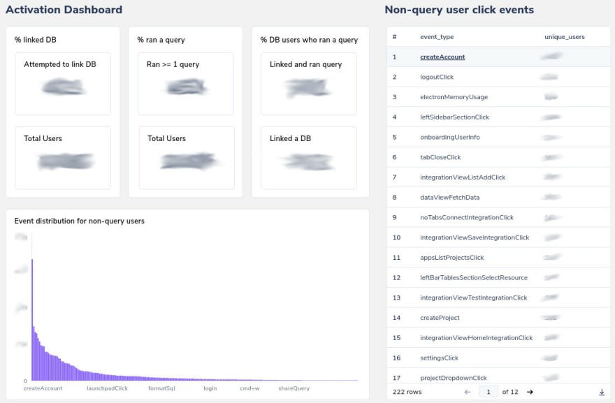 You’ll find that everything is grouped in threes as an ode to the law of 3s. We’ve found putting more than 3 similar objects actually makes dashboards more difficult to understand.
A repeatable process for user research
After we learned that 50% of our users weren’t linking a database, we prioritized conducting user research in the next sprint to learn how we could improve the database connection experience. In order to do this we began interviewing new users and observing them as they explored the app to learn more about where they were dropping off. After doing 20 user interviews, we developed some best practices.
- Email users immediately after they signed up or identify churned users and send them emails offering to “personally onboard” them onto the product
- User interviews can serve dual purpose of onboarding users and also gaining insights
- Create a general onboarding script that guides the user through tasks leading up to an “a-ha” moment
- Do interviews in pairs so one person can take notes. Written interview transcripts are incredibly helpful for synthesizing the research After you’ve finished collecting user feedback from your interviews, you will have a wealth of data, but it will be unorganized and indigestible. The end goal of conducting this user research is ultimately identifying actionable insights that can be turned into development tickets for the engineering team.
Making sense of user feedback
One tool that we commonly use at Arctype is affinity mapping. Through this process, we’re able to quickly group together insights and bubble up themes and develop a sense of what’s most important. Affinity mapping is usually completed in groups, but with zoom fatigue we’ve been trying to do more activities asynchronously. To run an effective asynchronous affinity mapping process, we borrowed some tips from the map-reduce model of distributed computing. Here’s what we learned.
- Assign everyone a clear set of interviews to be responsible for
- Everyone contributes observations, learnings, and ideas to a shared document
- Mark which interview each insight came from, and this will serve the dual purpose of seeing how many times each insight occurred
- For the first iteration of grouping, the focus is just creating any groupings to organize the mess of notes
- Take a second iteration to try to create some high-level MECE framework for categorizing all of the groups

After going through this process with our own user research, we had seven major groupings appear that could be categorized into either Product or Design insights. Product insights relate to building the right product, and it can include things like identifying a target user, refining your core value, etc. Design insights make sure your users can use the product. This can be things like navigation, information hierarchy, etc. For a quick primer on UI design principles, we highly recommend Don Norman’s 6 principles.
The original problem we wanted to solve was increasing the percent of users who connect a database. Going through this process allowed us to review our database connection experience with fresh eyes, and we discovered a lot of things to be improved. A key finding for us is that we have two different types of users: those who already have a database and those who don’t. These two personas had different problems, but we were not fully solving for either. In the next section I discuss how we took these insights to design a new user experience.
Designing a better experience
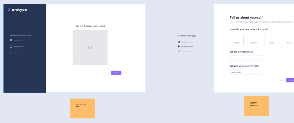
A problem that spanned across both user personas is that our existing database connection screen was “overwhelming” for new users. At Arctype we want to create the simplest tool for a developer to go from a database to queries, so we knew we had to fix this. The database connection screen is the first screen that any new user sees, and we immediately throw a lot of information at them. Multiple groupings of buttons (Gestalt), 20+ CTAs drawing your attention, etc. In order to streamline the entire process, we decided to introduce a paginated onboarding experience.
A dedicated onboarding experience would allow us to guide users through the database connection flow, and it would also enable displaying different screens depending on which user persona they fall into.

These are my tips for when you’re at a resource constrained startup and want to move fast on designing a new experience:
- Research best practices. Spend 1-2 hours just reading and taking notes. Don’t worry about your designs at this stage, this is just to prime you in the right mindset.
- Great artists steal. Look at the UI from large companies with large design budgets. We marked up Asana's onboarding experience in Figma to get a feel for the elements they used to make it great.
- Don’t be scared of LoFi. Use existing design components where you can (radio buttons, input boxes, etc), but feel free to just use shapes for the rest to keep up momentum. By the end of the week we had created an activation dashboard, conducted user research, synthesized insights, and designed a new onboarding flow. We had a review with the engineering team, and then it was time for implementation!
Measuring the success of the redesigned onboarding

It’s always important to measure the success of your efforts. This is a great time to pull back up that Arctype activation dashboard you made at the beginning and review how your metrics have changed. Shameless plug: try out our new onboarding experience here and let us know what you think! We’re excited to continue working together to create the best SQL client for developers.


Top comments (0)