
Author: David Omotayo
Introduction
A tooltip is a short and informative message that appears when a user interacts with certain elements on a webpage. The main objective of a tooltip is to provide users with relevant information about the features and elements on the page when they are hovered or clicked.
Typically, a tooltip is displayed as a small box or pop-up and is commonly used to offer additional information about an icon, button, or other UI elements in an application. The content of a tooltip can also consist of various multimedia, including images, videos, and GIFs, based on the application's design.
You can see a tooltip in action through the following GIF example:
In this article, we'll explore how to create a custom tooltip component in a React application, as well as integrating a tooltip library like react-tooltip.
Project setup
There are two ways you can use tooltips in your React applications, you either create a custom tooltip component from scratch or use a library such as react-tooltip. We'll go over how to set up both approaches, but before delving into the specifics, we'll quickly set up a simple React application to showcase the examples in this article.
To this end, refine.new serves as an excellent tool that we can use to rapidly create a new React CRUD application.
refine.new enables you to quickly bootstrap a new refine application, an open-source React-based, headless UI library for creating enterprise applications, within your browser with features such as preview, tweaking, and instant download.
To get started, head on to https://refine.new/, scroll down the page, and click on the Let's start button.
Upon clicking the button, you’ll be presented with a stepper component that let you choose and combine your preferred React platform, UI framework, backend connector, and auth provider.
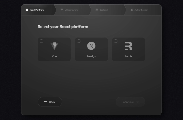
Since we’re not creating something complex, we’ll use these options to set up our application:
Vite > Headless > Rest Api > No auth
After completing the required steps and clicking the 'complete' button, you will be redirected to a preview page for your refine application. Here, you can make any necessary adjustments before building and downloading the application file.
Once you're done tweaking the application to your taste, click on the Build & Download button on the sidebar to download the application. If you haven't already, you will be prompted to sign in with your Google or GitHub profile.
After logging in, a second pop-up would appear with a URL for downloading the project file.
Finally, extract the downloaded file and open it in your IDE of choice.
Now that we have our project set up, the final step is to install the development dependencies and start the development server. you can do this by executing the commands below in your terminal:
npm install
npm run dev
These commands will install the necessary dependencies for your project and start the development server. If your browser doesn’t automatically preview the application, you can manually navigate to it by entering [http://127.0.0.1:5173](http://127.0.0.1:5173) in your browser.
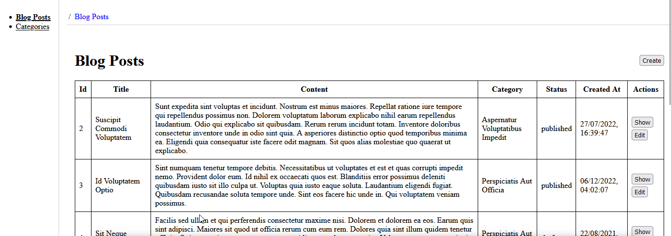
refine was originally designed to provide a rapid way of bootstrapping enterprise-level React applications, complete with predefined pages. When you create a new headless project with refine, you’ll notice that these pages are already set up by default, but with placeholder data generated using the refine Inferencer package.
The refine inferencer package is a tool that automates the generation of CRUD (Create, Read, Update, Delete) pages for resources in your refine application based on the data model. You can find more information about this package by visiting the documentation.
Since our application's pages are being populated by the inferencer, we don't have direct access to the rendered content, so we cannot add a tooltip to a specific element like the create button on the table. However, we can access the sidebar navigations via the Menu component in the src/component directory.
When you create a Headless refine application, a Layout component is automatically generated in the src/components directory. This component wraps the pages created by the inferencer and the Menu component, which contains the sidebar navigation.
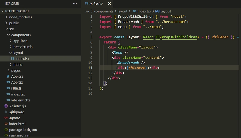
While the pages in the applications are automatically generate and are not editable, the Layout component provides some level of control over how the application is rendered to the browser.
We could simply clear out the Layout component and create a simple component that we can use to render an element for our examples. However, since the predefined pages generated by refine simulate a real-world application, we have something close to what our examples may look like in an actual application.
Creating a custom tooltip component
The structure of a tooltip is not as complex as it may seem. It consists of a single element that contains some text and is positioned absolutely to the anchor element ( element whose functionality is explained by the tooltip) or its parent element. When the anchor element is hovered or clicked, the opacity of the tooltip is increased.
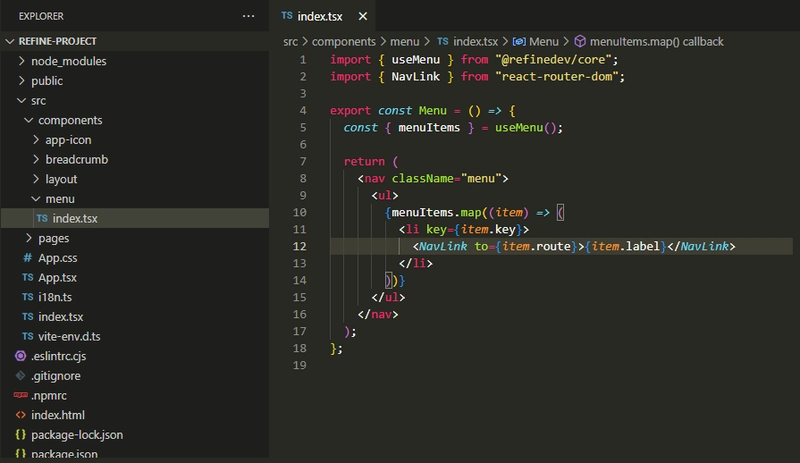
If we were to create a custom tooltip for the sidebar navigation, the markup inside the Menu component would be structured as follows:
<nav className="menu">
  <ul>
    {menuItems.map((item) => (
      <li key={item.key} className="tooltip_element">
        <NavLink to={item.route}>{item.label}</NavLink>
        <span className="tooltip">navigate to {item.label}</span>
      </li>
    ))}
  </ul>
</nav>;
What we did here is self-explanatory; we simply added a span element containing some text next to the navigation links.
And now for the styles:
.tooltip_element {
  position: relative;
}

.tooltip {
  position: absolute;
  background-color: black;
  color: white;
  padding: 5px;
  border-radius: 5px;
  opacity: 0;
  transition: opacity 1s;
  top: 0;
  left: 80px;
  width: max-content;
}

.tooltip_element:hover .tooltip {
  opacity: 1;
}
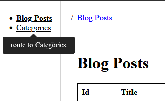
Here, we’re positioning the tooltip absolutely to the navigation links. initially, its opacity is set to 0, and it becomes visible with an opacity of 1 only when the navigation links are hovered over. This is all that is needed to create a simple tooltip.
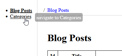
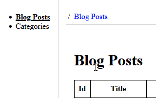
If you save your progress and go back to the browser, you should see something similar to the GIF below.
As of now, we have hardcoded the tooltip into our application, but this approach won't be practical for larger and more complex real-world applications. To make it scalable, we can create a separate component for the tooltip and pass the text and other properties such as color, position, and background color to it through props.
To implement this, create a new tooltip folder within the src/component directory of your project and then add a index.tsx file with the following code:
import * as React from "react";

export interface ITooltipProps {
  position: string;
  message: string;
}

export function Tooltip({ message, position }: ITooltipProps) {
  return (
    <div>
      <span className={`tooltip tooltip-${position}`}>{message}</span>
    </div>
  );
}
In this code block, we’re basically doing the same thing as before within the Menu component, but now we're passing the content and a position class to the span element dynamically. The position class name will allow us to position the tooltip using the top, right, bottom, and left properties of the tooltip element. We'll need to create styles for each position that will be passed to the component:
.tooltip-right {
  top: -5px;
  left: 105%;
}

.tooltip-left {
  top: -5px;
  right: 105%;
}

.tooltip-top {
  bottom: 105%;
  left: 0;
}

.tooltip-bottom {
  top: 105%;
  left: 0;
}
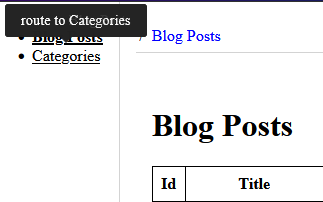
Now, If you import the tooltip component into the Menu component and pass the content and desired position as props, you should see a similar result when you view your application in the browser.
import { useMenu } from "@refinedev/core";
import { NavLink } from "react-router-dom";
import { Tooltip } from "../tooltip";

export const Menu = () => {
  const { menuItems } = useMenu();

  return (
    <nav className="menu">
      <ul>
        {menuItems.map((item) => (
          <li key={item.key} className="tooltip_element">
            <NavLink to={item.route}>{item.label}</NavLink>
            <Tooltip message={`route to ${item.label}`} position="bottom" />
          </li>
        ))}
      </ul>
    </nav>
  );
};
Our tooltip component is now ready for use throughout the application, however, it's missing some crucial features that would require significant time and effort to implement. For this reason, it is recommended to use a tooltip library like react-tooltip.
In the following sections, we will introduce and demonstrate how to integrate react-tooltip into our application.
What is React-tooltip?
React tooltip is an open-source package for adding tooltips to react applications. It allows developers to create dynamic and engaging user interfaces by providing a simple and customizable approach to adding tooltips to any React component.
With react-tooltip, developers can easily control the content, appearance, and behavior of the tooltips in their applications. Overall, the package simplifies the process of implementing tooltips and saves time and effort for developers.
Setting up React-tooltip
To incorporate react-tooltip into our application, we need to install the package first. Start by going to the terminal and executing the following command:
npm install react-tooltip
or
yarn add react-tooltip
Next, navigate to your project’s index.tsx file and add the following CSS import:
import "react-tooltip/dist/react-tooltip.css";
This CSS file contains all the necessary styles react-tooltip needs to properly render tooltips in your application. It is crucial to include this file in the index.tsx or an equivalent top-level file; otherwise, the tooltip may not render correctly.
react-tooltip has been successfully incorporated, we can now leverage its features throughout our application. We'll explore how to do so efficiently in the following sections.
Using React-tooltip
The react-tooltip package provides a <Tooltip/> component that can be bound to an anchor element and used to display element-specific information. There are two ways to bind the component to an anchor element:
- Using data attributes on elements
- Using the ReactTooltip component and props
Using data attributes
This method entails binding and defining the tooltip's content and position directly on anchor elements via specific data attributes, such as data-tooltip-content, data-tooltip-place, and data-tooltip-id.
The data-tooltip-id attribute is used to link the anchor element to the <Tooltip/> component. it is assigned an ID that corresponds to the ID on the anchor element. While the data-tooltip-content and data-tooltip-place are used to set the content and position of the tooltip, respectively.
To use this method in our application, we’ll start by importing the <Tooltip/> component into the Menu component and pass the content and position of the tooltip to the anchor element using the data attributes, as shown below:
import { Tooltip } from "react-tooltip";

export const Menu = () => {
  const { menuItems } = useMenu();

  return (
    <nav className="menu">
      <ul>
        {menuItems.map((item) => (
          <li key={item.key} className="tooltip_element">
            <NavLink
              data-tooltip-id="my-tooltip"
              data-tooltip-content="Hello world!"
              data-tooltip-place="top"
              to={item.route}
            >
              {item.label}
            </NavLink>
          </li>
        ))}
      </ul>
    </nav>
  );
};
Next, we will define the <Tooltip> component next to the anchor element and give it the same ID as the data-tooltip-id attribute on the navigation element:
<li key={item.key} className="tooltip_element">
  <>
    <NavLink
      data-tooltip-id="my-tooltip"
      data-tooltip-content={`route to ${item.label}`}
      data-tooltip-place="top"
      to={item.route}
    >
      {item.label}
    </NavLink>
    <Tooltip id="my-tooltip" />
  </>
</li>;
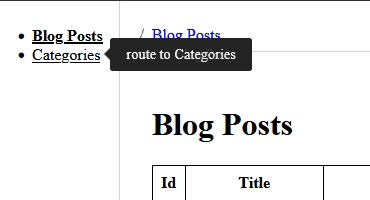
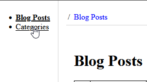
This will bind the <Tooltip/> component to the navigations and display the specified content when they are hovered on.
Open-source enterprise application platform for serious web developers
refine.new enables you to create React-based, headless UI enterprise applications within your browser that you can preview, tweak and download instantly.
🚀 By visually combining options for your preferred ✨ React platform, ✨ UI framework, ✨ backend connector, and ✨ auth provider; you can create tailor-made architectures for your project in seconds. It feels like having access to thousands of project templates at your fingertips, allowing you to choose the one that best suits your needs!

Using React Tooltip component
In contrast to the previous method, this technique employs CSS selectors to bind the anchor element with the tooltip component instead of relying on data attributes. The tooltip component’s content is assigned to it as children, while other properties such as place and delay are defined using props.
<li key={item.key} className="tooltip_element">
  <>
    <NavLink className="my-tooltip" to={item.route}>
      {item.label}
    </NavLink>
    <Tooltip anchorSelect=".my-tooltip" place="left">
      route to {item.label}
    </Tooltip>
  </>
</li>;
The anchorSelect property takes a string that matches the CSS selector provided on the anchor element. Its function is to locate anchor elements with matching selectors and attach the tooltip to them.
Notice that the anchorSelect property is prefixed with a dot, which is necessary because it accepts valid CSS selectors. If we were to set an ID on the anchor element instead, we would use a hash to begin the selector.
<li key={item.key} className="tooltip_element">
  <>
    <NavLink className="my-tooltip" to={item.route}>
      {item.label}
    </NavLink>
    <Tooltip anchorSelect=".my-tooltip" place="left">
      route to {item.label}
    </Tooltip>
  </>
</li>;
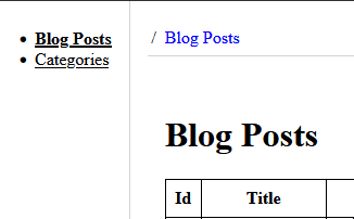
The tooltip will render on the browser just the same.
Positioning
Throughout this article, we've consistently demonstrated how to use positioning in different examples, so you likely have a good understanding of how it works for both low-level and high-level implementations.
The place prop in the react-tooltip package is used to set the position of the tooltips and can be assigned one of four values that are similar to the position properties in CSS.
-
top: This positions the tooltip at the top of the anchor element
-
right: This positions the tooltip on the right side of the anchor element
-
bottom: This positions the tooltip at the top of the anchor element
-
left: This positions the tooltip on the left side of the anchor element
You may be curious about why the tooltip is appearing on the right of the anchor element rather than the left. This leads us to another useful feature of react-tooltip: responsiveness. By default, react-tooltip adjusts itself to fit your design, regardless of limitations. In this scenario, there is no more space left on the left side of the navigation area. Therefore, react-tooltip is rendering the tooltip on the right side instead of the left.
Delay
Now that we understand how react-tooltip works and the various ways you could integrate it into your project, let's take a look at some of its standout features. Beginning with Delays, this feature enables you to introduce a delay before the tooltip appears or disappears when the anchor element is hovered over.
tooltip-delay-show
The tooltip-delay-show attribute adds a delay before the tooltip appears when an anchor element is hovered on. It requires a number value in milliseconds to specify the duration of the delay.
<li key={item.key} className="tooltip_element">
  <>
    <NavLink
      data-tooltip-id="my-tooltip"
      data-tooltip-content={`route to ${item.label}`}
      data-tooltip-place="top"
      data-tooltip-delay-show={1000}
      to={item.route}
    >
      {item.label}
    </NavLink>
    <Tooltip id="my-tooltip" />
  </>
</li>;
tooltip-delay-hide
This attribute does the opposite of the former, as it adds a delay to when the tooltip disappears from the screen after the mouse leaves the anchor element.
<li key={item.key} className="tooltip_element">
  <>
    <NavLink
      data-tooltip-id="my-tooltip"
      data-tooltip-content={`route to ${item.label}`}
      data-tooltip-place="top"
      data-tooltip-delay-hide={1000}
      to={item.route}
    >
      {item.label}
    </NavLink>
    <Tooltip id="my-tooltip" />
  </>
</li>;
Clickable tooltip
react-tooltip also provides a feature that allows you to create clickable tooltips. This is useful if you need to include a button or link that takes the user to a page with detailed information related to the content displayed in the tooltip.
<li key={item.key} className="tooltip_element">
  <>
    <NavLink id="my-tooltip" to={item.route}>
      {item.label}
    </NavLink>
    <Tooltip anchorSelect="#my-tooltip" place="right" clickable>
      route to {item.label}
      <br />
      <button
        onClick={() => alert(`This link routes to the ${item.label} page`)}
      >
        learn more
      </button>
    </Tooltip>
  </>
</li>;

Conclusion
In this article, we covered the steps involved in creating and implementing a custom tooltip in a React application, and highlighted the challenges of building a comprehensive tooltip component from scratch. We then introduced react-tooltip and explored various methods of integrating the package into a React application.
There are many more features available in react-tooltip than what we covered in this article. I would suggest visiting the documentation and exploring the many capabilities of the package.

Top comments (0)