Successful online services like marketing and e-commerce websites rely on exceptional customer experiences. As a front-end developer, it’s your job to create flawless layouts, so your customer can complete necessary actions (like submit a sign-up form or purchase a Christmas gift). As you probably know, layout issues cause the mistrust of your website, so you’ll want to fix them up ASAP.
These are some of the most common front-end mistakes that cause layout problems on websites, using examples from our website, Raygun.com. (In a test environment, of course!)
1. Stylesheet 404
When experiencing rendering issues, checking to see if the stylesheet is even loading is the first things I look for. By opening your developer tools in the browser and taking a look at the console, you will quickly be able to see if there has been an error.

My developer tools are showing an error on the homepage
In the example above, without the stylesheet loading, the browser doesn’t know how the page should be displayed. Rendering issues usually result in a long list of elements running down the left of the page with nothing but default styles being applied:

The result: the browser doesn’t know how to apply the styles creating a long list down the left of the page
2. Style specificity
Sometimes we generate more general styles that will be applied to multiple elements. General styles work well in some cases. However, if you don’t fully understand the order of precedence, styles can be accidentally applied to unintended elements.

Here, general styles have been applied to unintended elements
Not being specific with your styles can cause things to look broken, and if the selector is broad enough, it can even break styles across the whole site.
![]()
Layout issues in the header make it impossible to navigate around the website
3. Missing media queries
Media queries are used to manipulate element styles depending on a set of conditions. The most common example of this would be the (max-width: ) or (min-width: ) condition to change the way the page is rendered on different screen sizes.
If you are missing a media query or don’t have any to begin with this can make your webpage look broken on screens different to that it was created on.
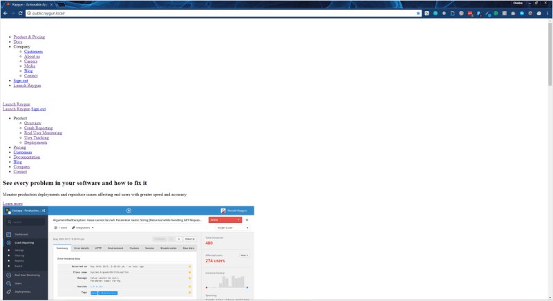
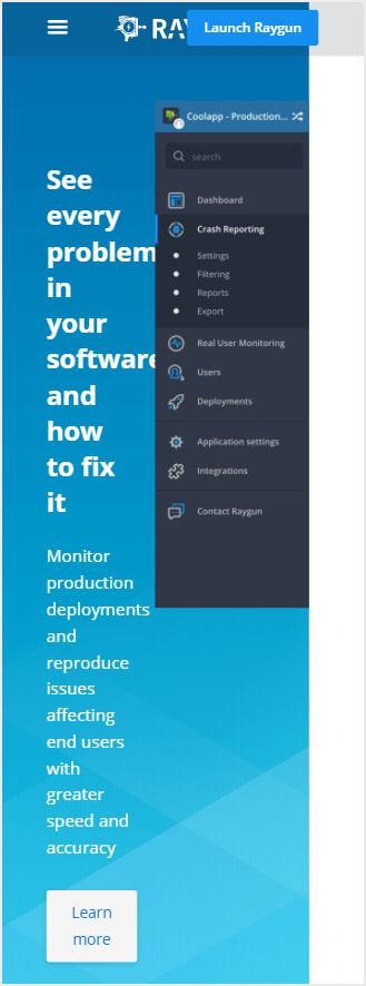
Below I compare a desktop view of the Raygun homepage compared to what it would look like on mobile without any media queries to change the styles.
Desktop:

Without any media queries to change the styles, the desktop version looks fine
Mobile:

Mobile, however, is a different story
4. Incorrect stack order
When building more complex components such as a navigation you often need to overlap various elements to achieve the desired effect. These elements are layered by applying a z-index property to them to instruct the browser where elements sit in the hierarchy.
If the z-index property for an element is wrong, it can easily make a page feel broken causing users to leave your website.
Below I’ve created an example of what can happen if the z-index property is set incorrectly.

Here, the z-index is set incorrectly and is causing stacking
5. Incorrect field validation
Forms are often used to collect data from your users and are often crucial steps in the user journey. Areas like the signup page or checkout often need to validate the user input to make sure that it matches what’s expected. This validation is often a good thing. However, if the validation rules are incorrect it can lead to users getting unnecessary error messages and can even block users from completing the signup or order. We talk more about how this can affect your business here.

Here, my inputs are correct, but I can’t submit the form – frustrating!
Without the data matching the validation rules, users are usually blocked from submitting the form. There’s now a high chance that the user is going to abandon ship and leave your website.
6. Browser incompatibility
Choosing which browsers to support is often a challenge. In the ideal world, you would have support for all browsers and versions. But, in doing this, you would also have to make a trade-off with which browser features you can use around your website. If your users are using an old version of IE, for example, and you don’t take this into account when creating the site, things could look broken causing people to leave. Here’s what happened when we applied it to Raygun’s homepage.

In IE9, the Raygun homepage looks broken
Understanding your users is critical in choosing which browsers to support. Luckily if you use a tool like Raygun, you can get insight into both the browser and version. This makes choosing which browsers to support much easier.

Real User Monitoring shows Browser performance
7. Cache busting
Caching assets on your website is always a good idea to help improve load times, and this includes your styles. Don’t forget to update the CSS cache buster after updating your styles, or you will cause many display issues. (Unless you have already automated the process.)
This is because the browser thinks it already has the file in its cache so doesn’t need to re-fetch it. Depending on the updates you made to your styles, this can have a big impact on your website.
An easy way to add a cache buster to style links is to add ?_=1512598593150 to the href on your tag, swapping out the UNIX epoch value with the current one.
8. Native resolution
When using responsive values on images, you need to make sure that you also set the max width and height of the image. This way, the image will never surpass the native resolution. If you stretch an image past its original size, the best case scenario is that you will start to see pixelation. Worst case scenario, you could break it’s aspect ratio depending on the styles applied.

SURPASSING AN IMAGES NATIVE RESOLUTION CAN CAUSE PIXELATION, WHICH IS EASILY MISSED
Surpassing native resolution is probably one of the most common front-end mistakes because it doesn’t look too bad and is easily missed, but fix it up, and it will make your website look professional and polished.
Avoid these front-end mistakes for happier customers
These are just a few of the common front-end mistakes I’ve come across, but hopefully, they provided a good start to detecting and solving them in your applications. Do you have a common issue that you wanted to share? Let me know in the comments!
Thanks for reading! – Ollie


Top comments (2)
Great article man. Glad to see someone here living in a place who I think would be cool to live. Greenland and Alaska. I am definitely pay more attention to this
Thanks!