
In this article, I will show you how to create a toggle to display items in a grid from a list. This will be using basic JavaScript skills with no external code or libraries. We will be using CSS Grid.
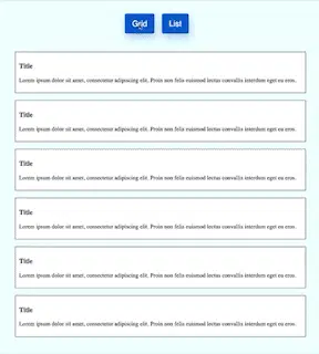
What We Will Be Creating
How to Create Our Starter Files
Let's start by creating three files called index.html and style.css and app.js. In your index.html file add the following starter code:
<!DOCTYPE html>
<html lang="en">
<head>
    <meta charset="UTF-8">
    <meta http-equiv="X-UA-Compatible" content="IE=edge">
    <meta name="viewport" content="width=device-width, initial-scale=1.0">
    <title>Grid List Toggle using CSS Grid</title>
    <link rel="stylesheet" href="style.css">
</head>
<body>

    <script src="app.js"></script>
</body>
</html>
In the style.css file add the following starter code:
body{
  padding: 0;
  margin: 0;
  height: 100vh;
  background-color: azure;
}
For now, we will leave the app.js file blank. We will put in the code later.
How To Add Our Toggle Buttons
The first thing we want to do is to create two buttons. These two buttons will have a title Grid and List. When clicked these buttons will change the layout of the cards on the screen.
The entire content of the page will be placed inside a div with a class of container. The two buttons will be placed inside a div with a class of buttons. Each button will have a class of btn. Each button will have a unique id assigned to it. Later on we will use this id to handle when the button is clicked.
Add the following code inside the body tag in your index.html file:
    <div class="container">
        <div class="buttons">
            <button class="btn" id="gridBtn">Grid</button>
            <button class="btn" id="listBtn">List</button>
        </div>
    </div>
How To Style Our Container and Buttons
Everything we display is wrapped inside a div with a class of container. We want this container to have a specified width that is centered on the screen.
Add this code to your style.css file:
.container {
    width: 90vw;
    max-width: 800px;
    margin: 50px auto;
}
Next, we want our two buttons to be centered on the screen. The buttons are wrapped by a div with a class of buttons. This class will use CSS Grid to center the buttons.
We want these two buttons to have a blue background with white text. To make them look like they are lifted off the page we will add a box shadow.
Add the following code to your style.css file:
.btn {
    height: 55px;
    background: #2364d2;
    color: white;
    padding: 10px 20px;
    margin-right: 20px;
    border: none;
    border-radius: 5px;
    font-size: 22px;
    font-weight: 500;
    font-family: "Source Sans Pro", sans-serif;
    box-shadow: 3px 10px 20px 0px rgba(35, 100, 210, 0.3);
}
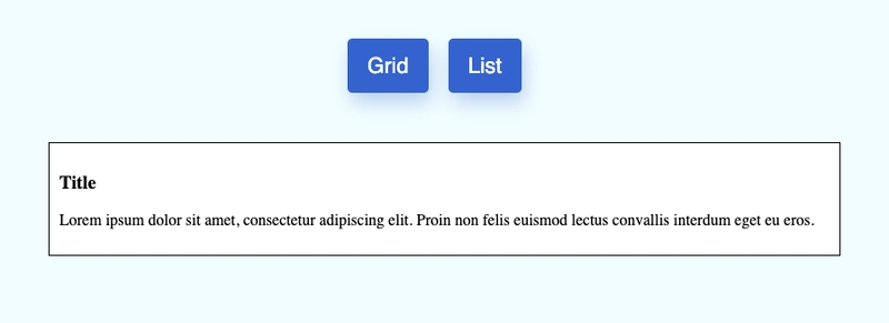
This is what our buttons look like:

How To Add The Cards
I want to add 6 cards that will be displayed. Each card will have a title and a paragraph of Lorem Ipsum text.
I want all of the cards to be contained within a div. The styling on this div will determine if the cards are displayed in a grid or in a list. I will add both an id and a class to this div.
Each card is wrapped by a div with a class of card. It will have a title and a paragraph of text. Since each card will be the same, once I have created one card, I can copy and paste it to create a total of 6 cards.
Add this code to your index.html file:
        <div id="card-wrapper" class="list">
            <div class="card">
                <h3>Title</h3>
                <p>Lorem ipsum dolor sit amet, consectetur adipiscing elit. Proin non felis euismod lectus convallis interdum eget eu eros.</p>
            </div>
        </div>
How to Add Styling To Our Cards
We will not add much styling to the card. We will give each card a border and some padding so that the text is not next to the border. We will also add a margin below each card.
Add the following code to your style.css file:
.card {
    border: 1px solid black;
    padding: 10px;
    background: white;
    margin-bottom: 20px;
}
This is what our card looks like:
In your index.html file copy the code for the single card and paste it so there are a total of 6 cards.
Styling our Grid and List
We will add styling for card-wrapper to make it display using CSS Grid and to have a width of 100% of our container. I will also add a margin on top so there is some spacing between the buttons and the cards. I also want to add a gap between each card.
Add the following code to your style.css file:
#card-wrapper {
    display: grid;
    width: 100%;
    margin-top: 50px;
    gap: 10px 20px;
}
With CSS Grid you can define the number of columns. For our grid layout, we want to have 3 columns. For our list layout, we want to have just 1 column.
Add the following code:
.grid {
    grid-template-columns: 1fr 1fr 1fr;
}

.list {
    grid-template-columns: 1fr;
}
Final Result
Now when you view the code in your browser, you will see the layout change as your click each of the buttons.
Here is what it looks like:
Let's Connect
Thanks for reading my article today. You can get the source code here.
If you like my content, please consider buying me a coffee ☕.

Latest comments (0)