
Introduction
As a data enthusiast, I’ve always been fascinated by the power of cloud platforms to transform raw data into actionable insights. Recently, I completed a capstone project using Google Cloud Platform (GCP) that put my skills to the test. My task? Help a fictional fintech startup, TheLook Fintech, leverage BigQuery and Looker to tackle critical business questions about loan performance and borrower behavior. In this blog, I’ll walk you through my journey—from collecting and processing data to building a sleek dashboard—and share the lessons I learned along the way.
Whether you’re a data analyst, a cloud newbie, or just curious about BigQuery and Looker, this post will give you a front-row seat to a real-world data project.
The Scenario: A Fintech Startup’s Data Challenge
Imagine you’re a cloud data analyst hired by TheLook Fintech, a growth-stage startup revolutionizing loans for online store owners. The Treasury department, led by Trevor, needs your help to monitor cash flow, understand why customers borrow, and track loan distribution across regions. Later, they want a dashboard to keep tabs on loan health. My mission was clear: use GCP tools to collect, process, and analyze data, then visualize the results.
The project unfolded in two parts:
- BigQuery Workflow: Collecting, processing, and storing loan data to answer three key questions.
- Looker Dashboard: Building visualizations to monitor loan health metrics.
Here’s how I tackled it.
Part 1: Collecting, Processing, and Storing Data in BigQuery
The first leg of the project was all about getting hands-on with BigQuery, GCP’s serverless data warehouse. My goal was to answer three business questions:
- How can we monitor cash flow to ensure loan funding doesn’t exceed incoming payments?
- What are the top reasons customers take out loans?
- Where are borrowers located geographically?
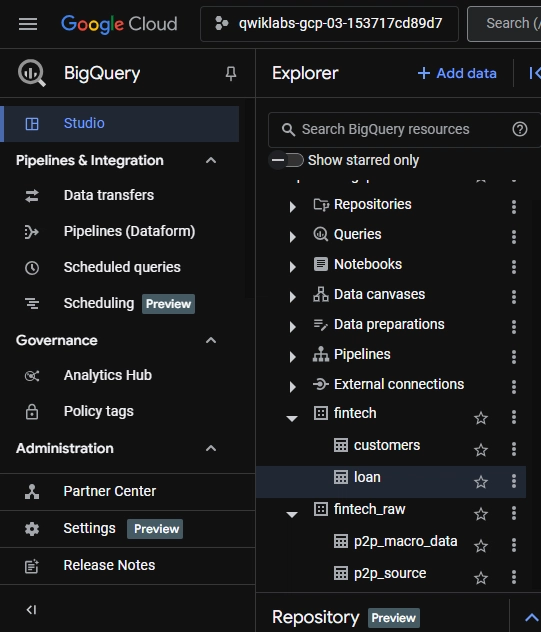
Step 1: Setting Up the BigQuery Environment
I started by creating a BigQuery dataset to house the loan data. This involved setting up tables and ensuring the schema aligned with the fintech’s needs—think columns for loan amounts, purposes, dates, and borrower locations.
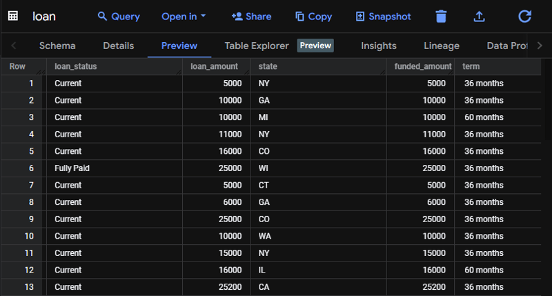
Step 2: Exploring the Loan Data
With the data loaded, I ran exploratory SQL queries to get a feel for it.
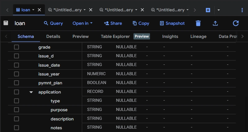
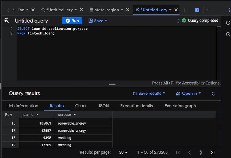
For cash flow, I calculated money in (loan repayments) versus money out (loan issuances). For loan purposes, I dug into a nested field in the application data to extract reasons like “inventory purchase” or “business expansion.”
For locations, I aggregated loans by state.
Step 3: Importing Additional Data
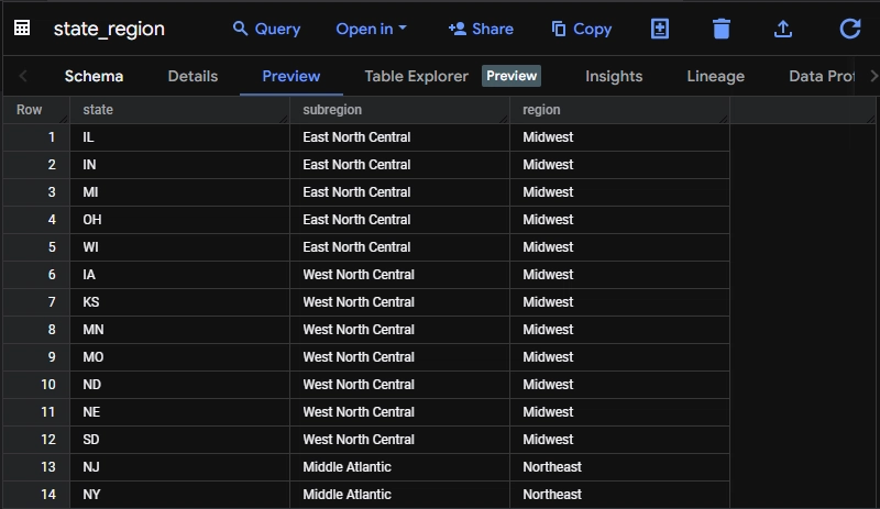
Trevor needed a deeper geographic breakdown, so I imported a CSV file with state classifications into BigQuery. I converted this into a standard table using a CREATE TABLE AS SELECT statement—a simple satisfying tactic.
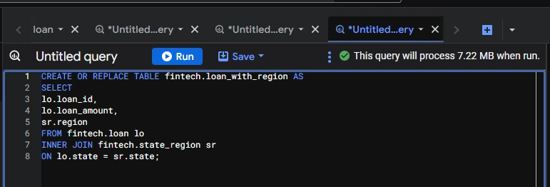
Step 4: Joining Tables
Next, I joined the loan data with the state classification table using a JOIN clause in SQL. This enriched the dataset, letting me map loans to regions and spot geographic trends.
Step 5: Cleaning Up with Deduplication
The loan purpose data had duplicates , so I used a DISTINCT query to clean it up. This ensured accurate reporting on why borrowers were seeking funds.
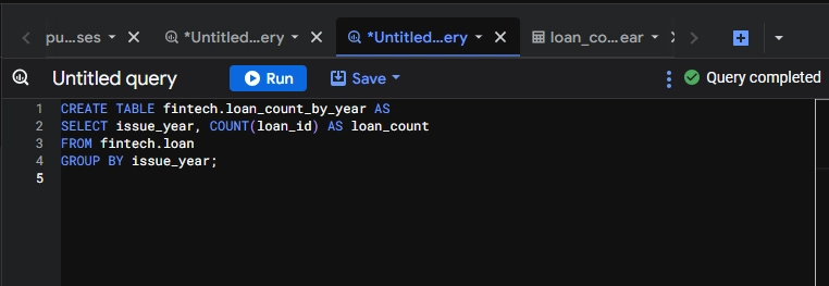
Step 6: Aggregating Loan Amounts by Year
Finally, I created a table with a GROUP BY query to sum loan amounts by issuance date and year. This gave Trevor a clear view of lending trends over time—crucial for cash flow monitoring.
By the end, I had a polished dataset ready for analysis, stored efficiently in BigQuery.
Part 2: Visualizing Insights with Looker Enterprise
With the data prepped, Trevor threw a new challenge my way: create a dashboard in Looker to track loan health. He wanted answers to four questions:
- What’s the total outstanding loan amount?
- What percentage of loans fall into each status (e.g., current, late, default)?
- Which states have the most outstanding loans?
- Which customers own their homes outright and have current loans?
Task 1: Getting Started with Looker
I kicked things off by connecting Looker to my BigQuery dataset. Looker’s intuitive interface made it easy to define a data model that mapped to my tables.
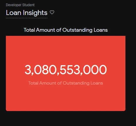
Task 2: Total Outstanding Loan Amount
For the first visualization, I built a single-value card showing the sum of all outstanding balances. A quick SUM measure in LookML, paired with a filter for unpaid loans, did the trick.
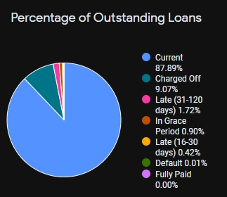
Task 3: Loan Status Breakdown
Next, I created a pie chart to display the percentage of loans by status. I grouped the data by categories like then used Looker’s percentage calculation to show the distribution. This was a game-changer for spotting risk areas.
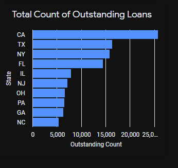
Task 4: Top States with Outstanding Loans
I crafted a bar chart highlighting the top 10 states by loan count. A COUNT measure, sorted in descending order, and a limit of 10 gave Trevor a clear view of geographic concentration.
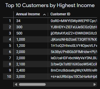
Task 5: Homeowners with Current Loans
For the final visualization, I built a table listing customers who own their homes outright and have “Current” loans. I filtered by homeownership status and loan status, then sorted by income to spotlight high earners.
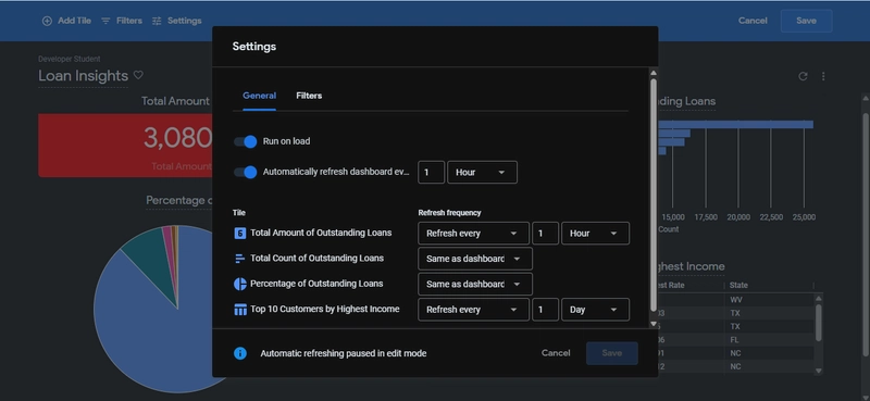
Task 6: Polishing the Dashboard
To make the dashboard interactive, I enabled cross-filtering—clicking a state in the bar chart filters the other visuals. I also set a daily refresh rate to keep the data fresh. The result? A sleek, user-friendly tool Trevor’s team could rely on.
The Final Dashboard
Here’s what the dashboard looked like:
- Card: Total outstanding amount ($3.08B).
- Pie Chart: Loan status percentages.
- Bar Chart: Top 10 states by loan count.
- Table: Homeowning customers with current loans.
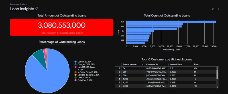
It was a proud moment seeing it all come together—a testament to the power of combining BigQuery’s data crunching with Looker’s visualization prowess.
Conclusion
My journey with TheLook Fintech’s data was a crash course in using GCP to tackle real-world challenges. BigQuery made it easy to handle large datasets, while Looker brought the insights to life. If you’re looking to break into cloud data analysis, I can’t recommend this kind of hands-on project enough—it’s the perfect way to build skills and confidence.
I’m excited to explore more advanced GCP features like Dataflow or AI Platform. For now, I’d love to hear your thoughts—have you worked with BigQuery or Looker? Drop a comment below!


Top comments (0)