
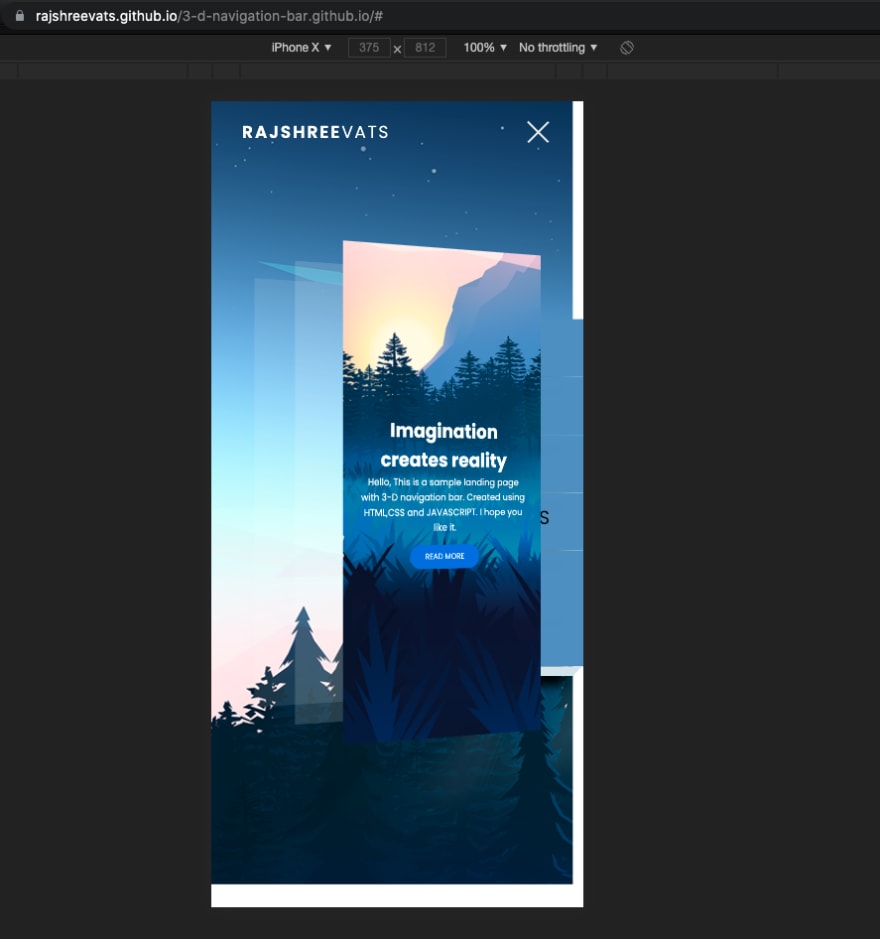
In this article I am going to show you how to add 3-D effects to a Landing Page using HTML, CSS and JavaScript. You can add 3-D effects to give your website a bold navigation and also show off your skills of better usability standards. Unique and beautiful effects are what can easily make people stop and take notice, increasing the time they spend on the site.
Step 1: Create HTML File
This is a basic layout of a landing page, further we are going to add effects using CSS and JavaScript.
<!DOCTYPE html>
<html lang="en">
  <head>
    <meta charset="UTF-8" />
    <meta name="viewport" content="width=device-width, initial-scale=1.0" />
    <title>3D Navbar Animation</title>
    <link rel="stylesheet" href="style.css" />
  </head>
  <body>
    <div class="container">
      <div class="navbar">
        <div class="menu">
          <h3 class="logo">Rajshree<span>Vats</span></h3>
          <div class="hamburger-menu">
            <div class="bar"></div>
          </div>
        </div>
      </div>

      <div class="main-container">
        <div class="main">
          <header>
            <div class="overlay">
              <div class="inner">
                <h2 class="title"> Imagination creates reality</h2>
                <p>
                  Hello, This is a sample landing page with 3-D navigation bar.
                  Created using HTML,CSS and JAVASCRIPT. I hope you like it.
                </p>
                <button class="btn">Read more</button>
              </div>
            </div>
          </header>
        </div>

Step 2: Styling Layout and Hamburger menu
This will style our html elements.
* {
  padding: 0;
  margin: 0;
  box-sizing: border-box;
}

body,
button {
  font-family: "Poppins", sans-serif;
}

.container {
  min-height: 100vh;
  width: 100%;
  background-image: url(bg2.png);

  overflow-x: hidden;
  transform-style: preserve-3d;
}

.navbar {
  position: fixed;
  top: 0;
  left: 0;
  width: 100%;
  z-index: 10;
  height: 3rem;
}

.menu {
  max-width: 72rem;
  width: 100%;
  margin: 0 auto;
  padding: 0 2rem;
  display: flex;
  justify-content: space-between;
  align-items: center;
  color: #fff;
}

.logo {
  font-size: 1.1rem;
  font-weight: 600;
  text-transform: uppercase;
  letter-spacing: 2px;
  line-height: 4rem;
}

.logo span {
  font-weight: 300;
}

.hamburger-menu {
  height: 4rem;
  width: 3rem;
  cursor: pointer;
  display: flex;
  align-items: center;
  justify-content: flex-end;
}

.bar {
  width: 1.9rem;
  height: 1.5px;
  border-radius: 2px;
  background-color: #eee;
  transition: 0.5s;
  position: relative;
}

.bar:before,
.bar:after {
  content: "";
  position: absolute;
  width: inherit;
  height: inherit;
  background-color: #eee;
  transition: 0.5s;
}

.bar:before {
  transform: translateY(-9px);
}

.bar:after {
  transform: translateY(9px);
}

.main {
  position: relative;
  width: 100%;
  left: 0;
  z-index: 5;
  overflow: hidden;
  transform-origin: left;
  transform-style: preserve-3d;
  transition: 0.5s;
}

header {
  min-height: 100vh;
  width: 100%;
  background: url("bg1.png") no-repeat top center / cover;
  position: relative;
}

.overlay {
  position: absolute;
  width: 100%;
  height: 100%;
  top: 0;
  left: 0;
  display: flex;
  justify-content: center;
  align-items: center;
}

.inner {
  max-width: 35rem;
  text-align: center;
  color: #fff;
  padding: 0 2rem;
}

.title {
  font-size: 2rem;
}

.btn {
  margin-top: 1rem;
  padding: 0.6rem 1.8rem;
  background-color: #1179e7;
  border: none;
  border-radius: 25px;
  color: #fff;
  text-transform: uppercase;
  cursor: pointer;
  text-decoration: none;
}
Step 3 : The Javascript Code
To add animation, we need to add a class called active to the container element and remove it every time hamburger menu is clicked on.
const hamburger_menu = document.querySelector(".hamburger-menu");
const container = document.querySelector(".container");

hamburger_menu.addEventListener("click", () => {
  container.classList.toggle("active");
});
Step 4: Styling active class
After this Let's style the container element and add animation using css -
.container.active .bar {
  transform: rotate(360deg);
  background-color: transparent;
}

.container.active .bar:before {
  transform: translateY(0) rotate(45deg);
}

.container.active .bar:after {
  transform: translateY(0) rotate(-45deg);
}

.container.active .main {
  animation: main-animation 0.5s ease;
  cursor: pointer;
  transform: perspective(1300px) rotateY(20deg) translateZ(310px) scale(0.5);
}

@keyframes main-animation {
  from {
    transform: translate(0);
  }

  to {
    transform: perspective(1300px) rotateY(20deg) translateZ(310px) scale(0.5);
  }
}
We are done with the 3-D transformation.
Now, add shadow effect to the image
.shadow {
  position: absolute;
  width: 100%;
  height: 100vh;
  top: 0;
  left: 0;
  transform-style: preserve-3d;
  transform-origin: left;
  transition: 0.5s;
  background-color: white;
}

.shadow.one {
  z-index: -1;
  opacity: 0.15;
}

.shadow.two {
  z-index: -2;
  opacity: 0.1;
}

.container.active .shadow.one {
  animation: shadow-one 0.6s ease-out;
  transform: perspective(1300px) rotateY(20deg) translateZ(215px) scale(0.5);
}

@keyframes shadow-one {
  0% {
    transform: translate(0);
  }

  5% {
    transform: perspective(1300px) rotateY(20deg) translateZ(310px) scale(0.5);
  }

  100% {
    transform: perspective(1300px) rotateY(20deg) translateZ(215px) scale(0.5);
  }
}

.container.active .shadow.two {
  animation: shadow-two 0.6s ease-out;
  transform: perspective(1300px) rotateY(20deg) translateZ(120px) scale(0.5);
}

@keyframes shadow-two {
  0% {
    transform: translate(0);
  }

  20% {
    transform: perspective(1300px) rotateY(20deg) translateZ(310px) scale(0.5);
  }

  100% {
    transform: perspective(1300px) rotateY(20deg) translateZ(120px) scale(0.5);
  }
}

.container.active .main:hover + .shadow.one {
  transform: perspective(1300px) rotateY(20deg) translateZ(230px) scale(0.5);
}

.container.active .main:hover {
  transform: perspective(1300px) rotateY(20deg) translateZ(340px) scale(0.5);
}
Step 5: Adding and styling Menu links
 <div class="links">
        <ul>
          <li>
            <a href="#" style="--i: 0.05s;">Home</a>
            <span>  </span>
          </li>
          <li>
            <a href="#" style="--i: 0.1s;">Services</a>
            <span>  </span>
          </li>
          <li>
            <a href="#" style="--i: 0.15s;">Portfolio</a>
            <span>  </span>
          </li>
          <li>
            <a href="#" style="--i: 0.2s;">Testimonials</a>
            <span>  </span>
          </li>
          <li>
            <a href="#" style="--i: 0.25s;">  About</a>
            <span>  </span>
          </li>
          <li>
            <a href="#" style="--i: 0.3s;">  Contact</a>
            <span>  </span>
          </li>
        </ul>
      </div>
    </div>
Let's style links
.links {
  position: absolute;
  width: 20%;
  right: 2em;
  top: 0;
  height: 100vh;
  z-index: 2;
  display: flex;
  justify-content: center;
  align-items: center;
}

ul {
  list-style: none;
}
ul li a .fa{
  font-size: 40px;
  color:black;
  line-height: 80px;
  transition: 0.5s;
  padding-right: 14px;
}
ul li a{
  text-decoration: none;
  display:absolute;
  display: block;
  width:160px;
  height:60px;
  background:#609aca;
  text-align:centre;
  padding-left: 20px;
  transform: rotate(0deg) skewX(25deg) translate(0,0);
  transition: 0.5s;
  box-shadow: -20px 20px 10px rgba(0,0,0,3);
}
ul li a:before {
  content: '';
  position: absolute;
  top: 10px;
  left: -20px;
  height: 100%;
  width:20px;
  background:#b1b1b1;
  transform:0.5s;
  transform:rotate(0deg) skewY(-45deg);

}
ul li a:before {
  content: '';
  position: absolute;
  top: 6px;
  left: -10px;
  height: 100%;
  width:10px;
  background:#dbe7f0;
  transform:0.5s;
  transform:rotate(0deg) skewY(-45deg);

}
ul li a:after {
  content: '';
  position: absolute;
  bottom: -10px;
  left: -6px;
  height: 10px;
  width:100%;
  background:#dbe7f0;
  transform:0.5s;
  transform:rotate(0deg) skewX(-45deg);

}
ul li a:hover {
  transform:rotate(-30deg) skew(25deg) translate(20px,-15px);
  box-shadow: -50px 50px 50px rgba(0,0,0,0);
}
ul li a:hover .fa {
  color: #fff;
}
ul li:hover span{
  color: #fff;
}
ul li:hover a{
  background: #9b154c;
}
ul li:hover a:before{
  background: #7B153F;
}
ul li:hover a:after{
  background: #9b154c;
}


.links a {
  text-decoration: none;
  color: black;
  padding: 0.7rem 0;
  display: flex;
  display: block;
  font-size: 1.2rem;
  font-weight: 200;
  text-transform: uppercase;
  letter-spacing: 0px;
  transition: 0.3s;
  opacity: 0;
  transform: translateY(10px);
  animation: hide 0.5s forwards ease;
}

.links a:hover {
  color: #fff;
}

.container.active .links a {
  animation: appear 0.5s forwards ease var(--i);
}

View the Final Version of this page here
Hopefully this tutorial was fun and worth your while. Get the full Source Code here on my Github Repo.


Top comments (4)
You should add a github page for your repo so that you could link a final visual version for people to see.
I forgot to mention it in the Post, Thanks!
It's added now.
Looks cool but broken on mobile, the menu is covered. Could use some media queries?
Yes, resize elements accordingly using media queries. It's a bit lengthy.