A little while back, I'd the opportunity to work for accessibility implementation. one of my colleague Nawaz Khan a11y expert asked me to implement SkipNav for the page. The term "Skip Navigation" links are completely new for me and I've come up with a decent implementation that might be useful to everyone who cares about accessibility and usability. In this article, I'd like to discuss what is the problem without Skip Navigation links and how to build a Skip Navigation links for our website or application.
Problem:
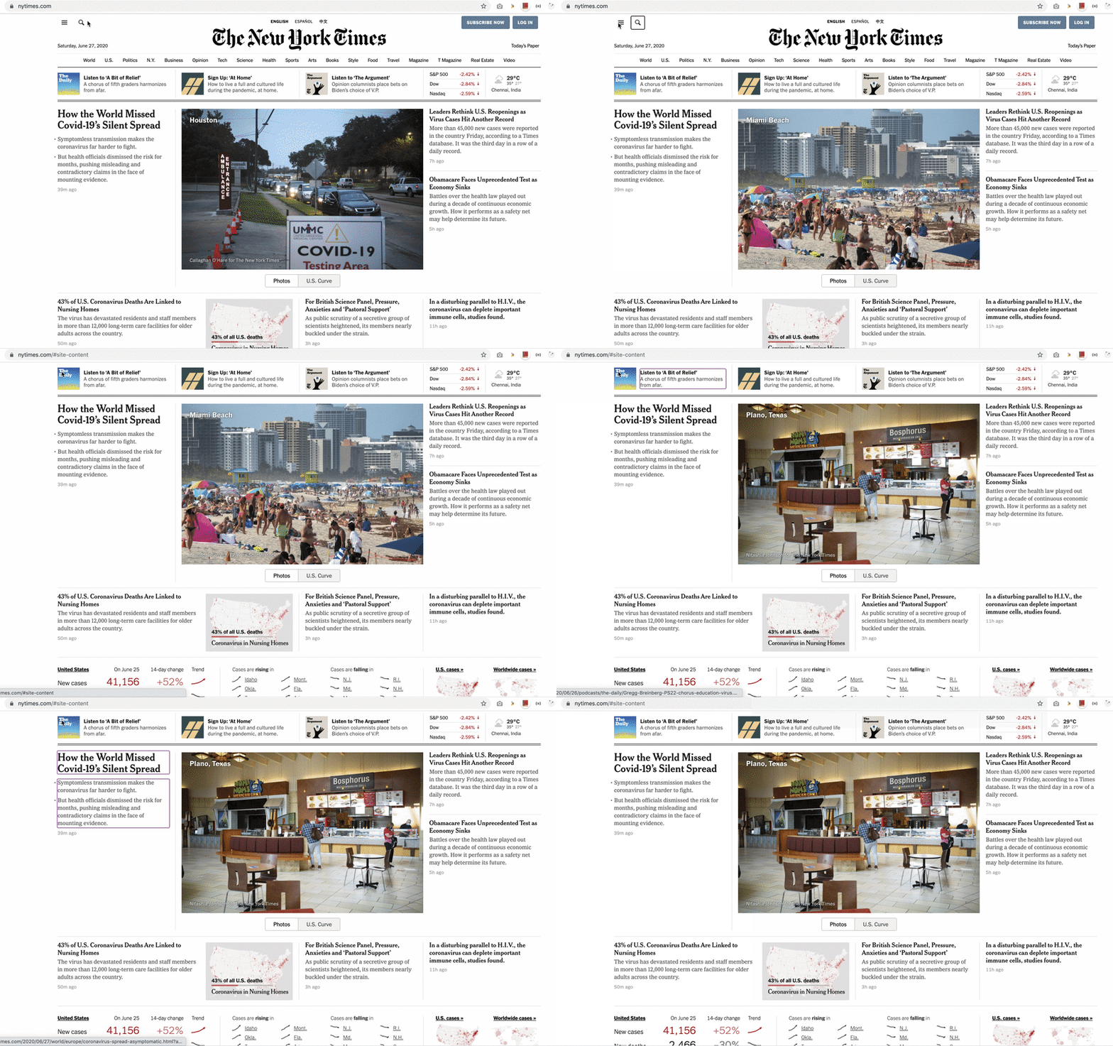
Take a glance at https://www.nytimes.com/ for a minute, see how many links present in the header, sidebar, footer etc..,?
The main content is not usually the first thing on a web page. Keyboard and screen reader users generally must navigate a long list of navigation links, sub-lists of links, corporate icons, site searches, and other elements before ever arriving at the main content
How to navigate to the main content without visiting all header navigation links?
How to avoid visiting all the links for every page when navigating to another page.
The solution is "Skip Navigation" Links
Solution:
Generally, skip nav links are placed first or second links of the website so that users can easily navigate to the main content or desired section easily in a few tabbing. we might have seen many different approaches to solve the problem but I see below two-approach are used widely
- Providing visible links at the top of the page
- Making the link invisible until it receives keyboard focus
We'll talk about the 2nd approach and its implementation.
Let's see how https://www.nytimes.com/ solved this problem visually.
As you can see in the clip, showing the skip nav link when the link receives the keyboard focus.
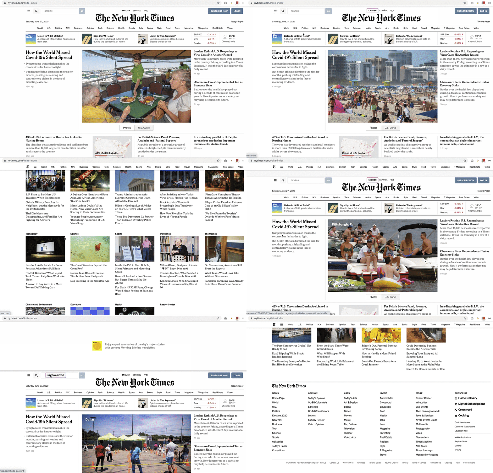
That's cool. Now see how user navigates to the site to index section of the site which declared way down in the site.
Let's implement the same functionality with the help of CSS and React.
Here we're controlling link toggle logic only in CSS through :focus pseudo selector like below, we are hiding the element normally then we'll show link in the screen only when the link element receives the focus. Note that we are not using display: none or visibility: hidden these make it inaccessible, Technically those types of elements (applied display: none and visibility: hidden) are not part of Accessibility tree. Hence we are using clip CSS properties.
.skip-nav-link {
    border: 0;
    clip: rect(0 0 0 0);
    height: 1px;
    margin: -1px;
    overflow: hidden;
    padding: 0;
    position: absolute;
    width: 1px;
}

.skip-nav-link:focus {
    background: white;
    clip: auto;
    height: auto;
    left: 10px;
    padding: 1rem;
    position: fixed;
    top: 0px;
    width: auto;
    z-index: 1001;
}
React implementation is dead simple and self-explanatory too. These 2 component does the job better SkipNavLink and SkipNavContent
export const SkipNavLink = ({ id, children = 'Skip to content', ...props }) => {
  return (
    <a {...props} href={`#${id}`} className="skip-nav-link">
      {children}
    </a>
  );
};

export const SkipNavContent = ({ id, ...props }) => {
  return <div id={id} {...props} />;
};
Here is the usage of components
...
<SkipNavContent id="main-content">
    <main>
        Lorem ipsum dolor sit amet, consectetur adipisicing elit, sed do eiusmod
        tempor incididunt ut labore et dolore magna aliqua. Ut enim ad minim veniam,
        quis nostrud exercitation ullamco laboris nisi ut aliquip ex ea commodo
        consequat. Duis aute irure dolor in reprehenderit in voluptate velit ease
    </main>
</SkipNavContent>
...

ReactDOM.createPortal(
    <React.Fragment>
        <SkipNavLink id="main-content">
            Skip to main
        </SkipNavLink>
        <SkipNavLink id="sitemap-links">
            Skip to sitemap
        </SkipNavLink>
    </React.Fragment>,
    document.getElementById('skip-links-root')!
)
To get some rough ideas on how laid out our HTML page.
<body>
    <div class="wrapper">
        <div id="skip-links-root">
            <!-- Skip Nav links -->
        </div>
        <header>
            <nav>
                <!-- Nav links -->
            </nav>
        </header>
        <div id="root">
            <!-- React content goes here -->
        </div>
    </div>
</body>
Just take a moment to think about how tiny changes improved the user experience a lot better.
That's it.
Happy Tabbing ⌨️! ❤️


Top comments (10)
GitHub has the same feature but currently, this feature doesn't work:
After press enter, It shows a big white panel:
They exclude the navigation content for screen reader as well. Their main content is already visible. The top bar is always on top.
Your explanation is not to make sense. The tab still moves under the white panel. That's a bug of UI. You should try it by yourself before commenting.
Sorry, I don't have access to any desktop nearby. If the tab still moves under the white panel, it's definitely a bug.
It's a bug in their UI, It works for private organization version of Github site.
I 💕 skip-nav when it works right. I do not use a screen reader but really like to keep my hands on the keyboard if I can.
Ironically enough this page's skip-nav is not working 😲. It appears as the first link I can tab into, but goes no where.
Since we are using anchor element for skip nav implementation, we should press the enter/return key (not spacebar).
Also, note that we are not directly redirecting to any focused element, to go the target element we need to press tab one more time.
Nice article! Congratulations! ;)
Thanks for the post
It was very helpful 😁
I'm glad that it helps!