
Material 3 is the newest version of the open-source design system from Google. Following Android 12, Google overhauled the design language with Material Design 3. These new releases will benefit UI UX designers and end users. This blog will explain how to use it and provide the necessary information.
Read More:

The Impact of Visual Design On Overall User Experience - Quokka Labs
The Role and Impact of Visual Design on UX Designers. Visual Design is about using text, design, and color in a way to enhance the overall design
 quokkalabs.com
What Is Material Design and Material You?
Material Design is Google's design language, released in 2014. Material Design is a comprehensive set of guidelines developed by Google to improve the overall look and feel of Android apps with streamlined designs.
On the other hand, an app design approach can be customized according to the user's tastes and preferences. Google intends to bring excitement and creativity to Android apps. Google has added lots of updates related to Material Design and MaterialUI icons.
In an interview, Google's VP of design, Matias Duarte, proposed a new personalized way to do it. Now, apps and widgets can be personalized according to wallpaper color palettes. It needs no effort from users to make it happen.
What's New in Google Material Design 3? | Everything You Need to Know
Dynamic Colors | Material Design 3
Material Design 3 is a perfect and bold update that changes dynamic colors. It has a built-in combination feature that takes input from the user's wallpaper colors.

Now, a new, different-colored palette applies to any app that supports/accepts dynamic colors.
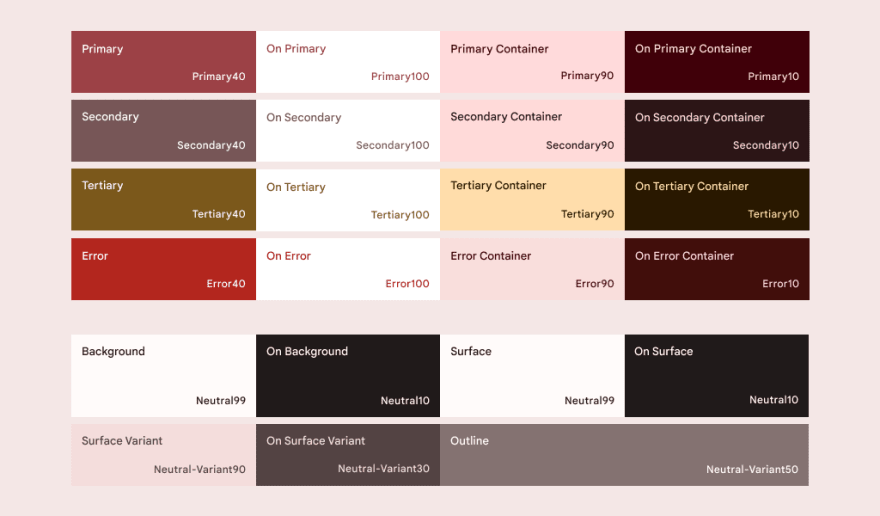
Now, in the dark and light modes, the app's native color palette is mixed with the user's to make a personalized version of the app. Also, designers can create a palette with a theme builder and see their app colors.
UI Components and MaterialUI icons: Material 3 Design
As you can see in the image, MaterialUI components got a new style. Overall, Material design 3 got a more straightforward, playful look, rounder elements, lighter shadows, and white space. It also has new active states, which are all compatible with dynamic colors.
As you can see below the image, the navigation rail also got a new touch.
In this update, new floating action buttons also got a new look. They got boxier and available in a new style with a larger format. Now, they can adapt to larger screens.
Cards also got a new look with three formats: elevated, outlined, and filled.
Dialog models also got more room for padding to use their boxier shape. They now come with good headlines to enhance readability.
Foldable Device
Yes, you thought it was fitting. Material Design 3 makes the future perfect for a foldable device with a new set of guidelines, components, animations, and compositions.
Composition
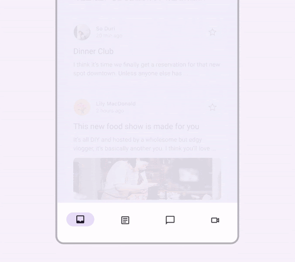
In Google Material Design 3, there are new updates related to layouts designed for large and foldable screens. There is a perfect list for conversation threads, file browsers, and media collections.
New supporting panels, similar to lists, display complementary information on the side of the screen. But here, the right side of the screen is mobilized to show document comments, related files, and support data related to the focus panel on the left.
Material Design 3 got feeds for foldable devices that will suggest new content. There is a hero layout to highlight tip images or videos on the other layouts, like supporting panels.
Motion
Foldable devices allow for entirely new interactions and transitions. For example, multiple apps can run side by side, and users can switch between drastically different screen sizes on the fly. Here are some examples of new motions enabled by Google Material Design 3 to assist users in navigating and interacting with your content.
The motion from landscape to Portrait:

The motion for dialogs:

Adaptive Type Scale
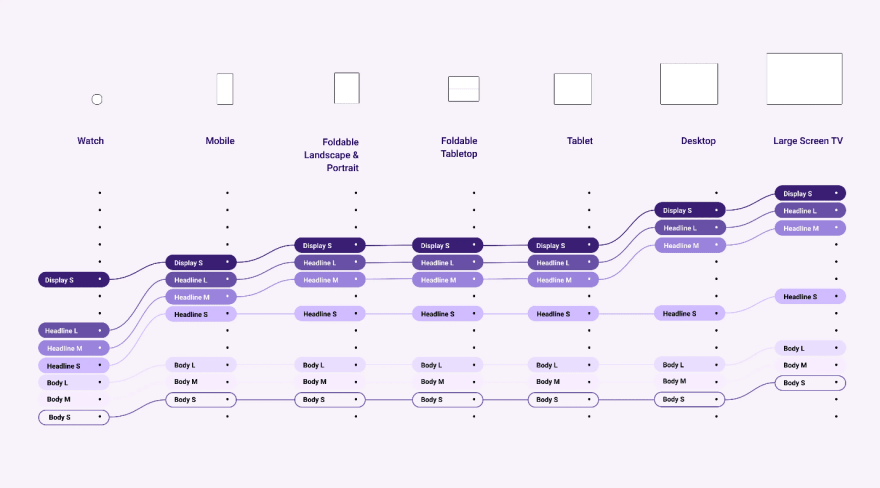
One of Google's primary goals for Material Design 3 is to assist creatives in designing for every screen. As a result, instead of utilizing fixed numbers, they now encourage designers to utilize a scale (small, medium, large) to map font sizes to all screen widths. This is especially helpful when designing apps for foldable devices.
Design Tokens
Design tokens are a new material tool intended to improve consistency and collaboration among design teams. However, their time-saving potential is enormous for large teams working on multiple and complex apps builds.
Tokens contain dynamic style values, such as colors, typefaces, measurements, or even other tokens, which can be updated across an entire project at once.
They enable teams to control styles from a single location during the design and execution phases on all platforms (not just Android). Isn't it possible that your next app upgrade will be 98% less aching?
Tools and Resources to Help You Switch Over to Material Design 3
- M3: a new spot for material guidelines
- Material Theme Builder: A tool to explore dynamic colors, visualize what dynamic colors will look like in your app, and create custom palettes. It is a Figma plugin and web tool.
- Jet Composer Updates: For custom coding apps
- Figma Design Kit
Material Design 3 Examples
Material Design 3 has only been available to non-Google apps since late October 2021, which explains why so few apps have been published or rebuilt with it thus far. But here's how it looks when applied to Google's particular apps.
Google Calculator
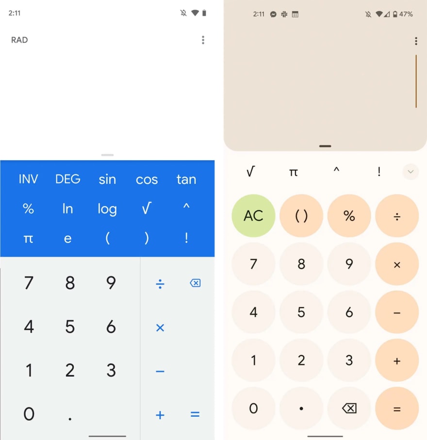
In the above image, you can see the old and new calculator apps.
Gmail

New updates: Active state, custom color palette, reduced radius on floating action button.
Google Drive

Updates: Simple elevations, dynamic colors, and taller navigation than previous.
Clock App

Most noticeable updates: active states, dynamic colors, multi-size FABs.
Know More about UI UX Design:

UI & UX Design: A Beginner's Guide (2022)- Quokka labs
UI and UX are two distinct design specializations that are often spoken of together but follow a completely different career route.
quokkalabs.com
Final Words:Is It Good to Adapt Material Design 3? What's next?
In this post, we have seen all the new updates relating to the release of Design 3. The upcoming updates are also ready to add 3D objects. Also, according to a Google blog, we can expect more updates related to the color palette.
Material Design 3 undoubtedly, got updates that users and designers loved. A successful business and digitalization need the best UI UX design service to create slick designs.
But the main question is, will brands adapt their Material Design 3? What do you think? Comment with your thoughts. Keep visiting for the latest updates.

Top comments (0)