TLDR: I created an animated SVG for my GitHub profile, check it out here.
So it all started with GitHub releasing a feature to add a Readme to your profile to showcase all the awesome work that you have done / been doing. And lo and behold, people figured out that it can be used to add GIFs to their profile. 🥳
But I was like, GIFs are so 2010 and SVGs are the new 💩. Only one problem, I don't know a thing about SVGs. I mean yes I have used it for icons and some illustrations. Sometimes generated one from some utility and snapped it onto a page. But I have never delved into how to create one from scratch and add animation to it.
With nothing better to do, I started googling and was surprised to find that MDN has elaborate documentation on SVG elements. Turns out, it is quite simple to add basic shapes. There are tags like rect, circle, polygon, line, and polyline, etc. Then simply write CSS to animate it.
Neat! 👍
So now I can just move a logo on the screen and have boomers look at it for hours! 💪

But I digress. Back to animating SVG. Above mentioned shapes might be more than sufficient for a creative person to come up with some really cool illustration. But my creativity is fairly limited and so I decided to do a moving wave. And to compensate for my lack of creativity, I learned another tag called path, which will help me create this wave. 🌊
The Idea 🤓
The idea was simple. Create multiple moving waves, each at a different speed, and make them a little see-through. The transparency will make the area darker where the waves intersect and thus there will be multiple shades of the color.
For the size of the banner, I settled for 1440 x 320 as I like the aspect ratio. It's not too big but is big enough to add context. Given that on GitHub it would show up in a smaller area, I can be sure that there is enough space left for other things that I might want to add.
<path />
So, I started by learning how to create a path. Which was quite simple. The path tag has a d attribute. It was not hard to get 😉. There are 6 different types of commands.
- MoveTo
- LineTo
- Cubic Bézier Curve
- Quadratic Bézier Curve
- Elliptical Arc Curve
- Close path
We only need to learn the first three. Each command is denoted with a letter followed by attributes which are
points (x-y coordinates).
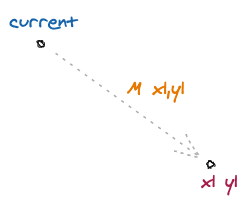
MoveTo command is denoted by letter M or m followed by the point. So a M10,10 would move the current position to the point 10,10.
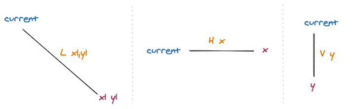
Similarly, LineTo has three commands.
L or l creates a line from the current position to the given point. For example, L10,10 would create a line from the current position to 10,10. H or h would create a horizontal line to the given x coordinate. And lastly, V or v would create a vertical line to the given y coordinate.
Cubic Bézier Curve is slightly more complex. It is denoted by letter C or c and takes 3 points as arguments.

So, the current position is the start point. The line from the current position to x1 y1 point defines the tangent to the curve at the start position. And the line from x2 y2 to x3 y3 defines tangent at the finish position. And x3 y3 is the endpoint. To know more about Cubic Bézier Curve refer to this blog post which I find short but descriptive. You can also refer MDN Tutorial on the SVG path to learn more.
To solidify what we learned right now, lets decode the following SVG.
<svg
  viewbox="0 0 100 100"
  width="100" height="100"
  xmlns="http://www.w3.org/2000/svg">
  <path
    d="M10,10 V50 C10,90,90,90,90,50 V10 H10 V50"
  />
</svg>
The code above results in SVG shown below. For clarity, I have put a green border around the image.
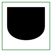
Our path starts at 0,0 and the first command M10,10 moves our point to 10,10. Then the second command V50 creates a vertical path to 10,50. Next C10,90,90,90,90,50 create a curve with 10,90 and 90,90 as our reference points and 90,50 is the endpoint. Then V10 creates a path to 90,10. Next, H10 creates a path to 10,10 and finally V50 closes the path and we get our final image. Simple right? 👌
Implementation ✍️
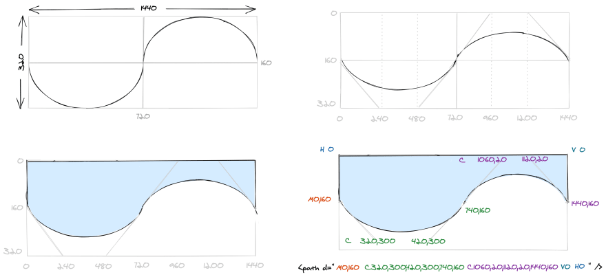
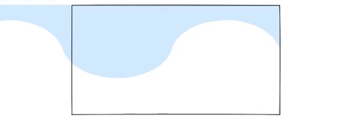
I divided the image into four quadrants and then planned to have a curve in the second and third quadrants, as shown in the first section in the image above. Then I can slightly move the tangents inwards to dampen the curve. Finally, I closed the path using lines. I moved the center point slightly to have curves that are slightly different. But making sure that the angle the tangents make with the vertical axis is the same. This ensures that the curve looks continuous when I animate it. Finally, I ended up with the path as described below.
<path d="M0,160 C320,300,420,300,740,160 C1060,20,1120,20,1440,160 V0 H0" />
If you are having trouble with understanding the path described above, look at the last section in the image above. I have colour-coded each part of the path to make it more clear. You can also compare it with the section just above it to get an understanding of the points. If you were able to follow me till now, then we already sailed through the difficult waters. 😁
<defs /> and <use />
Although, we can now just copy-paste the above path and create other waves with slight variations and call it a day. I want to introduce defs and use tag, that will help us do all these in a much more readable way. defs can be used to store graphical elements like path and then can be used later using use tag.
All we need to do is give an id to our path and put it inside defs tag and then use it using href attribute in use tag as described below.
<svg
  viewbox="0 0 1440 320"
  width="1440" height="320"
  xmlns="http://www.w3.org/2000/svg">
  <defs>
    <path
      id='sineWave'
      d="M0,160 C320,300,420,300,740,160 C1060,20,1120,20,1440,160 V0 H0"
    />
  </defs>
  <use href="#sineWave" />
</svg>
Right now a black wave is being rendered. To fix that we use fill and fill-opacity attribute in path. So our updated path becomes as described below.
<path
  fill="#0099ff" fill-opacity="0.2"
  id='sineWave'
  d="M0,160 C320,300,420,300,740,160 C1060,20,1120,20,1440,160 V0 H0"
/>
Animation 🤤
If you are already familiar with CSS animation, this section will be a cakewalk for you. So the idea is very simple. Have two of the waves (that we created above) stacked horizontally and then simply translate them from 0 to 100%. Rinse and repeat. Something like below.
Here the black box represents the viewport of the user.
To achieve this, we add another use tag but with x attribute set to -100%. Apply, wave class to both of these use tags. And create an animation where we translate x from 0% to 100% and apply this animation to our wave class.
<svg
  viewbox="0 0 1440 320"
  width="1440" height="320"
  xmlns="http://www.w3.org/2000/svg">
  <defs>
    <style type="text/css">
      .wave {
        animation: wave 8s linear infinite;
      }
      @keyframes wave {
        0% {
          transform: translateX(0%);
        }
        100% {
          transform: translateX(100%);
        }
      }
    </style>
    <path
      fill="#0099ff" fill-opacity="0.2"
      id='sineWave'
      d="M0,160 C320,300,420,300,740,160 C1060,20,1120,20,1440,160 V0 H0"
    />
  </defs>
  <use class="wave" href="#sineWave"/>
  <use class="wave" x="-100%" href="#sineWave"/>
</svg>
Finally, I added two more similar waves, the only difference is that I used scaleY in transform CSS property to have a different amplitude of the waves. You can check out the final SVG on CodePen.
Bonus Tips 🤗
I also added a few texts on the banner. This could have been simple as SVG supports Google Fonts but the content security policy of GitHub doesn't allow fonts to be downloaded from external sources. Thus, I used this utility to create an SVG path for me which I copied in my final SVG. Check it out on my GitHub Profile.
Conclusion 👨💻
I barely scratched the surface of SVG animation but was able to create something which I think is cool. Was there a better way to do it? Is there some other interesting thing that I should explore? Do let me know by commenting below or send me a tweet on twitter.
Update
My friend showed me SVG Path Visualizer which I find quite useful to visualize the change path.
We also found that there are many example SVGs present online which we can easily tweak using defs and use tags. To test this out, I tweaked this codepen example and created a banner for him which you can checkout on his GitHub profile.


Top comments (5)
This animation looks so cool.
Awesome 👍
It looked really nice on your github :)
This is really cool. Isn't it really just a CSS animation though? The SVG doesn't really animate so much as it's bounding box.
Yes, you are correct. What I used for animation here is just CSS. However, I can put the entire code in a
.svgfile and can use it like any other image type. The CSS will not leak out of the image and the SVG will hold its animation. I can use this SVG file as a background to any of my DOM elements. And I can also apply any CSS transformation on it. Just like how I would do to any other image. Does that sound fair enough to call it an animated SVG?It is definitely and SVG that is moving - and it's a really neat way to get that kinda of feel into a markdown file.