
Hello everyone, let’s start by understanding what problem we are solving.
Every hour in the world, development teams grow. When a new member joins, the first step is onboarding to the project, and it takes a lot of time. Therefore, today we will reduce this time and the second goal is to improve developers communications with designers and managers.
// Time is the most valuable thing a man can spend. — Theophrastus.
As a result, we will have such functionality in our Storybook:
- See how component looks like
- Interact with component options
- Get component template, depending on selected options There are many ready-made solutions for the first two points, which cannot be said for the third. I didn’t find any examples, so we need to write it ourselves. Let’s start.
// During all installations we will select default options.
If u don’t have an existing Vue.js project, let’s install it using the Vue CLI, the name of the project is up to you, i named it “dynamic-template-addon”
$ vue create dynamic-template-addon
Next, install Vuetify in our project
$ vue add vuetify
Then we need to install the Storybook, since we are using Vuetify, let’s get vue-cli-plugin-vuetify-storybook from their official repository
$ vue add vuetify-storybook
We also need to install js-beautify, so that the formatting of the template will lie on it’s shoulders. The entire list of settings and additional information is here, later we will return to this
$ npm install js-beautify
Now we can work with our Storybook, but before we start, let’s shorten the launch command a bit, we can do this in package.json file

Today we look at an example of a date picker component, based on Vuetify. So let’s get started.
// Talk is cheap. Show me the code. — Linus Torvalds.
Remove unnecessary components and settings, leave the most basic
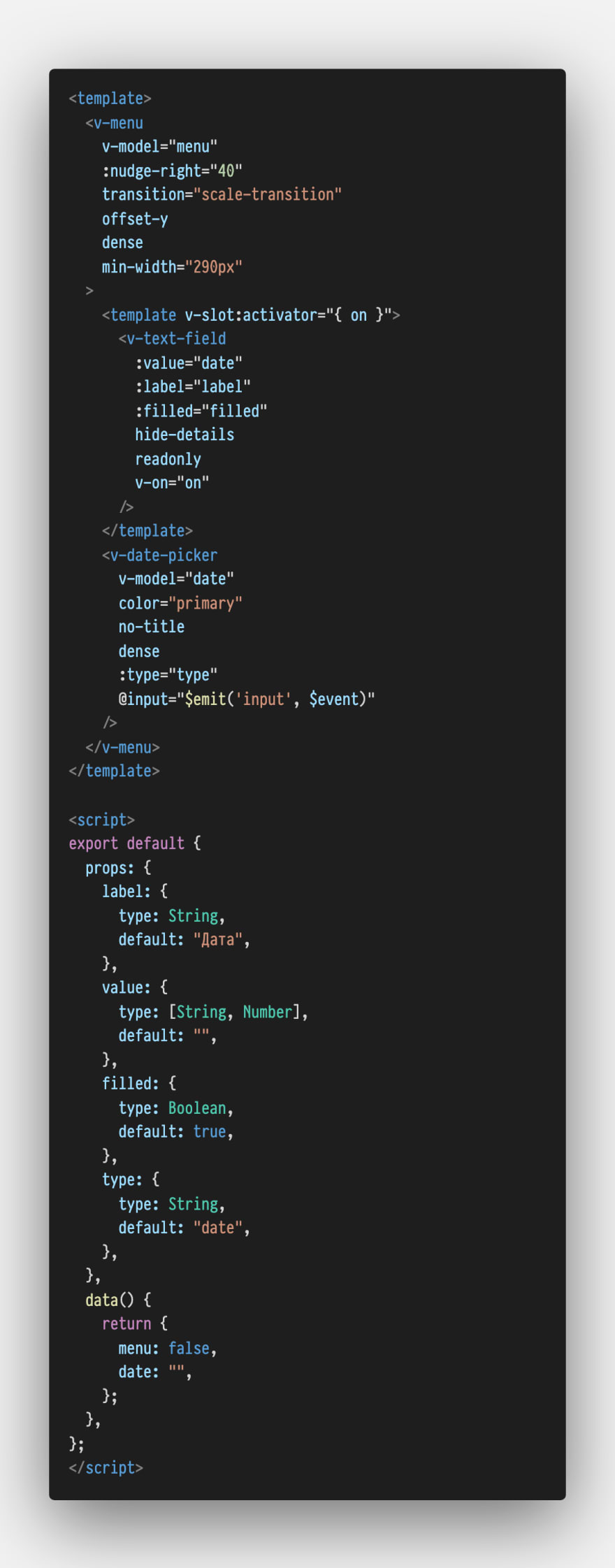
Create DatePicker.vue file in our components folder.
As a result, we will have an textfield, by clicking on it a menu with a calendar will open. After choosing a date, our menu will close and it will be written in the textfield.
Also in the component we have such props:
~ label — sets textfield label;
~ value — it’s the date value, that we want to update using our component;
~ filled — applies the alternate filled textfield style;
~ type — determines the type of the picker — date for date picker, month for month picker;
You can get more information about Vuetify component modifiers in the official documentation
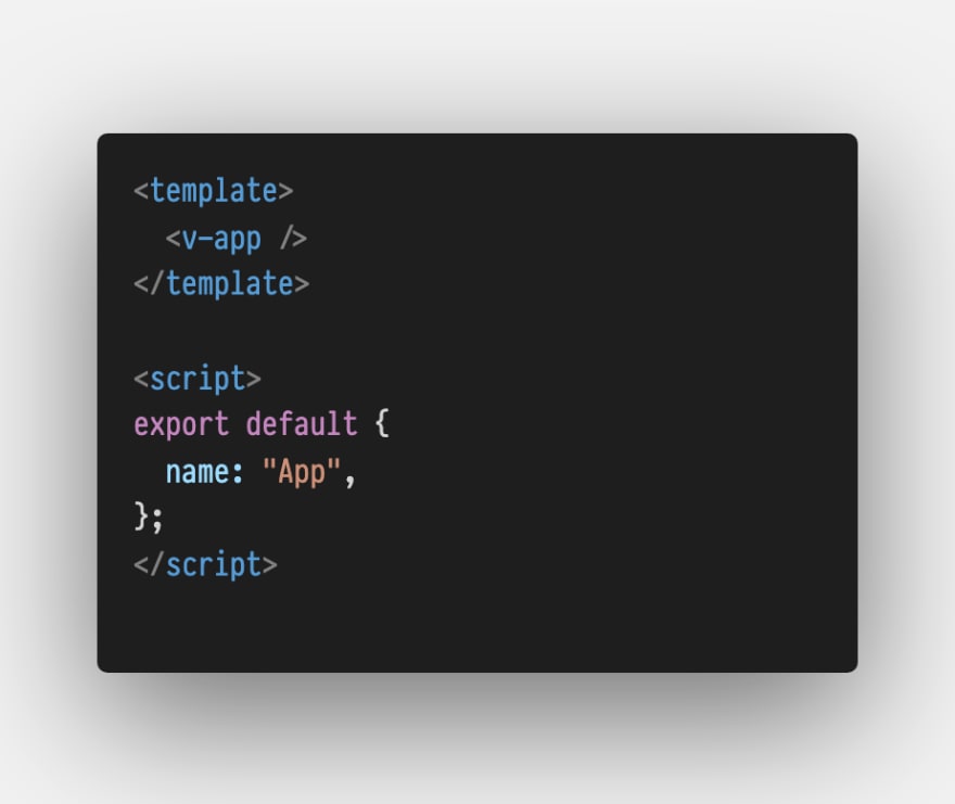
- Import our DatePicker component into App.vue file and create “date” property, which we will pass into it. Also add some styles, so as not to be nervous, when we open it all in the browser

Good, we are done with our component template, so let’s write a cool stories about it.
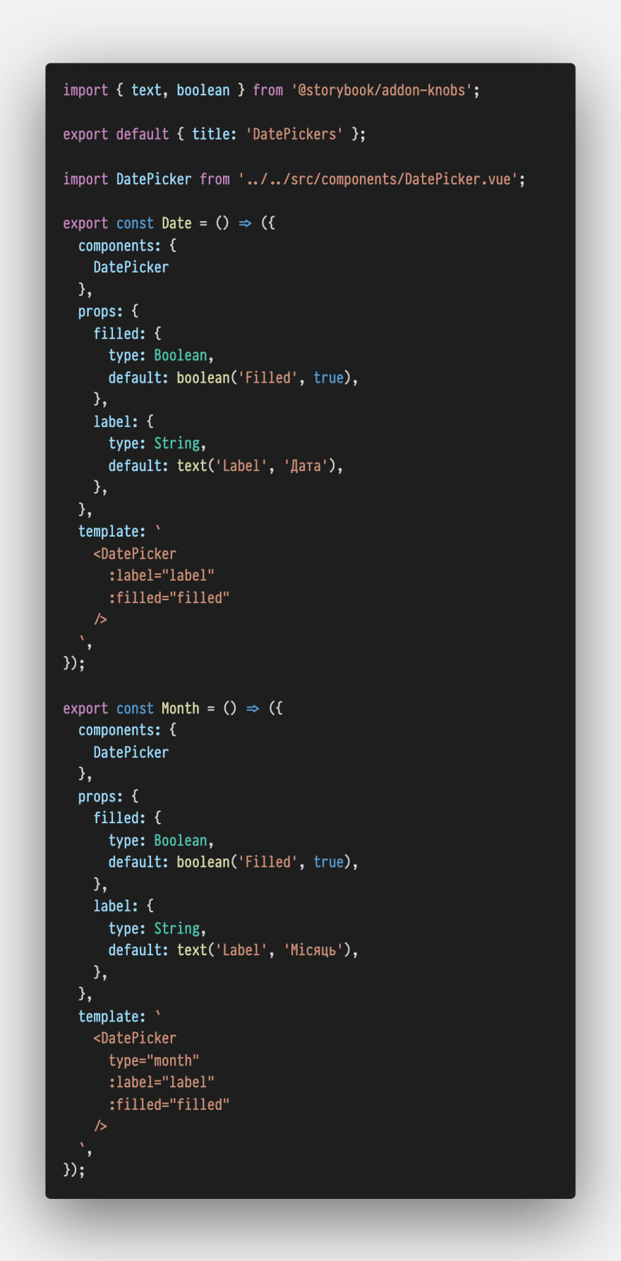
- Delete the utils folder, because we will use a different approach, than Vuetify offers us;
- Rename the file example.stories.js to datePicker.stories.js in the stories folder (config.js file contains regular expression, that collects all the files in this folder with the stories.js extension);
- Write stories in datePicker.stories.js file
Let’s go through each point of this file:
~ Import of Storybook Addon Knobs;
// Storybook Addon Knobs enable the user to interact with the component, allowing to edit props dynamically using the Storybook UI. You can dive deeper in official documentation.
~ Defined the name that will be shown in the list of all components of our Storybook;
~ Import of DatePicker component;
~ Written stories (we have two stories to select the date and month)
// Each story is a single state of your component.
Now we can run Storybook:
$ npm run storybook
But there are two problems:
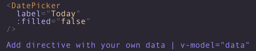
~ Our template shows props as variables, not values;
~ Props aren’t hidden, if they are equal to default values

Let’s fix it, because we want, after choosing the options we need, just copy the component and use it right way.
We have to edit decorator.js file in addon-show-vue-markup folder.
~ EVENT_ID —name of event that our panel will listen;
~ story — define our story instance;
~ template, components — template and components of our story;
~ storyValues — the value of props, that were selected in the knobs tab;
~ defaultValue — in our options we have an object “props”, but there is a bug, and when we change the value of props with knob — default value changes to a new one, so we must take the default value of the props from the component instance;
~ We have only one way to change the template with a regular expression, it is very short and easy;
~ Next we loop in “storyValues” and check, if the current value is default, we don’t want to add it to the template, and also don’t forget, that when value type is boolean or object, we must add a colon to it;
~ After all the code, add s hint, that the developer can bind the property to the component using v-model directive;
~ “I tried so hard” — in the end, add settings to beautify-js

// A few words about register.js file — In the Storybook we can’t create addon with Vue.js, because it must be React component, we can only hope that this will be fixed in the future
That’s all, now we have dynamic-template-addon, which implements all the functionality we need.
Github with source code - https://github.com/psborul/dynamic-template-addon
Thanks for reading.
See you next time!

Top comments (0)