Progress Software and the Telerik brand has a long history of supporting the .NET community with products like Telerik UI for ASP.NET AJAX, UI for ASP.NET, and UI for ASP.NET Core. This is why we’re proud to announce the early preview release of Telerik UI for Blazor!
- What is Blazor
- What is Razor Components
- Blazor Recommended Reading
- Built from the Ground-Up - 100% Native .NET
- Experiment With Us
- Telerik UI for Blazor Early Preview
What is Blazor
Blazor is a new framework by the Microsoft ASP.NET team that introduces a next generation component model that allows developers to write Single Page Applications (SPA) without JavaScript. If Blazor sounds new to you that’s because it has only been in development less than a year, and as an experimental project. Initially the Blazor framework targeted the Mono WebAssembly runtime (the .NET runtime compiled to wasm), thus allowing .NET to run on the client’s browser inspiring the name “Blazor” (Browser + Razor).
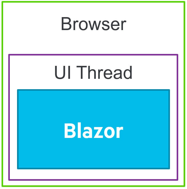
In this configuration the application’s resources including .dll files are delivered to the client and executed the Mono WebAssembly runtime. While the WebAssembly deployment of Blazor is sill in active development a server-side deployment option was introduced called Razor Components.
Blazor Component Model
The Blazor component model is refreshingly simple in its design. Components can contain markup (HTML) and logic (C#) in a single Razor (cshtml) file. The component is capable of handling data binding, events, and dependency injection all without JavaScript.
The Counter Component below demonstrates the basic composition of a Blazor component.
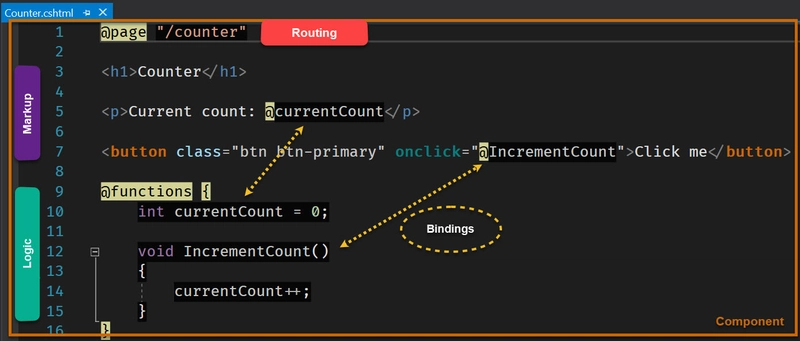
The counter component uses a basic HTML button to increment a counter field which is displayed within a paragraph tag. Because Blazor operates as a single page application all of the interactions in the component happen on the client. Updates to the browser’s Document Object Model (DOM) are handled by the Blazor framework though data binding.
What is Razor Components
Recently Microsoft has announced plans to support the framework when running server-side in a mode called Razor Components. Even more recently, an announcement was made that the same component model will be backwards compatible with ASP.NET Core (MVC) and Razor Pages. All of these cutting edge news and bits dropping around Blazor has our team at Telerik excited for the future of ASP.NET development. Much like Blazor running on WebAssembly, Razor Components allows developers to write Single Page Applications (SPA) without JavaScript.

The key difference between Blazor and Razor Components is the way the application is deployed. Instead of Blazor running via WebAssembly on the client, the Blazor framework runs on the server as an executable. In this mode, ASP.NET Core hosts the application and provides a communication channel using SignalR technology. Using SignalR the application sends UI updates and receives changes and events as binary packets of data over a web socket connection. Since only the changes are sent over the connection, the payload is small and efficient.
Since Razor Components utilizes the Blazor framework, components can be used in both deployment types.
Blazor Recommended Reading
If all of this is new to you, and it’s most likely that it is, then we have some blog posts to catch you up on all things Blazor. The following articles should bring you up to speed, or if you’re biting your nails to check out what’s below, we’ve included the TLDR as well.
- Blazor – A New Framework for Browser-based .NET Apps (DevReach 2018)
- What’s Coming in .NET Core 3.0
- Blazor Q&A with Microsoft’s Daniel Roth
- Goodbye JavaScript, Hello WebAssembly
- A Breakdown of Blazor Project Types
- Razor Components for a JavaScript-Free Front-end in 2019
TLDR
Razor Components , is what originally started as Blazor Server-Side in early 2018. Blazor is a .NET (SPA) framework that is generally associated with .NET running on Web Assembly. However, Blazor is capable of running under multiple scenarios including server-side as Razor Components.
- Razor is a popular template markup syntax for .NET
- (Browser + Razor) Blazor is a .NET based web framework which can run on the client using WebAssembly or as:
- Razor Components : The Blazor framework running on the server via SignalR
- Razor Components via “ circuits ” - Razor Components running in ASP.NET Core / Razor Pages
- All Blazor hosting models, both client and server-side, utilize C# APIs instead of JavaScript
- Razor Components is expected to ship in ASP.NET Core 3.0
Built from the Ground-Up - 100% Native .NET
Telerik UI for Blazor will not wrap existing jQuery/JavaScript products in C# and pretend it’s something new. With Telerik UI for Blazor we are starting from scratch and writing components with .NET whenever possible. Alternatively we could have decided to wrap existing jQuery components, as short-term path, however we feel that the wrapper programming model is a leaky abstraction that would “bleed back” into the .NET API layer. In addition, we feel that a native .NET approach is a long term investment that will fetch larger gains in the long run. Consider this a modern day tortoise vs. hare story.
We can’t express enough how important both the JavaScript and .NET ecosystems are to us. We have UI libraries for developers of all skill types, however a segment of .NET community has expressed the need for front-end web tooling that does not require JavaScript and we’re happy to have the opportunity to serve this community through Blazor.
Experiment With Us
Blazor is an exciting prospect for .NET developers because it allows us to create full-stack .NET web application. We have received countless feedback items asking for our support this next generation platform.
Initially we’re offering Telerik UI For Blazor as an early preview release. This development model closely resembles the effort being made by Microsoft with Blazor as we aim to release small sets of functionality in hopes to gain feedback and knowledge about how our customers use the product. During the experimental phase Telerik UI for Blazor will be a free trial for all and we hope that you will continue sharing with us your use cases, experience, road-blocks, and bugs.
After downloading Telerik UI for Blazor you will receive an email with instructions on how to share your feedback, wishes and Blazor experiments with us.
Telerik UI for Blazor Early Preview
The initial offering will be small with just a few popular UI components including the Data Grid , Tab Set , and Buttons. Through customer feedback we plan to expand the number of components and rage of APIs. We believe that building to our customers needs and recommendations is the path to success.
Prerequisites
Install the Blazor SDK by following the steps outlined on the Blazor website
Download the Telerik UI for Blazor NuGet package directly
(optional) Use the Telerik NuGet feed as a package source
Your First Blazor Project
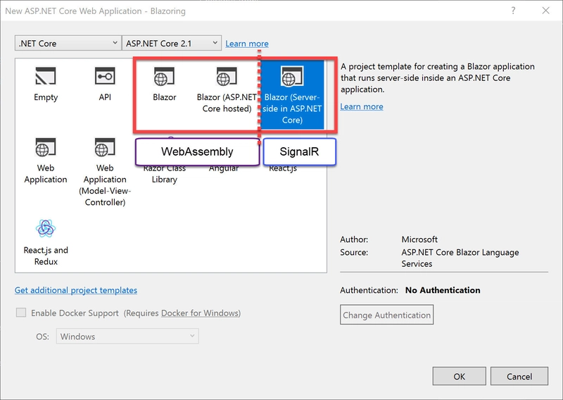
We recommend starting with the “Blazor (Server-side in ASP.NET Core)” project type when using the New Project dialog. This project type is also known as “Razor Components” and will eventually ship with ASP.NET Core 3.0. However, Telerik UI for Blazor will work on all Blazor project types.
With the new project created, we’ll need to install our Telerik UI for Blazor NuGet dependency. Before adding the package, be sure to navigate to the project that contains the application’s UI. This will be either <project>.App or <project>.Client depending of the template you chose.
Install the Telerik.UI.for.Blazor NuGet package. This will add the component library to your application.
Register the components in the application. In the root of the application, locate the _ViewImports.cshtml file and add the following code.
@using Kendo.Blazor

@addTagHelper *,Kendo.Blazor
- We’ll also need to reference the style sheet needed for the components. Locate the
index.htmlfile in the/wwwrootfolder and add the following line.
<link href="//kendo.cdn.telerik.com/2019.1.115/styles/kendo.material-v2.min.css" rel="stylesheet">
Notice we’re not referencing any JavaScript files, that’s because there aren’t any JavaScript dependencies. You’re now ready to start testing Telerik UI for Blazor.
Blazor Data Grid
The Telerik UI for Blazor Data Grid has quite a few features in this preview. The data grid in this release is capable of: data binding, sorting, paging, themes, templates, and in-cell editing, which only supports int, string and DateTime fields.
Let’s see these features in action by replacing the hand coded table in the Fetch Data example with the Telerik Data Grid. First take a moment to run and explore the Fetch Data example at localhost/fetchdata.
Locate the code for Fetch Data under the /Pages folder. Replace the entire table element with a KendoGrid component. Telerik UI for Blazor components use the Kendo namespace as it is a familiar reference to our existing front-end libraries and shares CSS code with those libraries.
else
{
  <KendoGrid Data=@forecasts Pageable=true PageSize=5 Sortable=true>
    <KendoGridColumn Field=@nameof(WeatherForecast.Date)>
      <Template>
        @($"{(context as WeatherForecast).Date:d}")
      </Template>
    </KendoGridColumn>
    <KendoGridColumn Field=@nameof(WeatherForecast.TemperatureC) />
    <KendoGridColumn Field=@nameof(WeatherForecast.TemperatureF) />
    <KendoGridColumn Field=@nameof(WeatherForecast.Summary) />
  </KendoGrid>
}
The KendoGrid component binds the Data property to forecasts which is an array of the WeatherForecast object. The grid also has the Pageable, PageSize, and Sortable properties enabled. Inside of the KendoGrid component, we define child components for each field we would like displayed in the grid. Because this is all C# code, we can set the Field property with C#'s nameof operator giving us type safety. In addition, templates can be used to display custom formats, images, and even other UI components. Here a template is used to format the Date field.

Blazor Tab Set
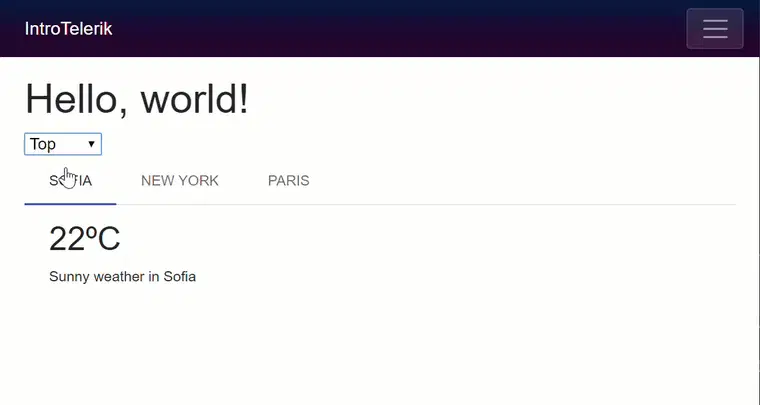
The other major component included in this release is the KendoTabSet. The KendoTabSet supports multiple tab positions: Top (default), Bottom, Left, and Right. We can use Blazor’s bind attribute to demonstrate the tab positions at run-time. Locate the index.cshtml page under the /pages folder. Replace the page’s content with the following code.
@using Kendo.Blazor.Components.TabStrip

<h1>Hello, world!</h1>
<select bind=@tabPosition>
  <option value=@KendoTabPosition.Top>Top</option>
  <option value=@KendoTabPosition.Left>Left</option>
  <option value=@KendoTabPosition.Right>Right</option>
  <option value=@KendoTabPosition.Bottom>Bottom</option>
</select>

<KendoTabStrip TabPosition=@tabPosition>
  <KendoTab Title="Sofia">
    <h2>22<span>ºC</span></h2>
    <p>Sunny weather in Sofia</p>
  </KendoTab>
  <KendoTab Title="New York">
    <h2>24<span>ºC</span></h2>
    <p>Partly Cloudy weather in New York</p>
  </KendoTab>
  <KendoTab Title="Paris">
    <h2>21<span>ºC</span></h2>
    <p>Rainy weather in Paris</p>
  </KendoTab>
</KendoTabStrip>

@functions {
  KendoTabPosition tabPosition = KendoTabPosition.Top;
}
In this example we start by creating a simple select list element with all of the KendoTabStrip position values, KendoTabPosition.<value>. Most importantly, KendoTabPosition is a standard C# enum type so we get strongly typed values and intellisense here. Next a KendoTabStrip component is created with several KendoTab components that display some weather forecast data. The TapPosition property is bound to both the select element and KendoTabStrip through the a simple backing field tabPosition declared in @function.
Because select is using the bind attribute, it automatically updates the tabPosition value when the option is changed, this allows us to modify the position at run-time.
Summary
We’re excited to be part of the next generation of ASP.NET applications by supporting Blazor. Telerik UI for Blazor Early Preview is available for free today. The package currently includes Data Grid, Tab Set, and Button components written from the gound up to take advantage of Blazor without JavaScript dependencies (there’s no jQuery this time folks). Throughout the year Microsoft will be working on Blazor (aka Razor Components) as part of ASP.NET Core 3.0. We plan on keeping Telerik UI for Blazor up to date as the project progresses and look forward to hearing your feedback, see what you’ve built, and know what components you need for your next app.
Sign Up for Release Webinars
Seeing is believing, so register to see all the new features – WEBINARS ARE COMING UP FAST! It will help you to follow along easily if you download the latest release here.
Telerik
Date/Time: Friday, January 18th @ 11:00 am - 12 pm EST Register Now
Kendo UI
Date/Time: Tuesday, Jan 22, 11:00 AM ET - 12:00 PM ET Register Now

Top comments (0)