
✨ What is react-creme
react-creme is a brand new UI toolkit (aka component library) for React.
With 40+ High quality UI components, react-creme comes with an exhaustive list of ready to use performant UI Elements for building apps of any shape and size.
Weighing just ~43kb (minzipped size), react-creme is light and we intend to keep it that way. The library has a very minimal dependency at the moment and the plan is to whittle down on external dependencies and make the lib completely independent in the future.
❓Why
The goal was to build a lighter UI component library but at the same time provide a toolkit that is powerful, easy to setup and configure.
The library exposes an intuitive API that is easier to understand and consistent across the components.
💪 Typescript
The library has been written completely in typescript and the components have been strongly typed in a manner that is consistent with the standards.
♿ Accessibility
react-creme takes accessibility seriously. All of the UI elements are accessibility complaint and the keyboard based navigation has been implemented to work seamlessly across all browsers.
🎨 Themes
react-creme comes with an inbuilt ThemeProvider that makes the whole themefication process easy and hassle free.
The colors, font sizes, icon sizes can be customized quickly with ease.
⚡Performance
Components are light, robust and elements like List comes with the virtualization feature out of the box. Virtualization is currently supported on elements such as List and Dropdown, but this will be soon introduced to components that deal with larger datasets.
Installation
react-creme is available for use from npm and you can install it via npm or yarn
yarn add react-creme
or
npm install react-creme
Getting started
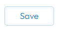
import { Button } from 'react-creme';
import 'react-creme/dist/react-creme.css';

const App = () => {
  return <Button label="Save" onClick={()=>alert("Saved")} />
};

export default App
If all goes well you should have the button rendered and on clicking should alert you with the "Saved" message.
How about a slider component ?
import { Slider} from 'react-creme';
import 'react-creme/dist/react-creme.css';

const App = () => {
  return <Slider end={13} knobShape="square" knobSize={15} position="top" start={4} />
};

export default App
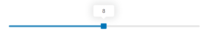
You can checkout all the cool stuff you can have on a slider here
⚡What's coming next
🌒 - Support for Dark mode has been under the works and will be released as part of the beta release.
🌈 - More components
🛣️ Roadmap
react-creme has been under development for the past few months and its currently in alpha stage. I expect the lib to move into beta stage in the coming weeks.
Please feel free to add your comments / feedback. What you like, what you didn't like, what can be improved.
If you liked this post, you might also like some of the other stuff i built on Github


Top comments (2)
Congratulations on the successful launch!
Thank you ☺️