One of the key features of Progressive Web Applications is the ability for them to function without a network connection. Angular makes it really easy to turn any web app into a PWA. Believe it or not, though, having a PWA that works offline does come with some downside, primarily due to it caching much of your application. If your users are expecting current data, but your service worker is serving cached data, there could be some confusion. So in this post, I will show you how to provide a small visual indicator to your users whenever the app is offline.
Note: This is an excerpt from my online video course, Building Progressive Web Applications with Ionic (and Angular). There is also a video version of this post on YouTube.
@ngx-pwa/offline
Obviously, if your application needs to be online for some functions, those functions will not work, and you will want to be able to degrade your functionality gracefully, and at least let the user know that some features will not be available. In my applications, I want to provide a visual indicator that the application is offline. To do that, I use @ngx-pwa/offline, a handy little npm package that will help do this in an Angular friendly way. You can quickly install it with npm. Use one of these two commands, depending on the version of Angular your project uses.
# Angular 9+
npm install @ngx-pwa/offline@9

# Angular 6 / 7 / 8
npm install @ngx-pwa/offline@6
The package provides an Observable you can watch called onlineChanges. Subscribing to this observable will provide the value of true or false, whenever the network state goes from online to offline. Once you add the package to your page component, you can assign the observable to a class-level variable, and then subscribe to its changes.
@Component()
export class AppComponent {
  constructor(network: Network) {
    online$ = this.network.onlineChanges;
  }
. . .
}
In the component’s markup, rather than write code to handle the subscription explicitly, you can use Angular’s async pipe, which will do that work for you.
<div *ngIf="online$ | async">
I am only visible when online
</div>
In this code, you can bind the value of the observable online$ to the ngIf directive, adding the async pipe. This tells Angular to subscribe to the observable automatically, updating the binding whenever the value changes, and automatically unsubscribe when the page is unloaded. Remember that the observable wraps a Boolean, so the ngIf will get either true or false, showing or hiding the div appropriately.
Rather than simply display a piece of text, I want to dress it up a bit using an ion-chip component from Ionic.
Adding Ionic Components
If you are not currently using the Ionic Framework in your application, you can easily import and use individual components, without adding a lot of bulk to your code.
Ionic provides an Angular schematic to help you. Enter the command
ng add @ionic/angular
ion-chip
According to the Ionic docs, an ion-chip is a way to present complex entities in a small space. It can contain text, icons, and images.
Below are some examples of different ways you can style it.
<ion-chip color="warning">
<ion-label>Offline</ion-label>
</ion-chip>
<ion-chip color="warning" outline="true">
<ion-label>Offline</ion-label>
</ion-chip>
<ion-chip>
<ion-icon name="pin"></ion-icon>
<ion-label>Location</ion-label>
</ion-chip>
<ion-chip>
<ion-icon name="pin" color="primary"></ion-icon>
<ion-label>Location</ion-label>
<ion-icon name="close"></ion-icon>
</ion-chip>

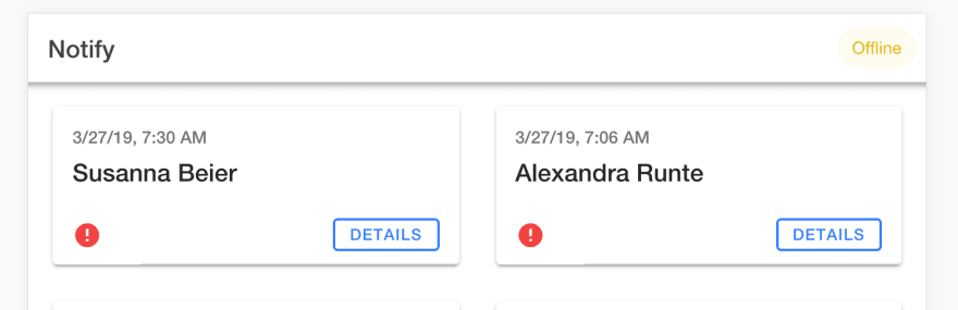
The first one is the chip that I will use to show whenever the application is offline. It’s an unobtrusive yellow rounded rectangle with the word “offline” in it. This color is is known as “warning” and is an ionic constant.
The second example adds an outline.
By default, ion-chip elements are gray. The third example is a default colored chip with map pin icon added to the text. You can also color the icon, and even add another icon if you want, as in the fourth example
I prefer to stick with the first example, as the others look too much like buttons. You never want your users to click on things that are not interactive.
Putting It All Together
Here are all of these concepts put together. In this code, I have created an ion-buttons element to put into each page’s header.
<ion-buttons slot="end">
  <div *ngIf="online$ | async; else offline"></div>
  <ng-template #offline>
    <ion-chip color="warning">
    <ion-label>Offline</ion-label>
    </ion-chip>
  </ng-template>
</ion-buttons>
The ngIf is the same one we saw before, with a twist – it has ”else offline” added to it. What this means is that in the event the online$ observable returns true, the div will be shown. However, if it is false, the else case, the ng-template matching the id offline will be displayed instead.
Thus, when the application is online, nothing will be shown. When the application is offline, the ion-chip will be shown instead.
Whenever the application is offline, it would look something like this.
It occurred to me that I could have negated the value of the observable in the component, subscribed to that, and then cut down on the markup. I think I prefer this method, though, because it makes it easier to change what is displayed, instead of simply showing or hiding it. The strategy is the same regardless. The final decision, of course, is yours.

Top comments (0)