
In recent years, we got used to seeing React on top of popular ranking lists related to web development technologies. Indeed, this JavaScript framework is frequently selected by developers for building performant interfaces and fostering a comfortable user experience. React is favored by many programmers for its reusable components, Virtual DOM, JSX syntax, React hooks, and strong community support. But I would like to pay special attention to the large and constantly evolving ecosystem of the framework.
In this article, we will focus on commercial and open-source UI component libraries that help you to handle development tasks of varying complexity more quickly and efficiently.
Commercial UI Components for React
DHTMLX Gantt for React
If you receive an order to develop a React-based project management app, it will most likely have to be equipped with a Gantt chart for providing a comprehensive look at the status of all tasks and dependencies between them within a project. That is where DHTMLX Gantt for React can become a true asset. Written in pure React.js, this component allows creating fully editable Gantt charts complemented with the main task management features. It comes with a range of configuration and customization options to meet any of your project requirements.
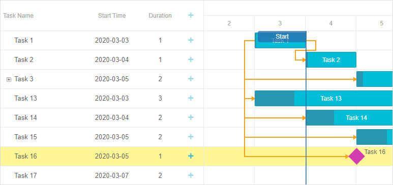
You will be amazed how fast this component is at rendering a large number of tasks (10000+ tasks in milliseconds!). Another great thing about this React Gantt is its reactivity, meaning that any changes in the config can be instantly seen in the Gantt chart. Thanks to touch support, users can conveniently interact with Gantt charts via smartphones and tablets. You can also adapt the Gantt chart interface to different languages to reach more users. Need more? The DHTMLX development team plans to enrich it with sophisticated features such as auto-scheduling, critical path, and resource management by the end of 2021.
Useful resources: documentation, examples
Trial version: DHTMLX React Gantt
Price: from $699
DevExtreme Reactive
DevExtreme Reactive is a small package of business-oriented React components, including Grid, Scheduler, and Chart. These components are notable for a plugin-based architecture allowing you to apply only features that are necessary for your project or add extra capabilities using your own plugins. The use of React optimizations, Virtual DOM, and lightweight markup ensures robust performance with big data for all three components.
The state of the Reactive components can be controlled externally (stateless mode) by enabling state persistence and time-traveling with Redux or internally (stateful mode) by the components. DevExtreme Reactive offers native support for popular React UI libraries (Material-UI, React Bootstrap). You can utilize themes provided by these libraries or create custom ones for styling React components to your liking. All UI textual data in the components can be localized. You can also speed up the integration of the DevExtreme Reactive components in your application by avoiding coding errors with TypeScript definitions.
Useful resources: documentation, examples
Trial version: DevExtreme Reactive
Price: from $499
KendoReact
KendoReact is a UI library designed from scratch specifically for React to aid you in building business web apps. It comprises a collection of UI components ranging from basic interface elements (buttons, inputs, etc.) to more advanced tools such as Charts and Scheduler. Tree shaking, server-side loading, and lazy loading techniques help to avoid performance deteriorations. Built with the use of TypeScript, KendoReact allows you to make use of typings and IntelliSense to accelerate the development process. All components are fully accessible and localizable.
The overall look and feel of components is defined with three built-in themes that can be customized with the Theme Builder tool. Interestingly, the library also comes with three UI kits for the default themes, providing assets for matching the KendoReact UI components with the design of your app. If necessary, KendoReact can be integrated with almost any library from the React ecosystem such as Redux, NextJS, GraphQL, and others.
Useful resources: documentation, examples
Trial version: KendoReact
Price: from $799
Ignite UI for React
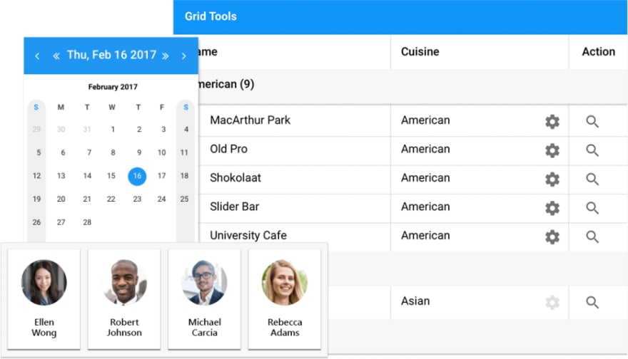
Ignite UI for React is a client-side toolkit including a set of React UI components for producing enterprise-grade software solutions. Utilizing these tools, you can considerably simplify the implementation of various UI elements. For instance, you can arrange large amounts of data in the tabular form using grids, add visualizations via charts and maps, manage the layout of your app via panes, and more.
Taking advantage of the Ignite UI command-line tool (CLI), you have an opportunity to increase the efficiency of your work with the React components. This tool allows you to use pre-configured project templates that help to complete your project faster. Ignite UI for React also includes an Excel library allowing you to employ a large number of formulas and work with sparklines.
Useful resources: documentation, examples
Trial version: Ignite UI for React
Price: from $749
Sencha ExtReact
Sencha ExtReact is a suite of ready-made UI components that can be put together into a consistent React application using the JSX style of coding. It supports React 15 and React 16. Get at your disposal grids, layouts, charts, pivot grids, D3 visualization, and many other useful components that can be configured according to your requirements and seamlessly incorporated into a web project. ExtReact comes with a theming API that enables you to fine-tune the appearance of components.
Moreover, you can also benefit from utilizing special Sencha tools designed to boost various stages of the development process. For example, these tools allow you to create custom themes for the React components being used in your app (Sencha Themer), perform end-to-end testing of ExtReact (Sencha Test), try your code in the browser without any specific preparations (Sencha Fiddle), and many other useful things.
Useful resources: documentation, examples
Trial version: Sencha ExtReact
Price: from $799
Syncfusion React UI
Syncfusion React UI is a UI components library intended for building React applications and accelerating their time to market. It contains a range of UI components for addressing various development needs. Look for inputs, forms, layouts, and other standard UI elements? Not a problem. Having issues with data management? There are plenty of React grid components. Want to integrate more complex business tools such as Gantt charts, event calendars, Kanban boards faster? Syncfusion React UI will get you covered. The library is based on a modular architecture, so you can optimize the app’s bundle size by including only required components and features.
All widgets have an adaptive and responsive design, thus they can be viewed and navigated on devices with different screen resolutions. The support for components’ state persistence helps to provide a cohesive user experience during navigation and page reloads. The library offers a set of customizable default themes, including a high-contrast option for users with low vision. It is also possible to display the text content of the Syncfusion React components in different languages for a global audience.
Useful resources: documentation, examples
Trial version: Syncfusion React UI
Price: from $995
Open-Source UI Components for React
PrimeReact
 PrimeReact is a package of UI components for React engineered by PrimeTek Informatics. Buttons, menus, charts, forms, inputs, layouts - these and many other useful components will help to increase your coding productivity. PrimeReact is design-agnostic, meaning it does not depend on any specific styling library. The library ships with a variety of free themes that can be customized to meet your styling requirements. All components are responsive and touch-friendly, so users will be able to conveniently interact with them from any device. Most of PrimeReact components are native, but some of them (such as GMap) have external dependencies. You will also have to use special libraries for adding icons (PrimeIcons) and animations (React Transition Group).
Useful resources: documentation, examples, GitHub repository
Package size: 28.3 MB
License: MIT
Chakra UI
 Chakra UI is one more interesting solution aimed to provide you with an array of modular and themable UI components for creating modern React-based apps in a shorter time. Utilizing style props, you can easily modify the components’ styling. There are two available color modes (light and dark). Each Chakra component is composable, so you can divide it into smaller parts and put them together in a different way, thereby creating new components. Chakra UI follows modern accessibility standards, ensuring a great user experience for people with disabilities. If you experience any difficulties in using this UI library, you can count on assistance from an active Chakra community.
Useful resources: documentation, video tutorials, GitHub repository
Package size: 167 kB
License: MIT
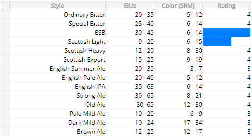
Recharts
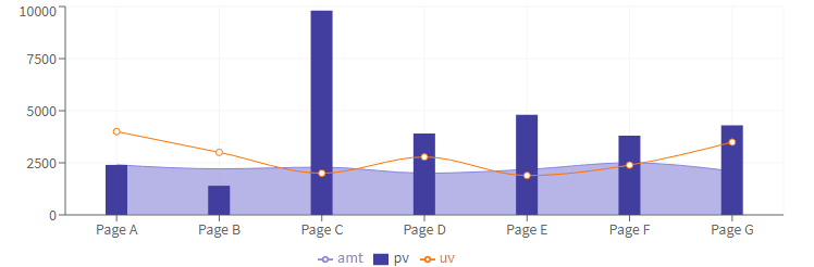 When working on data-intensive applications, it is good to have a reliable tool for visualizing complex data in a clear hierarchical structure. If you work with React.js, you should consider Recharts. It is a time-proven charting tool based on React and D3. It enables you to integrate popular chart types (Area, Pie, Radar, Bar, Skatter, etc.) into your app and customize them without any trouble. It also provides native SVG support for adding vector graphics to the web.
Useful resources: documentation, examples, GitHub repository
Package size: 5.27 MB
License: MIT
React Simple Maps
 React Simple Maps is a tool devoted to simplifying the creation and styling of SVG maps in React. It relies on d3-geo and topojson and offers a declarative API for generating map charts. Here you get access to a collection of isolated mapping components that can be combined in different ways. React Simple Maps helps you to take care of all wearisome stuff such as panning, zooming, etc., and concentrate on making visually appealing maps. If necessary, it is also possible to add any 3rd party React libraries.
Useful resources: documentation, examples, GitHub repository
Package size: 74.3 kB
License: MIT
React-Chrono
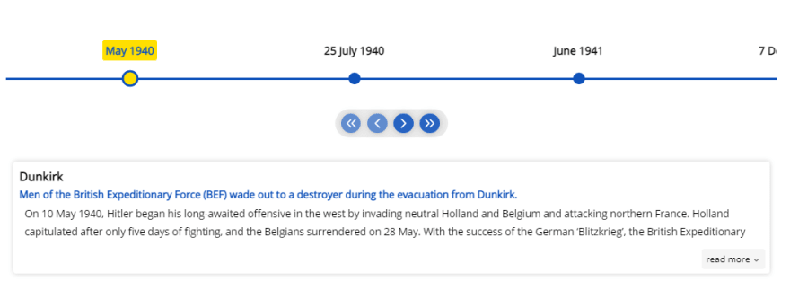 React-Chrono can come in handy if you need a React component allowing you to visually present the sequence of events over a specific period of time. This timeline component enables you to depict events in three modes (horizontal, vertical, vertical-alternating) or autoplay the whole timeline chart in slideshow mode. It is possible to make the timeline more informative by complementing it with images, videos, icons, or any other custom items. You can navigate the timeline chart via scrolling or with a keyboard.
Useful resources: GitHub repository
Package size: 290 kB
License: MIT
React Table
 React Table is a "headless" UI library with a small memory footprint that gives you a set of hooks for organizing data sets in a tabular format. Using this tool, you can create data tables with an extensive set of features for viewing and manipulating data. For instance, it supports sorting, global filters, row grouping, column ordering, pagination, aggregations, and many other useful functions. React Table has its own plugin system allowing you to extend the table’s functionality. Only you decide how the table looks on the screen by providing your own markup and styles.
Useful resources: documentation, examples, GitHub repository
Package size: 922 kB
License: MIT
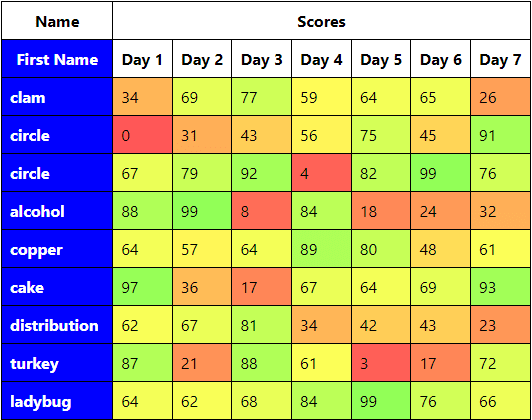
React-datasheet
 React-datasheet is a highly customizable React UI component that serves for generating Excel-like spreadsheets on a web page. It allows performing basic cell operations (select, cut, copy, paste) and using keyboard navigation by default. You can add more advanced capabilities, extra cell attributes, your own editors, or new behaviors with the help of custom renderers. It is important to mention that React-datasheet does not support math calculations and validation. For this purpose, you’ll have to integrate some math libraries (such as mathjs).
Useful resources: GitHub repository
Package size: 116 kB
License: MIT
Conclusion
Summarizing the above, we can say for sure that developers have no reasons to complain about the lack of commercial and open-source UI components for React.js. The main question here is which type of components suits better for your project. If your React project requires UI libraries with advanced functionalities, regular updates, bug fixes, and reliable technical support, then you should consider commercial products. In case your budget does not imply spendings on commercial dev tools or the amount of work may not justify the costs, benefit from using free tools. So, which do you usually prefer? Give your answers in the comments below.

Latest comments (0)