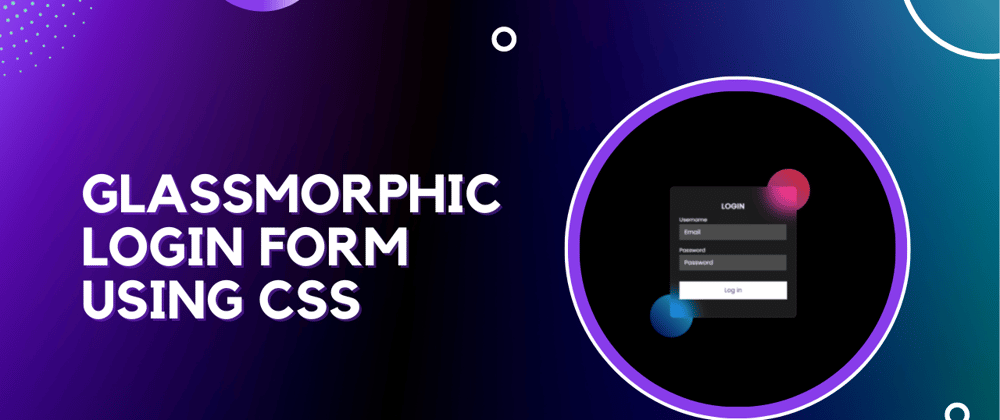
Hello Guys! In this blog, I'm going to explain to you how to make a glassmorphism Login Form using CSS. This will be a step-by-step guide including HTML and CSS. Let's get started 🚀.
Get FULL SOURCE Code and more Amazing Web Development projects on Coding Torque
We can convert any simple design into a Glassmorphism design. For this, we need to change a little bit of code. First we use background color semi-transparent such as rgba(255,255,255,0.1.5).
Then, we need to use backdrop-filter: blur (10px) to blur the background a bit. In the end, we need to use a border to enhance its beauty.
Let's cover HTML Part
We use HTML to make the skeleton of a website. HTML is a markup language.
Now let's import the fonts using Google Fonts API. Below is the code for Poppins Font. Paste the below code in <head> tag.
<link rel="preconnect" href="https://fonts.googleapis.com">
<link rel="preconnect" href="https://fonts.gstatic.com" crossorigin>
<link href="https://fonts.googleapis.com/css2?family=Poppins&display=swap" rel="stylesheet">
Now let's design the container in our <body> tag. In the below HTML code, we have created a container that contains the two divs with classname 'circle' for the circle shapes to show the glassmorphic effect. Next, we have a card div that contains form inputs for username and password, and lastly a login button.
<div class="container">
    <div class="circle"></div>
    <div class="circle"></div>
    <div class="card">
        <h4 class="title">Login</h4>
        <div class="form-input">
            <label for="username">Username</label>
            <input type="email" id="username" placeholder="Email">
        </div>
        <div class="form-input">
            <label for="password">Password</label>
            <input type="password" id="password" placeholder="Password">
        </div>
        <button class="login-btn">Log in</button>
    </div>
</div>
Here is the final HTML code
<!doctype html>
<html lang="en">

<head>
    <!-- Required meta tags -->
    <meta charset="utf-8">
    <meta name="viewport" content="width=device-width, initial-scale=1">

    <link rel="preconnect" href="https://fonts.googleapis.com">
    <link rel="preconnect" href="https://fonts.gstatic.com" crossorigin>
    <link href="https://fonts.googleapis.com/css2?family=Poppins&display=swap" rel="stylesheet">

    <title>Login Form with Glassmorphism CSS - @code.scientist x @codingtorque</title>
</head>

<body>
    <div class="container">
        <div class="circle"></div>
        <div class="circle"></div>
        <div class="card">
            <h4 class="title">Login</h4>
            <div class="form-input">
                <label for="username">Username</label>
                <input type="email" id="username" placeholder="Email">
            </div>
            <div class="form-input">
                <label for="password">Password</label>
                <input type="password" id="password" placeholder="Password">
            </div>
            <button class="login-btn">Log in</button>
        </div>
    </div>
</body>

</html>
Output Till Now

Let's understand CSS part
In the below CSS code.
- We declare a * selectors for the font Poppins that we have imported in our head tag.
- Next we declare a body selector which consists of styles for dark mode and aligns all elements in the body to the center.
- Next we created a circle using equal height & width and used border-radius: 50% to curve all edges. Then we created the gradient background for our circles.
- Next, we have a card that contains backdrop-filter: blur(10px), background: semi-transparent, and border property to create an amazing glassmorphism effect.
* {
    margin: 0;
    padding: 0;
    font-family: 'Poppins', sans-serif;
}

body {
    background: black;
    color: white;
    display: flex;
    align-items: center;
    justify-content: center;
    padding-top: 15rem;
}

.container {
    position: relative;
}

.circle {
    width: 6rem;
    height: 6rem;
    background: linear-gradient(45deg, #7b4397, #dc2430);
    border-radius: 50%;
    z-index: -1;
    position: absolute;
    top: -40px;
    right: -30px;
}

.circle:nth-child(2) {
    top: 240px;
    left: -45px;
    background: linear-gradient(45deg, #000046, #1CB5E0);
}

.card {
    backdrop-filter: blur(16px) saturate(180%);
    background-color: rgb(255 255 255 / 11%);
    border-radius: 8px;
    border: 1px solid rgba(255, 255, 255, 0.125);
    display: flex;
    flex-direction: column;
    align-items: center;
    width: 15rem;
    padding: 20px 20px;
    padding-top: 20px;
}


.title {
    text-transform: uppercase;
    letter-spacing: 1px;
    margin-top: 10px;
}

.form-input {
    margin: 5px 0;
}

.form-input label {
    font-size: 12px;
}

.form-input input {
    backdrop-filter: blur(16px) saturate(180%);
    background-color: rgb(255 255 255 / 11%);
    border: 1px solid rgba(255, 255, 255, 0.125);
    width: 90%;
    padding: 6px 10px;
    color: white;
    outline: none;
}

.form-input input::placeholder {
    color: white;
}

.login-btn {
    background-color: white;
    color: black;
    width: 100%;
    padding: 10px 0;
    margin: 20px 0;
    cursor: pointer;
    border: none;
}
Output Till Now


Top comments (0)