Building my website for a while using Tailwind CSS, I started to have more and more specific needs like backdrop-filter to create blur overlay effects, autofill pseudo-class to style form fields when they have been autocompleted, etc, and these use cases weren't covered by TailwindCSS core packages. So I had to leave my HTML and write separate CSS files to be able to use custom CSS properties. Although writing separate CSS is fine, I just don't like having ad
hoc CSS files here and there, which feels like an anti-pattern using Tailwind CSS for me, especially when your theming system starts to appear everywhere. So, I asked:
"Why don't I just create a TailwindCSS plugin, I'll get to see how it works more specifically, too!".
So, here I am.
TL;DR: It turned out pretty fun!
tailwindcss-autofill variant
The first plugin adds a variant, which is to add styles when an element entered a special state like hover, focus, etc.
The state I needed is when a form field was autocompleted.
By default, when a form field has been autocompleted, its foreground and background will be changed to some browser defaults.

But the defaults clearly don't work with my design. The perfect way to style it with TailwindCSS is:
<input className="autofill:bg-white autofill:text-gray-700" />
So, I wrote a variant to support it. It turned out to be quite simple:
const plugin = require("tailwindcss/plugin");

const autofill = plugin(({ addVariant, e }) => {
  addVariant("autofill", ({ modifySelectors, separator }) => {
    modifySelectors(({ className }) => {
      const newClass = e(`autofill${separator}${className}`);
      return [
        `.${newClass}:-webkit-autofill`,
        `.${newClass}:-webkit-autofill:hover`,
        `.${newClass}:-webkit-autofill:focus`,
      ].join(",");
    });
  });
});

module.exports = autofill;
What I did is calling addVariant in a tailwindcss/plugin invocation with 2 essential things:
A name or indicator:
autofill. This will enable the syntaxautofill:text-gray-100.A function that will modify the suffixed class. For example, when I use
autofill:text-gray-100, this function will receive aclassName=text-gray-100and its job is to modify this class into something that will properly handle the targeted state, which is-webkit-autofillin this case.
I released this as an NPM package, check out its repo to see more.
Now, what I needed to do is to just add this plugin into plugins in my tailwind.config.js.
module.exports = {
  // ...
  plugins: [
    require("tailwindcss-autofill"),
    // Other plugins.
  ],
  variants: {
    extend: {
      // Enable `autofill` variant for essential plugins.
      borderColor: ["autofill", "dark"],
      textColor: ["autofill", "dark"],
      backgroundColor: ["autofill", "dark"],
    },
  },
};
This plugin works fine with borderColor, focusRing, and most others, unfortunately, backgroundColor and textColor won't work because the browsers use special properties that got prioritized (it's weird). So, I had to hack it further, and the solution is to use -webkit-text-fill-color for the foreground and a special box-shadow value to override the background.
tailwindcss-text-fill and tailwindcss-shadow-fill
-webkit-text-fill-color and background fill using box-shadow are again special properties that weren't supported by TailwindCSS core packages. So, I wrote 2 other plugins, tailwindcss-text-fill and tailwindcss-shadow-fill respectively.
This time, the two new plugins add utilities instead of variants. TailwindCSS utilities are classes to conveniently style elements like text-gray-100, bg-red-50, etc.
Here is the code of one of them:
const plugin = require("tailwindcss/plugin");
const flatten = require("flatten-tailwindcss-theme");

const textFill = plugin(
  ({ addUtilities, variants, theme, e }) => {
    const colors = flatten(theme("colors"));
    const utils = Object.entries(colors).reduce(
      (res, [key, value]) =>
        Object.assign(res, {
          [`.${e(`text-fill-${key}`)}`]: {
            "-webkit-text-fill-color": value,
          },
        }),
      {}
    );
    addUtilities(utils, variants("textFill"));
  },
  { variants: { textFill: [] } }
);

module.exports = textFill;
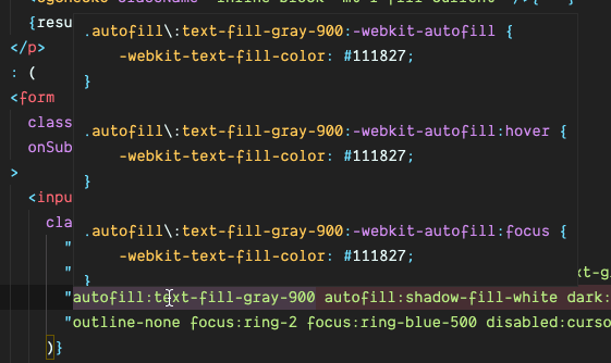
This plugin will generate multiple text-fill-{color} classes for you, like what text-{color} or bg-{color} did. The cool thing about this is it dynamically respects your theme and generate classes for only colors you are used to (colors in your current design system) and all Intellisense features on VS Code are automatically integrated (same for the tailwindcss-autofill plugin):
Final result
Finally, it worked 🔥!
Here is how I styled my component:
<input
  className={classNames(
    "bg-white dark:bg-gray-800 text-gray-900 dark:text-gray-100",
    "autofill:text-fill-gray-900 autofill:shadow-fill-white dark:autofill:shadow-fill-gray-800 dark:autofill:text-fill-gray-100"
  )}
/>
To see the final result in real life, checkout my website and test the Subscribe to the newsletter form input yourself to see the result now!
Final thoughts
I know what you're thinking now
A couple of different CSS properties and pseudo-classes turned into 3 JS plugins.
Yeah, it is true. But the fact is these plugins didn't take a lot of time or LoCs either, especially now I've already known how to do it, it took literally the same energy compared to creating separate CSS, class names, and maintaining them along with other Tailwind-based configurations. On the other hand, I can reuse these plugins for different purposes in the future, too. And also remember
that it is rare to write extra CSS when using Tailwind, the more plugins I (and others) added, the less likely I had to write extra CSS in future projects.
All the plugins are released and open-source, check out if you want to see more:

Top comments (4)
This is great! Definitely gonna use this for my current project.
Although I do have one issue.
autofill:shadow-fill-transparent leaves me with a white background.
Would love some insight. Thank you!
Oh,
shadow-fill-transparentcan't work technically, because the way this plugin works is to create a "virtual" background layer using shadow and place on top of hard-coded browser background, so it has to be a solid color!The walkaround for you is to use the same color with the underlying element's color instead of using transparent.
What if I have a gradient or an image?
In that case you’ll have build custom solution, I don’t think this solution can achieve that. Also, as far as I went into this problem, it may be not possible, because on autofill, browser automatically adds an extra background layer that is on top of the typical background and we can’t change color of it