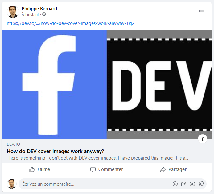
There is something I don't get with DEV cover images.
I have prepared this image:
It is a 1200x630 image, as expected by Facebook and as supported by most social networks and messaging services. That's a 1.91 ratio. When I say "expected" and "supported", I mean that the image is displayed as is when my article is posted.
But DEV does not work that way.
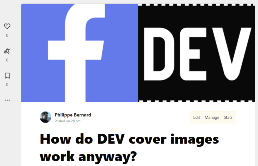
As I type this post, I can see the cover image I already assigned to it:
The top and bottom of the image are cropped. This is really how DEV displays cover images, with a 2.38 ratio.
How are we supposed to prepare cover images for DEV? Sure, it works pretty well with photos which remain consistent as long as you crop as much on one side as on the other.
But many technical writers craft their own cover images. In this scenario, DEV makes it kind of a dilemma. The only solution I found was to add artificial padding.
This is the generic cover image I prepared for a previous article:
When I wanted to publish it to DEV, I had to rework it a bit.
DEV image is still 1200x630 / 1.91, with extra padding at the top and bottom, which DEV crops:
As a workaround, it should be possible to assign a specific Open Graph image in the Post Options. That would help people like me to craft perfect cover image for DEV and social networks.


Top comments (1)
I'm going to agree about the cover images being so annoying to deal with. They always crop so weirdly, and users have no control over it.